Table of Contents
- Preface
- 1. Introduction
- 2. Installation and Setup
- 3. Quick Start
- 4. The Framework
-
- 4.1. Architecture
- 4.2. Common Components
-
- 4.2.1. Data Model
- 4.2.2. Metadata Framework
- 4.2.3. Views
- 4.2.4. Managed Beans
- 4.2.5. JMX Beans
- 4.2.6. Infrastructure Interfaces
- 4.2.7. AppContext
- 4.2.8. Application Properties
- 4.2.9. Messages Localization
- 4.2.10. User Authentication
- 4.2.11. Exceptions Handling
- 4.3. Database Components
- 4.4. Middleware Components
- 4.5. Generic User Interface
-
- 4.5.1. Screens
- 4.5.2. Visual Components Library
-
- 4.5.2.1. Components
-
- 4.5.2.1.1. Button
- 4.5.2.1.2. Bulk Editor
- 4.5.2.1.3. CheckBox
- 4.5.2.1.4. DateField
- 4.5.2.1.5. Embedded
- 4.5.2.1.6. FieldGroup
- 4.5.2.1.7. FileMultiUploadField
- 4.5.2.1.8. FileUploadField
- 4.5.2.1.9. Filter
- 4.5.2.1.10. GroupTable
- 4.5.2.1.11. Label
- 4.5.2.1.12. Link
- 4.5.2.1.13. LinkButton
- 4.5.2.1.14. LookupField
- 4.5.2.1.15. LookupPickerField
- 4.5.2.1.16. MaskedField
- 4.5.2.1.17. OptionsGroup
- 4.5.2.1.18. PasswordField
- 4.5.2.1.19. PickerField
- 4.5.2.1.20. PopupButton
- 4.5.2.1.21. ProgressBar
- 4.5.2.1.22. Related Entities
- 4.5.2.1.23. RichTextArea
- 4.5.2.1.24. SearchPickerField
- 4.5.2.1.25. Table
- 4.5.2.1.26. TextArea
- 4.5.2.1.27. TextField
- 4.5.2.1.28. TimeField
- 4.5.2.1.29. TokenList
- 4.5.2.1.30. Tree
- 4.5.2.1.31. TreeTable
- 4.5.2.1.32. TwinColumn
- 4.5.2.2. Containers
- 4.5.2.3. Miscellaneous
- 4.5.2.4. XML-Attributes of Components
- 4.5.3. Datasources
- 4.5.4. Actions. The Action Interface
- 4.5.5. Dialogs and Notifications
- 4.5.6. Background Tasks
- 4.5.7. Creating Application Themes
- 4.5.8. Web Client Specifics
- 4.5.9. Desktop Client Specifics
- 4.5.10. Creating Custom Components
- 4.5.11. Keyboard Shortcuts
- 4.6. Portal Components
-
- 4.6.1. Basic Functionality
- 4.6.2. REST API
-
- 4.6.2.1. Including in a Project
- 4.6.2.2. Describing Functions
-
- 4.6.2.2.1. Login
- 4.6.2.2.2. Logout
- 4.6.2.2.3. Loading a Persistent Object Instance From the Database by Identifier
- 4.6.2.2.4. Executing JPQL Query to Retrieve Data
- 4.6.2.2.5. Committing New and Modified Instances, Removal
- 4.6.2.2.6. Uploading Files from Storage
- 4.6.2.2.7. Obtaining Data Model Description in HTML Format
- 4.6.2.2.8. Creating New Views on Server
- 4.6.2.2.9. Service Calls
- 4.7. Platform Features
-
- 4.7.1. Scheduled Tasks Execution
- 4.7.2. Email Sending
- 4.7.3. Dynamic Attributes
- 4.7.4. Pessimistic Locking
- 4.7.5. Entity Statistics
- 4.7.6. Entity Log
- 4.7.7. Entity Snapshots
- 4.7.8. File Storage
- 4.7.9. Sequence Generation
- 4.7.10. Running SQL Using QueryRunner
- 4.7.11. Integration with MyBatis
- 4.7.12. Folders Panel
- 4.7.13. Screen Links
- 4.7.14. Entity Inspector
- 4.7.15. Information about Software Components
- 4.8. Functionality Extension
- 5. Application Development
-
- 5.1. Recommended Code Style
- 5.2. Project File Structure
- 5.3. Build Scripts Overview
- 5.4. Creating a Project
- 5.5. Designing the Database
- 5.6. Logging
- 5.7. Debugging and Testing
- 5.8. Development Recipes
- 6. Application Deployment
- 7. Security Subsystem
- A. Configuration Files
- B. Application Properties
- C. System Properties
- Glossary
This Manual provides the information required for the development of CUBA-based business applications. Business applications are understood here as a wide range of information systems intended for the support of enterprise operations, management and decision-making.
This Manual is intended for business applications developers using the CUBA platform. The following technologies knowledge is required to use the platform:
-
Java Standard Edition
-
Relational databases (SQL, DDL)
This Manual and other documentation related to the CUBA platform can be found at www.cuba-platform.com/manual.
Knowledge of the following technologies and frameworks will be helpful to get a deeper understanding of the core principles of the platform:
If you have any suggestions for improvement of this Manual, please contact support at www.cuba-platform.com/support/topics.
If you find a mistake in the documentation, please specify the number of the chapter and attach a small portion of the surrounding text to facilitate the search.
Basic Features
-
The platform is based on Java and thus supports almost all operating systems for servers and workstations
-
Completely open source
-
DBMS specifics independent
-
Platform-based applications can be easily deployed in a fail-over configuration
-
Efficient tools for user interface development using plain Java and XML
-
Powerful access control means, which can be configured at runtime from the application UI
-
A built-in Office and PDF reports generator (See Report Generator manual)
-
The facility to create and execute business processes including an integrated visual process designer (See Workflow manual)
-
Full-text search within entity attributes and file attachments (See Full Text Search manual)
-
Charts and maps (See Displaying Charts And Maps manual)
-
Built-in REST API with support for data exchange in XML or JSON for rapid integration with third-party applications
-
Extensions support enabling off-the-shelf software customization for individual customers while retaining seamless product version upgrade
-
CUBA Studio – a tool for rapid development of platform-based applications. Studio provides visual tools for creating, designing and editing the project data model, screens and other elements. Using Studio does not restrict development using standard Java IDE, but rather helps to achieve maximum efficiency when working on a project using both tools:
-
Studio is used for quick startup of the project, as well as visual design of the data model and UI screens layout
-
Java IDE is used for the implementation of business logic and UI events handling
CUBA Studio is integrated with IntelliJ IDEA and Eclipse enabling quickly switching between Studio and the IDE.
-
CUBA Platform Benefits
-
Solutions built on the platform benefit from the efficient architecture, tried and tested on a number of applications created by Haulmont and other developers
-
Declarative approach to user interface design provides the following advantages:
-
abstracts the developer from the specifics of diverse technologies (HTML / JavaScript, Swing, etc.)
-
clearly separates visual layout from initialization and event handling logic, making it easier to read and modify the code
-
-
Application screens are equally functional in both Web and Desktop clients.
-
The platform provides ready functionality on the following levels:
-
System level
-
Infrastructure and means of implementing business logic on the middleware tier
-
Visual components library and client tier infrastructure
-
Tools for managing configuration parameters and localized messages
-
Support for running background tasks from the user interface
-
Support for running scheduled tasks on the Middleware
-
Support for dynamic attributes allowing adding new attributes to entities at runtime
-
-
Application level
-
Security subsystem
-
Reports generator
-
Workflow subsystem
-
Full-text search
-
Reliable asynchronous email sending facility
-
Full audit of entity changes and tools for entity version snapshots storage
-
-
Deployment level
-
Support for running applications in fail-over configuration
-
Extensions support, enabling adapting off-the-shelf products to individual customer needs
-
-
-
Platform functionality significantly reduces project development time and cost, as well as associated technological risks
-
CUBA-based web applications development does not require knowledge of the traditional web technologies, such as HTML, CSS, or JavaScript.
Minimum requirements for development using CUBA platform:
-
Memory – 4 GB
-
Hard drive space – 5 GB
-
Operating system: Microsoft Windows,Linux or Mac OS X
CUBA platform changelog is available at files.cuba-platform.com/cuba/platform/platform-5.5-changelog.html.
Minimum software requirements are as follows:
-
Java SE Development Kit (JDK) 7 or 8. It is recommended that you use Oracle Java HotSpot VM.
In order to build and run projects outside Studio, you need to set the path to the JDK root directory in the
JAVA_HOMEenvironment variable, e.g.C:\Program Files\Java\jdk1.8.0_45. On Windows, you can do this at -> -> -> -> The value of the variable should be added to the System variables list. -
Java IDE: IntelliJ IDEA Community Edition 12+ or Eclipse 4.3+. We recommended using IntelliJ IDEA.
In the most basic scenario, the built-in HyperSQL (http://hsqldb.org) can be used as the database server. This is sufficient for exploring the platform capabilities and application prototyping. For building production applications, it is recommended to install and use one of the full-featured DBMS supported by the platform, like PostgreSQL for instance.
The web interface of the platform-based applications supports all popular browsers, including Google Chrome, Mozilla Firefox, Safari, Opera 15+, Internet Explorer 8+.
Prerequisites:
-
Make sure that Java SE Development Kit (JDK) 7 or 8 is installed by running the following command in the console:
java -versionThe command should return the Java version, e.g.
1.8.0_45. -
If you connect to the internet via a proxy server, some Java system properties must be passed to the JVM running Studio and Gradle. These properties are explained here: http://docs.oracle.com/javase/7/docs/technotes/guides/net/proxies.html (see properties for HTTP and HTTPS protocols).
It is recommended to set these properties system-wide in the
JAVA_OPTSenvironment variable. The Studio launch script passesJAVA_OPTSto the Java executable.
In order to install CUBA Studio, take the following steps:
-
Download
studio-<version>.ziparchive at www.cuba-platform.com/download. -
Extract the files to local directory, e.g.
c:/work/studio -
Open the command line, go to
bindirectory and runstudio -
In the CUBA Studio Server window, enter the following parameters:
-
Java home − JDK installation to be used for building and running projects. If you have set the
JAVA_HOMEenvironment variable as described in the beginning of this chapter, it will appear in this field. Otherwise, Studio will try to find your Java installation itself. -
Gradle home − leave this field empty; in this case, the required Gradle distribution will be downloaded automatically.
If you want to use a local Gradle distribution, enter the path to the respective directory in the field. For project build system to work correctly, Gradle 1.12 is required.
-
Server port − CUBA Studio server port (the default port is 8111).
-
IDE port − IDE plugin listening port (the default port is 48561).
-
Repository − binary artifacts repository URL and authentication parameters.
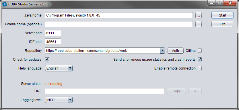
The following options are also available:
-
Check for updates - check for new versions on every start.
-
Help language - built-in help language.
-
Offline - enable working with projects without an Internet connection, provided that all the required libraries have been previously downloaded from the repository.
-
Send anonymous statistics and crash reports - enable Studio to send error statistics to developers.
-
Enable remote connection - by default, it is assumed that Studio runs on localhost. Check this box if you need to connect to this Studio copy from a remote host.
-
-
Click to run the Studio server.
The server will download, run, and connect to the Gradle daemon. This may take a significant amount of time on first startup; on subsequent launches, this will take a few seconds.
After that, the web server will be started, and the URL of the Studio interface will appear in the URL field. By clicking , you can open the address in browser; by clicking you can copy the address to clipboard.
-
Open the specified address in web browser.
-
Click in the Studio web interface. In the Select project window, click to create a new project, or to add an existing one to the Studio list.
-
Once the project is opened, the Studio will download the source code of the platform base projects and save it to the local folder. Before building the project, it is recommended to wait until the download is finished and make sure that the background task indicator in the bottom right corner of the Studio has faded out.
Take the following steps to integrate Studio with IntelliJ IDEA or Eclipse:
-
Open or create a new project in the Studio.
-
Switch to Project properties section and click . Select the required Java IDE by checking or .
-
Select > in the Studio menu. The corresponding files will be created in the project directory.
-
For IntelliJ IDEA 12+ integration:
-
Run IntelliJ IDEA 12+ and install CUBA Framework Integration plugin, from the plugin repository: .
-
Find CUBA in the Languages and Frameworks section of the menu. Check Enabled on the Studio integration panel and click .
-
-
For Eclipse 4.3 integration:
-
Run Eclipse, open , add
http://files.cuba-platform.com/eclipse-update-siterepository and install the CUBA Plugin. -
In the CUBA section of the menu, check Studio Integration Enabled, and click .
-
Please note that IDE: on port 48561 label has appeared in the bottom left corner of the Studio. Now the corresponding source code files will be opened in IDE when you click IDE buttons in the Studio.
This section describes the process of creating an application using CUBA Studio. Similar information is provided in the videos available at www.cuba-platform.com/quickstart.
Make sure that the necessary software is already installed and set up on your computer, see Chapter 2, Installation and Setup.
Key stages of our application development:
-
Data model development including creation of entities describing application domain and corresponding database tables.
-
Development of the user interface screens enabling to create, view, update and delete data model entities.
The application should maintain information about the customers and their orders.
A customer has the following attributes:
-
Name
-
E-mail
Order attributes:
-
Ownership by a customer
-
Date
-
Amount
The application UI should contain:
-
Customers browser screen;
-
Customer editor screen, containing as well the list of this customer's orders;
-
General orders browser screen;
-
Order editor screen.
The application should support user interface in English and Russian.
-
Start CUBA Studio and open its web interface (See Section 2.1, “CUBA Studio Installation”).
-
Click in the start window.
-
Click in the appeared Select project window.
-
Specify the name of the new project in the Project name field of the New project window – for example,
sales. The name should contain only Latin letters, numbers and underscores. Think carefully on the project name at this stage, as changing it later on will require complex manual intervention. -
The following fields below will be automatically populated:
-
Project path – the path to the new project directory. You can select the directory manually by clicking the button next to the field. The Select folder window will appear with the list of folders n your hard drive. You can select one of those, or create a new directory by clicking the button.
-
Project namespace – the namespace which will be used as a prefix for entity names and database tables. The namespace can consist of Latin letters only and should be as short as possible. For example, if the project name is
sales_2, the namespace can besalesorsal. -
Root package − the root package of Java classes. It can be adjusted later, but the classes generated at project creation will not be moved.
-
Base projects version – the platform version used in the project. The platform artifacts will be automatically downloaded from the repository on project build.
-
-
Click . Empty project will be created in the specified
salesdirectory and the main Studio window will open. -
Assemble the project: select option > in the Studio main menu. At this stage all required libraries will be downloaded and project artifacts will be assembled in
buildsubdirectories of the modules. -
Create the database on the local HyperSQL server: select option > in the menu. The database name is the same as project namespace by default.
-
Select > menu option. Tomcat server with the built application will be installed in the project
buildsubdirectory. -
Select > option. The link next to the Web application caption in the status panel will become available in a few seconds so you will be able to open the application directly from Studio.
The username and password are
admin/admin.The running application contains two main menu items ( and ), as well as security and administration subsystems functionality.
Let us create the Customer entity class.
-
Go to the Entities tab in the navigation section and click . The New entity dialog window will appear.
-
Enter the name of the entity class –
Customer– in the Class name field.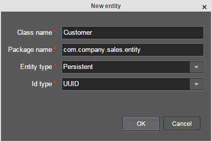
-
Click . The entity designer page will be displayed in the workspace.
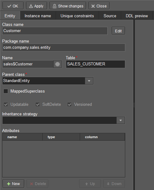
-
The entity name and the database table name will be automatically generated in the Name and the Table fields respectively.
-
Leave the existing value –
StandardEntity- in the Parent class field. -
Leave the Inheritance strategy field blank.
-
Click
 button next to the Name to open the Localized message window.
Specify localization for the entity name for the available languages in it.
button next to the Name to open the Localized message window.
Specify localization for the entity name for the available languages in it.
Next, let us create entity attributes. To do this, click the button below the Attributes table.
-
Create attribute window will appear. Enter the name of the entity attribute −
name, in the Name field. SelectDATATYPEvalue in the Attribute type list, specifyStringattribute type in the Type field and then set the length of the text attribute to 100 characters in the Length field. Check the Mandatory box. The name of the database table column will be automatically generated in the Column field.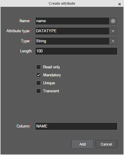
Now click
button next to the attribute name to open the Localized message window. Localize the attribute
name in the available languages. Click to add the attribute.
-
emailattribute is created in the same way but the value in Length field should be set to50.
After creating the attributes, go to the Instance name tab in the entity designer to specify Name pattern. Select the name attribute in the Available attributes list and move it to the Name pattern attributes list by clicking the button with the right arrow on it.
Customer entity creation is now complete. Click in the upper
left corner of the entity designer to save the changes and close the page.
Let us create the Order entity. Click option on the
Entities tab. Enter the Class name − Order. The entity
should have the following attributes:
-
Name −
customer, Attribute type −ASSOCIATION, Type −Customer, Cardinality −MANY_TO_ONE. -
Name −
date, Attribute type −DATATYPE, Type −Date. Check Mandatory box fordateattribute. -
Name −
amount, Attribute type −DATATYPE, Type −BigDecimal.
Specify localized caption for each of the attributes by clicking the
button next to the attribute name.
It is sufficient to click button in Entities tab on the navigation panel to create database tables. After that, Database scripts page will open. Both incremental DB update scripts from the current state (Update scripts) and initial DB creation scripts (Init tables, Init constraints, Init data) will be generated on this page.
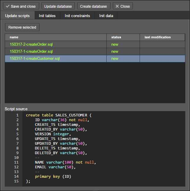
Click button to save the generated scripts. To run update scripts, stop the running application using the > command, then select > .
Now we will create screens for customers and orders data management.
Select Customer entity in the Entities tab on the navigation panel to
create standard screens for viewing and editing Customers. Click
link at the bottom of the section. After that, Create standard screens window will appear.
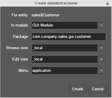
All fields in this dialog are already populated with default values, there is no need to change them. Click the button.
customer-edit.xml and customer-browse.xml items will appear in
GUI Module on Screens tab of the navigation panel.
You can specify localized captions for the screens. For this, select a screen and click
to open the screen designer page. Go to the Properties tab.
Click the
button next to the Caption field and specify screen names in different locales.
Alternatively, you can open messages.properties item located in the screens package and edit
browseCaption and editCaption messages for available locales.
Order entity has the following distinction: since one of the attributes is Order.customer
reference attribute, you should define a view
including this attribute (standard _local view does not include reference attributes).
Go to the Entities tab on the navigation panel, select the Order entity and click
the button. View designer page will open. Enter orderWithCustomer
as the view name, click on customer attribute and select _minimal view for the
Customer entity in the panel on the right.
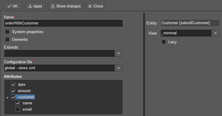
Click in the upper left corner.
After that select the Order entity and click .
Select orderWithCustomer as Browse view and Edit view
in the appeared Create standard screens window and click .
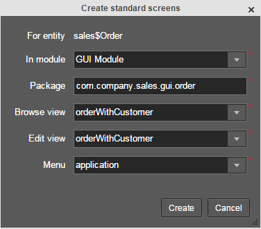
order-edit.xml and order-browse.xml items will appear in the
GUI Module on the Screens tab of the navigation panel.
You can specify localized captions for the Order screens as described above for the Customer screens.
At the moment of their creation, the screens were added to the menu item of
the default application menu. Let us rename it. Switch to the Main menu tab on the navigation
panel and click . The Menu designer page will open. Select the
application menu item to edit its properties.
Enter the new value of the menu identifier − shop − in the Id field, then click
the Caption button and set localized names of the menu item.
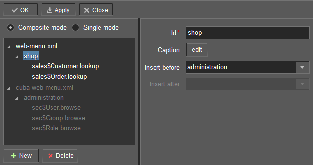
After editing the menu, click at the top left corner of the page.
Do the following to display the list of Orders in the Customer’s edit screen:
-
Go to the Screens tab on the navigation panel. Choose
customer-edit.xmlscreen and click . -
Go to the Datasources tab on the screen designer page and click .
-
Select the newly created data source in the list. Its attributes will appear in the right part of the page.
-
Specify
collectionDatasourcein the Type field. -
In Id field enter the data source identifier −
ordersDs. -
Select
com.sample.sales.entity.Orderentity in the Entity list. -
Select
_localview in the View list. -
Enter the following query in the Query field:
select o from sales$Order o where o.customer.id = :ds$customerDs order by o.date
The query contains orders selection criterion with
ds$customerDsparameter. The parameter value named likeds${datasource_name}will contain id of the entity selected indatasource_namedatasource at the moment, in this case it is the id of the Customer being edited.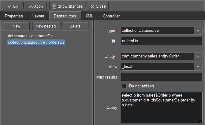
-
Click to save the changes.
-
Next go to the Layout tab in the screen designer and find the
Labelcomponent in the components palette. Drag this component to the screen components hierarchy panel and place it betweenfieldGroupandwindowActions. Go to the Properties tab in the properties panel. Entermsg://ordersin the value field. Click the
button next to the value field and define label values in available locales.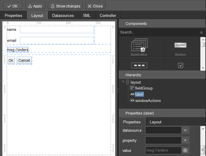
If the application is not intended to be used in multiple languages, the value in the value field can be entered straight in the required language.
-
Drag
Tablefrom the components palette to components hierarchy panel and place it betweenlabelandwindowActions. Select this component in the hierarchy and specify table size in properties on the Layout tab: set100%in width field and200pxin height field.Go to the Properties tab. Set
ordersTablevalue as id, chooseorderDsfrom the list of available datasources.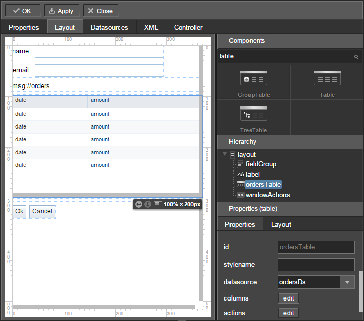
Next, click the button for columns. The table columns editor window will appear on the screen. Select the
datevalue from the drop-down list in the first line of the id column, andamountin the second line.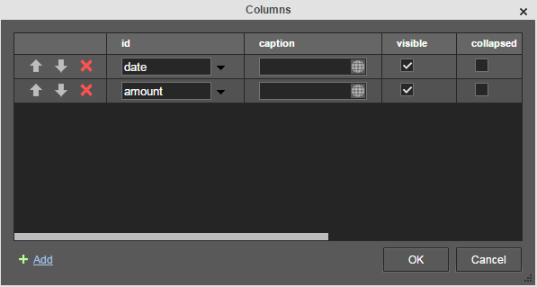
-
Click in the upper left corner of the screen designer page to save the changes in Customer edit screen.
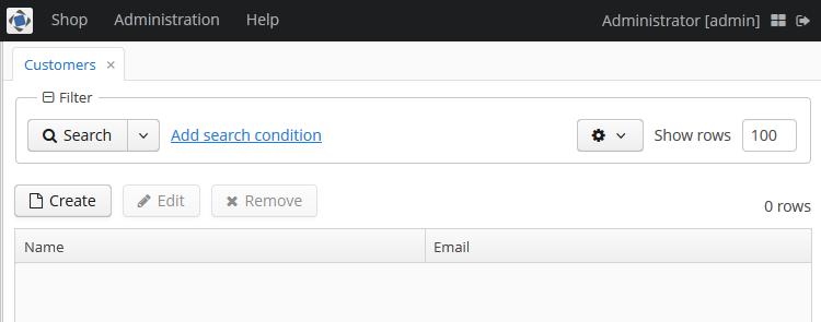
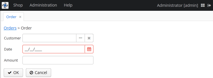
Now let us see how the created screens look in the actual application. Select > .
Log in selecting English language in the login window. Open the > menu item:
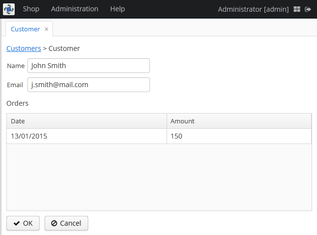
Click :
Open the > menu item:
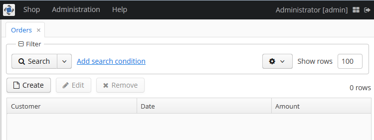
Click :
This chapter contains detailed description of the platform architecture, components and mechanisms.
This section covers the architecture of CUBA applications in different aspects: in regard to tiers, blocks, modules, and to the used basic projects.
The platform allows building applications according to the classic three-tier pattern: client tier, middleware tier, database. The tier indicates the degree of “remoteness” from the stored data.
Further on, mainly middleware and client tiers will be described, therefore the words “all tiers” will refer to these tiers only.
Each tier allows creating one or more application blocks. A block is a separate executable program interacting with other blocks in the application. CUBA platform tools enable creation of blocks in the form of web or desktop applications. Block development for mobile platforms currently remains beyond CUBA framework; however, mobile blocks made up using other tools can be integrated with the standard blocks of the application.
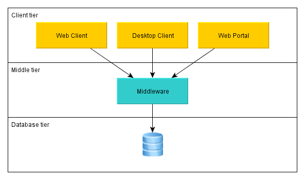
- Middleware
-
The middle tier contains core business-logic of the application and provides access to the database. It is represented by a separate web application running on Java EE Web Profile standard container. See Section 4.4, “Middleware Components”.
- Web Client
-
The main block in the Client tier. It contains the interface designed primarily for internal users. It is represented by a separate web application running on Java EE Web Profile standard container. The user interface is implemented on the base of Vaadin framework. See Section 4.5, “Generic User Interface”.
- Desktop Client
-
The additional block of Client tier. It contains the interface designed primarily for internal users. It is represented by a desktop Java application; the user interface is implemented on the base of Java Swing framework. See Section 4.5, “Generic User Interface”.
- Web Portal
-
The additional block of Client tier. It contains the interface for external users and integration tools for mobile devices and third-party applications. It is represented by a separate web application running under Java EE Web Profile standard container. The user interface is implemented on the base of Spring MVC framework. See Section 4.6, “Portal Components”.
The mandatory block for any application is the middle tier – Middleware. User interface is generally implemented on the basis of one or several blocks, such as Web Client and Web Portal.
The above mentioned blocks are standard, however, in order to separate the functionality in a complex application one can easily create any number of Client blocks as well as Middleware blocks.
All of the Client blocks interact with the middle tier uniformly via HTTP protocol enabling to place the middle tier arbitrarily, behind firewall as well. It is worth mentioning, that in the simplest case when the middle tier and the web client are deployed on the same server local interaction between them can bypass the network stack in order to reduce overhead.
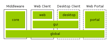
A module is the smallest structural part of CUBA application. It is a single module of application project and the corresponding JAR file with executable code.
Standard modules:
-
global – includes entity classes, service interfaces, and other classes common for all tiers. It is used in all application blocks.
-
core – implements services and all other components of the middle tier. It is used only in Middleware.
-
gui – common components of the generic user interface. It is used in Web Client and Desktop Client.
-
web – the implementation of generic user interface based on Vaadin and other specific web client classes. It is used in Web Client block.
-
desktop – an optional module – implementation of generic user interface based on Java Swing, as well as other specific desktop client classes. It is used in Desktop Client block.
-
portal – an optional module – implementation of Web portal based on Spring MVC.
The functionality of the platform is divided into several so-called base projects:
-
cuba – the main base project containing all of the functionality described in this manual
-
reports – reports generating subsystem
-
workflow – workflow management subsystem with built-in visual designer for business processes
-
fts – full-text search subsystem
-
charts – subsystem for displaying charts and maps
-
ccpayments – subsystem dealing with credit cards
-
bpmn – the mechanism of business processes execution according to the standard BPMN 2.0
The application created on the platform can comprise the functionality of the base projects by declaring dependencies on their artifacts. Dependence on cuba artifacts is mandatory. Optional base projects in turn also depend on cuba, and may contain dependencies between them.
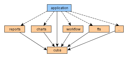
Solid lines demonstrate mandatory dependencies, dashed lines mean optional ones.
The above-listed architectural principles are directly reflected in the composition of assembled application. Let us consider the example of a simple application sales, which has two blocks – Middleware and Web Client; and includes functionality of the two base projects cuba and reports.
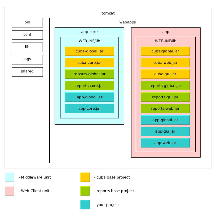
The figure demonstrates the contents of several directories on Tomcat server with a deployed application sales in it.
The Middleware block is represented by the app-core web application, the Web Client block – by the app web application. The executable code of the web applications can be found in directories WEB-INF/lib in sets of JAR-files. Each JAR (artifact) is a result of assembly of one of the application modules or base projects.
For instance, the contents of JAR-files of the web application in middle tier app-core is determined by the facts that Middleware block includes global and core modules, and the application uses base projects cuba and reports.
This chapter covers platform components, which are common for all tiers of the application.
Entities are divided into two categories:
-
Persistent – instances of such entities are stored in the database tables.
-
Non-persistent – instances exist only in memory.
The entities are characterized by their attributes. An attribute corresponds to a field and a pair of access methods (get / set) of the field. To make an attribute immutable (read only), it is enough to omit "set" method.
Persistent entities may include attributes that are not stored in the database. For non-persistent attribute the field is optional, creation of access methods will be sufficent.
The entity class should meet the following requirements:
-
Be inherited from one of the base classes provided by the platform (see below).
-
Have a set of fields and access methods corresponding to the entity attributes.
-
The class and its fields (or access methods if the attribute has no corresponding field) must be annotated in a definite way for correct operation of JPA (in case of a persistent entity) and the metadata framework.
-
To enable support of potential extension of the entity, fields should be declared with the modifier
protected, instead ofprivate.
The following attribute types of entities are supported:
-
java.lang.String -
java.lang.Boolean -
java.lang.Integer -
java.lang.Long -
java.lang.Double -
java.math.BigDecimal -
java.util.Date -
java.sql.Date -
java.sql.Time -
java.util.UUID -
byte[] -
enum -
entity
Base entity classes (see below) override equals() and hashCode() methods to provide entity instance matching by comparing their identifiers. I.e., instances are considered equal, if their identifiers match. An identifier of the UUID type is assigned to an instance right after its creation in memory, which is why new instances can also be compared and added to collections.
The base entity classes and interfaces are described in detail in this section.
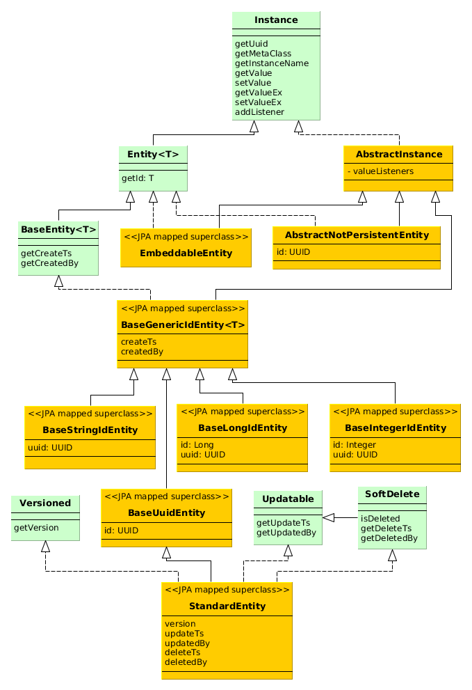
-
Instance– declares the basic methods for working with objects of application domain:-
getting the global unique identifier (UUID) of the entity
-
getting references to the object meta-class
-
generating the instance name
-
reading/writing attribute values by name
-
adding listeners receiving notifications about attribute changes
-
-
Entity– extendsInstancewith entity identifier (which is not necessarily equal to the UUID); at the same timeEntitydoes not define the type of the identifier leaving this option to descendants. -
AbstractInstance– implements the logic of working with attribute change listeners.AbstractInstancestores the listeners inWeakReference, and if there are no external references to the added listener, it will be immediately destroyed by garbage collector. Normally, attribute change listeners are visual components and UI datasources that are always referenced by other objects, so there is no problem with listeners dropout. However, if a listener is created by application code and no objects refer to it in a natural way, it is necessary to save it in a certain object field apart from just adding it toInstance. -
AbstractNotPersistentEntity– base class of non-persistent entities withUUIDidentifier. -
BaseEntity– base class of persistent entities; declares methods for working with information about when and by whom the entity instance was created in the database. -
BaseGenericIdEntity– implementsBaseEntitywith added JPA annotations without specifying the type of the identifier (i.e. the primary key) of the entity. -
BaseUuidEntity– extendsBaseGenericIdEntityand sets theididentification attribute of theUUIDtype. -
BaseLongIdEntity– extendsBaseGenericIdEntityand sets theididentification attribute of theLongtype. -
BaseIntegerIdEntity– extendsBaseGenericIdEntityand sets theididentification attribute of theIntegertype. -
BaseStringIdEntity– extendsBaseGenericIdEntityand sets only the type of the identifier -String. A specific entity class, extended fromBaseStringIdEntity, must have aString-type identifier attribute with the@IdJPA annotation. -
Versioned– interface for entities supporting optimistic locking . -
Updatable– interface for entities which require to keep the information about when and by whom the instance was last changed. -
SoftDelete– interface for entities supporting soft deletion. -
StandardEntity– the most commonly used base class of persistent entities that implements the interfaces given above.
When creating entity classes it is recommended to choose a base class according to the following rules:
-
If an entity is not stored in the database, inherit it from
AbstractNotPersistentEntity. -
If an entity is embedded, inherit it from
EmbeddableEntity. -
If an entity is only created in DB, never changes and needs no soft deletion, inherit it from
BaseUuidEntity. -
If an entity behaves in a standard way: changes in the database, requires optimistic locking and soft deletion − inherit it from
StandardEntity. -
Otherwise inherit the entity from
BaseUuidEntityand implementVersioned,Updatable,SoftDeleteinterfaces if required. -
For some entities, it is desirable to use integer or string primary keys. In this case, inherit the entity from
BaseLongIdEntity,BaseIntegerIdEntityorBaseStringIdEntityinstead ofBaseUuidEntity.
This section describes all annotations of entity classes and attributes supported by the platform.
Annotations of the javax.persistence package are needed for JPA, annotations of com.haulmont.* packages are designed for metadata management and control of other mechanisms in the platform.
In this manual, if an annotation is identified by a simple class name, it refers to a platform class, located in one of com.haulmont.* packages.
-
@javax.persistence.Entity -
Declares a class to be a data model entity.
Parameters:
-
name– the name of the entity, must begin with a prefix, separated by a$sign. It is recommended to use a short name of the project as a prefix to form a separate namespace.
Example:
@Entity(name = "sales$Customer")
-
-
@javax.persistence.MappedSuperclass -
Defines that the class is an ancestor for some entities and its attributes must be used as part of descendant entities. Such class is not associated with any particular database table.
-
@javax.persistence.Table -
Defines database table for the given entity.
Parameters:
-
name– the table name
Example:
@Table(name = "SALES_CUSTOMER")
-
-
@javax.persistence.Embeddable -
Defines an embedded entity stored in the same table as the owning entity.
@MetaClass annotation should be used to specify the entity name.
-
@javax.persistence.Inheritance -
Defines the inheritance strategy to be used for an entity class hierarchy. It is specified on the entity class that is the root of the entity class hierarchy.
Parameters:
-
strategy– inheritance strategy,SINGLE_TABLEby default
-
-
@javax.persistence.DiscriminatorColumn -
Is used for defining a database column responsible for the distinction of entity types in the cases of
SINGLE_TABLEandJOINEDinheritance strategies.Parameters:
-
name– the discriminator column name -
discriminatorType– the discriminator column type
Example:
@DiscriminatorColumn(name = "TYPE", discriminatorType = DiscriminatorType.INTEGER)
-
-
@javax.persistence.DiscriminatorValue -
Defines the discriminator column value for this entity.
Example:
@DiscriminatorValue("0") -
@javax.persistence.PrimaryKeyJoinColumn -
Is used in the case of
JOINEDinheritance strategy to specify a foreign key column for the entity which refers to the primary key of the ancestor entity.Parameters:
-
name– the name of the foreign key column of the entity -
referencedColumnName– the name of primary key column of the ancestor entity
Example:
@PrimaryKeyJoinColumn(name = "CARD_ID", referencedColumnName = "ID")
-
-
@NamePattern -
Determines the way of getting the name of the instance returned by the method
Instance.getInstanceName().The annotation value should be a string in the format
{0}|{1}, where:-
{0}– formatting string according to theString.format()rules, or this object method name with the prefix#. The method should returnStringand should have no parameters. -
{1}– a list of field names separated by commas, corresponding to{0}format. If the method is used in{0}, the list of fields is still required as it forms the_minimalview.
Examples:
@NamePattern("%s|name")@NamePattern("#getCaption|login,name") -
-
@Listeners -
Defines the list of listeners intended for reaction to the events of the entity instance lifecycle on the Middleware tier.
The annotation value should be a string or an array of strings containing class names of the listeners. See Section 4.4.4.6, “Entity Listeners”.
The strings here are used instead of class references because classes of the listeners are contained only on Middleware tier and are inaccessible for client code, while the classes of the entities are used on all tiers.
Examples:
@Listeners("com.haulmont.cuba.security.listener.UserEntityListener")@Listeners({"com.abc.sales.entity.FooListener","com.abc.sales.entity.BarListener"}) -
@MetaClass -
Is used for declaring non-persistent or embedded entity (meaning that
@javax.persistence.Entityannotation cannot be applied)Parameters:
-
name– the entity name, must begin with a prefix, separated by a$sign. It is recommended to use a short name of the project as prefix to form a separate namespace.
Example:
@MetaClass(name = "sys$LockInfo")
-
-
@SystemLevel -
Indicates that the entity is system only and should not be available for selection in various lists of entities, such as generic filter parameter types or dynamic attribute type.
-
@EnableRestore -
Indicates that the entity instances are available for recovery after soft deletion on a special screen
core$Entity.restore. -
@TrackEditScreenHistory -
Indicates that editor screens opening history (
{entity_name}.edit) will be recorded with the ability to display it on a special screensec$ScreenHistory.browse. -
@Extends -
Indicates that the entity is an extension and it should be used everywhere instead of the base entity. See Section 4.8, “Functionality Extension”.
-
@PostConstruct -
This annotation can be specified for a method. Such method will be invoked right after the entity instance is created by Metadata.create(). This is convenient, when instance initialization requires invocation of beans. For example, see Section 5.8.2.1, “Entity Fields Initialization”.
Attribute annotations should be set for the corresponding fields, with the following exception: if there is a need to declare read-only, non-persistent attribute foo, it is sufficient to create getFoo() method and annotate it with @MetaProperty.
-
@javax.persistence.Transient -
Indicates that field is not stored in the database, meaning it is non-persistent.
The fields supported by JPA types (See http://docs.oracle.com/javaee/5/api/javax/persistence/Basic.html) are persistent by default, that is why
@Transientannotation is mandatory for non-persistent attribute of such type.@MetaProperty annotation is required if
@Transientattribute should be included in metadata. -
@org.apache.openjpa.persistence.Persistent - Indicates that field is stored in the database, meaning it is persistent.
This annotation is only required for non-standard JPA fields. The platform currently supports one such type –
java.util.UUID. Thus,@Persistentannotation is only required when declaring persistentUUIDtype field. -
@javax.persistence.Column -
Defines DB column for storing attribute values.
Parameters:
-
name– the column name. -
length– (optional parameter,255by default) – the length of the column. It is also used for metadata generation and ultimately, can limit the maximum length of the input text in visual components implementing this attribute. Add the@Lobannotation to remove restriction on the attribute length. -
nullable– (optional parameter,trueby default) – determines if an attribute can containnullvalue. Whennullable = falseJPA ensures that the field has a value when saved. In addition, visual components working with the attribute can request the user to enter a value.
-
-
@javax.persistence.Id -
Indicates that the attribute is the entity primary key. Typically, this annotation is set on the field of a base class, such as BaseUuidEntity. Using this annotation for a specific entity class is required only in case of inheritance from the
BaseStringIdEntitybase class (i.e. creating an entity with a string primary key). -
@javax.persistence.ManyToOne -
Defines a reference attribute with many-to-one relationship type.
Parameters:
-
fetch– (EAGERby default) parameter that determines whether JPA will eagerly fetch the referenced entity. This parameter should always be set toLAZY, since retrieval of referenced entity in CUBA-application is determined dynamically by the views mechanism. -
optional– (optional parameter,trueby default) – indicates whether the attribute can containnullvalue. Ifoptional = falseJPA ensures the existence of reference when the entity is saved. In addition, the visual components working with this attribute can request the user to enter a value.
For example, several
Orderinstances refer to the sameCustomerinstance. In this caseOrderclass should contain the following annotations:@ManyToOne(fetch = FetchType.LAZY) @JoinColumn(name = "CUSTOMER_ID") protected Customer customer;
-
-
@javax.persistence.OneToMany -
Defines a collection attribute with one-to-many relationship type.
Parameters:
-
mappedBy– the field of the referenced entity, which determines the relationship. -
targetEntity– the type of referenced entity. This parameter is optional if the collection is declared using Java generics. -
fetch– (optional parameter,LAZYby default) – determines whether JPA will eagerly fetch the collection of referenced entities. This parameter should always remainLAZY, since retrieval of referenced entities in CUBA-application is determined dynamically by the views mechanism. -
cascade– (optional parameter,{}by default) – determines operations that should be cascaded to the referenced entities. Cascading on this level is not recommended.
For example, several
Iteminstances refer to the sameOrderinstance using@ManyToOnefieldItem.order. In this caseOrderclass can contain a collection ofIteminstances:@OneToMany(mappedBy = "order") protected Set<Item> items;
-
-
@javax.persistence.OneToOne -
Defines a reference attribute with one-to-one relationship type.
Parameters:
-
fetch– (EAGERby default) determines whether JPA will eagerly fetch the referenced entity. This parameter should be set toLAZY, since retrieval of referenced entities in CUBA-application is determined dynamically by the views mechanism. -
mappedBy– the field of the referenced entity, which determines the relationship. It must only be set on the non-owning side of the relationship. -
optional– (optional parameter,trueby default) – indicates whether the attribute can containnullvalue. Ifoptional = falseJPA ensures the existence of reference when the entity is saved. In addition, the visual components working with this attribute can request the user to enter a value.
Example of owning side of the relationship,
Driverclass:@OneToOne(fetch = FetchType.LAZY) @JoinColumn(name = "CALLSIGN_ID") protected DriverCallsign callsign;
Example of non-owning side of the relationship,
DriverCallsignclass:@OneToOne(fetch = FetchType.LAZY, mappedBy = "callsign") protected Driver driver;
-
-
@javax.persistence.ManyToMany -
Defines a collection attribute with many-to-many relationship type.
Many-to-many relationship always has an owning side and can also have inverse, non-owning side. The owning side should be marked with additional
@JoinTableannotation, and the non-owning side – withmappedByparameter.Parameters:
-
mappedBy– the field of the referenced entity, which determines the relationship. It must only be set on the non-owning side of the relationship. -
targetEntity– the type of referenced entity. This parameter is optional if the collection is declared using Java generics. -
fetch– (optional parameter,LAZYby default) – determines whether JPA will eagerly fetch the collection of referenced entities. This parameter should always remainLAZY, since retrieval of referenced entities in CUBA-application is determined dynamically by the views mechanism.
-
-
@javax.persistence.JoinColumn -
Defines DB column that determines the relationship between entities.
Parameters:
-
name– the column name
Example:
@ManyToOne(fetch = FetchType.LAZY)
@JoinColumn(name = "CUSTOMER_ID")
protected Customer customer;
-
-
@javax.persistence.JoinTable -
Defines a join table on the owning side of
@ManyToManyrelationship.Parameters:
-
name– the join table name -
joinColumns–@JoinColumnelement in the join table corresponding to primary key of the owning side of the relationship (the one containing@JoinTableannotation) -
inverseJoinColumns–@JoinColumnelement in the join table corresponding to primary key of the non-owning side of the relationship.
Example of the
customersattribute of theGroupclass on the owning side of the relationship:@ManyToMany @JoinTable(name = "SALES_CUSTOMER_GROUP_LINK", joinColumns = @JoinColumn(name = "GROUP_ID"), inverseJoinColumns = @JoinColumn(name = "CUSTOMER_ID")) protected Set<Customer> customers;Example of the
groupsattribute of theCustomerclass on non-owning side of the same relationship:@ManyToMany(mappedBy = "customers") protected Set<Group> groups;
-
-
@javax.persistence.OrderBy -
Determines the order of elements in a collection attribute at the point when the association is retrieved from the database. This annotation should be specified for ordered Java collections such as
ListorLinkedHashSetto get a predictable sequence of elements.Parameters:
-
value– string, determines the order in the format:orderby_list::= orderby_item [,orderby_item]* orderby_item::= property_or_field_name [ASC | DESC]
Example:
@OneToMany(mappedBy = "user") @OrderBy("createTs") protected List<UserRole> userRoles; -
-
@javax.persistence.Embedded -
Defines a reference attribute of embeddable type. The referenced entity should have
@Embeddableannotation.Example:
@Embedded
protected Address address;
-
@javax.persistence.Temporal -
Specifies the type of the stored value for
java.util.Dateattribute: date, time or date+time.Parameters:
-
value– the type of the stored value:DATE,TIME,TIMESTAMP
Example:
@Column(name = "START_DATE")
@Temporal(TemporalType.DATE)
protected Date startDate;
-
-
@javax.persistence.Version -
Indicates that the annotated field stores version for optimistic locking support.
Such field is required when an entity class implements the
Versionedinterface (StandardEntitybase class already contains such field).Example:
@Version
@Column(name = "VERSION")
private Integer version;
-
@javax.persistence.Lob -
Indicates that the attribute does not have any length restrictions. This annotation is used together with the
@Columnannotation. If@Lobis set, the default or explicitly defined length in@Columnis ignored.Example:
@Column(name = "DESCRIPTION")
@Lob
private String description;
-
@MetaProperty -
Indicates that metadata should include the annotated attribute. This annotation can be set for a field or for a getter method, if there is no corresponding field.
This annotation is not required for the fields already containing the following annotations from
javax.persistencepackage:@Column,@OneToOne,@OneToMany,@ManyToOne,@ManyToMany,@Embedded. Such fields are included in metadata automatically. Thus,@MetaPropertyis mainly used for defining non-persistent attributes of the entities.Parameters:
-
mandatory– (optional parameter,falseby default) – determines whether the attribute can containnullvalue. Ifmandatory = true, the visual components working with this attribute can request the user to enter a value.
Field example:
@Transient
@MetaProperty
protected String token;
Method example:
@MetaProperty public String getLocValue() { if (!StringUtils.isBlank(messagesPack)) { return AppBeans.get(Messsages.class).getMessage(messagesPack, value); } else { return value; } } -
-
@OnDelete -
Determines handling policy for related entities in case of soft deletion of the entity, containing the attribute. See Section 4.2.1.4, “Soft Deletion”.
Example:
@OneToMany(mappedBy = "group")
@OnDelete(DeletePolicy.CASCADE)
private Set<Constraint> constraints;
-
@OnDeleteInverse -
Determines handling policy for related entities in case of soft deletion of the entity from the inverse side of the relationship. See Section 4.2.1.4, “Soft Deletion”.
Example:
@ManyToOne
@JoinColumn(name = "DRIVER_ID")
@OnDeleteInverse(DeletePolicy.DENY)
private Driver driver;
-
@Composition -
Indicates that the relationship is a composition, which is a stronger variant of the association. Essentially this means that the related entity should only exist as a part of the owning entity, i.e. created and deleted together with it.
For example, a list of items in an order (
Orderclass contains a collection ofIteminstances):@OneToMany(mappedBy = "order") @Composition protected List<Item> items;
Choosing
@Compositionannotation as the relationship type allows making use of a special commit mode for datasources in edit screens. In this mode, the changes to related instances are only stored when the master entity is committed. See Section 5.8.3, “Editing Composite Entities” for details. -
@LocalizedValue -
Determines a method for retrieving a localized value for an attribute, using
MessageTools.getLocValue()method.Parameters:
-
messagePack– explicit indication of the package, from which a localized message will be taken, for example,com.haulmont.cuba.core.entity. -
messagePackExpr– expression defining the path to the attribute, containing a package name from which the localized message should be taken (for example,proc.messagesPack). The path starts from the attribute of the current entity.
The annotation in the example below indicates that localized message for the
stateattribute value should be taken from the package name defined in themessagesPackattribute of theprocentity.@Column(name = "STATE") @LocalizedValue(messagePackExpr = "proc.messagesPack") protected String state; @ManyToOne(fetch = FetchType.LAZY) @JoinColumn(name = "PROC_ID") protected Proc proc;
-
-
@IgnoreUserTimeZone -
Directs the platform to ignore the user's time zone (if it is set for the current session) for an attribute of the timestamp type (annotated with
@javax.persistence.Temporal.TIMESTAMP).
The standard use of JPA for enum attributes, involves an integer database field containing a value obtained from the ordinal() method. This approach may lead to the following issues with extending a system in production:
-
An entity instance cannot be loaded, if the value of the enum in the database does not equal to any
ordinalvalue. -
It is impossible to add a new value between the existing ones, which is important when sorting by enumeration value (order by).
CUBA-style approach to solving these problems is to detach the value stored in the database from ordinal value of the enumeration. In order to do this, the field of the entity should be declared with the type, stored in the database (Integer or String), while the access methods (getter / setter) should be created with the actual enumeration type.
Example:
@Entity(name = "sales$Customer")
@Table(name = "SALES_CUSTOMER")
public class Customer extends StandardEntity {

    @Column(name = "GRADE")
    protected Integer grade;

    public CustomerGrade getGrade() {
        return grade == null ? null : CustomerGrade.fromId(grade);
    }

    public void setGrade(CustomerGrade grade) {
        this.grade = grade == null ? null : grade.getId();
    }
    ...
}
In this case, the enumeration class can look like this:
public enum CustomerGrade implements EnumClass<Integer> {

    PREMIUM(10),
    HIGH(20),
    MEDIUM(30);

    private Integer id;

    CustomerGrade(Integer id) {
        this.id = id;
    }

    @Override
    public Integer getId() {
        return id;
    }

    public static CustomerGrade fromId(Integer id) {
        for (CustomerGrade grade : CustomerGrade.values()) {
            if (grade.getId().equals(id))
                return grade;
        }
        return null;
    }
}
For correct reflection in metadata the enumeration class must implement EnumClass interface.
As the examples show, grade attribute corresponds to the Integer type value stored in the database, which is specified by the id field of CustomerGrade enumeration, namely 10, 20 or 30. At the same time, the application code and metadata framework use CustomerGrade enum through access methods, which perform the actual conversion.
A call to getGrade() method will simply return null, if the value in the database does not correspond to any of the enumeration values. In order to add a new value, for example, HIGHER, between HIGH and PREMIUM, it is sufficient to add new enumeration value with id = 15, which ensures that sorting by Customer.grade field remains correct.
Enumeration values can be associated with localized names that will be displayed in the user interface of the application.
CUBA platform supports soft deletion mode, when the records are not deleted from the database, but instead, marked in a special way, so that they become inaccessible for common use. Later, these records can be either completely removed from the database using some kind of scheduled procedure or restored.
Soft deletion mechanism is transparent for an application developer, the only requirement is for entity class to implement SoftDelete interface. The platform will adjust data operations automatically.
Soft deletion mode offers the following benefits:
-
Significantly reduces the risk of data loss caused by incorrect user actions.
-
Allows to make certain records inaccessible instantly even if there are references to them.
Using Orders-Customers data model as an example, let's assume that a certain customer has made several orders but we need to make him inaccessible. This is impossible with traditional hard deletion, as deletion of a customer requires either deletion of all his orders or setting to null all references to the customer (meaning data loss). After soft deletion, the customer becomes unavailable for search and modification; however, a user can see the name of the customer in the order editor, as deletion attribute is purposely ignored when the related entities are fetched.
The standard behavior above can be modified with related entities processing policy.
The negative impact of soft deletion is increase in database size and likely need for additional cleanup procedures.
To support soft deletion, the entity class should implement SoftDelete interface, and the corresponding database table should contain the following columns:
-
DELETE_TS – when the record was deleted.
-
DELETED_BY – the login of the user who deleted the record.
The default behavior for instances implementing SoftDelete interface, is that soft deleted entities are not returned by queries or search by id. If required, this behavior can by dynamically turned off using the following methods:
-
Calling
setSoftDeletion(false)for the current EntityManager instance. -
Calling
setSoftDeletion(false)forLoadContextobject when requesting data via DataManager. -
On datasource level – calling
CollectionDatasource.setSoftDeletion(false)or settingsoftDeletion="false"attribute ofcollectionDatasourceelement in XML-descriptor screen.
In soft deletion mode, the platform automatically filters out the deleted instances when loading by id and when using JPQL queries, as well as the deleted elements of the related entities in collection attributes. However, related entities in single-value attributes are loaded, regardless of whether the related instance was deleted or not.
The platform offers a tool for managing related entities when deleting, which is largely similar to ON DELETE rules for database foreign keys. This tool works on the Middleware tier and uses @OnDelete, @OnDeleteInverse annotations for entity attributes.
@OnDelete annotation is processed when the entity in which this annotation is found is deleted, but not the one pointed to by this annotation (this is the main difference from cascade deletion at the database level).
@OnDeleteInverse annotation is processed when the entity which it points to is deleted (which is similar to cascade deletion at foreign key level in the database). This annotation is useful when the object being deleted has no attribute that can be checked before deletion. Typically, the object being checked has a reference to the object being deleted, and this is the attribute that should be annotated with @OnDeleteInverse.
Annotation value can be:
-
DeletePolicy.DENY– prohibits entity deletion, if the annotated attribute is notnullor not an empty collection. -
DeletePolicy.CASCADE– cascade deletion of the annotated attribute. -
DeletePolicy.UNLINK– disconnect the link with the annotated attribute. It is reasonable to disconnect the link only in the owner side of the association – the one with@JoinColumnannotation in the entity class.
Examples:
-
Prohibit deletion of entity with references:
DeletePolicyExceptionwill be thrown if you try to deleteCustomerinstance, which is referred to by at least oneOrder.Order.java@ManyToOne(fetch = FetchType.LAZY) @JoinColumn(name = "CUSTOMER_ID") @OnDeleteInverse(DeletePolicy.DENY) protected Customer customer;
Customer.java@OneToMany(mappedBy = "customer") protected List<Order> orders;
-
Cascade deletion of related collection elements: deletion of
Roleinstance causes allPermissioninstances to be deleted as well.Role.java@OneToMany(mappedBy = "role") @OnDelete(DeletePolicy.CASCADE) protected Set<Permission> permissions;
Permission.java@ManyToOne(fetch = FetchType.LAZY) @JoinColumn(name = "ROLE_ID") protected Role role;
-
Disconnect the links with related collection elements: deletion of
Roleinstance leads to setting to null references to thisRolefor allPermissioninstances included in the collection.Role.java@OneToMany(mappedBy = "role") protected Set<Permission> permissions;
Permission.java@ManyToOne(fetch = FetchType.LAZY) @JoinColumn(name = "ROLE_ID") @OnDeleteInverse(DeletePolicy.UNLINK) protected Role role;
Implementation notes:
-
Be careful when using
@OnDeleteInversetogether withCASCADEandUNLINKpolicies. During this process, all instances of the related objects are fetched from the database, modified and then saved.For example, if
@OnDeleteInverse(CASCADE)policy is set onJob.customerattribute in aCustomer–Jobassociation with many jobs to one customer, if you set@OnDeleteInverse(CASCADE)policy onJob.customerattribute, all jobs will be retrieved and modified when deleting a Customer instance. This may overload the application server or the database.On the other hand, using
@OnDeleteInverse(DENY)is safe, as it only involves counting the number of the related objects. If there are more than0, an exception is thrown. This makes use of@OnDeleteInverse(DENY)suitable forJob.customerattribute. -
Related entities processing is implemented at Middleware using Entity Listeners.
In order to apply unique restrictions for certain value in the soft deletion mode, at least one non-deleted record with this value and an arbitrary number of deleted records with the same value may exist in database.
This logic can be implemented in a specific way for each database server type:
-
If database server supports partial indexes (e.g. PostgreSQL), unique restrictions can be achieved as follows:
create unique index IDX_SEC_USER_UNIQ_LOGIN on SEC_USER (LOGIN_LC) where DELETE_TS is null
-
If database server does not support partial indexes (e.g. Microsoft SQL Server 2005), DELETE_TS field can be included in the unique index:
create unique index IDX_SEC_USER_UNIQ_LOGIN on SEC_USER (LOGIN_LC, DELETE_TS)
Metadata framework is used to support efficient work with data model in CUBA-applications. The framework:
-
provides API for obtaining information about entities, their attributes and relations between the entities; it is also used for traversing object graphs;
-
serves as a specialized and more convenient alternative for Java Reflection API;
-
controls permitted data types and relationships between entities;
-
allows implementation of universal mechanisms for operations with data.
Let us consider the basic metadata interfaces.
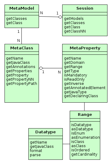
-
Session -
Entry point of the metadata framework. Allows obtaining
MetaClassinstances by name and by the corresponding Java class. Note the difference in methods:getClass()methods can returnnullwhilegetClassNN()(NonNull) methods cannot.Sessionobject can be obtained usingMetadatainfrastructure interface.Example:
@Inject protected Metadata metadata; ... Session session = metadata.getSession(); MetaClass metaClass1 = session.getClassNN("sec$User"); MetaClass metaClass2 = session.getClassNN(User.class); assert metaClass1 == metaClass2; -
MetaModel -
Rarely used interface intended to group meta-classes.
Meta-classes are grouped by the root name of Java project package specified in metadata.xml file.
-
MetaClass -
Entity class metadata interface.
MetaClassis always associated with Java class which it represents.Basic methods:
-
getName()– entity name, according to convention the first part of the name before$sign is namespace code, for example,sales$Customer. -
getProperties()– the list of meta-properties (MetaProperty). -
getProperty(),getPropertyNN()– methods return meta-properties by name. In case when there is no attribute with provided name, the first method returnsnull, and the second throws an exception.Example:
MetaClass userClass = session.getClassNN(User.class); MetaProperty groupProperty = userClass.getPropertyNN("group"); -
getPropertyPath()– allows you to navigate by references. This method accepts string parameter – path in the format of dot-separated attribute names. The returnedMetaPropertyPathobject allows accessing the required (the last in the path) attribute by invokinggetMetaProperty()method.Example:
MetaClass userClass = session.getClassNN(User.class); MetaProperty groupNameProp = userClass.getPropertyPath("group.name").getMetaProperty(); assert groupNameProp.getDomain().getName().equals("sec$Group"); -
getJavaClass()– entity class, corresponding to thisMetaClass. -
getAnnotations()– collection of meta-annotations.
-
-
MetaProperty -
Entity attribute metadata interface.
Basic methods:
-
getName()– property name, corresponds to entity attribute name. -
getDomain()– meta-class, owning this property. -
getType()- the property type:-
simple type:
DATATYPE -
enumeration:
ENUM -
reference type of two kinds:
-
ASSOCIATION− simple reference to another entity. For example, Order-Customer relationship is an association. -
COMPOSITION− reference to the entity, having no consistent value without the owning entity.COMPOSITIONis considered to be a “closer” relationship thanASSOCIATION. For example, the relationship between Order and its Items is aCOMPOSITION, as the Item cannot exist without the Order to which it belongs.
The type of
ASSOCIATIONorCOMPOSITIONreference attributes affects entity edit mode: in the first case the related entity is persisted to the database independently, in the second case – only together with the owning entity. See Section 5.8.3, “Editing Composite Entities” for details. -
-
-
getRange()–Rangeinterface providing detailed description of the attribute type. -
isMandatory()– indicates a mandatory attribute. For instance, it is used by visual components to signal a user that value is mandatory. -
isReadOnly()– indicates a read-only attribute. -
getInverse()– for reference-type attribute, returns the meta-property from the other side of the association, if such exists. -
getAnnotatedElement()– field (java.lang.reflect.Field) or method (java.lang.reflect.Method), corresponding to the entity attribute. -
getJavaType()– Java class of the entity attribute. It can either be the type of corresponding field or the type of the value returned by corresponding method. -
getDeclaringClass()– Java class containing this attribute.
-
-
Range -
Interface describing entity attribute type in detail.
Basic methods:
-
isDatatype()– returnstruefor simple type attribute. -
asDatatype()– returns Datatype for simple type attribute. -
isEnum()– returnstruefor enumeration type attribute. -
asEnumeration()– returns Enumeration for enumeration type attribute. -
isClass()– returnstruefor reference attribute ofASSOCIATIONorCOMPOSITIONtype. -
asClass()– returns metaclass of associated entity for a reference attribute. -
isOrdered()– returnstrueif the attribute is represented by an ordered collection (for exampleList). -
getCardinality()– relation kind of the reference attribute:ONE_TO_ONE,MANY_TO_ONE,ONE_TO_MANY,MANY_TO_MANY.
-
The main source for metadata structure generation are annotated entity classes.
Entity class will be present in the metadata in the following cases:
-
Persistent entity class is annotated by
@Entity,@Embeddable,@MappedSuperclassand is located within the root package specified in metadata.xml. -
Non-persistent entity class is annotated by
@MetaClassand is located within the root package specified inmetadata.xml.
All entities inside same root package are put into the same MetaModel instance, which is given the name of this package. Entities within the same MetaModel can contain arbitrary references to each other. References between entities from different meta-models can be created in the order of declaration of metadata.xml files in cuba.metadataConfig property.
Entity attribute will be present in metadata if:
-
A class field is annotated by
@Column,@OneToOne,@OneToMany,@ManyToOne,@ManyToMany,@Embedded. -
A class field or an access method (getter) is annotated by
@MetaProperty.
Metaclass and metaproperty parameters are determined on the base of the listed annotations parameters as well as field types and class methods. Besides, if an attribute does not have write access method (setter), it becomes immutable (read only).
Datatype interface describes a valid data type for the entity attribute if it is not a reference. Each Datatype implementation corresponds to a single Java class.
All of the instances are registered in repository – Datatypes class, which performs loading and initializing of Datatype implementation classes in the following way:
-
datatypes.xml file is searched in
CLASSPATHroot, and if it is found,Datatypesrepository is initialized from it. -
otherwise
Datatypesrepository is initialized from/com/haulmont/chile/core/datatypes/datatypes.xmlfile.
Datatype instance can be obtained in two ways:
-
For an entity attribute – from the corresponding meta-property DATATYPE using
getRange().asDatatype()call. -
Using
Datatypes.get()static method by passing to it the name of theDatatypeimplementation or Java class it was created for.
Datatypes are associated with entity attributes during application start according to the following rules:
-
If
@MetaPropertyannotation is defined on the field or method having a non-emptydatatypevalue, the attribute is associated with theDatatypeinstance with the given name.For instance, if the entity attribute is declared as in the example below, it will be associated with a nonstandard type –
GeoCoordinateDatatype:@MetaProperty(datatype = GeoCoordinateDatatype.NAME) @Column(name = "LATITUDE") private Double latitude;
-
In most cases, explicit specification is omitted, and the attribute is associated with the
Datatypeinstance from repository, which is returned byDatatypes.get(Class)by supplied field or method type.In example below,
latitudeattribute will get a standardDoubleDatatypetype registered in the/com/haulmont/chile/core/datatypes/datatypes.xmlbase file:@Column(name = "LATITUDE") private Double latitude;
Basic methods of Datatype interfaces:
-
getName()– returns the unique name of the implementation. -
format()– converts the passed value into a string. -
parse()– transforms a string into the value of corresponding type.
Datatype determines two sets of methods for formatting and parsing: considering and not considering locale. Conversion considering locale is applied everywhere in user interface, ignoring locale – in system mechanisms, for example, serialization in REST API.
Parsing formats ignoring locale are specified in the above mentioned datatypes.xml file.
The parsing formats considering locale are provided in the main localized messages pack, in the strings containing the following keys:
-
numberDecimalSeparator– specifies decimal separator for numeric types. -
numberGroupingSeparator– defines separator between digits groups for numeric types (e.g. when space is used as separator, number will be formatted as 1 000 000). -
integerFormat– format forIntegerandLongtypes. -
doubleFormat– format forDoubletype. -
decimalFormat– format forBigDecimaltype. -
dateTimeFormat– format forjava.util.Datetype. -
dateFormat– format forjava.sql.Datetype. -
timeFormat– format forjava.sql.Timetype. -
trueString– string corresponding toBoolean.TRUE. -
falseString– string corresponding toBoolean.FALSE.
All the listed formats are specified in the main localized message pack of CUBA base projects by default, and can be overridden in the similar files of the application project.
Let us consider the way Order.date attribute is displayed in orders browser table.
order-browse.xml
<table id="ordersTable">
...
<columns>
<column id="date"/>
...
date attribute in Order class is defined using "date" type:
@Column(name = "DATE", nullable = false) @Temporal(TemporalType.DATE) private Date date;
If the current user is logged in with the Russian locale, the following string is retrieved from the main message pack on the client tier:
dateFormat=dd.MM.yyyy
The result: date "6th August 2012 " is converted into a string "06.08.2012" which is displayed in the table cell.
-
Date formatting example
@Inject protected UserSessionSource userSessionSource; ... Date date = ...; String dateStr = Datatypes.get(Date.class).format(date, userSessionSource.getLocale());
-
Example of formatting of numeric values with high accuracy (5 decimal numbers after comma) in Web Client:
/com/sample/sales/web/messages_ru.propertiescoordinateFormat = #,##0.00000
SomeClass.java@Inject protected Messages messages; @Inject protected UserSessionSource userSessionSource; ... String coordinateFormat = messages.getMainMessage("coordinateFormat"); FormatStrings formatStrings = Datatypes.getFormatStrings(userSessionSource.getLocale()); NumberFormat format = new DecimalFormat(coordinateFormat, formatStrings.getFormatSymbols()); String formattedValue = format.format(value);
Let us consider the implementation of a custom GeoCoordinateDatatype, intended for the attributes storing geographical coordinates.
First, we need to create a class in the global module:
public class GeoCoordinateDatatype extends DoubleDatatype {
public static final String NAME = "geocoordinate";
// the format is the same for all locales but may differ in decimal points
public static final String FORMAT = "#0.000000";
public GeoCoordinateDatatype(Element element) {
super(element);
}
@Override
public String getName() {
return NAME;
}
@Override
public String format(Double value, Locale locale) {
if (value == null)
return "";
FormatStrings formatStrings = Datatypes.getFormatStrings(locale);
if (formatStrings == null)
return format(value); // FormatStrings are not defined for locales, so formatting is made according to datatypes.xml file
NumberFormat format = new DecimalFormat(FORMAT, formatStrings.getFormatSymbols());
return format.format(value);
}
@Override
public Double parse(String value, Locale locale) throws ParseException {
if (StringUtils.isBlank(value))
return null;
FormatStrings formatStrings = Datatypes.getFormatStrings(locale);
if (formatStrings == null)
return parse(value); // FormatStrings are not defined for locales, so parsing is made according to datatypes.xml file
NumberFormat format = new DecimalFormat(FORMAT, formatStrings.getFormatSymbols());
return parse(value, format).doubleValue();
}
}
Next, we create datatypes.xml file in the root of the global module src directory in the application project and copy contents from /com/haulmont/chile/core/datatypes/datatypes.xml file located in global module of cuba base project. Then add registration of the new type to it:
<datatypes>
<datatype class="com.sample.sales.entity.GeoCoordinateDatatype"
format="#0.000000" decimalSeparator="." groupingSeparator=""/>
...
Finally we specify new datatype for the required attributes:
@MetaProperty(datatype = GeoCoordinateDatatype.NAME)
@Column(name = "LATITUDE")
private Double latitude;
After the above listed operations are completed, latitude attribute will be displayed in the desired format throughout the application.
Entity meta-annotations are a set of key/value pairs providing additional information about entities.
Meta-annotations are accessed using meta-class getAnnotations() method.
The sources of meta-annotations are:
-
@OnDelete,@OnDeleteInverse,@Extendsannotations. These annotations cause creation of special meta-annotations for describing relations between entities. -
@NamePattern,@SystemLevel,@EnableRestore,@TrackEditScreenHistoryannotations. These annotations cause generation of meta-annotations with keys corresponding to the full name of Java class of the annotation. -
Optional: custom annotations can be defined in a project, and reflected to corresponding meta-annotations in the overridden
MetadataImpl.initMetaAnnotations()method. -
Optional: entity meta-annotations can also be defined in metadata.xml files. If a meta-annotation in XML has the same name as the meta-annotation created by Java entity class annotation, then it will override the latter.
The example below shows meta-annotations definition in
metadata.xml:<annotations> <entity class="com.haulmont.cuba.security.entity.User"> <annotation name="com.haulmont.cuba.core.entity.annotation.TrackEditScreenHistory" value="false"/> <annotation name="com.haulmont.cuba.core.entity.annotation.EnableRestore" value="true"/> </entity> </annotations>
When retrieving the entities from the database, we often face a question: how to ensure loading of the related entities to desired depth?
For example, you need to display the date and order amount together with the Buyer name in Orders browser, which means that you need to fetch the related Buyer instance. And for Order editor screen, you need to fetch the collection of Items, in addition to that each Item should contain a related Product instance to display its name.
Lazy loading can not help in most cases because data processing is usually performed not in the transaction where the entities were loaded but, for example, on client tier in UI. At the same time it is unacceptable to apply eager fetching by entity annotations as it leads to permanent retrieval of the entire graph of related entities which can be very large.
Another similar problem is the requirement to limit the set of local entity attributes of the loaded graph: for example, some entity can have 50 attributes, including BLOB, but only 10 attributes need to be displayed on the screen. In this case, why should we download 40 remaining attributes from the database, then serialize them and transfer to the client when it does not need them at the moment?
Views mechanism resolves these issues by providing retrieval from database and transmitting to the client entity graphs, limited by depth and by attributes. A view is the descriptor of object graph required on a certain UI screen or data-processing operation.
Views processing is performed in the following way:
-
All relations in the data model are declared with lazy fetching property (
fetch = FetchType.LAZY. See Section 4.2.1.2, “Entity Annotations”). -
In the process of data loading using DataManager the client code provides required view together with JPQL query.
-
The so-called Fetch Plan is produced on the base of the view – this is a special feature of Apache OpenJPA framework lying in the base of ORM layer. Fetch Plan affects the generation of SQL queries to the database: both the list of returned fields and joins with the other tables containing related entities.
-
References, excluded from the Fetch Plan (sometimes this helps to simplify the basic SQL query), are loaded by separate SQL queries. To maintain this process the view-processing mechanism just invokes corresponding attribute reading methods (getters).
-
As a result, when the data loading transaction is finished, the Middleware will contain the object graph, determined by JPQL query and the provided view.
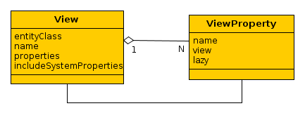
The view is determined by View class instance, where:
-
entityClass– the entity class, for which the view is defined. In other words, it is the “root” of the loaded entities tree. -
name– the name of the view. It should be eithernull, or a unique name within all views for the entity. -
properties– collection ofViewPropertyinstances, corresponding to the entity attributes which should be loaded. -
includeSystemProperties– if set, system attributes (included into basic interfaces ofBaseEntityandUpdatablepersistent entities) are automatically included in the view. The system attributes are not explicitly listed inpropertiesbut they are included by view processing mechanism depending on the interfaces which are implemented by this entity.
ViewProperty class has the following properties:
-
name– the name of the entity attribute. -
view– for reference attributes, specifies the view which which will be used to load the related entity. -
lazy– for reference attributes, indicates that this attribute should not be included into Fetch Plan, but loaded as a separate SQL query, initiated by accessing the attribute. It is important to mention that, if requesting data through DataManager or datasource query, the attribute is loaded anyway, this property affects only the method of fetching. But if the view with lazy attributes is used on the ORM layer, after loading instances they should be passed to EntityManager.fetch() method, otherwise the lazy attributes will not be fetched.
Regardless of the attributes defined in the view, the following attributes are always loaded:
-
id– entity identifier. -
version– used for optimistic locking of the entities implementingVersioned. -
deleteTs,deletedBy– used for the entities, implementing SoftDelete.
Attributes, which were not loaded, have null value. By default an attempt to set the value for a not loaded attribute (setter call) for detached entity raises an exception. This behavior can be modified using the application property cuba.allowSetNotLoadedAttributes. If this property is set to true, then setter call will not cause exception, nevertheless the value will not be saved.
Bear in mind that not loaded reference attributes of detached entity, corresponding to external keys (i.е. ManyToOne, OneToOne) can be set to a new non-zero value in any case and the changes will be saved during the subsequent EntityManager.merge().
A view can be created in two possible ways:
-
Programmatically – by creating
Viewinstance, for example:View view = new View(Order.class) .addProperty("date") .addProperty("amount") .addProperty("customer", new View(Customer.class) .addProperty("name") );Typically, this way can be appropriate for creating views that are used in a single piece of business-logic.
-
Declaratively – by creating an XML descriptor and deploying it to
ViewRepository.Viewinstances are created and cached when XML-based descriptor is deployed. Further on the required view can be retrieved in any part of the application code by repository call providing the entity class and view name.
Let us consider in details the declarative way for creation and working with views.
ViewRepository is a Spring bean, accessible to all application blocks. The link to ViewRepository can be obtained using Metadata infrastructure interface. getView() methods are used to retrieve View instance from the repository. deployViews() methods from AbstractViewRepository basic implementation are used to deploy XML view descriptors to the repository.
Two views named _local and _minimal are available in the repository for each entity by default:
-
_localcontains all local entity attributes. -
_minimalcontains the attributes which are included to the name of the entity instance and which are specified by @NamePattern annotation. If@NamePatternannotation is not specified in the entity, this view does not contain any attributes.
The detailed structure of XML descriptors is provided in Section A.11, “views.xml”.
The example below shows view descriptor for Order entity which provides loading of all local attributes, associated Customer and ordered Items collection:
<view class="com.sample.sales.entity.Order"
      name="orderWithCustomer"
      extends="_local">
    <property name="customer" view="_minimal"/>
    <property name="items" view="itemsInOrder"/>
</view>
The recommended way of grouping and deployment of view descriptors is as follows:
-
Create
views.xmlfile in the global module insrcroot and place all view descriptors which should be globally accessible (i.e. on all application tiers into it. -
Register this file in cuba.viewsConfig application property of all used blocks, i.e. in
app.propertiesof the core module,web-app.propertiesof the web module, etc. This will ensure automatic deployment of the views upon application startup in the repository (SeeAbstractViewRepository.init()method). -
If there are views which are used only in one application block, they can be specified in the similar file in this block, for example,
web-views.xml, and registered in cuba.viewsConfig property of this block only.If the repository contains a view with certain name for some entity, an attempt to deploy another view with this name for the same entity will be ignored. If you need to replace the existing view in the repository with a new one and guarantee its deployment, specify
overwrite = "true"attribute for it.
It is recommended to give “descriptive” names to the views. For example, not just “browse”, but “customerBrowse”. It simplifies the search of views in XML descriptors.
Managed Beans are program components intended for implementation of the application’s business logic. “Managed” in this case means that the instance creation and dependency management is handled by the container, which is the main part of the Spring framework.
Managed Bean is a singleton, i.e., only one instance of such class exists in each application block. Therefore, if a bean contains mutable data in fields (in other words, has a state), it is necessary to synchronize access to such data.
To create a managed bean, add the @javax.annotation.ManagedBean annotation to the Java class. For example:
package com.sample.sales.core;

import com.sample.sales.entity.Order;
import javax.annotation.ManagedBean;

@ManagedBean(OrderWorker.NAME)
public class OrderWorker {
    public static final String NAME = "sales_OrderWorker";

    public void calculateTotals(Order order) {
    }
}
It is recommended to assign a unique name to the bean in form of {project_name}_{class_name} and to define it in the NAME constant.
The managed bean class should be placed inside the package tree with the root specified in the context:component-scan element of the spring.xml file. In this case, the spring.xml file contains the element:
<context:component-scan base-package="com.sample.sales"/>
which means that the search for annotated beans for this application block will be performed starting with the com.sample.sales package.
To provide an ability to substitute the implementation in the future, it is recommended to give the bean a separate interface:
// OrderWorker.java – interface
package com.sample.sales.core;

import com.sample.sales.entity.Order;

public interface OrderWorker {
    String NAME = "sales_OrderWorker";

    void calculateTotals(Order order);
}
// OrderWorkerBean.java – implementation
package com.sample.sales.core;

import com.sample.sales.entity.Order;
import javax.annotation.ManagedBean;

@ManagedBean(OrderWorker.NAME)
public class OrderWorkerBean implements OrderWorker {
    @Override
    public void calculateTotals(Order order) {
    }
}
Managed beans can be created on any tier, because the Spring Framework container is used in all standard blocks of the application.
A reference to the bean can be obtained through injection or through the AppBeans class. As an example of using the bean, let us look at the implementation of the OrderService bean that delegates the execution to the OrderWorker bean:
package com.sample.sales.core;

import com.haulmont.cuba.core.Persistence;
import com.sample.sales.entity.Order;
import org.springframework.stereotype.Service;
import org.springframework.transaction.annotation.Transactional;
import javax.inject.Inject;

@Service(OrderService.NAME)
public class OrderServiceBean implements OrderService {

    @Inject
    protected Persistence persistence;

    @Inject
    protected OrderWorker orderWorker;

    @Transactional
    @Override
    public BigDecimal calculateTotals(Order order) {
        Order entity = persistence.getEntityManager().merge(order);
        orderWorker.calculateTotals(entity);
    }
}
In this example, the service starts a transaction, places the entity instance obtained from the client level into the persistent context, and passes the control to the OrderWorker bean, which contains the main business logic.
Sometimes, it is necessary to give system administrator an ability to view and change the state of some managed bean at runtime. In such case, it is recommended to create a JMX bean – a program component having the JMX interface. JMX bean is usually a wrapper delegating calls to the managed bean which actually maintains state: cache, configuration data or statistics.
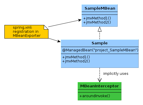
As can be seen from the diagram, the JMX bean consists of the interface and implementation class. The class should be a managed bean, i.e., should have the @ManagedBean annotation and unique name. The interface of the JMX bean is registered in spring.xml in a special way to create the JMX interface in the current JVM.
Calls to all JMX bean interface methods are intercepted using Spring AOP by the MBeanInterceptor interceptor class, which sets the correct ClassLoader in the current thread, and enables logging of unhandled exceptions.
The JMX bean interface name must conform to the following format: {class_name}MBean.
The following example shows how to create a JMX bean.
-
JMX bean interface:
package com.sample.sales.core;

import org.springframework.jmx.export.annotation.*;

@ManagedResource(description = "Performs operations on Orders")
public interface OrdersMBean {

    @ManagedOperation(description = "Recalculates an order amount")
    @ManagedOperationParameters({@ManagedOperationParameter(name = "orderId", description = "")})
    String calculateTotals(String orderId);
}
The interface and its methods may contain annotations to specify the description of the JMX bean and its operations. This description will be displayed in all tools that work with this JMX interface, thereby helping the system administrator.
Since the JMX tools support a limited set of data types, it is desirable to use
Stringas the type for the parameters and result of the method and perform the conversion inside the method, if necessary. -
The JMX bean class:
package com.sample.sales.core;

import com.haulmont.cuba.core.*;
import com.haulmont.cuba.core.app.*;
import com.sample.sales.entity.Order;
import org.apache.commons.lang.exception.ExceptionUtils;
import javax.annotation.ManagedBean;
import javax.inject.Inject;
import java.util.UUID;

@ManagedBean("sales_OrdersMBean")
public class Orders implements OrdersMBean {

    @Inject
    protected OrderWorker orderWorker;

    @Inject
    protected Persistence persistence;

    @Authenticated
    @Override
    public String calculateTotals(final String orderId) {
        try {
            persistence.createTransaction().execute(new Transaction.Runnable() {
                @Override
                public void run(EntityManager em) {
                    Order entity = em.find(Order.class, UUID.fromString(orderId));
                    orderWorker.calculateTotals(entity);
                }
            });
            return "Done";
        } catch (Throwable e) {
            return ExceptionUtils.getStackTrace(e);
        }
    }
}
The
@ManagedBeanannotation defines class as a managed bean with thesales_OrdersMBeanname. The name is specified directly in the annotation and not in the constant, since access to the JMX bean from Java code is not required.Lets overview the implementation of the
calculateTotals()method.-
The method has the
@Authenticatedannotation, i.e., system authentication is performed on method entry in the absence of the user session. -
The method’s body is wrapped in the
try/catchblock, so that, if successful, the method returns "Done", and in case of error – the stack trace of the exception as string.It should be kept in mind that, in this case, all exceptions are handled and therefore do not get logged automatically, because they never fall through to
MBeanInterceptor. If logging of exceptions is required, the call of the logger should be added in thecatchsection. -
The method starts the transaction, loads the
Orderentity instance by identifier, and passes control to theOrderWorkerbean for processing.
-
-
The registration of the JMX bean in
spring.xml:<bean id="sales_MBeanExporter" lazy-init="false" class="com.haulmont.cuba.core.sys.jmx.MBeanExporter"> <property name="beans"> <map> <entry key="${cuba.webContextName}.sales:type=Orders" value-ref="sales_OrdersMBean"/> </map> </property> </bean>
All JMX beans of a project are declared in one MBeanExporter instance in the map/entry elements of the beans property. The key is JMX ObjectName, the value – the bean’s name specified in the @ManagedBean annotation. ObjectName begins with the name of the web application, because several web applications, which export the same JMX interfaces, can be deployed in one Tomcat instance (i.e., in one JVM).
This section describes some of the JMX beans available in the platform.
CachingFacadeMBean provides methods to clear various caches in the Middleware and Web Client blocks.
JMX ObjectName: app-core.cuba:type=CachingFacade and app.cuba:type=CachingFacade
ConfigStorageMBean allows viewing and setting values of the application properties in the Middleware, Web Client and Web Portal blocks.
This interface has separate sets of methods for working with parameters of configuration and deployment (*AppProperties) and with runtime parameters (*DbProperties). This is due to the difference in mechanisms of storing these categories of properties.
The following usage restrictions of ConfigStorageMBean interface apply:
-
Only the properties explicitly set in the storage location are displayed. When accessed through the configuration interface, the default value is returned, if the property value is not set. However, the default value cannot be obtained through
ConfigStorageMBean. -
The changes to property values stored in files are not persistent, and are valid only until a restart of this block.
JMX ObjectName: app-core.cuba:type=ConfigStorage, app.cuba:type=ConfigStorage, app-portal.cuba:type=ConfigStorage
EmailerMBean allows viewing the current values of the email sending parameters, and to send a test message.
JMX ObjectName: app-core.cuba:type=Emailer
PersistenceManagerMBean provides the following abilities:
-
Managing entity statistics mechanism.
-
Viewing new DB update scripts using the
findUpdateDatabaseScripts()method. Triggering DB update with theupdateDatabase()method. -
Executing arbitrary JPQL queries in the Middleware context by using
jpqlLoadList(),jpqlExecuteUpdate()methods.
JMX ObjectName: app-core.cuba:type=PersistenceManager
ScriptingManagerMBean is the JMX facade for the Scripting infrastructure interface.
JMX ObjectName: app-core.cuba:type=ScriptingManager
JMX attributes:
-
RootPath– absolute path to the configuration directory of the Middleware block, in which this bean was started.
JMX operations:
-
runGroovyScript()– executes a Groovy script in the Middleware context and returns the result. The following variables should be passed to the script:-
persistenceof the Persistence type. -
metadataof the Metadata type. -
configurationof the Configuration type.
The result type should be of the String type, for it to be displayed in the JMX interface. Otherwise, the method is similar to the Scripting.runGroovyScript() method.
The example script for creating a set of test users is shown below:
import com.haulmont.cuba.core.* import com.haulmont.cuba.core.global.* import com.haulmont.cuba.security.entity.* PasswordEncryption passwordEncryption = AppBeans.get(PasswordEncryption.class) Transaction tx = persistence.createTransaction() try { EntityManager em = persistence.getEntityManager() Group group = em.getReference(Group.class, UUID.fromString('0fa2b1a5-1d68-4d69-9fbd-dff348347f93')) for (i in (1..250)) { User user = new User() user.setGroup(group) user.setLogin("user_${i.toString().padLeft(3, '0')}") user.setName(user.login) user.setPassword(passwordEncryption.getPasswordHash(user.id, '1')); em.persist(user) } tx.commit() } finally { tx.end() } -
ServerInfoMBean provides the general information about this Middleware block: the build number, build date and the server id.
JMX ObjectName: app-core.cuba:type=ServerInfo
Infrastructure interfaces provide access to frequently used functionality of the platform. Most of them are located in global module and can be used both on the Middle tier and in Client tier blocks. However, some of them (Persistence, for example) are accessible only for Middleware code.
Infrastructure interfaces are implemented by Spring Framework beans, so they can be injected into any other managed components (managed beans, Middleware services, generic user interface screen controllers).
Also, like any other beans, infrastructure interfaces can be obtained using static methods of AppBeans class, and can be used in non-managed components (POJO, helper classes etc.).
The interface helps to obtain references to configuration interfaces.
Examples:
// field injection

@Inject
protected Configuration configuration;
...
String tempDir = configuration.getConfig(GlobalConfig.class).getTempDir();
// setter injection

protected GlobalConfig globalConfig;

@Inject
public void setConfiguration(Configuration configuration) {
    this.globalConfig = configuration.getConfig(GlobalConfig.class);
}
// location

String tempDir = AppBeans.get(Configuration.class).getConfig(GlobalConfig.class).getTempDir();
Messages interface provides methods to get localized message strings.
Let us consider interface methods in detail.
-
getMessage()– returns the localized message by key, pack name and required locale. There are several modifications of this method with different sets of parameters. If locale is not specified in the method parameter, the current user locale is used.Examples:
@Inject protected Messages messages; ... String message1 = messages.getMessage(getClass(), "someMessage"); String message2 = messages.getMessage("com.abc.sales.web.customer", "someMessage"); String message3 = messages.getMessage(RoleType.STANDARD); -
formatMessage()– retrieves a localized message by key, pack name and required locale, then uses it to format the input parameters. The format is defined according toString.format()method rules. There are several modifications of this method with different sets of parameters. If locale is not specified in the method parameter, the current user locale is used.Example:
String formattedValue = messages.formatMessage(getClass(), "someFormat", someValue);
-
getMainMessage()– returns the localized message from the main message pack of the application block.Example:
protected Messages messages = AppBeans.get(Messages.class); ... messages.getMainMessage("actions.Ok"); -
getMainMessagePack()– returns the name of the main message pack of the application block.Example:
String formattedValue = messages.formatMessage(messages.getMainMessagePack(), "someFormat", someValue);
-
getTools()– returnsMessageToolsinterface instance (see below).
MessageTools interface is a managed bean containing additional methods for working with localized messages. You can access MessageTools interface either using Messages.getTools() method, or as any other bean – by means of injection or through AppBeans class.
MessageTools methods:
-
loadString()– returns a localized message, specified by reference inmsg://{messagePack}/{key}formatReference components:
-
msg://– mandatory prefix. -
{messagePack}– optional name of the message pack. If it is not specified, it is assumed that the pack name is passed toloadString()as a separate parameter. -
{key}– message key in the pack.
Examples of the message references:
msg://someMessage
msg://com.abc.sales.web.customer/someMessage
-
-
getEntityCaption()– returns the localized entity name. -
getPropertyCaption()– returns the localized name of an entity attribute. -
hasPropertyCaption()– checks whether the entity attribute was given a localized name. -
getLocValue()– returns the localized value of the entity attribute based on @LocalizedValue annotation. -
getMessageRef()– forms a message reference for meta-property which can be used to retrieve the localized name of the entity attribute. -
getDefaultLocale()– returns default application locale, which is the first one listed in cuba.availableLocales application property. -
useLocaleLanguageOnly()– returnstrue, if for all locales supported by the application (defined incuba.availableLocalesproperty) only the language parameter is specified, without country and variant. This method is used by platform mechanisms which need to find the most appropriate supported locale when locale info is received from the external sources such as operation system or HTTP request. -
trimLocale()– deletes from the passed locale everything except language, ifuseLocaleLanguageOnly()method returnstrue.
You can override MessageTools to extend the set of its methods in a particular application. Below are the examples of working with the extended interface:
MyMessageTools tools = messages.getTools();
tools.foo();
((MyMessageTools) messages.getTools()).foo();
Metadata interface provides access to metadata session and view repository.
Interface methods:
-
getSession()– returns the metadata session instance. -
getViewRepository()– returns the view repository instance. -
getExtendedEntities()– returnsExtendedEntitiesinstance, intended for working with the extended entities. See more in Section 4.8.1, “Extending an Entity”. -
create()– creates an entity instance, taking into account potential extension. See more in Section 4.8.1, “Extending an Entity”. -
getTools()– returnsMetadataToolsinterface instance (see below).
MetadataTools is a managed bean, containing additional methods for working with metadata. You can access MetadataTools interface by either using Metadata.getTools() method, or as any other bean – by means of injection or through AppBeans class.
MetadataTools methods:
-
getAllPersistentMetaClasses()– returns the collection of persistent entities meta-classes. -
getAllEmbeddableMetaClasses()– returns the collection of embeddable entities meta-classes. -
getAllEnums()– returns the collection of enumeration classes used as entity attributes types. -
format()– formats the passed value according to data type of the given meta-property. -
isSystem()– checks if a meta-property is system, i.e. specified in one of the basic entity interfaces. -
isPersistent()– checks if a meta-property is persistent, i.e. stored in the database. -
isTransient()– checks if a meta-property or an arbitrary attribute is non-persistent. -
isEmbedded()– checks if a meta-property is an embedded object. -
isAnnotationPresent()– checks if an annotation is present on the class or on one of its ancestors. -
getNamePatternProperties()– returns collection of meta-properties of attributes included in the instance name, returned byInstance.getInstanceName()method. See @NamePattern.
You can override MetadataTools bean in your application to extend the set of its methods. The examples of working with the extended interface:
MyMetadataTools tools = metadata.getTools();
tools.foo();
((MyMetadataTools) metadata.getTools()).foo();
Resources interface maintains resources loading according to the following rules:
-
If the provided location is a URL, the resource is downloaded from this URL;
-
If the provided location begins with
classpath:prefix, the resource is downloaded from classpath; -
If the location is not a URL and it does not begin with
classpath:, then:-
The file is searched in the configuration folder of application using the provided location as relative pathname. If the file is found, the resource is downloaded from it;
-
If the resource is not found at the previous steps, it is downloaded from classpath.
-
In practice, explicit identification of URL or classpath: prefix is rarely used, so resources are usually downloaded either from the configuration folder or from classpath. The resource in the configuration folder overrides the classpath resource with the same name.
Resources methods:
-
getResourceAsStream()– returnsInputStreamfor the provided resource, ornull, if the resource is not found. The stream should be closed after it had been used, for example:@Inject protected Resources resources; ... InputStream stream = null; try { stream = resources.getResourceAsStream(resourceLocation); ... } finally { IOUtils.closeQuietly(stream); }You can also use "try with resources":
try (InputStream stream = resources.getResourceAsStream(resourceLocation)) { ... } -
getResourceAsString()– returns the indicated resource content as string, ornull, if the resource is not found.
Scripting interface is used to compile and load Java and Groovy classes dynamically (i.e. at runtime) as well as to execute Groovy scripts and expressions.
Scripting methods:
-
evaluateGroovy()– executes the Groovy expression and returns its result.cuba.groovyEvaluatorImport application property is used to define the common set of the imported classes inserted into each executed expression. By default, all standard application blocks import PersistenceHelper class.
The compiled expressions are cached, and this considerably speeds up repeated execution.
Example:
@Inject protected Scripting scripting; ... Integer intResult = scripting.evaluateGroovy("2 + 2", new Binding()); Binding binding = new Binding(); binding.setVariable("instance", new User()); Boolean boolResult = scripting.evaluateGroovy("return PersistenceHelper.isNew(instance)", binding); -
runGroovyScript()– executes Groovy script and returns its result.The script should be located either in application configuration folder or in classpath (the current
Scriptingimplementation supports classpath resources within JAR files only). A script in the configuration folder overrides the script in classpath with the same name.The path to the script is constructed using separators
/. The separator is not required in the beginning of the path.Example:
@Inject protected Scripting scripting; ... Binding binding = new Binding(); binding.setVariable("itemId", itemId); BigDecimal amount = scripting.runGroovyScript("com/abc/sales/CalculatePrice.groovy", binding); -
loadClass()– loads Java or Groovy class using the following steps:-
If the class is already loaded, it will be returned.
-
The Groovy source code (file
*.groovy) is searched in the configuration folder. If it is found, it will be compiled and the class will be returned. -
The Java source code (file
*.java) is searched in the configuration folder. If it is found, it will be compiled and the class will be returned. -
The compiled class is searched in classpath. If it is found, it will be loaded and returned.
-
If nothing is found,
nullwill be returned.
The files in configuration folder containing Java and Groovy source code can be modified at runtime. On the next
loadClass()call the corresponding class will be recompiled and the new one will be returned, with the following restrictions:-
The type of the source code must not be changed from Groovy to Java;
-
If Groovy source code was once compiled, the deletion of the source code file will not lead to loading of another class from classpath. Instead of this, the class compiled from the removed source code will still be returned.
Example:
@Inject protected Scripting scripting; ... Class calculatorClass = scripting.loadClass("com.abc.sales.PriceCalculator"); -
-
getClassLoader()– returnsClassLoader, which is able to work according to the rules forloadClass()method described above.
Cache of the compiled classes can be cleaned at runtime using CachingFacadeMBean JMX bean.
This interface provides authorization – checking user access rights to different objects in the system.
Most of the interface methods delegate to the corresponding methods of current UserSession
object, but before this they search for an original meta-class of the entity, which is important for projects with
extensions. Besides methods duplicating UserSession functionality,
this interface contains isEntityAttrReadPermitted() and isEntityAttrUpdatePermitted()
methods that check attribute path availability with respect to availability of all attributes and entities
included in the path.
The Security interface is recommended to use everywhere instead of direct calling of
UserSession's is...Permitted() methods.
See more in Section 4.2.10, “User Authentication ”.
TimeSource interface provides the current time. Using new Date() and similar methods in the application code is not recommended.
Examples:
@Inject
protected TimeSource timeSource;
...
Date date = timeSource.currentTimestamp();
long startTime = AppBeans.get(TimeSource.class).currentTimeMillis();
The interface is used to obtain current user session object. See more in Section 4.2.10, “User Authentication ”.
The interface is used to obtain UUID values, including those used for entity identifiers. Using UUID.randomUUID() in the application code is not recommended.
To call from a static context, you can use the UuidProvider class, which also has an additional fromString() method that works faster than the standard UUID.fromString() method.
DataManager interface provides CRUD functionality on both middle and client tiers. It is the universal
tool for loading entity graphs from the database and saving changes applied to detached entity instances.
DataManager always starts a new transaction and commits
it on operation completion, thus returning entities in the detached state.
DataManager methods are listed below:
-
load(),loadList()– loads a graph of entities according to the parameters of theLoadContextobject passed to it.LoadContextmust include either a JPQL query or an entity identifier. If both are defined, the query is used, and the identifier is ignored. The rules for queries creation are similar to those described in Section 4.4.4.4, “Executing JPQL Queries” . The difference is that the query inLoadContextmay only use named parameters; positional parameters are not supported.load()andloadList()methods check user permissionEntityOp.READfor the entity being loaded. Additionally, loading entities from DB is subject for access group constraints. It is possible to ignore access constraints by passinguseSecurityConstraints = falsetoLoadContext.Examples of loading entities in the screen controller:
@Inject private DataManager dataManager; private Book loadBookById(UUID bookId) { LoadContext loadContext = new LoadContext(Book.class) .setId(bookId).setView("book.edit"); return dataManager.load(loadContext); } private List<BookPublication> loadBookPublications(UUID bookId) { LoadContext loadContext = new LoadContext(BookPublication.class) .setView("bookPublication.full"); loadContext.setQueryString("select p from library$BookPublication p where p.book.id = :bookId") .setParameter("bookId", bookId); return dataManager.loadList(loadContext); } -
commit()– saves the set of entities passed inCommitContextto the database. Collections of entities for updating and deletion must be specified separately.The method returns the set of entity instances returned by EntityManager.merge(); essentially these are fresh instances just updated in DB. Further work should be performed with these returned instances to prevent data loss or optimistic locking. You can ensure that required attributes are present in the returned entities by setting a view for each saved instance using
CommitContext.getViews()map.This method checks user permissions
EntityOp.UPDATEfor the updated entities andEntityOp.DELETEfor the deleted ones.Examples for saving a collection of entities:
@Inject private DataManager dataManager; private void saveBookInstances(List<BookInstance> toSave, List<BookInstance> toDelete) { CommitContext commitContext = new CommitContext(toSave, toDelete); dataManager.commit(commitContext); } private Set<Entity> saveAndReturnBookInstances(List<BookInstance> toSave, View view) { CommitContext commitContext = new CommitContext(); for (BookInstance bookInstance : toSave) { commitContext.getCommitInstances().add(bookInstance); commitContext.getViews().put(bookInstance, view); } return dataManager.commit(commitContext); } -
reload()- convenience methods to reload a specified instance from the database with the required view. They delegate toload()method. -
remove()- removes a specified instance from the database. Delegates tocommit()method.
While loading data, DataManager may also implement additional functionality described below.
The following may happen when distinct operator is omitted in JPQL queries for screens
containing lists of entities with enabled paging and in scenario where an unpredictable modification of the query can happen
as result of applying a generic filter or access group
constraints mechanisms:
-
If a collection is joined at database level, the dataset will contain duplicate rows.
-
On client level the duplicates disappear in the datasource as they are added to a map (
java.util.Map). -
In case of paged table, a page may show fewer lines than requested, while the total number of lines exceeds requested.
Thus, we recommend including distinct in JPQL queries, which ensures the absence
of duplicates in the dataset returned from the DB. However, certain DB servers
(PostgreSQL in particular) may take unacceptably long time to execute an
SQL query with distinct, if the number of returned records is big (more than 10000).
To solve this, the platform contains a mechanism to operate correctly without distinct
at SQL level. This mechanism is enabled by cuba.inMemoryDistinct
application property. When activated, it does the following:
-
The JPQL query should still include
select distinct. -
DataManagercutsdistinctout of the JPQL query before sending it to ORM. -
After the data page is loaded by
DataManager, it deletes the duplicates and runs additional queries to DB in order to retrieve the necessary number of rows which are then returned to the client.
DataManager can select data from the results of previous requests. This ability is used
by the generic filter for sequential application of filters.
The mechanism works as follows:
-
If a
LoadContextwith defined attributesprevQueriesandqueryKeyis provided, theDataManagerexecutes the previous query and saves identifiers of retrieved entities in SYS_QUERY_RESULT table (corresponding tosys$QueryResultentity), separating the sets of records by user sessions and the query session keyqueryKey. -
The current query is modified to be combined with the results of the previous one, so that the resulting data complies with the conditions of both queries combined by AND.
-
The process may be further repeated. In this case the gradually reduced set of previous results gets deleted from SYS_QUERY_RESULT table and refilled again.
The table SYS_QUERY_RESULT should be periodically cleaned of all unnecessary
query results left by terminated user sessions. This is done by the deleteForInactiveSessions()
method of the QueryResultsManagerAPI bean. In an application with enabled
cuba.allowQueryFromSelected property this method should
be called by scheduled tasks, for example:
<task:scheduled-tasks scheduler="scheduler">
    <task:scheduled ref="cuba_QueryResultsManager" method="deleteForInactiveSessions" fixed-rate="600000"/>
</task:scheduled-tasks>
AppContext is a system class, which stores references to certain common components for each application block in its static fields:
-
ApplicationContextof Spring framework. -
Set of application properties loaded from
app.propertiesfiles. -
ThreadLocalvariable, storing SecurityContext instances. -
Collection of application lifecycle listeners (
AppContext.Listener).
When the application is started, AppContext is initialized using loader classes, specific for each application block:
-
Middleware loader –
AppContextLoader -
Web Client loader –
WebAppContextLoader -
Web Portal loader –
PortalAppContextLoader -
Desktop Client loader –
DesktopAppContextLoader
AppContext can be used in the application code for the following tasks:
-
Registering listeners, triggered after full initialization and before termination of the application, for example:
AppContext.addListener(new AppContext.Listener() {
    @Override
    public void applicationStarted() {
        System.out.println("Application is ready");
    }

    @Override
    public void applicationStopped() {
        System.out.println("Application is closing");
    }
});
At the moment of
applicationStarted()call:-
All the beans are fully initialized and their
@PostConstructmethods are executed. -
Static
AppBeans.get()methods can be used for obtaining beans. -
The
AppContext.isStarted()method returnstrue. -
The
AppContext.isReady()method returnsfalse. -
If cuba.automaticDatabaseUpdate application property is enabled, all database update scripts are successfully executed (in the Middleware block).
At the moment of
applicationStopped()call:-
All the beans are operational and can be obtained via
AppBeans.get()methods. -
AppContext.isStarted()method returnsfalse. -
The
AppContext.isReady()method returnsfalse.
A real example of using
AppContext.Listenercan be found in Section 5.8.4, “Running Code at Application Start”. -
-
Getting the application property values, stored in
app.propertiesfiles in case they are not available through configuration interfaces. -
Passing
SecurityContextto new execution threads, see Section 4.2.10, “User Authentication ”.
Use injection or static methods of AppBeans class to obtain references to Spring beans.
It is not recommended to use AppContext.getApplicationContext().getBean().
Application properties present named data of different types, which determine various aspects of application configuration and functions.
Application properties can be classified by the intended purpose as follows:
-
Configuration parameters – specify sets of configuration files and certain user interface parameters, i.e. determine the application functionality.
For example: cuba.springContextConfig, cuba.web.useLightHeader.
-
Deployment parameters – describe different URLs to connect application blocks, DBMS type, security subsystem settings etc.
For example: cuba.connectionUrlList, cuba.dbmsType, cuba.userSessionExpirationTimeoutSec.
-
Runtime parameters – audit settings, email sending parameters etc.
For example: cuba.security.EntityLog.enabled, cuba.email.smtpHost.
Typically, a property belongs to one or several application blocks. For example, cuba.persistenceConfig is only intended for Middleware, cuba.web.useLightHeader belongs to Web Client, while cuba.springContextConfig is used in all blocks.
Belonging to a block means that if you need to set some value to a property, you should do it in all blocks, used in the application, to which this property belongs.
You can find out where a property belongs as per below:
-
From the documentation: See Appendix B, Application Properties.
-
By tracing property usage in the application code.
-
If a property has an access via configuration interface, by project module owning the interface .
Configuration interfaces mechanism is the main way to get access to the application properties from the application code. In addition, all configuration and deployment parameters are available via AppContext class methods.
Some application blocks define JMX interfaces for application properties access. In particular, Middleware, Web Client and Web Portal blocks contain ConfigStorageMBean JMX interface, which allows you to get and set the value of any property at runtime.
The properties, which determine configuration and deployment parameters, are specified in special properties files, named using *-app.properties pattern. Each application block contains a set of such files, including files from platform base projects and the current application file. Properties files set is defined as follows:
-
For web applications blocks (Middleware, Web Client, Web Portal) properties files set should be specified in
web.xmlinappPropertiesConfigparameter. -
For Desktop Client block the standard way to specify properties files set is to override
getDefaultAppPropertiesConfig()method incom.haulmont.cuba.desktop.Appdescendant class.
For example, properties files set of the Middleware block is specified in web/WEB-INF/web.xml file of the core module, and looks as follows:
classpath:cuba-app.properties
classpath:app.properties
file:${catalina.home}/conf/app-core/local.app.properties
The classpath: prefix means that corresponding file can be found in Java classpath, while file: prefix means that it should be accessed using file system path. Java system properties can be used, in this example it is catalina.home – Tomcat root path.
Files declaration order is important as the values, specified in each subsequent file override the values of the same named properties, specified in the preceding files. This allows you to override platform properties in application.
The last file in the above set is local.app.properties. It can be used to override application properties upon deployment. If the file does not exist, it is ignored. However if application installation requires overriding of certain parameters (usually different URLs) you can create such file and place all overridden properties into it. It is easy to retain such file during further system updates.
For Desktop Client JVM command line arguments serve as an equivalent of local.app.properties. Properties loader of this block treats all the arguments containing "=" sign as a key/value pair and uses them to replace corresponding application properties specified in app.properties files.
The rules for data definition in *.properties files:
-
File encoding –
UTF-8. -
The key can contain Latin letters, numbers, periods and underscores.
-
The value is entered after (
=) sign. -
Do not quote values using " or ' brackets.
-
Set file paths either in UNIX (
/opt/haulmont/) or Windows (c:\\haulmont\\) format. -
You can use
\n \t \rcodes. The sign\is a reserved code, use (\\) to insert it in value. See more in: http://docs.oracle.com/javase/tutorial/java/data/characters.html. -
Use
\sign at the end of each line to enter a multi-line value.
Runtime parameters are stored in SYS_CONFIG table.
Such properties have the following distinctive features:
-
As the property value is stored in the database, it is defined in a single location, regardless of the application blocks in which it is used.
-
The value can be changed and saved at runtime both using configuration interface, containing this property, or ConfigStorageMBean.
-
Property value can be overridden for a particular application block in its
app.propertiesfiles. Value search is always done in two stages – inapp.propertiesfirst, then if not found – in the database.
The properties kept in the database are cached on the Middleware. You can clean the cache via ConfigStorageMBean JMX interfaces using clearCache() method or via CachingFacadeMBean using clearConfigStorageCache() method.
It is important to mention, that retrieving DB-stored properties on the client side leads to Middleware requests. This is less efficient than retrieving local properties from app.properties files. To reduce the number of such requests the client caches all the properties, kept in the DB, for the lifetime of configuration interface implementation instance. Thus, if you need to access the properties of a configuration interface from some UI screen for several times, it is better to get the reference to this interface at screen initialization and save it to a screen controller field for further access.
The configuration interfaces mechanism allows working with application properties using Java interface methods, providing the following benefits:
-
Typed access – application code works with actual data types (String, Boolean, Integer etc.) and not only with strings.
-
The application code uses interface methods instead of string property identifiers, so IDE can prompt their names.
Example of transaction timeout value access in Middleware block:
@Inject
private ServerConfig serverConfig;

public void doSomething() {
    int timeout = serverConfig.getDefaultQueryTimeoutSec();
    ...
}
If injection is impossible, the configuration interface reference can be obtained via Configuration infrastructure interface:
int timeout = AppBeans.get(Configuration.class)
        .getConfig(ServerConfig.class)
        .getDefaultQueryTimeoutSec();
Configuration interfaces are not regular Spring beans. They can only be obtained through explicit interface injection or via Configuration.getConfig() but not through AppBeans.get() .
Do the following to create a configuration interface:
-
Create an interface inherited from
com.haulmont.cuba.core.config.Config(not to be confused with the entity classcom.haulmont.cuba.core.entity.Config). -
Add
@Sourceannotation to the interface in order to identify the source (storing method) for parameters:-
SourceType.SYSTEM– the property value will be taken from the system properties of the given JVM, usingSystem.getProperty()method. -
SourceType.APP– the property value will be taken fromapp.propertiesfiles. -
SourceType.DATABASE– the property value will be taken from SYS_CONFIG table.
-
-
Create property access methods (getters / setters). If the property value is not expected to be changed at runtime, setter is not needed. Possible property types are described below.
-
Add
@Propertyannotation defining the property name to getter. -
You can optionally set
@Sourceannotation for a particular property of the interface if its source differs from the interface source.
Example:
@Source(type = SourceType.DATABASE)
public interface SalesConfig extends Config {

    @Property("sales.companyName")
    String getCompanyName();
}
There is no need to create implementation class for the configuration interface as required proxy will be automatically created.
The following property types are supported without any additional efforts:
-
String, primitive types or their object wrappers (boolean,Boolean,int,Integer, etc.) -
enum. The property value is stored in a file or in the database as the value name of the enumeration. -
Persistent entity classes. When accessing a property of the entity type, the instance defined by the property value is loaded from the database.
To support arbitrary types use TypeStringify and TypeFactory classes to convert the value to/from a string and specify these classes for property with @Stringify and @Factory annotations.
Let us consider this process using UUID type as example.
-
Create class
com.haulmont.cuba.core.config.type.UuidTypeFactoryinherited fromcom.haulmont.cuba.core.config.type.TypeFactoryand implement the following method in it:public Object build(String string) { if (string == null) { return null; } return UUID.fromString(string); } -
There is no need to create
TypeStringifyastoString()method is sufficient in this case. -
Annotate the property in the configuration interface:
@Factory(factory = UuidTypeFactory.class)
UUID getUuidProp();
void setUuidProp(UUID value);
The platform provides TypeFactory implementations for the following types:
-
UUID–UuidTypeFactory, as described above. -
java.util.Date–DateFactory. Date value must be specified inyyyy-MM-dd HH:mm:ss.SSSformat, for example:cuba.test.dateProp = 2013-12-12 00:00:00.000
-
List<Integer>(integer numbers list) –IntegerListTypeFactory. The property value must be specified in the form of numbers list, separated by spaces, for example:cuba.test.integerListProp = 1 2 3
-
List<String>(list of strings) –StringListTypeFactory. The property value must be specified as a list of strings separated by "|" sign, for example:cuba.test.stringListProp = aaa|bbb|ccc
You can specify default values for configuration interfaces properties. These values will be returned instead of null if the property is not defined in the storage location – DB or app.properties.
The default value can be specified as a string using @Default annotation, or as a specific type using other annotations from com.haulmont.cuba.core.config.defaults package:
@Property("cuba.email.adminAddress")
@Default("address@company.com")
String getAdminAddress();

@Property("cuba.email.delayCallCount")
@Default("2")
int getDelayCallCount();

@Property("cuba.email.defaultSendingAttemptsCount")
@DefaultInt(10)
int getDefaultSendingAttemptsCount();

@Property("cuba.test.dateProp")
@Default("2013-12-12 00:00:00.000")
@Factory(factory = DateFactory.class)
Date getDateProp();

@Property("cuba.test.integerList")
@Default("1 2 3")
@Factory(factory = IntegerListTypeFactory.class)
List<Integer> getIntegerList();

@Property("cuba.test.stringList")
@Default("aaa|bbb|ccc")
@Factory(factory = StringListTypeFactory.class)
List<String> getStringList();
Default value for entities is a string of {entity_name}-{id}-{optional_view_name} type, for example:
@Default("sec$User-98e5e66c-3ac9-11e2-94c1-3860770d7eaf-browse")
User getAdminUser();

@Default("sec$Role-a294aef0-3ac9-11e2-9433-3860770d7eaf")
Role getAdminRole();
Applications based on CUBA platform support messages localization, which means that all user interface elements can be displayed in the language, selected by user.
Language selection options are determined by the combination of cuba.localeSelectVisible and cuba.availableLocales application properties.
This section describes the localization mechanism and rules of localized messages creation. For information about obtaining messages see Section 5.8.1, “Getting Localized Messages”.
A message pack is a set of properties files with the names in format of messages{_XX}.properties located in a single Java package. XX suffix indicates the language of the messages in this file and corresponds to the language code in Locale.getLanguage(). It is also possible to use other Locale attributes, for example, country. In this case the pack file will look like messages{_XX_YY}.properties. One of the files in the pack can have no language suffix – it is the default file. The name of the message pack corresponds to the name of the Java package, which contains the pack files.
Let us consider the following example:
/com/abc/sales/gui/customer/messages.properties
/com/abc/sales/gui/customer/messages_fr.properties
/com/abc/sales/gui/customer/messages_ru.properties
This pack consists of 3 files – one for the Russian language, one for the French and a default file. The name of the pack is com.abc.sales.gui.customer.
Message files contain key/value pairs, where the key is the message identifier referenced by the application code, and the value is the message itself in the language of the file. The rules for matching pairs are similar to those of java.util.Properties properties files with the following specifics:
-
File encoding –
UTF-8only. -
Including other message packs is supported using
@includekey. Several packs can be included using comma-separated enumeration. In this case, if some message key is found in both the current and the included pack, the message from the current pack will be used. Example of including packs:@include=com.haulmont.cuba.web, com.abc.sales.web someMessage=Some Message ...
Messages are retrieved from the packs using Messages interface methods according to the following rules:
-
At first step search is performed in the application configuration directory.
-
messages_XX.propertiesfile is searched in the directory specified by the message pack name, whereXXis the code of the required language. -
If there is no such file, default
messages.propertiesfile is searched in the same directory. -
If either the required language file or the default file is found, it is loaded together with all
@includefiles, and the key message is searched in it. -
If the file is not found or it does not contain the proper key, the directory is changed to the parent one and the search procedure is repeated. The search continues until the root of the configuration directory is reached.
-
-
If the message is not found in the configuration directory, the search is performed in classpath according to the same algorithm.
-
On client tier, if the message is not found after the previous steps, the query is made to Middleware, and the message is searched there in the similar way.
-
If the message is found, it is cached and returned. If not, the fact that the message is not present is cached as well and the key which was passed for search is returned. Thus, the complex search procedure is only performed once and further on the result is loaded from the local cache of the application block.
It is recommended to organize message packs as follows:
-
If the application is not intended for internationalization, you can include message strings directly into the application code instead of using packs or use
messages.propertiesdefault files to separate resources from code. -
If the application is international, it is reasonable to use default files for the language of the application primary audience or for the English language, so that the messages from these default files are displayed to the user if the messages in the required language are not found.
Each standard application block should have its own main message pack. For Client tier blocks the main message pack contains main menu entries and common UI elements names (for example, names of and buttons). The main pack also determines Datatype transformation formats for all application blocks, including Middleware.
cuba.mainMessagePack application property is used to specify the main message pack. The property value can be either a single pack or list of packs separated by spaces. For example:
cuba.mainMessagePack=com.haulmont.cuba.web com.abc.sales.web
In this case the messages in the second pack of the list will override those from the first pack. Thus, the messages defined in the base projects packs can be overridden in the application project.
To display localized names of the entities and attributes in UI, create special message packs in the Java packages containing the entities. Use the following format in message files:
-
Key of the entity name – simple class name (without package).
-
Key of the attribute name – simple class name, then the name of the attribute separated by period.
The example of default English localization of com.abc.sales.entity.Customer entity – /com/abc/sales/entity/messages.properties file:
Customer=Customer
Customer.name=Name
Customer.email=Email

Order=Order
Order.customer=Customer
Order.date=Date
Order.amount=Amount
Such message packs are usually used implicitly by the framework, for example, by Table and FieldGroup visual components. Besides, you can obtain the names of the entities and attributes using the following methods:
-
Programmatically – by MessageTools
getEntityCaption(),getPropertyCaption()methods; -
In XML screen descriptor – by reference to the message according to MessageTools.loadString() rules:
msg://{entity_package}/{key}, for example:caption="msg://com.abc.sales.entity/Customer.name"
To localize the enumeration names and values, add messages with the following keys to the message pack located in the Java package of the enumeration class:
-
Enumeration name key – simple class name (without package);
-
Value key – simple class name, then the value name separated by period.
For example, for enum
package com.abc.sales;

public enum CustomerGrade {
    PREMIUM,
    HIGH,
    STANDARD
}
default English localization file /com/abc/sales/messages.properties should contain the following lines:
CustomerGrade=Customer Grade
CustomerGrade.PREMIUM=Premium
CustomerGrade.HIGH=High
CustomerGrade.STANDARD=Standard
Localized enum values are automatically used by different visual components such as LookupField. You can obtain localized enum value programmatically: use getMessage() method of the Messages interface and simply pass the enum instance to it.
This section describes some access control aspects from developer's point of view. For complete information on configuring user data access restrictions, see Chapter 7, Security Subsystem.
User Session is the main element of access control subsystem of the CUBA-application. It is represented by UserSession object, associated with the currently authenticated user in the system; it contains information about user rights to access data. The object of the current session can be obtained in any application block using UserSessionSource infrastructure interface.
The user session is created on Middleware during LoginService.login() method execution after the user is authenticated using the provided name and password. UserSession object is then cached in this Middleware block and is returned to the Client tier. When running in cluster, session object is replicated to all cluster members. The client tier also stores the session object after receiving it, associating it with the active user in one way or another (for example, in HTTP session). Further on all Middleware invocations on behalf of this user are followed by passing the session identifier (of UUID type). This process does not need any special support in the application code, as the session identifier is passed automatically, regardless of the signature of invoked methods. Client invocations processing in the Middleware starts from retrieving session from cache using the obtained identifier. Then the session is assigned to the execution thread. The session object is deleted from cache when LoginService.logout() method is called or when the timeout defined by cuba.userSessionExpirationTimeoutSec application property expires.
Thus the session identifier created when the user logs into the system is used for user authentication during each Middleware invocation.
UserSession object also contains methods for current user authorization – validation of the rights to access system objects: isScreenPermitted(), isEntityOpPermitted(), isEntityAttrPermitted(), isSpecificPermitted().
UserSession object can contain named attributes of arbitrary serializable type. The attributes are set by setAttribute() method and returned by getAttribute() method. The latter is also able to return the following session parameters, as if they were attributes:
-
userId– ID of the currently registered or substituted user; -
userLogin– login of the currently registered or substituted user in lowercase.
The attributes are replicated within the Middleware cluster, same as the rest session data.
Standard user login process:
-
The user enters his username and password.
-
Application client block hashes the password using
getPlainHash()method ofPasswordEncryptionbean and invokesLoginService.login()Middleware method passing the user login and password hash to it. -
LoginServicedelegates execution to theLoginWorkerbean, which loadsUserobject by the entered login, hashes the obtained password hash again using user identifier as salt and compares the obtained hash to the password hash stored in the DB. In case of mismatch,LoginExceptionis thrown. -
If the authentication is successful, all the access parameters of the user (roles list, rights, restrictions and session attributes) are loaded to the created UserSession instance.
Password hashing algorithm is implemented by the EncryptionModule type bean and is specified in cuba.passwordEncryptionModule application property. SHA-1 is used by default.
It is possible that the user password (actually, password hash) is not stored in the database, but is verified by external means, for example, by means of integration with ActiveDirectory. In this case the authentication is in fact performed by the Client block, while the Middleware “trusts” the client by creating the session based on user login only, without the password, using LoginService.loginTrusted() method. This method requires satisfying the following conditions:
-
The client block has to pass the so-called trusted password, specified in cuba.trustedClientPassword Middleware and Client block application property.
-
IP address of the client block has to match the mask, specified in cuba.trustedClientPermittedIpMask application property.
Login to the system is also required for scheduled automatic processes as well as for connecting to the Middleware beans using JMX interface. Formally, these actions are considered administrative and they do not require authentication as long as no entities are changed in the database. When an entity is persisted to the database, the process requires login of the user who is making the change so that the login of the user responsible for the changes is stored.
An additional benefit from login to the system for an automatic process or for JMX call is that the server log output is displayed with the current user login if the user session is set to the execution thread. This simplifies searching messages created by specific process during log parsing.
System access for the processes within Middleware is done using LoginWorker.loginSystem() call passing the login (without password) of the user on whose behalf the process will be executed. As result, UserSession object will be created and cached in the corresponding Middleware block but it will not be replicated in the cluster.
See more about processes authentication inside Middleware in Section 4.4.2, “System Authentication”.
SecurityContext class instance stores information about the user session for the current execution thread. It is created and passed to AppContext.setSecurityContext() method in the following moments:
-
For Web Client and Web Portal blocks – at the beginning of processing of each HTTP request from the user browser.
-
For Middleware block – at the beginning of processing of each request from the Client tier.
-
For Desktop Client block – once after the user login, as the desktop application is running in single user mode.
In the first two cases, SecurityContext is removed from the execution thread when the request execution is finished.
If you create a new execution thread from the application code, pass the current SecurityContext instance to it as in the example below:
final SecurityContext securityContext = AppContext.getSecurityContext();
executor.submit(new Runnable() {
    public void run() {
        AppContext.setSecurityContext(securityContext);
        // business logic here
    }
});
This section describes various aspects of working with exceptions in CUBA applications.
The following rules should be followed when creating your own exception classes:
-
If the exception is part of business logic and requires some non-trivial actions to handle it, the exception class should be made checked (inherited from
Exception). Such exceptions are handled by the invoking code. -
If the exception indicates an error and assumes interruption of execution and a simple action like displaying the error information to the user, its class should be unchecked (inherited from
RuntimeException). Such exceptions are processed by special handler classes registered in Client blocks of the application. -
If the exception is thrown and processed in the same block, its class should be declared in corresponding module. If the exception is thrown on Middleware and processed on the Client tier, the exception class should be declared in the global module.
The platform contains a special unchecked exception class SilentException. It can be used to interrupt execution without showing any messages to the user or writing them to the log. SilentException is declared in the global module, and therefore is accessible both in Middleware and Client blocks.
If an exception is thrown on Middleware as result of handling a client request, the execution terminates and the exception object is returned to the Client. The object usually includes the chain of underlying exceptions. This chain can contain classes which are inaccessible for Client tier (for example, JDBC driver exceptions). For this reason, instead of sending this chain to the Client we send its presentation inside specially created RemoteException object.
The information about the causing exceptions is stored as a list of RemoteException.Cause objects. Each Cause object always contains an exception class name and its message. Moreover, if the exception class is “supported by client”, Cause stores the exception object as well. This allows passing information to the Client in the exception fields.
Exception class should be annotated by @SupportedByClient if its objects should be passed to the Client tier as Java objects. For example:
@SupportedByClient
public class WorkflowException extends RuntimeException {
...
Thus, when an exception is thrown on Middleware and it is not annotated by @SupportedByClient the calling Client code will receive RemoteException containing original exception information in a string form. If the source exception is annotated by @SupportedByClient, the caller will receive it directly. This enables handling the exceptions declared by Middleware services in the application code in the traditional way – using try...catch blocks.
Bear in mind that if you need the exception supported by client to be passed on the client as an object, it should not contain any unsupported exceptions in its getCause() chain. Therefore, if you create an exception instance on Middleware and want to pass it to the client, specify cause parameter only if you are sure that it contains the exceptions known to the client.
ServiceInterceptor class is a service interceptor which packs the exception objects before passing them to the client tier. Besides, it performs exceptions logging. All information about the exception including full stack trace is output to the log by default. If it is not desirable, add @Logging annotation to the exception class and specify the logging level:
-
FULL– full information, including stacktrace (default). -
BRIEF– exception class name and message only. -
NONE– no output.
For example:
@SupportedByClient
@Logging(Logging.Type.BRIEF)
public class FinancialTransactionException extends Exception {
...
Unhandled exceptions in Web Client and Desktop Client blocks thrown on the client tier or passed from Middleware, are passed to the special handlers mechanism. This mechanism is implemented in GUI module and available for both blocks.
The handler should be a managed bean implementing the GenericExceptionHandler interface,
handle processing in its handle() method and return true, or immediately return
false, if this handler is not able to handle the passed exception. This behaviour enables creating
a “chain of responsibility” for handlers.
It is recommended to inherit your handlers from the AbstractGenericExceptionHandler base class,
which is able to disassemble the exceptions chain (including ones packed inside RemoteException)
and handle specific exception types. Exceptions types supported by this handler are defined by passing strings
array to the base constructor from the handler constructor. Each string of the array should contain one full
class name of the handled exception, for example:
@ManagedBean("cuba_EntityAccessExceptionHandler")
public class EntityAccessExceptionHandler extends AbstractGenericExceptionHandler {

    public EntityAccessExceptionHandler() {
        super(EntityAccessException.class.getName());
    }
...
If the exception class is not accessible on the client side, specify its name with the string literal:
@ManagedBean("cuba_OptimisticExceptionHandler")
public class OptimisticExceptionHandler extends AbstractGenericExceptionHandler implements Ordered {

    public OptimisticExceptionHandler() {
        super("org.springframework.orm.jpa.JpaOptimisticLockingFailureException");
    }
...
In the case of using AbstractGenericExceptionHandler as a base class, the processing logic is located
in doHandle() method and looks as follows:
@Override
protected void doHandle(String className, String message, @Nullable Throwable throwable, WindowManager windowManager) {
    String msg = messages.getMainMessage("zeroBalance.message");
    windowManager.showNotification(msg, IFrame.NotificationType.ERROR);
}
If the name of the exception class is insufficient to make a decision whether this handler can be applied
to the exception, canHandle() method should be defined. Above all, this method accepts the text
of the exception. If the handler is applicable for this exception, the method must return true.
For example:
@ManagedBean("cuba_NumericOverflowExceptionHandler")
public class NumericOverflowExceptionHandler extends AbstractGenericExceptionHandler {

    public NumericOverflowExceptionHandler() {
        super(ReportingSQLException.class.getName());
    }

    @Override
    protected boolean canHandle(String className, String message, @Nullable Throwable throwable) {
        return StringUtils.containsIgnoreCase(message, "Numeric field overflow");
    }
...
This section provides information on all possible types of DBMS supported by CUBA platform. Furthermore, a script-based mechanism, which allows creating a new database and keeping it up-to-date throughout the entire cycle of the development and operation of the application, is described.
Database components belong to the Middleware block; other blocks of the application do not have direct access to the database.
Some additional information on working with the database is provided in Section 5.5, “Designing the Database” and Section 6.5, “Creating and Updating the Database in Production”.
The type of the DBMS used is defined by the cuba.dbmsType and (optionally) cuba.dbmsVersion application properties and the configuration of javax.sql.DataSource datasource, which the database access is made through. The instance of the datasource is extracted from the JNDI by name specified in the cuba.dataSourceJndiName application property. The configuration file for Tomcat, which defines the datasource, is described in Section A.1, “context.xml”
The platform supports the following DBMS "out of the box":
| cuba.dbmsType | cuba.dbmsVersion | |
|---|---|---|
| HSQLDB | hsql | |
| PostgreSQL 8.4+ | postgres | |
| Microsoft SQL Server 2005, 2008 | mssql | |
| Microsoft SQL Server 2012+ | mssql | 2012 |
| Oracle Database 11g | oracle |
The table below describes the recommended mapping of data types between entity attributes in Java and table columns in different DBMS. These types are automatically chosen by CUBA Studio when generating scripts to create and update the database. The operation of all platform mechanisms is guaranteed when using these types.
| Java | HSQL | PostgreSQL | MS SQL Server | Oracle |
|---|---|---|---|---|
| UUID | varchar(36) | uuid | uniqueidentifier | varchar2(32) |
| Date | timestamp | timestamp | datetime | timestamp |
| java.sql.Date | timestamp | date | datetime | date |
| java.sql.Time | timestamp | time | datetime | timestamp |
| BigDecimal | decimal(p, s) | decimal(p, s) | decimal(p, s) | number(p, s) |
| Double | double precision | double precision | double precision | float |
| Long | bigint | bigint | bigint | number(19) |
| Integer | integer | integer | integer | integer |
| Boolean | boolean | boolean | tinyint | char(1) |
| String (limited) | varchar(n) | varchar(n) | varchar(n) | varchar2(n) |
| String (unlimited) | longvarchar | text | varchar(max) | clob |
| byte[] | longvarbinary | bytea | image | blob |
As a rule, the whole work to convert the data between the database and the Java code is performed by the ORM layer in conjunction with the appropriate JDBC driver. This means that no manual conversion is required when working with the data using the EntityManager methods and JPQL queries you should simply use Java types listed in the left column of the table.
When using native SQL through EntityManager.createNativeQuery() or through QueryRunner some types in the Java code will be different from those mentioned above, depending on DBMS used. In particular, this applies to attributes of the UUID - type – only the PostgreSQL driver returns values of corresponding columns using this type; other servers return String. To abstract application code from the DBMS used, it is recommended to convert parameter types and query results using the DbTypeConverter interface.
In the application project, you can use any DBMS supported by the ORM framework (OpenJPA). Follow the steps below:
-
Specify the type of database in the form of an arbitrary code in the cuba.dbmsType property. The code must be different from those used in the platform:
hsql,postgres,mssql,oracle. -
Implement the
DbmsFeatures,SequenceSupport,DbTypeConverterinterfaces by classes with the following names:TypeDbmsFeatures,TypeSequenceSupport, andTypeDbTypeConverter, respectively, whereTypeis the DBMS type code. The package of the implementation class must be the same as of the interface. -
If the project includes the workflow base project, override the
CubaJbpmSpringHelperbean and itsgetHibernateDialectName()method to select the Hibernate dialect that will be used in jBPM. -
Create database init and update scripts in the directories marked with the DBMS type code. Init scripts must create all database objects required by the platform entities (you can copy them from the existing
10-cuba, etc. directories and modify for your database). -
To create and update the database by Gradle tasks, you need to specify the additional parameters for these tasks in
build.gradle:task createDb(dependsOn: assemble, type: CubaDbCreation) { dbms = 'my' // DBMS code driver = 'net.my.jdbc.Driver' // JDBC driver class dbUrl = 'jdbc:my:myserver://192.168.47.45/mydb' // Database URL masterUrl = 'jdbc:my:myserver://192.168.47.45/master' // URL of a master DB to connect to for creating the application DB dropDbSql = 'drop database mydb;' // Drop database statement createDbSql = 'create database mydb;' // Create database statement timeStampType = 'datetime' // Date and time datatype - needed for SYS_DB_CHANGELOG table creation dbUser = 'sa' dbPassword = 'saPass1' } task updateDb(dependsOn: assemble, type: CubaDbUpdate) { dbms = 'my' // DBMS code driver = 'net.my.jdbc.Driver' // JDBC driver class dbUrl = 'jdbc:my:myserver://192.168.47.45/mydb' // Database URL dbUser = 'sa' dbPassword = 'saPass1' }
In addition to cuba.dbmsType application property, there is an optional cuba.dbmsVersion property. It affects the choice of interface implementations for DbmsFeatures, SequenceSupport, DbTypeConverter, and the search for database init and update scripts.
The name of the implementation class of the integration interface is constructed as follows: TypeVersionName. Here, Type is the value of the cuba.dbmsType property (capitalized), Version is the value of cuba.dbmsVersion, and Name is the interface name. The package of the class must correspond to that of the interface. If a class with the same name is not available, an attempt is made to find a class with the name without version: TypeName. If such class does not exist either, an exception is thrown.
For example, the com.haulmont.cuba.core.sys.persistence.Mssql2012SequenceSupport class is defined in the platform. This class will take effect if the following properties are specified in the project:
cuba.dbmsType = mssql
cuba.dbmsVersion = 2012
The search for database init and update scripts prioritizes the type-version directory over the type directory. This means that the scripts in the type-version directory replace the scripts with the same name in the type directory. The type-version directory can also contain some scripts with unique names; they will be added to the common set of scripts for execution, too. Script sorting is performed by path, starting with the first subdirectory of the type or type-version directory, i.e. regardless of the directory where the script is located (versioned or not).
For example, the init script for Microsoft SQL Server versions below and above 2012 should look as follows:
modules/core/db/init/
   mssql/
       10.create-db.sql
       20.create-db.sql
       30.create-db.sql
   mssql-2012/
       10.create-db.sql
A CUBA-application project always contains two sets of scripts:
-
Scripts to create the database, intended for the creation of the database from scratch. They contain a set of the DDL and DML operators, which create an empty database schema that is fully consistent with the current state of the data model of the application. These scripts can also fill the database with the necessary initialization data.
-
Scripts to update the database, intended for bringing the database structure to the current state of the data model from any of the previous states.
When changing the data model, it is necessary to reproduce the corresponding change of the database schema in create and update scripts. For example, when adding the address attribute to the Customer entity, it is necessary to:
-
Change the table creation script:
create table SALES_CUSTOMER (
  ID varchar(36) not null ,
  CREATE_TS timestamp,
  CREATED_BY varchar(50),
  --
  NAME varchar(100),
  ADDRESS varchar(200), -- added column
  --
  primary key (ID)
)
-
Add an update script, which modifies the same table:
alter table SALES_CUSTOMER add ADDRESS varchar(200)
The create scripts are located in the /db/init directory of the core module. For each type of DBMS supported by the application, a separate set of scripts is created and located in the subdirectory specified in cuba.dbmsType application property, for example /db/init/postgres. Create scripts names should have the following format {optional_prefix}create-db.sql.
The update scripts are located in the /db/update directory of the core module. For each type of DBMS supported by the application, a separate set of scripts is created and located in the subdirectory specified in cuba.dbmsType application property, for example, /db/update/postgres.
The update scripts can be of two types: with the *.sql or *.groovy extension. The primary way to update the database is with SQL scripts. Groovy scripts are only executed by the server mechanism to launch database scripts, Therefore they are mainly used at the production stage, in cases when migration or import of the data that cannot be implemented in pure SQL.
The update scripts should have names, which form the correct sequence of their execution when sorted in the alphabetical order (usually, it is a chronological sequence of their creation). Therefore, when creating such scripts manually, it is recommended to specify the name of the update scripts in the following format: {yymmdd}-{description}.sql, where yy is a year, mm is a month, dd is a day, and description is a short description of the script. For example, 121003-addCodeToCategoryAttribute.sql. Studio also adheres to this format when generating scripts automatically.
It is possible to group update scripts into subdirectories, however the path to the script with the subdirectory should not break the chronological sequence. For example, subdirectories can be created by using year, or by year and month.
In a deployed application, the scripts to create and update the database are located in a special database script directory, that is set by the cuba.dbDir application property.
Create and update SQL scripts are text files with a set of DDL and DML commands separated by the "^" character. The "^" character is used, so that the ";" separator can be applied as part of complex commands; for example, when creating functions or triggers. The script execution mechanism splits the input file into separate commands using the "^" separator and executes each command in a separate transaction. This means that, if necessary, it is possible to group several single statements (e.g., insert), separated by semicolons and ensure that they execute in a single transaction.
An example of the update SQL script:
create table LIBRARY_COUNTRY (
  ID varchar(36) not null,
  CREATE_TS time,
  CREATED_BY varchar(50),
  --
  NAME varchar(100) not null,
  --
  primary key (ID)
)^

alter table LIBRARY_TOWN add column COUNTRY_ID varchar(36) ^
alter table LIBRARY_TOWN add constraint FK_LIBRARY_TOWN_COUNTRY_ID foreign key (COUNTRY_ID) references LIBRARY_COUNTRY(ID)^
create index IDX_LIBRARY_TOWN_COUNTRY on LIBRARY_TOWN (COUNTRY_ID)^
Groovy update scripts have the following structure:
-
The main part, which contains the code executed before the start of the application context. In this section, you can use any Java, Groovy and the Middleware application block classes. However, it should be kept in mind that no beans, infrastructure interfaces and other application objects have yet been instantiated and it is impossible to use them.
The main part is primarily designed to update the database schema, as usually done with ordinary SQL scripts.
-
The PostUpdate part – a set of closures, which will be executed after the start of the application context and once the update process is finished. Inside these closures, it is possible to use any Middleware objects.
In this part of the script, it is convenient to perform data import as it is possible to use the Persistence interface and data model objects.
The execution mechanism passes the following variables to the Groovy scripts:
-
ds– instance ofjavax.sql.DataSourcefor the application database; -
log– instance oforg.apache.commons.logging.Logto output messages in the server log; -
postUpdate– object that contains theadd(Closure closure)method to add PostUpdate closures described above.
Groovy scripts are executed only by the server mechanism to launch database scripts.
An example of the Groovy update script:
import com.haulmont.cuba.core.Persistence
import com.haulmont.cuba.core.global.AppBeans
import com.haulmont.refapp.core.entity.Colour
import groovy.sql.Sql

log.info('Executing actions in update phase')

Sql sql = new Sql(ds)
sql.execute """
alter table MY_COLOR add DESCRIPTION varchar(100);
"""

// Add post update action
postUpdate.add({
    log.info('Executing post update action using fully functioning server')

    def p = AppBeans.get(Persistence.class)
    def tr = p.createTransaction()
    try {
        def em = p.getEntityManager()

        Colour c = new Colour()
        c.name = 'yellow'
        c.description = 'a description'

        em.persist(c)
        tr.commit()
    } finally {
        tr.end()
    }
})
This mechanism is generally used by application developers for updating their own database instance. The execution of scripts essentially comes down to running a special Gradle task from build.gradle build script. This can be done from the command line or via the Studio interface.
To run scripts to create the database, the createDb task is used. In Studio, it corresponds to the -> command in main menu. When this task is started, the following occurs:
-
Platform’s base projects scripts and
db/**/*.sqlscripts of the core module of the current project are built in themodules/core/build/dbdirectory. Sets of scripts for base projects are located in subdirectories with numeric prefixes starting from 10. Scripts of the current project are located in a subdirectory with prefix 50. The numeric prefixes are used to provide the alphabetical order of the execution of scripts – first, cuba scripts are executed, then base projects scripts, then current project scripts. -
If the database exists, it is completely erased. A new empty database is created.
-
All creation scripts from
modules/core/build/db/init/**/*create-db.sqlsubdirectory are executed sequentially in the alphabetical order, and their names along with the path relative to the db directory are registered in the SYS_DB_CHANGELOG table. -
Similarly, in the SYS_DB_CHANGELOG table, all currently available
modules/core/build/db/update/**/*.sqlupdate scripts are registered. This is required for applying the future incremental updates to the database.
To run scripts to update the database, the updateDb task is used. In Studio, it corresponds to the -> command in main menu. When this task is started, the following occurs:
-
The scripts are built in similar way to
createDbcommand described above. -
The execution mechanism checks, whether all base projects have required tables in the database. If the database is not initialized for use of some base project, its creation scripts are executed.
-
A search is performed in
modules/core/build/db/update/**directories, for update scripts, which are not registered in the SYS_DB_CHANGELOG table, i.e., not previously executed. -
All scripts found in the previous step are executed sequentially in the alphabetical order, and their names along with the path relative to the
dbdirectory are registered in the SYS_DB_CHANGELOG table.
The mechanism to execute database scripts by the server is used for bringing the DB up to date at the start of the application server and is activated during the initialization of the Middleware block. Obviously, the application should have been built and deployed on the server – production or developer’s Tomcat instance.
Depending on the conditions described below, this mechanism either executes create or update scripts, i.e., it can initialize the DB from scratch and update it. However, unlike the Gradle createDb task described in the previous section, the database must exist to be initialized – the server does not create the DB automatically but only executes scripts on it.
The mechanism to execute scripts by the server works as follows:
-
The scripts are extracted from the database scripts directory, defined by the cuba.dbDir application property, which by default is set to
tomcat/webapps/app-core/WEB-INF/db. -
If the DB does not have the SEC_USER table, the database is considered empty and the full initialization is run using the create scripts. After executing the initialization scripts, their names are stored in the SYS_DB_CHANGELOG table. The names of all available update scripts are stored in the same table, without their execution.
-
If the DB has the SEC_USER table but does not have the SYS_DB_CHANGELOG table (this is the case when the described mechanism is launched for the first time on the existing production DB), no scripts are executed. Instead, the SYS_DB_CHANGELOG table is created and the names of all currently available create and update scripts are stored.
-
If the DB has both the SEC_USER and SYS_DB_CHANGELOG tables, the update scripts whose names were not previously stored in the SYS_DB_CHANGELOG table are executed and their names are stored in the SYS_DB_CHANGELOG table. The sequence of scripts execution is determined by two factors: the priority of the base project (see database scripts directory:
10-cuba,20-workflow, ...) and the name of the script file (taking into account the subdirectories of theupdatedirectory) in the alphabetical order.Before the execution of update scripts, the check is performed, whether all base projects have required tables in the database. If the database is not initialized for use of some base project, its creation scripts are executed.
The mechanism to execute the scripts on server startup is enabled by the cuba.automaticDatabaseUpdate application property.
In already running application, the script execution mechanism can be launched using the app-core.cuba:type=PersistenceManager JMX bean by calling its updateDatabase() method with the update parameter. Obviously it is only possible to update already existing DB as it is impossible to log in to the system to run a method of the JMX bean with an empty DB. Please note, that an unrecoverable error will occur, if part of the data model no longer corresponding to the outdated DB schema is initialized during Middleware startup or user login. That is why the automatic update of the DB on the server startup before initializing the data model is only universal.
The JMX app-core.cuba:type=PersistenceManager bean has one more method related to the DB update mechanism: findUpdateDatabaseScripts(). It returns a list of new update scripts available in the directory and not registered in the DB (not yet executed).
Recommendations for usage of the server DB update mechanism can be found in Section 6.5, “Creating and Updating the Database in Production”.
The following figure shows the main components of the CUBA application middle tier.
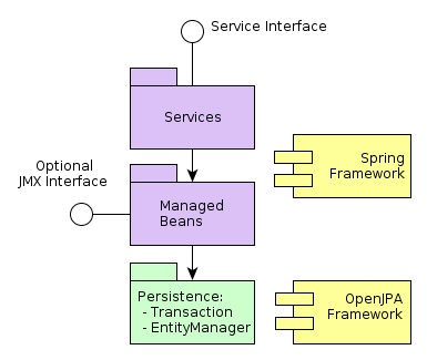
Services are container-managed components that form the application boundary and provide the interface to the client tier. Services may contain the business logic themselves or delegate the execution to managed beans.
Managed beans are container-managed components that contain the business logic of the application. They are called by services, other beans or via the optional JMX interface.
Persistence is the infrastructure interface to access the data storage functionality: ORM and transactions management.
Services form the component layer that defines a set of Middleware operations available to the client tier. Services encapsulate business logic and transaction management.
The main objectives of services:
-
Provide the remote interface to call from the client tier.
-
Check the availability of the active user session, that corresponds to the session identifier transferred from the client.
-
Log unhandled middleware exceptions.
In addition, it is recommended to perform user authorization in the service layer, i.e. to check their rights for a particular functionality.
The objectives common to all services are handled as follows:
-
Checking the availability of the user session and logging exceptions are performed by the
ServiceInterceptor, class which intercepts the execution of each service method using Spring AOP. -
The remote interface to access the service through Spring HTTP Invoker is created by the
RemoteServicesBeanCreator, bean, which is configured in the remoting-spring.xml file of the core module.
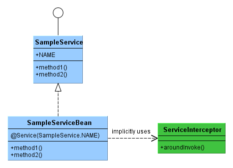
The name of service interface should end with Service, the names of implementation class – with ServiceBean.
The following steps are required for creating a service:
-
Create the service interface in the global module, as the service interface must be available at all tiers), and specify the service name in it. It is recommended to specify the name in the following format:
{project_name}_{interface_name}. For example:package com.sample.sales.core; import com.sample.sales.entity.Order; public interface OrderService { String NAME = "sales_OrderService"; void calculateTotals(Order order); } -
Create the service class in the core module and add the
@org.springframework.stereotype.Serviceannotation to it with the name specified in the interface:package com.sample.sales.core; import com.sample.sales.entity.Order; import org.springframework.stereotype.Service; @Service(OrderService.NAME) public class OrderServiceBean implements OrderService { @Override public void calculateTotals(Order order) { } }The service class, being a managed bean, should be placed inside the package tree with the root specified in the
context:component-scanelement of the spring.xml file. In this case, thespring.xmlfile contains the element:<context:component-scan base-package="com.sample.sales"/>
which means that the search for annotated beans for this application block will be performed starting with the
com.sample.salespackage.
Services are only intended for calling “outside of” Middleware. It is not recommended to call service methods from other components of the middle tier. An error message is logged upon detection of a service call from another service.
If different services or other Middleware components require to call the same business logic, it should be extracted and encapsulated inside an appropriate managed bean.
In order to call the service, the corresponding proxy object should be created in the client block of the application. Declare the service name and interface in the parameters of the proxy object factory to achieve this. For the Web Client block, it is WebRemoteProxyBeanCreator, for Web Portal – PortalRemoteProxyBeanCreator , for Desktop Client – RemoteProxyBeanCreator .
The proxy object factory is configured in spring.xml of the corresponding client block.
For example, to call the sales_OrderService service from the web client in the sales application, it is necessary to add the following code into the web-spring.xml file of the web module:
<bean id="sales_proxyCreator" class="com.haulmont.cuba.web.sys.remoting.WebRemoteProxyBeanCreator">
    <property name="clusterInvocationSupport" ref="cuba_clusterInvocationSupport"/>
    <property name="remoteServices">
        <map>
            <entry key="sales_OrderService" value="com.sample.sales.core.OrderService"/>
        </map>
    </property>
</bean>
All imported services are declared in a single remoteServices property in the map/entry elements.
From the application code perspective, the service’s proxy object at the client level is a standard Spring bean and can be obtained either by injection or through AppBeans class. For example:
@Inject
protected OrderService orderService;
...
orderService.calculateTotals(order);
DataService provides a facade for calling DataManager
middleware implementation from the client tier. The usage of DataService interface in the
application code is not recommended. Instead, use DataManager directly on both middle and client tiers.
When executing user requests, the Middleware program code always has access to the information on the current user via the UserSessionSource interface. This is possible because the corresponding SecurityContext object is automatically set for the current thread when a request is received from the client tier.
However, there are situations when the current thread is not associated with any system user, for example, when calling a bean’s method from the scheduler, or via the JMX interface. In case the bean modifies entities in the database, it will require information on who is making changes, i.e., authentication.
This kind of authentication is called “system authentication” as it requires no user participation – the application middle layer simply creates or uses an existing user session and sets the corresponding SecurityContext object for the current thread.
The following methods can be used to provide the system authentication for a code block:
-
Make use of the
com.haulmont.cuba.security.app.Authenticationbean:@Inject protected Authentication authentication; ... authentication.begin(); try { // authenticated code } finally { authentication.end(); } -
Add the
@Authenticatedannotation to the bean method:@Authenticated public String foo(String value) { // authenticated code }
The second case uses the Authentication bean implicitly, via the AuthenticationInterceptor object, which intercepts calls of all bean methods with the @Authenticated annotation.
In the examples above, the user session will be created on behalf of the user, whose login is specified in the cuba.jmxUserLogin application property. If authentication on behalf of another user is required, pass the login of the desired user to the begin() method of the first variant.
If current thread has an active user session assigned at the time of Authentication.begin() execution, it will not be replaced. Therefore the code will be executed with the existing session and the subsequent call to the end() method will not clear the thread.
For example, if a bean is in the same JVM as the Web Client block, to which the user is currently connected, the call of the JMX bean method from the Web Client built-in JMX console will be executed on behalf of the currently logged in user, regardless of the system authentication.
The infrastructure interface, serving as an entry point to data storage functionality.
The interface has the following methods:
-
createTransaction(),getTransaction()– obtain the interface to manage transactions. -
isInTransaction()– checks if an active transaction exists at the moment. -
getEntityManager()– returns the EntityManager instance bound to the current transaction. -
isSoftDeletion()– allows you to determine if the soft deletion mode is active. -
setSoftDeletion()– enables or disables the soft deletion mode. Setting this property affects all newly createdEntityManager. instances. Soft deletion is enabled by default. -
getDbTypeConverter()– returns the DbTypeConverter instance for the currently used database. -
getDataSource()– returns thejavax.sql.DataSourceinstance for the currently used database.For all
javax.sql.Connectionobjects obtained throughgetDataSource().getConnection()method theclose()method should be called in thefinallysection after using the connection. Otherwise, the connection will not be returned to the pool. Over time, the pool will overflow and the application will not be able to execute database queries. -
getTools()– returns an instance of thePersistenceToolsinterface (see below).
Managed bean containing helper methods related to data storage functionality. It can be obtained either by calling the Persistence.getTools() method or like any other bean, through injection or the AppBeans class.
The PersistenceTools bean has the following methods:
-
getDirtyFields()– returns a collection of entity attribute names that have been changed since the last load of the instance from the DB. For new instances an empty collection is returned. -
isLoaded()– determines if the specified instance attribute was loaded from the DB. The attribute may not be loaded, if it was not present in the view specified when loading the instance.This method only works for instances in the Managed state.
-
getReferenceId()– returns an ID of the related entity without loading it from the DB.Let us suppose that an
Orderinstance was loaded in the persistent context and it is necessary to get the ID value of theCustomerinstance related to thisOrder. A call to theorder.getCustomer().getId()method will execute the DB query to load theCustomerinstance, which in this case is unnecessary, because the value of the Customer ID is also located in theOrdertable as a foreign key. Whereas the execution ofpersistence.getTools().getReferenceId(order, "customer")
will not send any additional queries to the database.
This method works only for instances in the Managed state.
The PersistenceTools bean can be overridden in your application to extend the set of default helper methods. An example of working with the extended interface is shown below:
MyPersistenceTools tools = persistence.getTools();
tools.foo();
((MyPersistenceTools) persistence.getTools()).foo();
A helper class for obtaining the information on persistent entities. Unlike the Persistence and PersistenceTools beans, this class is available on all tiers.
The PersistenceHelper bean has the following methods:
-
isNew()– determines if the passed instance is newly created, i.e., in the New state. Also returnstrueif this instance is actually in Managed state but newly-persisted in the current transaction, or if it is not a persistent entity. -
isDetached()– determines if the passed instance is in the Detached state. Also returnstrue, if this instance is not a persistent entity. -
isSoftDeleted()– determines if the passed entity class supports the soft deletion. -
getEntityName()– returns the name of the entity specified in the @Entity annotation.
The interface containing methods for conversion between data model attribute values and parameters/results of JDBC queries. An object of this interface can be obtained through the Persistence.getDbTypeConverter() method.
The DbTypeConverter interface has the following methods:
-
getJavaObject()– converts the result of the JDBC query into a type suitable for assigning to entity attribute. -
getSqlObject()– converts the value of the entity attribute into a type suitable for assigning to the JDBC query parameter. -
getSqlType()– returns ajava.sql.Typesconstant that corresponds to the passed entity attribute type.
Object-Relational Mapping is the technology for linking relational database tables to programming language objects.
- Benefits of using ORM:
-
-
Allows working with a relational DBMS by means of Java objects manipulation.
-
Simplifies programming by eliminating routine writing of SQL queries.
-
Simplifies programming by letting you extract and save entire object graphs with one command.
-
Ensures easy porting of the application to different DBMS.
-
Uses a concise object query language – JPQL.
-
Optimizes the number of SQL requests for insert and update.
-
- Shortcomings:
-
-
Requires understanding of specifics of working with ORM.
-
Does not allow to directly optimize SQL or use specifics of the DBMS.
-
CUBA uses the ORM implementation according to Java Persistence API standard based on Apache OpenJPA framework.
EntityManager – main ORM interface, used to manage persistent entities.
Reference to the EntityManager may be obtained via the Persistence interface, by calling the getEntityManager() method.
The retrieved instance of EntityManager is bound to the current transaction, i.e. all calls to getEntityManager() as part of one transaction return one and the same instance of EntityManager. After the end of transaction calls to the corresponding EntityManager instance are impossible.
An instance of EntityManager contains a "persistent context" – a set of instances loaded from DB or newly created. Persistent context is a kind of data cache within a transaction.
EntityManager automatically flushes to DB all changes done in its persistent context at the moment when a transaction is committed or when the flush() method is called explictly.
EntityManager interface used in CUBA applications mainly copies the standard javax.persistence.EntityManager interface. Let us have a look at its main methods:
-
persist()– adds a new instance of the entity to the persistent context. When the transaction is committed a corresponding record is created in DB using SQLINSERT. -
merge()– copies the state of detached instance to the persistent context the following way: an instance with the same identifier gets loaded from DB and the state of the passed Detached instance is copied into it and then the loaded Managed instance is returned. After that you should work with the returned Managed instance. The state of this entity will be stored in DB using SQLUPDATEon transaction commit. -
remove()– removes an object from the database, or, if soft deletion mode is turned on, setsdeleteTsanddeletedByattributes.If the passed instance is in Detached state,
merge()is performed first. -
find()– loads an entity instance by its identifier.When forming a request to the database the system considers the view which has been passed as a parameter to this method, or set to the entire
EntityManagerviasetView(). As a result the persistent context will contain a graph of objects with all non-lazy view attributes loaded. The rest of the attributes may be loaded by calling the corresponding access methods of the entity, or by callingEntityManager.fetch(). -
createQuery()– creates aQueryobject for executing a JPQL query.We recommend using the variant of this method, which receives an entity class to return an instance of
TypedQuery. -
createNativeQuery()– creates aQueryobject to execute an SQL query. -
setView()– sets the default view, which will be used for further loading of instance viafind()or JPQL requests. As a result, all non-lazy attributes of the view will be eagerly fetched.Passing
nullto this method or not calling it at all will load the attributes according to entity annotations.The views explicitly passed to
find()method or set in theQueryobject have a priority over the one set by this method. -
addView()is similar tosetView(), but does not replace the view if it was already set in theEntityManager. Instead it adds the attributes of the passed view to it. -
fetch()– ensures loading of all attributes of the specified view for the entity instance, including lazy attributes. The entity instance should be in Managed state.We recommend calling this method before committing a transaction, if the view contains lazy attributes and the entity instance should be sent to the client tier. In this case, only calling
fetch()will ensure that all attributes required by the client code have been actually loaded. -
reload()– reloads the entity instance with the provided view. Ensures loading of all view attributes by callingfetch()internally. -
isSoftDeletion()– checks if theEntityManageris in soft deletion mode. -
setSoftDeletion()– sets soft deletion mode for thisEntityManager. -
getConnection()– returns ajava.sql.Connection, which is used by this instance ofEntityManager, and hence by the current transaction. Such connection does not need to be closed, it will be closed automatically when the transaction is complete. -
getDelegate()– returnsjavax.persistence.EntityManagerprovided by the ORM implementation.
- New
-
An instance which has been just created in memory:
Car car = new Car().New instance may be passed to
EntityManager.persist()to be stored to the DB, in which case it switches into Managed state. - Managed
-
The instance loaded from DB, or a new one passed to
EntityManager.persist(). Belongs to aEntityManagerinstance, i.e. is contained in its persistent context.Any changes of the instance in Managed state will be saved to the DB when a transaction that the
EntityManagerbelongs to is committed. - Detached
-
An instance loaded from the DB and detached from its persistent context (as result of transaction closing or serialization).
The changes applied to a Detached instance will be saved in DB only if this instance is switched back to the Managed state by being passed to
EntityManager.merge().
Loading on demand (lazy loading) allows delayed loading of linked entities, i.e. they get loaded when their properties are accessed for the first time.
Lazy loading generates more DB queries than eager fetching, but it is stretched in time.
-
For example, in case of lazy loading of a list of N instances of entity A, each containing a link to an instance of entity B, will require N+1 requests to DB.
-
It is important to aim towards fewer requests to DB to minimize response time and load levels. The platform uses the mechanism of views to achieve this. Using view allows ORM to create only one request to DB with table joining for the above mentioned case.
-
If A includes a collection of B, then eager fetching will result in an SQL request, returning Cartesian product of rows A and B.
-
Sometimes lazy loading provides better performance than eager fetching. For example, when an asynchronous process is carrying out business logic, the execution time may not be critical and it may be better to distribute the load on DB in time.
Lazy loading works only for instances in Managed state, i.e. within the transaction which loaded the specified instance.
JPQL queries should be run through the Query interface. The reference to it may be obtained from the current EntityManager instance by calling createQuery() method. If the query is supposed to be used to load entities, we recommend calling createQuery() and passing the result type as parameter. This will create a TypedQuery instance.
The methods of Query mainly correspond to the methods of a standard javax.persistence.Query interface. Let us have a look at the differences.
-
setParameter()– sets a value to a query parameter. If the value is an entity instance, implicitly converts the instance into its identifier. For example:Customer customer = ...; TypedQuery<Order> query = entityManager.createQuery( "select o from sales$Order o where o.customer.id = ?1", Order.class); query.setParameter(1, customer);Note that the actual entity is passed as parameter while comparison in the query is done using identifier.
A variant of the method with
implicitConversions = falsedoes not do such conversion. -
setView(),addView()– are similar to theEntityManagermethods with the same names – they define a view, used to load data with the current query and do not affect the view of the entireEntityManager. -
getDelegate()– returns an instance ofjavax.persistence.Query, provided by the ORM implementation.
When a request is run through Query changes in the current persistent context are ignored, i.e. the query just runs in DB. If the results of selection are the instances already contained in persistent context, then the query result will contain instances from context and not the ones read from DB. The following test fragment should clarify this:
TypedQuery<User> query;
List<User> list;

query = em.createQuery("select u from sec$User u where u.name = ?1", User.class);
query.setParameter(1, "testUser");
list = query.getResultList();
assertEquals(1, list.size());
User user = list.get(0);

user.setName("newName");

query = em.createQuery("select u from sec$User u where u.name = ?1", User.class);
query.setParameter(1, "testUser");
list = query.getResultList();
assertEquals(1, list.size());
User user1 = list.get(0);

assertTrue(user1 == user);
This behavior is controlled by openjpa.IgnoreChanges=true, parameter defined in persistence.xml file of the cuba base project. It is possible to change this parameter in your project by including it in the project's own persistence.xml.
The queries, which change data (update, delete) cause flush of the data from the current persistent context to the database prior to execution. In other words, ORM first synchronizes the states of entities in the persistent context and DB, and only after that runs the modifying query. We recommend to run such queries in an unchanged persistent context in order to prevent implicit actions by the ORM, which may have negative impact on performance.
You can use (?i) prefix in the value of the query parameters to conveniently specify conditions for case insensitive search by any part of the string. For example, let us assume we have a query:
select c from sales$Customer c where c.name like :name
If we pass the string (?i)%doe% as a value of the name parameter, the search will return John Doe, if such record exists in DB, even though the case of the D is different. This will happen because ORM will run the SQL query with condition like lower(C.NAME) like ?
It should be kept in mind that such search will not use index on the name field, even if such exists in the DB.
JPQL query text may include macros, which are processed before the query is executed. They are converted into the executable JPQL and thus additionally modify the set of parameters.
The macros defined in the platform solve the following problems:
-
Provide a workaround for the limitation of JPQL which makes it impossible to express the condition of dependency of a given field on current time (i.e. expressions like “current_date -1” do not work).
-
Allow comparing
Timestamptype fields (the date/time fields) with a date.
Let us consider them in more detail:
- @between
-
Has the format
@between(field_name, moment1, moment2, time_unit), where-
field_nameis the name of the compared attribute. -
moment1,moment2– start and end points of the time interval where the value offield_nameshould fall into. Each of the points should be defined by an expression containingnowvariable with an addition or subtraction of an integer number. -
time_unit– defines the unit for time interval added to or subtracted fromnowin the time point expressions and time points rounding precision. May be one of the following:year,month,day,hour,minute,second. With included workflow base project, work time units can also be used:workday,workhour,workminute.
The macro gets converted to the following expression in JPQL:
field_name >= :moment1 and field_name < :moment2Example 1. Customer was created today:
select c from sales$Customer where @between(c.createTs, now, now+1, day)
Example 2. Customer was created within the last 10 minutes:
select c from sales$Customer where @between(c.createTs, now-10, now, minute)
Example 3. Documents dated within the last 5 work days (for the projects including workflow):
select d from sales$Doc where @between(d.createTs, now-5, now, workday)
-
- @today
-
Has the format
@today(field_name)and helps to define a condition checking that the attribute value falls into the current date. Essentially, this is a special case of the@betweenmacro.Example. Customer was created today:
select d from sales$Doc where @today(d.createTs)
- @dateEquals
-
Has the format
@dateEquals(field_name, parameter)and allows you to define a condition checking thatfield_namevalue (inTimestampformat) falls into the date passed asparameter.Example:
select d from sales$Doc where @dateEquals(d.createTs, :param)
- @dateBefore
-
Has the format
@dateBefore(field_name, parameter) and allows you to define a condition checking thatfield_namevalue (inTimestampformat) is smaller than the date passed asparameter.Example:
select d from sales$Doc where @dateBefore(d.createTs, :param)
- @dateAfter
-
Has the format
@dateAfter(field_name, parameter) and allows you to define a condition that the date of thefield_namevalue (inTimestampformat) is more or equal to the date passed asparameter.Example:
select d from sales$Doc where @dateAfter(d.createTs, :param)
- @enum
-
Allows you to use a fully qualified enum constant name instead of its database identifier. This simplifies searching for enum usages throughout the application code.
Example:
select r from sec$Role where r.type = @enum(com.haulmont.cuba.security.entity.RoleType.SUPER) order by r.name
The list of macros may be extended in the application project. To create a new macro, it is necessary to define a bean implementing the interface QueryMacroHandler, and define its @Scope("prototype"). The execution mechanism of JPQL queries creates all accessible QueryMacroHandler beans and passes the query text with a set of parameters to these beans one by one. The handlers are called without any specific order..
ORM allows running SQL queries to the database returning either the lists of individual fields or entity instances. For this, it is necessary to create a Query or TypedQuery object by calling one of the methods of EntityManager.createNativeQuery().
If individual columns are selected within a table, the resulting list will include the rows as Object[]. For example:
Query query = em.createNativeQuery("select ID, NAME from SALES_CUSTOMER where NAME like ?1");
query.setParameter(1, "%Company%");
List list = query.getResultList();
for (Iterator it = list.iterator(); it.hasNext(); ) {
    Object[] row = (Object[]) it.next();
    UUID id = (UUID) row[0];
    String name = (String) row[1];
}
Keep in mind when using SQL that the columns corresponding to entity attributes of UUID type are returned as UUID or as String, depending on the used DBMS and JDBC driver:
-
HSQLDB –
String -
PostgreSQL, driver
postgresql-8.3-603.jdbc4.jar–String -
PostgreSQL, driver
postgresql-9.1-901.jdbc4.jar–UUID -
Microsoft SQL Server, driver
jtds-1.2.4.jar–String -
Oracle –
String
Parameters of this type should also be defined either as UUID or using their string representation, depending on the DBMS and JDBC driver. To ensure that your code does not depend on the DBMS used, it is recommended to use DbTypeConverter.
If the resulting entity class is passed along with the query text, TypedQuery is returned, and the attempt to map the query results to entity attributes is performed. For example:
TypedQuery<Customer> query = em.createNativeQuery(
    "select * from SALES_CUSTOMER where NAME like ?1",
    Customer.class);
query.setParameter(1, "%Company%");
List<Customer> list = query.getResultList();
Behavior of SQL queries returning entities and modifying queries (update, delete), in relation to the current persistent context is similar to that of JPQL queries described above.
Entity Listeners are designed to react to lifecycle events of entity instances on Middleware.
A listener is a class implementing one or several interfaces of com.haulmont.cuba.core.listener package. The listener will react to events corresponding to the implemented interfaces.
-
BeforeDetachEntityListener -
onBeforeDetach()method is called before the object is detached from EntityManager on transaction commit.This listener can be used for filling non-persistent entity attributes before sending it to the client tier.
-
BeforeAttachEntityListener -
onBeforeAttach()method is called before the object is attached to the persistent context as a result ofEntityManager.merge()operation.This listener can be used, for example, to fill persistent entity attributes before saving it in the database.
-
BeforeInsertEntityListener -
onBeforeInsert()method is called before a record is inserted into database. All kinds of operations can be performed with the current EntityManager available within this method. -
AfterInsertEntityListener -
onAfterInsert()is called after a record is inserted into database, but before transaction commit. This method does not allow modifications of the current persistent context, however, database modifications can be done using QueryRunner. -
BeforeUpdateEntityListener -
onBeforeUpdate()method is called before a record is updated in the database. All kinds of operations can be performed with the current EntityManager available within this method. -
AfterUpdateEntityListener -
onAfterUpdate()method is called after a record was updated in the database, but before transaction commit. This method does not allow modifications of the current persistent context, however, database modifications can be done using QueryRunner. -
BeforeDeleteEntityListener -
onBeforeDelete()method is called before a record is deleted from the database (in the case of soft deletion – before updating a record). All kinds of operations can be performed with the current EntityManager available within this method. -
AfterDeleteEntityListener -
onAfterDelete()method is called after a record is deleted from the database (in the case of soft deletion – before updating a record), but before transaction commit. This method does not allow modifications of the current persistent context, however, database modifications can be done using QueryRunner.
An entity listener can be a plain Java class or a managed bean. In the latter case, injection can be used as follows:
@ManagedBean("cuba_MyEntityListener")
public class MyEntityListener implements
        BeforeInsertEntityListener<MyEntity>,
        BeforeUpdateEntityListener<MyEntity> {

    @Inject
    protected Persistence persistence;

    @Override
    public void onBeforeInsert(MyEntity entity) {
        EntityManager em = persistence.getEntityManager();
        ...
    }

    @Override
    public void onBeforeUpdate(MyEntity entity) {
        EntityManager em = persistence.getEntityManager();
        ...
    }
}
Entity Listener can be created in two ways:
-
Statically – the names of listener classes are listed in @Listeners annotation in the entity class.
-
Dynamically – entity and listener classes are passed to
addListener()method ofEntityListenerManagerbean. For example:@ManagedBean public class MyBean implements AppContext.Listener { @Inject private EntityListenerManager entityListenerManager; public ClusterManager() { AppContext.addListener(this); } @Override public void applicationStarted() { entityListenerManager.addListener(User.class, MyUserListener.class); } @Override public void applicationStopped() { } }
Only one listener instance of a certain type is created for all instances of a particular entity class, therefore listener must not have a state.
If several listeners of the same type (for example from annotations of entity class and its parents and also added dynamically) were declared for an entity, they will be called in the following order:
-
For each ancestor, starting from the most distant one, dynamically added listeners are called first, followed by statically assigned listeners.
-
Once parent classes are processed, dynamically added listeners for given class are called first, followed by statically assigned.
This section covers various aspects of transaction management in CUBA applications.
Programmatic transaction management is done using com.haulmont.cuba.core.Transaction interface, a reference to which may be obtained via the createTransaction() or getTransaction() methods of the Persistence infrastructure interface.
The createTransaction() method creates a new transaction and returns the Transaction interface. Subsequent calls of commit(), commitRetaining(), end() methods of this interface control the created transaction. If at the moment of creation there was another transaction, it will be paused and resumed after the completion of the newly created one.
The getTransaction() method either creates a new transaction or attaches to an existing one. If at the moment of the call there is an active transaction, then the method completes successfully, but subsequent calls of commit(), commitRetaining(), end() have no influence on the existing transaction. However calling end() without a prior call to commit() will mark current transaction as RollbackOnly.
An example of programmatic transaction management:
@Inject
private Persistence persistence;
...
Transaction tx = persistence.createTransaction();
try {
    EntityManager em = persistence.getEntityManager();
    Customer customer = new Customer();
    customer.setName("John Smith");
    em.persist(customer);

    tx.commit();
} finally {
    tx.end();
}
Transaction interface also has the execute() method accepting an action class as input. This class defines an action which should be performed in this transaction. This allows organizing transaction management in functional style, for example:
persistence.createTransaction().execute(new Transaction.Runnable() {
    public void run(EntityManager em) {
        // transactional code here
    }
});
If the transactional block is expected to return a result, the action class should implement Transaction.Callable interface. If the result is not required as in the example above, it is recommended to inherit the action class from the abstract class Transaction.Runnable.
Keep in mind that execute() method of a given instance of Transaction may be called only once because the transaction ends after the action class code is executed.
Any method of the Middleware managed bean may be marked with the annotation @org.springframework.transaction.annotation.Transactional, which will automatically create a transaction when the method is called. Such method does not require invoking Persistence.createTransaction(), you can immediately get EntityManager and work with it.
@Transactional annotation supports a number of parameters. The main parameter is transaction creation mode – Propagation. The value REQUIRED corresponds to getTransaction(), the value REQUIRES_NEW – to createTransaction(). The default value is REQUIRED.
Declarative transaction management allows you to reduce the amount of boilerplate code, but it has the following drawback: transactions are committed outside of the application code, which often complicates debugging because it conceals the moment when changes are sent to the DB and the entities become Detached. Additionally, keep in mind that declarative markup will only work if the method is called by the container, i.e. calling a transaction method from another method of the same object will not start a transaction.
With this in mind, we recommend using declarative transaction management only for simple cases like a service method reading a certain object and returning it to the client.
If a nested transaction was created via getTransaction() and rolled back, then commit of the enclosing transaction will be impossible. For example:
void methodA() {
    Transaction tx = persistence.createTransaction();
    try {
        // (1) calling a method creating a nested transaction
        methodB();

        // (4) at this point an exception will be thrown, because transaction
        //     is marked as rollback only
        tx.commit();
    } finally {
        tx.end();
    }
}

void methodB() {
    Transaction tx = persistence.getTransaction();
    try {
        // (2) let us assume  the exception occurs here
        tx.commit();
    } catch (Exception e) {
        // (3) handle it and exit
        return;
    } finally {
        tx.end();
    }
}
If the transaction in methodB() is created with createTransaction() instead, then rolling it back will have no influence on the enclosing transaction in methodA().
Let us first have a look at a dependent nested transaction created using getTransaction():
void methodA() {
    Transaction tx = persistence.createTransaction();
    try {
        EntityManager em = persistence.getEntityManager();

        // (1) loading an entity with name == "old name"
        Employee employee = em.find(Employee.class, id);
        assertEquals("old name", employee.getName());

        // (2) setting new value to the field
        employee.setName("name A");

        // (3) calling a method creating a nested transaction
        methodB();

        // (8) the changes are committed to DB, and
        //     it will contain "name B"
        tx.commit();
    } finally {
      tx.end();
    }
}

void methodB() {
    Transaction tx = persistence.getTransaction();
    try {
        // (4) retrieving the same instance of EntityManager as methodA
        EntityManager em = persistence.getEntityManager();

        // (5) loading an entity with the same identifier
        Employee employee = em.find(Employee.class, id);

        // (6) the field value is the new one since we are working with the same
        //     persistent context, and there are no calls to DB at all
        assertEquals("name A", employee.getName());
        employee.setName("name B");

        // (7) no actual commit is done at this point
        tx.commit();
    } finally {
      tx.end();
    }
}
Now, let us have a look at the same example with an independent nested transaction created with createTransaction():
void methodA() {
    Transaction tx = persistence.createTransaction();
    try {
        EntityManager em = persistence.getEntityManager();

        // (1) loading an entity with name == "old name"
        Employee employee = em.find(Employee.class, id);
        assertEquals("old name", employee.getName());

        // (2) setting new value to the field
        employee.setName("name A");

        // (3) calling a method creating a nested transaction
        methodB();

        // (8) an exception occurs due to optimistic locking
        //     and commit will fail
        tx.commit();
    } finally {
      tx.end();
    }
}

void methodB() {
    Transaction tx = persistence.createTransaction();
    try {
        // (4) creating a new instance of EntityManager,
        //    as this is a new transaction
        EntityManager em = persistence.getEntityManager();

        // (5) loading an entity with the same identifier
        Employee employee = em.find(Employee.class, id);

        // (6) the field value is old because an old instance of the entity
        //     has been loaded from DB
        assertEquals("old name", employee.getName());

        employee.setName("name B");

        // (7) the changes are commited to DB, and the value of
        //     "name B" will now be in DB
        tx.commit();
    } finally {
      tx.end();
    }
}
In the last example, the exception at point (8) will only occur if the entity supports optimistic blocking, i.e. if it implements Versioned interface.
You can set timeout in seconds for created transaction. When the timeout is exceeded, transaction will be interrupted and rolled back. Transaction timeout effectively limits the maximum duration of a database request.
When transactions are managed programmatically, the timeout is specified by passing TransactionParams object to the Persistence.createTransaction(). method. For example:
Transaction tx = persistence.createTransaction(new TransactionParams().setTimeout(2));
In case of declarative transactions management, timeout parameter of the @Transactional annotation can be used, for example:
@Transactional(timeout = 2)
public void someServiceMethod() {
...
The default timeout can be defined using cuba.defaultQueryTimeoutSec application property.
PostgreSQL
Unfortunately, JDBC driver for PostgreSQL does not support the setQueryTimeout() method of the java.sql.Statement interface. For this reason an extra command set local statement_timeout to {value} is executed in DB at the beginning of each transaction, for which timeout has been set using any approach, including a non-zero value of cuba.defaultQueryTimeoutSec. In this case, the DB server will interrupt the request itself if the timeout is exceeded.
We recommend the following to decrease the load generated by these extra operators:
-
Default timeout should be set not on Middleware using cuba.defaultQueryTimeoutSec property, but on PostgreSQL server in the file
postgresql.conf. For example,statement_timeout = 3000(in milliseconds). -
For methods which need a longer timeout (reports and similar) the timeout should be specified explicitly in transaction parameters.
Microsoft SQL Server
JTDS driver supports the setQueryTimeout() method of the java.sql.Statement interface, so you can just set the standard EntityManager property javax.persistence.query.timeout, which will automatically apply to JDBC queries.
Generic user interface (Generic UI, GUI) subsystem allows you to create UI screens using XML and Java. The screens created using this approach work identically in both standard client blocks: Web Client and Desktop Client.
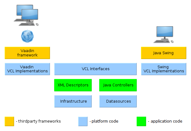
Main components of Generic UI screens are marked as green:
-
XML-descriptors – XML files containing information about datasources and screen layout.
-
Controllers – Java classes containing logic for screen initialization and handling of events generated by UI controls.
The code of application screens included in the gui module interacts with visual component interfaces (VCL Interfaces) implemented separately in the web and desktop modules of the cuba base project. For Web Client the implementation is based on the Vaadin framework, for Desktop Client on the Java Swing framework.
Visual Components Library (VCL) contains a large set of ready-to-use components.
Datasources mechanism provides a unified interface that ensures functioning of data-aware visual components.
Client’s infrastructure (Infrastructure) includes main application window, mechanisms for display and interaction of UI screens and means of interaction with the middleware.
A generic UI screen is defined by an XML-descriptor and a controller class. The descriptor has a link to the controller class.
In order to be able to invoke the screen from the main menu or from Java code (e.g. from controller of a different screen) the XML-descriptor should be registered in the project’s screens.xml file.
The main menu of an application is generated separately for the Web Client and the Desktop Client based on the menu.xml files, located in the project’s web and desktop modules.
This section describes the following basic types of screens:
Frames are parts of the screen intended for decomposition and reuse.
The iframe element of the screen’s XML is used to add a frame to the screen. It defines either path to the frame’s XML descriptor, or its identifier, if the frame is registered in screens.xml.
A frame controller should be derived from the AbstractFrame class.
Rules for interaction between a screen and its enclosed frame are the following:
-
Frame components can be referenced from a screen using a dot:
frame_id.component_id -
List of screen components can be obtained from a frame controller by invoking
getComponent(component_id)method but only if there is no component with the same name in the frame itself. I.e. frame components mask screen components. -
Screen datasource can be obtained from a frame by invoking
getDsContext().get(ds_id)method or injection, or usingds$ds_idin query, but only if the data source with a matching name is not declared in the frame itself (same as for components). -
From a screen, frame data source can be obtained only by iterating
getDsContext().getChildren()collection.
Screen commit also causes commits of modified datasources of the frame it uses.
Simple screens allow display and editing of arbitrary information including individual instances and lists of entities. This screen type has only core functionality to display it in the application’s main window, close it and to work with datasources.
Screen identifier in screens.xml may have an arbitrary format.
Controller of a simple screen should be inherited from the AbstractWindow class.
When a lookup screen is invoked by openLookup() method, it displays a panel at the bottom with the buttons designed to pass an instance of the currently selected entity to the calling code. That’s the main difference between lookup and simple screen. When being invoked by openWindow() method or, for example, from the main menu, the panel with the buttons is not displayed.
Lookup screens are recommended to be used to display lists of entities. Visual components intended to display and edit links between entities (such as PickerField, LookupPickerField, SearchPickerField) invoke lookup screens to find related entities.
For standard actions to work correctly, an identifier of a lookup screen in screens.xml should have the format of {entity_name}.lookup, for example, sales$Customer.lookup.
Controller of a lookup screen should be inherited from the AbstractLookup class. The lookupComponent attribute of the screen’s XML should refer to the component (for example Table), from which the selected entity instance should be taken as result of lookup.
Edit screen is designed to display and edit entity instances. It initializes the instance being edited and supports actions for committing changes to the database. Edit screen should be opened by the openEditor() method passing an entity instance as an argument.
For standard actions to work correctly, an identifier of an edit screen inscreens.xml should have the format of {entity_name}.edit, for example, sales$Customer.edit.
Edit screen controller should be inherited from the AbstractEditor class. The datasource attribute of a screen’s XML should refer to a data source containing the edited entity instance. The following standard button frames in the XML can be used to display actions that commit or cancel changes:
-
editWindowActions(filecom/haulmont/cuba/gui/edit-window.actions.xml) – contains and buttons -
extendedEditWindowActions(filecom/haulmont/cuba/gui/extended-edit-window.actions.xml) – contains , and
The following actions are implicitly initialized in the edit screen:
-
windowCommitAndClose(corresponds to theWindow.Editor.WINDOW_COMMIT_AND_CLOSEconstant) – an action committing changes to the database and closing the screen. The action is initialized if the screen has a visual component withwindowCommitAndCloseidentifier. The action is displayed as an button when the mentioned above standardextendedEditWindowActionsframe is used. -
windowCommit(corresponds to theWindow.Editor.WINDOW_COMMITconstant) – an action which commits changes to the database. In absence ofwindowCommitAndCloseaction, closes the screen after committing. The action is always displayed as an button if the screen has the abovementioned standard frames. -
windowClose(corresponds to theWindow.Editor.WINDOW_CLOSEconstant) – which closes the screen without committing any changes. The action is always initialized. If the screen has the abovementioned standard frames, it is displayed as button.
Thus, if the screen contains an editWindowActions frame, the button commits the changes and closes the screen, and the button – closes the screen without committing the changes. If the screen contains an extendedEditWindowActions frame, the button only commits the changes, button commits the changes and closes the screen, and the button closes the screen without committing the changes.
Instead of standard frames actions can be visualized using arbitrary components, for example, LinkButton.
XML-descriptor is a file in XML format describing datasources and screen layout.
XML schema is available at http://schemas.haulmont.com/cuba/5.6/window.xsd.
Descriptor has the following structure:
window − root element.
window attributes:
-
class− name of a controller class. -
messagesPack− a default message pack for the screen. It is used to obtain localized messages in the controller usinggetMessage()method and in the XML descriptor using message key without specifying the pack. -
caption− window caption, can contain a link to a message from the above mentioned pack, for example,caption="msg://credits"
-
focusComponent− identifier of a component which should get input focus when the screen is displayed. -
lookupComponent– mandatory attribute for a lookup screen; defines the identifier of a visual component that the entity instance should be selected from. Supports the following types of components (and their subclasses):-
Table -
Tree -
LookupField -
PickerField -
OptionsGroup
-
-
datasource– mandatory attribute for an edit screen which defines the identifier of the data source containing the edited entity instance.
window elements:
-
metadataContext− the element initializing the views required for the screen. It is recommended to define all views in a single views.xml file, because all view descriptors are deployed into a common repository, so it is difficult to ensure unique names if the descriptors are scattered across multiple files. -
dsContext− defines data source for the screen. -
actions– defines the list of actions for the screen. -
timers– defines the list of timers for the screen. -
companions– defines the list of companion classes for the screen controller.Elements of
companions:-
web– defines a companion implemented in the web module. -
desktop– defines a companion implemented in the desktop module.
Each of these elements contains
classattribute defining the companion class. -
-
layout− root element of the screen layout, a container with a vertical layout of components, similar to vbox.Attributes of
layout:
Screen controller is a Java or Groovy class, linked to an XML-descriptor and containing screen initialization and events handling logic.
Controller should be inherited from one of the following base classes:
-
AbstractFrame − for implementation of frames.
-
AbstractWindow − for implementation of simple screens.
-
AbstractLookup − for implementation of lookup screens.
-
AbstractEditor − for implementation of edit screens.
If a screen does not need additional logic, it can use the base class itself as a controller – AbstractWindow, AbstractLookup or AbstractEditor, by specifying it in the XML-descriptor (these classes are not actually abstract in a sense of impossibility of instantiating). For frames, controller class can be omitted.
Controller class should be registered in class attribute of the root element window in a screen’s XML descriptor.
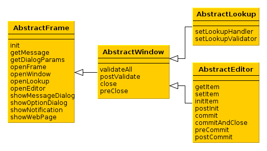
AbstractFrame is the root of the controller class hierarchy. Below is the description of its main methods:
-
init()is called by the framework after creating components tree described by an XML-descriptor, but before a screen is displayed.init()method accepts a map of parameters that can be used in controller. These parameters can be passed both from the controller of the calling screen (usingopenWindow(),openLookup()oropenEditor()methods) or defined in the screen registration file screens.xml.init()method should be implemented if it is necessary to initialize screen components, for example:@Inject private Table someTable; @Override public void init(Map<String, Object> params) { someTable.addGeneratedColumn("someColumn", new Table.ColumnGenerator<Colour>() { @Override public Component generateCell(Colour entity) { ... } }); } -
getMessage(),formatMessage()– methods for retrieving localized messages from a pack, defined for a screen in the XML-descriptor. They work as shortcuts for calling the corresponding methods of the Messages interface. -
getDialogParams()– returns aDialogParamsobject to set up dialog window display properties (height, width, etc.). The values defined in this object affect the next screen opened as a modal dialog (WindowManager.OpenType.DIALOG). The settings are reset to defaults after the dialog has been displayed.Thus, the properties of
DialogParamsobject should be set immediately before opening another modal screen usingopenWindow(),openLookup(),openEditor(). For example:getDialogParams().setWidth(400); openEditor("sales$Customer.edit", customer, WindowManager.OpenType.DIALOG);If the current screen itself is modal it is possible to adjust its display properties by changing
DialogParamsobject in itsinit()method. Please note that the properties defined ininit()method have priority over the ones defined in the calling code. -
openFrame()– loads a frame according to an identifier registered in screens.xml file. If the method receives a container component from the invoking code, the frame is shown within the container. The method returns frame controller. For example:@Inject private BoxLayout container; @Override public void init(Map<String, Object> params) { SomeFrame frame = openFrame(container, "someFrame"); frame.setHeight("100%"); frame.someInitMethod(); }It is not required to pass the container immediately via
openFrame()method, instead it is possible to load the frame first and then add it to the necessary container:@Inject private BoxLayout container; @Override public void init(Map<String, Object> params) { SomeFrame frame = openFrame(null, "someFrame"); frame.setHeight("100%"); frame.someInitMethod(); container.add(frame); } -
openWindow(),openLookup(),openEditor()– open a simple screen, a lookup screen, or an edit screen respectively. Methods return a controller of the created screen.CloseListenercan be added in order to perform actions after the invoked screen closes, for example:CustomerEdit editor = openEditor("sales$Customer.edit", customer, WindowManager.OpenType.THIS_TAB); editor.addListener(new CloseListener() { @Override public void windowClosed(String actionId) { // do something } }); -
showMessageDialog()– shows a dialog box with a message. -
showOptionDialog()– shows a dialog box with a message and an option for user to invoke certain actions. Actions are defined by an array of Action type items displayed as buttons in the dialog.DialogActionobjects a recommended to be used for display of standard buttons such as , and other, for example:showOptionDialog("PLease confirm", "Are you sure?", MessageType.CONFIRMATION, new Action[] { new DialogAction(DialogAction.Type.YES) { @Override public void actionPerform(Component component) { // do something } }, new DialogAction(DialogAction.Type.NO); }); -
showNotification()– shows a pop up notification. -
showWebPage()– opens specified web page in a browser.
AbstractWindow is a subclass of AbstractFrame and defines the following methods:
-
validateAll()– validates a screen. The default implementation callsvalidate()for all screen components implementing theComponent.Validatableinterface, collects information about exceptions and displays corresponding message. Method returnsfalse, if any exceptions were found; andtrueotherwise.This method should be overridden only if it is required to override screen validation procedure completely. It is sufficient to implement a special template method –
postValidate(), if validation should be just supplemented. -
postValidate()– a template method that can be implemented in controller for additional screen validation. The method stores validation errors information inValidationErrorsobject which is passed to it. Afterwards this information is displayed together with the errors of standard validation. For example:private Pattern pattern = Pattern.compile("\\d"); @Override protected void postValidate(ValidationErrors errors) { if (getItem().getAddress().getCity() != null) { if (pattern.matcher(getItem().getAddress().getCity()).find()) { errors.add("City name can't contain digits"); } } } -
close()– closes this screen.The method accepts string value, which is then passed to
preClose()template method and toCloseListenerlisteners. Thus, the information about the reason why the window was closed can be obtained from the code that initiated the closing event. It is recommended to use the following constants for closing edit screens:Window.COMMIT_ACTION_IDafter committing changes,Window.CLOSE_ACTION_ID– without committing changes.If any of the datasources contains unsaved changes, a dialog with a corresponding message will be displayed before the screen is closed. Notification type may be adjusted using the cuba.gui.useSaveConfirmation application property.
A variant of
close()method withforce = trueparameter closes the screen without callingpreClose()and without a notification regardless of any unsaved changes.close()method returnstrue, if the screen is closed successfully, andfalse– if closing procedure was interrupted. -
preClose()is a template method which can be implemented in a controller to intercept the moment when the window closes. The method receives a string value provided by the closing initiator when invokingclose()method.If the
preClose()method returnsfalse, the window closing process is interrupted.
AbstractLookup is the base class for lookup screen controllers. It is a subclass of AbstractWindow and defines the following own methods:
-
setLookupComponent()– sets the component, which will be used to select entity instances.As a rule, component for selection is defined in screen XML-descriptor and there is no need to call this method in the application code.
-
setLookupValidator()– setsWindow.Lookup.Validatorobject to the screen, whichvalidate()method is invoked by the framework before returning selected entity instances. Ifvalidate()method returnsfalse, the lookup and window closing process is interrupted.By default, the validator is not set.
AbstractEditor is the base class for edit screen controller. It is a subclass of AbstractWindow.
When creating a controller class, it is recommended to parameterize AbstractEditor with the edited entity class. This enables getItem() and initItem() methods work with the specified entity type and application code does not need to do additional type conversion. For example:
public class CustomerEdit extends AbstractEditor<Customer> {

    @Override
    protected void initItem(Customer item) {
        ...
AbstractEditor defines the following own methods:
-
getItem()– returns an instance of the entity being edited, which is set in the main data source of the screen (i.e. specified in thedatasourceattribute of the root element of the XML-descriptor).If the instance being edited is not a new one, screen opening procedure will reload the instance from the database with the required view as set for the main data source.
Changes made to the instance returned by
getItem(), are reflected in the state of the data source and will be sent to the Middleware at commit.It should be considered that
getItem()returns a value only after screen is initialized withsetItem()method. Until this moment, this method returnsnull, for instance when calling from insideinit()orinitItem().However, in the
init()method, an instance of an entity passed toopenEditor()can be retrieved from parameters using the following approach:@Override public void init(Map<String, Object> params) { Customer item = WindowParams.ITEM.getEntity(params); // do something }initItem()method requires an instance to be passed explicitly and of an appropriate type.In both cases the obtained entity instance will be reloaded afterwards unless it is a new one. Therefore you should not change it or save it in a field for future use.
-
setItem()– invoked by the framework when a window is opened usingopenEditor()to set the instance being edited to the main data source. By the moment of invocation all screen components and datasources will have been created and the controller’sinit()method will have been executed.It is recommended to use template methods
initNewItem()andpostInit(), instead of overridingsetItem()in order to initialize a screen. -
initNewItem()– a template method invoked by the framework before setting the edited entity instance into the main data source.The
initNewItem()method is called for newly created entity instances only. The method is not called for detached instances. This method can be implemented in the controller, if new entity instances must be initialized before setting them in the data source. For example:@Inject private UserSession userSession; @Override protected void initNewItem(Complaint item) { item.setOpenedBy(userSession.getUser()); item.setStatus(ComplaintStatus.OPENED); }A more complex example of using the
initNewItem()method can be found in development recipes section. -
postInit()– a template method invoked by the framework immediately after the edited entity instance is set to the main data source. In this method,getItem()can be called to return a new entity instance or an instance re-loaded during screen initialization.This method can be implemented in controller for final screen initialization, for example:
@Inject protected EntityDiffViewer diffFrame; @Override protected void postInit() { if (!PersistenceHelper.isNew(getItem())) { diffFrame.loadVersions(getItem()); } } -
commit()– validates the screen and submits changes to the Middleware via DataSupplier.If a method is used with
validate = false, commit does not perform a validation.It is recommended to use specialized template methods –
postValidate(),preCommit()andpostCommit()instead of overriding this method. -
commitAndClose()– validates the screen, submits changes to the Middleware and closes the screen. The value of theWindow.COMMIT_ACTION_IDwill be passed to thepreClose()method and registeredCloseListenerlisteners.It is recommended to use specialized template methods –
postValidate(),preCommit()andpostCommit()instead of overriding this method. -
preCommit()– a template method invoked by the framework during the commit process, after a successful validation, but before the data is submitted to the Middleware.This method can be implemented in controller. If the method returns
false, commit process gets interrupted, as well as window closing process (ifcommitAndClose()was invoked). For example:@Override protected boolean preCommit() { if (somethingWentWrong) { showNotification("Something went wrong", NotificationType.WARNING); return false; } return true; } -
postCommit()– a template method invoked by the framework at the final stage of committing changes. Method parameters are:-
committed– set totrue, if the screen had changes and they have been submitted to Middleware. -
close– set totrue, if the screen should be closed after the changes are committed.
If the screen does not close the default implementation of this method displays a message about successful commit and invokes
postInit().This method can be overridden in controller in order to perform additional actions after successful commit, for example:
@Inject private Datasource<Driver> driverDs; @Inject private EntitySnapshotService entitySnapshotService; @Override protected boolean postCommit(boolean committed, boolean close) { if (committed) { entitySnapshotService.createSnapshot(driverDs.getItem(), driverDs.getView()); } return super.postCommit(committed, close); } -
The diagrams below show initialization sequence and different ways to commit changes for an edit screen.
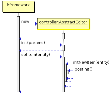
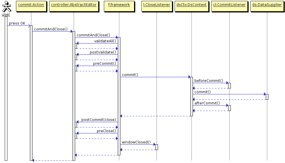
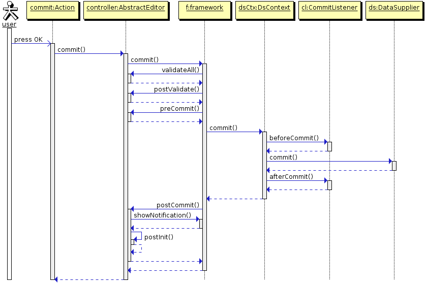
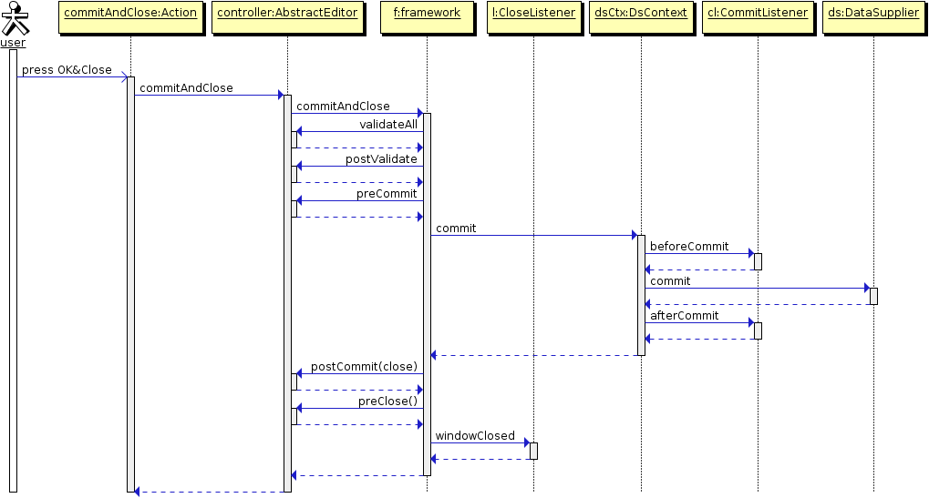
Dependency Injection in controllers can be used to acquire references to utilized objects. For this purpose it is required to declare either a field of the corresponding type or a write access method (setter) with an appropriate parameter type and with one of the following annotations:
-
@Inject– the simplest option, where an object for injection will be found according to the field/method type and the name of the field or attribute corresponding to the method according to JavaBeans rules. -
@Named("someName")– explicitly defines the name of the target object.
The following objects can be injected into controllers:
-
This screen’s visual components defined in the XML-descriptor. If the attribute type is derived from
Component, the system will search for a component with the corresponding name within the current screen. -
Actions defined in the XML-descriptor – see Section 4.5.4, “Actions. The Action Interface”.
-
Datasources defined in the XML-descriptor. If the attribute type is derived from
Datasource, the system will search for a data source with the corresponding name in the current screen. -
UserSession. If the attribute type is UserSession, the system will inject an object of the current user session. -
DsContext. If the attribute type isDsContext, the system will inject theDsContextof the current screen. -
WindowContext. If the attribute type isWindowContext, the system will inject theWindowContextof the current screen. -
DataSupplier. If the attribute type is DataSupplier, the corresponding instance will be injected. -
Any bean defined in the context of a given client block, including:
-
Middleware services imported by Client
-
ComponentsFactory -
WindowConfig -
ExportDisplay
-
-
If nothing of the mentioned above is appropriate and the controller has companions, a companion for the current client type will be injected, if the types match.
It is possible to inject the parameters passed in the map to the
init()method into the controller using special annotation@WindowParam. The annotation has anameattribute which contains the parameter name (a key in the map) and an optional required attribute. Ifrequired = trueand the map does not contain the corresponding parameter aWARNINGmessage is added to the log. An example of an injection of a Job-type object passed to the controller’sinit()method:@WindowParam(name = "job", required = true) protected Job job;
Controller base classes are located in the gui module of the cuba base project and do not contain references to implementation of visual component classes (Swing or Vaadin). This allows you to use them in both types of clients. Instead, base controller classes implement an additional interface – Window.Wrapper – and delegate execution to the wrapped window.
At the same time concrete controller classes may be contained in gui, web or desktop modules, depending on screen specifics and client client blocks used in the project. If controller is universal and additional functionality is required for different client types it can be implemented in so-called companion classes.
Companion class is located in client module of the corresponding client type (web or desktop) and implements an interface defined in the controller which uses the companion class. A companion class should be defined in the companions element of the screen XML-descriptor. Controller can retrieve a reference to the companion instance using injection or by invoking getCompanion(), and then pass control to the companion instance when appropriate, e.g. for extended initialization of visual components in a way specific to a given client type.
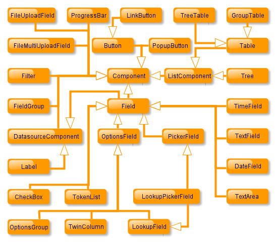
Component is the parent of all visual components. It contains basic attributes to identify a component and place it within a screen.
| Buttons | |
| Button |
 |
| PopupButton |
 |
| LinkButton |
 |
| Text | |
| Label |
 |
| Text inputs | |
| TextField |
 |
| PasswordField |
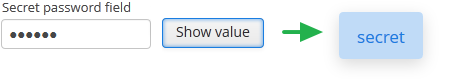 |
| MaskedField |
 |
| TextArea |
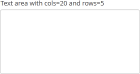 |
| RichTextArea |
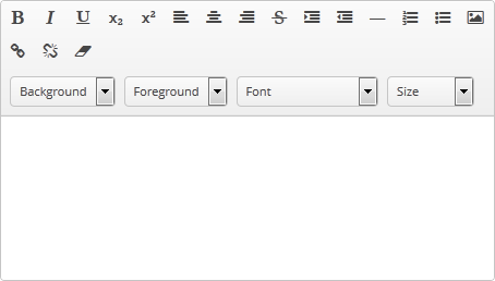 |
| Date inputs | |
| DateField |
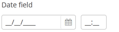 |
| TimeField |
 |
| Selects | |
| CheckBox |
 |
| OptionsGroup |
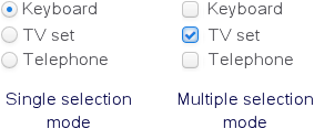 |
| PickerField |
 |
| LookupField |
 |
| LookupPickerField |
 |
| SearchPickerField |
 |
| TwinColumn |
 |
| Uploads | |
| FileUploadField |
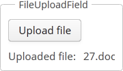 |
| FileMultiUploadField | |
| Tables and trees | |
| Table |
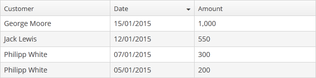 |
| GroupTable |
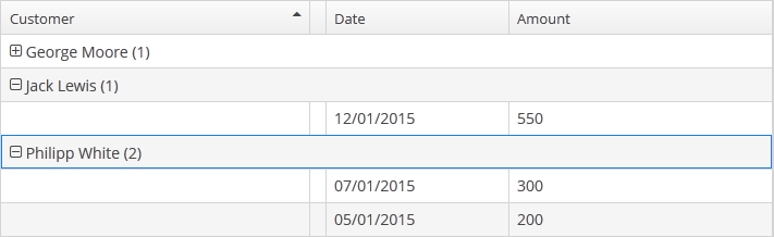 |
| TreeTable |
 |
| Tree |
 |
| Others | |
| FieldGroup |
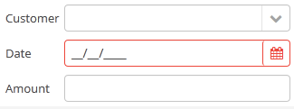 |
| TokenList |
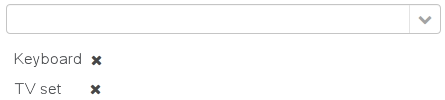 |
| Filter |
 |
A button is a component which performs an action when clicked.
Component’s XML-name: button
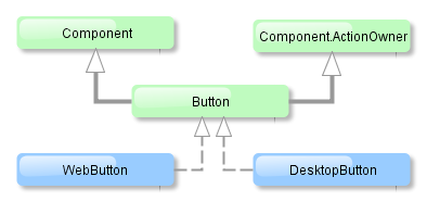
Button component is implemented for both Web and Desktop clients.
Buttons can contain a caption, an icon, or both. The figure below shows different button types.
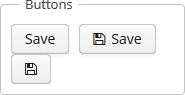
An example of a button with a tooltip and a caption retrieved from a localized message pack:
<button id="textButton" caption="msg://someAction" description="Press me"/>
The button’s caption is set using the caption attribute, the tooltip – using the description attribute.
The icon attribute defines icon location. Detailed information on recommended icon placement is available in Section 4.5.7, “Creating Application Themes” .
Example of creating a button with an icon:
<button id="iconButton" caption="" icon="icons/save.png"/>
The button’s main function is to perform an action on a click. Controller method that should be invoked after a click can be defined using invoke attribute. The attribute value should contain name of the controller method satisfying the following conditions:
-
The method should be
public. -
The method should return
void. -
The method should not have any arguments, or should have a single argument of
Componenttype. If the method has aComponentargument, then an instance of the invoking button will be passed in it.
Below is the example of a button invoking someMethod:
<button invoke="someMethod" caption="msg://someButton"/>
A method named someMethod should be defined in the screen controller:
public void someMethod() {
    //some actions
}
The invoke attribute is ignored if action attribute is set. The action attribute contains an Action name corresponding to the button.
Example of a button with an action:
<actions>
    <action id="someAction" caption="msg://someAction"/>
</actions>
<layout>
    <button action="someAction"/>
Any action present in the component implementing Component.ActionsHolder interface can be assigned to a button. This applies to Table, GroupTable, TreeTable, Tree. The way of adding components (declaratively in the XML descriptor or programmatically in the controller) is irrelevant. In any case, for using an action, the name of the component and the identifier of the required action must be specified in the action attribute, separated by dot. For instance, in the next example the create action of the coloursTable table is assigned to a button:
<button action="coloursTable.create"/>
Button actions can be also created programmatically in the screen controller by deriving them from BaseAction class.
If an Action instance is defined for a Button, the button will import the following properties from it: caption, icon, enable, visible. caption property will be imported from Action only if it is not set in the Button itself. All other listed Action properties have priority over the Button properties. If Action properties are changed after the Action is set for a Button, then Button properties also change accordingly, i.e. the button listens to the changes in Action properties and the caption property will change even if it was initially assigned to the button itself.
button attibutes:
Bulk Editor – is a component that enables changing attribute values for several entity instances at once. The component is a button, usually added to a table or a tree, which opens the entity bulk editor on click.

XML-name of the component: bulkEditor
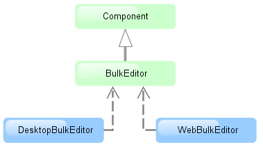
The component is implemented for Web Client and Desktop Client.
To enable the use of Bulk Editor, the table or tree must have the multiselect attribute set to "true".
The entity editor is automatically generated based on the defined view (containing the fields of this entity, including references) and the user permissions. System attributes are not displayed in the editor either.
Entity attributes in the editor are sorted alphabetically. By default, the fields are empty. At screen commit, non-empty attribute values defined in the editor, are set for all the entity instances.
The editor also allows removing a specific field value for all the instances by setting it to null. In order to do this, click  button next to the field. After that, the field will become non-editable. The field can
be unlocked by clicking the same button again.
button next to the field. After that, the field will become non-editable. The field can
be unlocked by clicking the same button again.
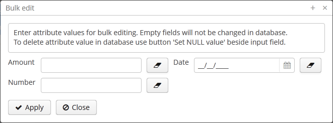
Example of bulkEditor use in a table:
<table id="invoiceTable"
       multiselect="true"
       width="100%">
    <actions>
        <!-- ... -->
    </actions>
    <buttonsPanel>
        <!-- ... -->
        <bulkEditor for="invoiceTable"
                    exclude="customer"/>
    </buttonsPanel>
The for attribute is required. It contains the identifier of a table or a tree; in this case, it is the invoiceTable.
The exclude attribute can contain a regular expression
to exclude some fields explicitly from the list of attributes available for editing. For example:
date|customer
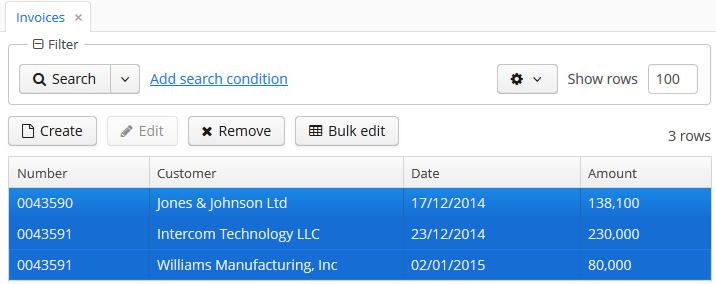
The BulkEditor attributes:
CheckBox is a component with two states: checked, unchecked.
Component’s XML-name: checkBox.
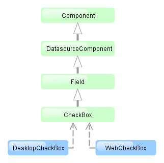
CheckBox component is implemented for both Web and Desktop Clients.
An example of a checkbox with a label retrieved from a localized messages pack:
<checkBox id="accessField" caption="msg://accessFieldCaption"/>
Checking / unchecking of the checkbox changes its value: Boolean.TRUE or Boolean.FALSE.The value can be retrieved using getValue() method and set using setValue(). Submitting null using setValue() will change the value to Boolean.FALSE and uncheck the checkbox.
Changes of checkbox value, as well as of any other components implementing the Field interface, can be tracked using a ValueListener. For example:
@Inject
private CheckBox accessField;

@Override
public void init(Map<String, Object> params) {
    accessField.addListener(new ValueListener<Object>() {
        @Override
        public void valueChanged(Object source, String property, Object prevValue, Object value) {
            if (Boolean.TRUE.equals(value)) {
                showNotification("set", NotificationType.HUMANIZED);
            } else {
                showNotification("not set", NotificationType.HUMANIZED);
            }
        }
    });
}
The datasource and property attributes should be used to create a checkbox associated with data.
<dsContext>
    <datasource id="customerDs" class="com.sample.sales.entity.Customer" view="_local"/>
</dsContext>
<layout>
    <checkBox datasource="customerDs" property="active"/>
According to the example the screen includes the description of customerDs data source for a Customer entity with active attribute. The datasource attribute of the checkBox component should contain a reference to a data source; the property attribute should contain the name of an entity attribute which value should be displayed in the checkbox. The attribute should have Boolean type. If the attribute value is null the checkbox is unchecked.
checkBox attributes:
DateField is a field to display and enter date and time. It is an input field, inside which there is a button with a drop-down calendar. To the right, there is a time field.
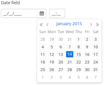
XML name of the component: dateField.
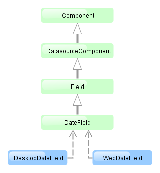
The DateField component is implemented for Web Client and Desktop Client.
-
To create a date field associated with data, you should use the datasource and property attributes:
<dsContext>
    <datasource id="orderDs" class="com.sample.sales.entity.Order" view="_local"/>
</dsContext>
<layout>
    <dateField datasource="orderDs" property="date"/>
In the example above, the screen has an
orderDsdata source for an Order entity, which has thedateproperty. In the date component, you should specify a link to a data source as datasource and a name of an entity attribute (which value should be displayed in the field) as property. -
If the field is associated with an entity attribute, it will automatically take the appropriate form:
-
If the attribute has the
java.sql.Datetype or the@Temporal(TemporalType.DATE)annotation is specified, the time field will not be displayed. The date format is defined by thedatedatatype and is specified in the main localized message pack in thedateFormatkey. -
Otherwise, the time field with hours and minutes will be displayed. The time format is defined by the
timedatatype and is specified in the main localized message pack in thetimeFormatkey.
-
-
You can change the date and time format using the
dateFormatattribute. An attribute value can be either a format string itself or a key in a message pack (if the value starts withmsg://).The format is defined by rules of the
SimpleDateFormatclass (http://docs.oracle.com/javase/7/docs/api/java/text/SimpleDateFormat.html). If there are noHorhcharacters in the format, the time field will not be displayed.<dateField dateFormat="MM/yy" caption="msg://monthOnlyDateField"/>

-
Date and time accuracy can be defined using a
resolutionattribute. An attribute value should match theDateField.Resolutionenumeration −SEC,MIN,HOUR,DAY,MONTH,YEAR. Default isMIN, i.e., to within a minute.If
resolution="DAY"anddateFormatis not specified, the format will be taken from one specified in the main message pack with thedateFormatkey.If
resolution="MIN"anddateFormatis not specified, the format will be taken from one specified in the main message pack with thedateTimeFormatkey. Below is a field definition for entering a date up to within a month.<dateField resolution="MONTH" caption="msg://monthOnlyDateField"/>
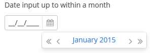
-
DateFieldcan perform timestamp value conversions between server and user time zones if the user's time zone is set bysetTimeZone()method. The time zone is assigned automatically from the current user session when the component is bound to an entity attribute of the timestamp type. If the component is not bound to such attribute, you can callsetTimeZone()in the screen controller to make theDateFieldperform required conversions.
.
DateField is primarily intended for quick input by filling placeholders from keyboard.
Therefore the component supports only formats with digits and separators. Complex formats with textual
representation of weekdays or months will not work.
dateField attributes:
| align | description | id | resolution |
| caption | editable | property | stylename |
| datasource | enable | required | visible |
| dateFormat | height | requiredMessage | width |
dateField elements:
Embedded component is intended for displaying images and embedding optional web pages into the screen.
XML name of the component: embedded
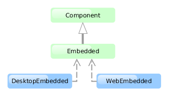
The component is implemented for Web Client and Desktop Client. Desktop Client supports image display only.
Below is an example of using the component to display an image from a file located in FileStorage.
-
Declare the component in an XML screen descriptor:
<groupBox caption="Embedded" spacing="true" height="250px" width="250px" expand="embedded"> <embedded id="embedded" width="100%" align="MIDDLE_CENTER"/> </groupBox> -
In a screen controller, inject the component itself, and the
FileStorageServiceinterface. Ininit()method, get theFileDescriptorpassed from the calling code, upload the corresponding file as a byte array, create aByteArrayInputStreamfor it, and pass it to thesetSource()method of the component:@Inject private Embedded embedded; @Inject private FileStorageService fileStorageService; @Override public void init(Map<String, Object> params) { FileDescriptor imageFile = (FileDescriptor) params.get("imageFile"); byte[] bytes = null; if (imageFile != null) { try { bytes = fileStorageService.loadFile(imageFile); } catch (FileStorageException e) { showNotification("Unable to load image file", NotificationType.HUMANIZED); } } if (bytes != null) { embedded.setSource(imageFile.getName(), new ByteArrayInputStream(bytes)); embedded.setType(Embedded.Type.IMAGE); } else { embedded.setVisible(false); } }
Web Client allows image output from any files available to the Web Client block. Define the resource files directory in cuba.web.resourcesRoot application property, and specify the name of the file inside this directory for the Embedded component
embedded.setSource("my-logo.png")
Pass the URL to the component to embed an external web page into the screen:
try {
    embedded.setSource(new URL("http://www.cuba-platform.com"));
} catch (MalformedURLException e) {
    throw new RuntimeException(e);
}
embedded attributes:
FieldGroup is intended for the joint display and editing of multiple entity attributes.
XML-name of the component: fieldGroup
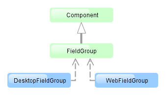
The component is implemented for Web Client and Desktop Client.
Below is an example of describing a group of fields in an XML screen descriptor:
<dsContext>
    <datasource id="orderDs"
                class="com.sample.sales.entity.Order"
                view="orderWithCustomer">
    </datasource>
</dsContext>
<layout>
    <fieldGroup id="orderFieldGroup" datasource="orderDs" width="250px">
        <field id="date"/>
        <field id="customer"/>
        <field id="amount"/>
    </fieldGroup>
In the example above, dsContext defines an orderDs data source, which contains a single instance of the Order entity. For the fieldGroup component, you should specify a data source in datasource attribute. Entity attributes containing in the data source, which you need to display, should be specified in field elements.
fieldGroup elements:
-
column– optional element that allows you to position fields in multiple columns. For this purpose,fieldelements should be placed not immediately withinfieldGroup, but within itscolumn. For example:<fieldGroup id="orderFieldGroup" datasource="orderDs" width="100%"> <column width="250px"> <field id="num"/> <field id="date"/> <field id="amount"/> </column> <column width="400px"> <field id="customer"/> <field id="info"/> </column> </fieldGroup>In this case, fields will be arranged in two columns; the first column will contain all fields with the width of
250px, the second one with the width of400px.columnmay have the following attributes:-
width– specifies the field width of a column. By default, fields have the width of200px. In this attribute, the width can be specified both in pixels and in percentage of the total horizontal width of the column. -
flex– a number, which indicates the degree of horizontal change in the overall size of the column relative to other columns as a result of changing the entire width offieldGroup. For example, you can specifyflex=1for a column, andflex=3for another one. -
id– an optional column identifier, which allows you to refer to it in case of screen extension.
-
-
field– main component element. It describes one component field.Attributes of
field:-
id– required attribute; it should contain either an entity attribute name, which is displayed in the field, or an arbitrary unique identifier of a programmatically defined field. In the latter case,fieldshould havecustom="true"as well (see below). -
caption− allows you to specify a field caption. If not specified, an entity attribute localized name will be displayed. -
visible− allows you to hide the field together with the caption. -
datasource− allows you to specify a data source for the field, other than specified for the entirefieldGroupcomponent. Thus, attributes of different entities can be displayed in a field group. -
optionsDatasourcespecifies a name of a data source, used to create a list of options. You can specify this attribute for a field related to a reference entity attribute. By default, the selection of a related entity is made through a selection screen. IfoptionsDatasourceis specified, you can select the related entity from a drop-down list of options. Actually, specifyingoptionsDatasourcewill lead to the fact that LookupPickerField will be used in the field instead of PickerField. -
width− allows you to specify the field width excluding caption. By default, the field width will be200px. The width can be specified both in pixels and in percentage of the total horizontal width of the column. To specify the width of all fields simultaneously, you can use thewidthattribute ofcolumn, described above. -
custom– if set totrue, it means that a field identifier does not refer to an entity attribute, and a component, which is in the field, will be set programmatically usingaddCustomField()method ofFieldGroup(see below). -
link- if set totrue, allows displaying a link to an entity editor instead of an entity picker field (supported for Web Client only). Such behaviour may be required when the user should be able to view the related entity, but should not change the relationship. -
linkScreen- contains the identifier of the screen that is opened by clicking the link, enabled in thelinkattribute. -
linkScreenOpenType- sets the screen opening mode (THIS_TAB,NEW_TABorDIALOG). -
linkInvoke- contains the controller method to be invoked instead of opening the screen.
The following attributes of
fieldcan be applied depending on an entity attribute type, which is displayed in the field:-
If you specify a value of the
maskattribute for a text entity attribute, MaskedField with an appropriate mask will be used instead of TextField. In this case, you can also specify thevalueModeattribute. -
If you specify a value of the
rowsattribute for a text entity attribute, TextArea with an appropriate number of rows will be used instead of TextField. In this case, you can also specify thecolsattribute. -
For a text entity attribute, you can specify the
maxLengthattribute similarly to one described for TextField. -
For an entity attribute of the
dateordateTimetype, you can specify thedateFormatandresolutionfor the parameterization of the DateField component located in the field. -
For an entity attribute of the
timetype, you can specify theshowSecondsattribute for the parameterization of the TimeField component located in the field.
-
fieldGroup attributes:
Methods of the FieldGroup interface:
-
addCustomField()is used together with thecustom="true"attribute offieldand it allows you to set your own field view. It takes two parameters: field identifier specified in theidattribute offieldand the implementation of theFieldGroup.CustomFieldGeneratorinterface.generateField()of theCustomFieldGeneratorinterface is invoked byFieldGroup. A data source and field identifier, for which this generator is registered, are passed into the method. The method should return a visual component (or container), which will be displayed in the field.Example:
@Inject protected FieldGroup fieldGroup; @Inject protected ComponentsFactory componentsFactory; @Override public void init(Map<String, Object> params) { fieldGroup.addCustomField("password", new FieldGroup.CustomFieldGenerator() { @Override public Component generateField(Datasource datasource, String propertyId) { PasswordField passwordField = componentsFactory.createComponent(PasswordField.NAME); passwordField.setDatasource(datasource, propertyId); return passwordField; } }); } -
getFieldComponent()returns a visual component, which is located in a field with the specified identifier. This may be required for additional component parameterization, which is not available through XML attributes offielddescribed above.To obtain a reference to a field component in a screen controller, you can use injection instead of the explicit invocation of
getFieldComponent(). To do this, use the@Namedannotation with the indication of an identifier offieldGroupand a field identifier after a dot.For example, in the field to select a related entity, you can add an action to open an instance and remove the field cleaning action as follows:
<fieldGroup id="orderFieldGroup" datasource="orderDs">
    <field id="date"/>
    <field id="customer"/>
    <field id="amount"/>
</fieldGroup>
@Named("orderFieldGroup.customer") protected PickerField customerField; @Override public void init(Map<String, Object> params) { customerField.addOpenAction(); customerField.removeAction(customerField.getAction(PickerField.ClearAction.NAME)); }To use
getFieldComponent()or to inject field components, you need to know which component type is located in the field. The table below shows the matching of entity attribute types and components created for them:Entity attribute type Additional conditions Field component type Related Entity optionsDatasourceis specifiedLookupPickerField PickerField Enumeration ( enum)LookupField stringmaskis specifiedMaskedField rowsis specifiedTextArea TextField booleanCheckBox date,dateTimeDateField timeTimeField int,long,double,decimalTextField
All fieldGroup attributes:
All field attributes:
field elements:
column attributes:
The FileMultiUploadField component allows a user to upload files to a server. The component is a button; when it is clicked, the screen will show a standard OS file picker window where you can select multiple files for upload.
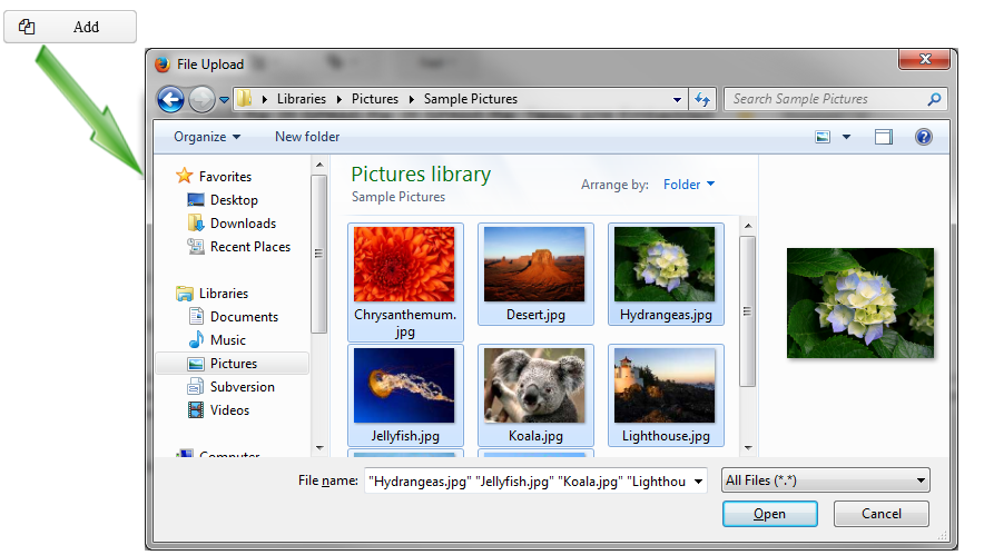
XML name of the component: multiUpload.
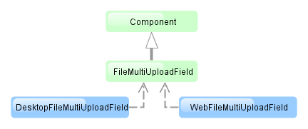
The component is implemented for Web Client and Desktop Client. For the operation of component web version, a browser should support the Flash technology.
Below is an example of using the component.-
Declare the component in an XML screen descriptor:
<multiUpload id="multiUploadField" caption="msg://upload"/>
-
In the screen controller, inject the component itself, and the FileUploadingAPI and DataSupplier interfaces. Then, in
init()add a listener to the component, which will react to successful upload events or errors:@Inject protected FileMultiUploadField multiUploadField; @Inject protected FileUploadingAPI fileUploading; @Inject protected DataSupplier dataSupplier; @Override public void init(Map<String, Object> params) { multiUploadField.addListener(new FileMultiUploadField.UploadListener() { @Override public void queueUploadComplete() { Map<UUID, String> uploadMap = multiUploadField.getUploadsMap(); for (Map.Entry<UUID, String> entry : uploadMap.entrySet()) { UUID fileId = entry.getKey(); String fileName = entry.getValue(); FileDescriptor fd = fileUploading.getFileDescriptor(fileId, fileName); // save file to FileStorage try { fileUploading.putFileIntoStorage(fileId, fd); } catch (FileStorageException e) { new RuntimeException(e); } // save file descriptor to database dataSupplier.commit(fd, null); } multiUploadField.getUploadsMap().clear(); } }); }The component will invoke
queueUploadComplete()after uploading all selected files to a temporary storage of the client tier. At this point, by invokinggetUploadsMap()you can get a map of temporary storage file identifiers to file names. Then, for each file, a correspondingFileDescriptorobject is created based on this data.com.haulmont.cuba.core.entity.FileDescriptor(do not confuse withjava.io.FileDescriptor) is a persistent entity, which uniquely identifies an uploaded file and then is used to download the file from the system.FileUploadingAPI.putFileIntoStorage()is used to move the uploaded file from the temporary client storage to FileStorage. Parameters of this method are temporary storage file identifier and theFileDescriptorobject.After uploading the file to
FileStorage, theFileDescriptorinstance is saved in a database by invokingDataSupplier.commit(). The saved instance returned by this method can be set to an attribute of an entity related to this file. In this case,FileDescriptoris simply stored in the database and gives access to the file through the -> screen.After processing, the list of files should be cleared via the
clearUploads()method in order to prepare for further uploads. -
Maximum upload size is determined by the cuba.client.maxUploadSizeMb application property and is equal to 20Mb by default. If a user selects a file of a larger size, a corresponding message will be displayed and the upload will be interrupted.
multiUpload attributes:
The FileUploadField component allows a user to upload files to a server. The component is a
button; when it is clicked, the screen will show a standard OS file picker window where you can select one file.
To allow a user to upload multiple files, use FileMultiUploadField.
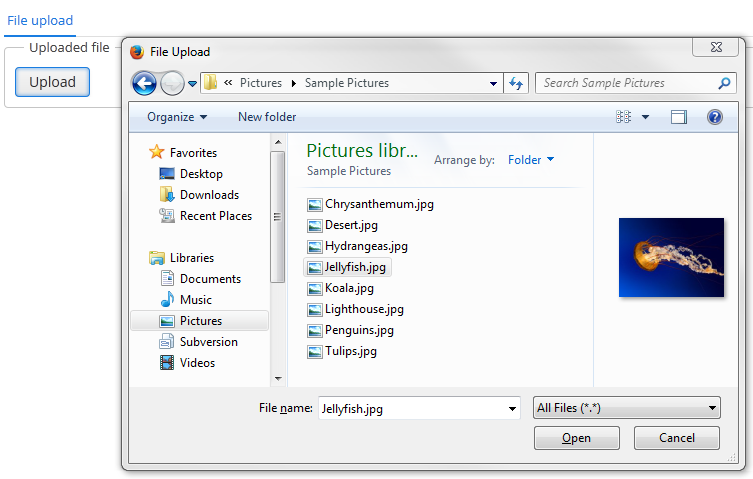
XML name of the component: upload.
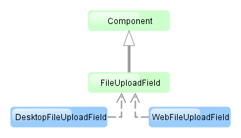
The component is implemented for Web Client and Desktop Client.
Below is an example of using the component.-
Declare the component in an XML screen descriptor:
<upload id="uploadField" caption="msg://upload"/>
-
In the screen controller, inject the component itself, and the FileUploadingAPI and DataSupplier interfaces. Then, in
init()add a listener to the component, which will react on successful upload events or errors:@Inject protected FileUploadField uploadField; @Inject protected FileUploadingAPI fileUploading; @Inject protected DataSupplier dataSupplier; @Override public void init(Map<String, Object> params) { uploadField.addListener(new FileUploadField.ListenerAdapter() { @Override public void uploadSucceeded(Event event) { FileDescriptor fd = uploadField.getFileDescriptor(); try { // save file to FileStorage fileUploading.putFileIntoStorage(uploadField.getFileId(), fd); } catch (FileStorageException e) { throw new RuntimeException(e); } // save file descriptor to database dataSupplier.commit(fd, null); showNotification("File uploaded: " + uploadField.getFileName(), NotificationType.HUMANIZED); } @Override public void uploadFailed(Event event) { showNotification("File upload error", NotificationType.HUMANIZED); } }); }The component will invoke
uploadSucceeded()after uploading the file to a temporary storage of the client tier. At this point, you can get component’sFileDescriptorobject, which corresponds to the uploaded file.com.haulmont.cuba.core.entity.FileDescriptor(do not confuse withjava.io.FileDescriptor) is a persistent entity, which uniquely identifies an uploaded file and then is used to download the file from the system.FileUploadingAPI.putFileIntoStorage()method is used to move the uploaded file from the temporary client level storage to FileStorage. Parameters of this method are temporary storage file identifier and theFileDescriptorobject. Both of these parameters are provided byFileUploadField.After uploading the file to
FileStoragetheFileDescriptorinstance is saved in a database by invokingDataSupplier.commit(). The saved instance returned by this method can be set to an attribute of an entity related to this file. In this case,FileDescriptoris simply stored in the database and gives access to the file through the -> screen.uploadFailed()will be invoked by theFileUploadFieldcomponent if an error occurs when uploading a file to the temporary storage of the client level. -
Maximum upload size is determined by the cuba.client.maxUploadSizeMb application property and is equal to 20Mb by default. If a user selects a file of a larger size, a corresponding message will be displayed and the upload will be interrupted.
upload attributes:
The Filter is a versatile tool for filtering lists of entities extracted from a database to display in a tabular form. The component enables quick data filtering by arbitrary conditions, as well as creating filters for repeated use.
Filter should be connected to the collectionDatasource containing a JPQL query. Its logic is based on the modification of this query in accordance with criteria provided by the user. Thus, filtering is done at the database level on the execution of the query translated from JPQL to SQL, and only selected data is loaded to the Middleware and Client tiers.
A typical filter is shown below:
By default, the component is in quick filter mode. This means that a user can add a set of conditions for a one-off data search. After the screen is closed, the conditions will disappear.
To create a quick filter, click link. The condition selection screen will be displayed:
Possible condition types are described below:
-
Attributes – attributes of this entity and related entities. Only persistent attributes are displayed. They should also either be explicitly set in the
propertyelement of the filter XML descriptor, or comply with the rules specified in thepropertieselement (see below). -
Custom conditions – conditions specified by developer in the
customelements of the filter XML descriptor. -
Create new... – allows creating a new arbitrary JPQL condition. This option is only available to users having the specific
cuba.gui.filter.customConditionspermission.
Selected conditions are displayed at the top of the filter panel. The  icon will appear next to each condition field, allowing them to be removed from the set.
Quick filters can be saved for further re-use. In order to save a quick filter, click the filter settings icon, select and provide a new filter name in the popup dialog:
After that, the filter will be saved and will appear in the drop-down menu of the button.
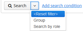
The filter settings popup button provides the list of options for filter management:
-
– save changes to the current filter.
-
– save the filter under a new name.
-
– open the filter editor (see below).
-
– make the filter default for this screen. The filter will be automatically displayed on the filter panel when the screen is opened.
-
– delete the current filter.
-
– use the results of the last search for sequential data filtering (see Section 4.5.2.1.9.5, “Applying Filters Sequentially”).
-
– create a search folder based on the current filter.
-
– create an application folder based on the current filter. This option is available to users having the specific
cuba.gui.appFolder.globalpermission only.
The option opens the filter editor, allowing advanced configuration of the current filter:
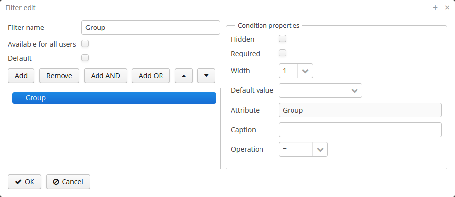
Filter name should be provided in the Name field. This name will be displayed in available filters list for the current screen.
Filter can be made global (i.e., available for all users) using the Available to all users checkbox, or default using the Default checkbox.
The filter conditions are contained in the tree. They can be added using the button, swapped using  /
/ or removed using the button.
AND or OR grouping conditions can be added with the help of the corresponding buttons. All top level conditions (i.e., without explicit grouping) are joined with AND.
Selecting a condition in the tree opens the list of its properties in the right part of the editor.
The conditions can be made hidden or required by means of corresponding checkboxes. The hidden condition parameter is invisible to the user, so it should be provided when the filter is being edited.
Width property allows selecting the width of the parameter field on the filter panel for the current condition. By default, conditions on the filter panel are displayed in three columns. The field width equals to the number of columns it will occupy (1, 2 or 3).
Default parameter value for the current condition can be selected in the Default value field.
A custom caption for filter condition can be provided in the Caption field.
Operation field allows selecting the condition operator. The list of available operators depends on the attribute type.
If filter has not been previously saved, clicking OK in the filter editor saves the changes to the filter only for the current search. In order to keep them for further use, click the button and Save/Save as. Otherwise, all changes will disappear once the screen is closed.
XML name of the component: filter.
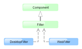
The component is implemented for Web Client and Desktop Client.
An example of component declaration in XML screen descriptor is shown below:
<dsContext>
    <collectionDatasource id="carsDs" class="com.company.sample.entity.Car" view="carBrowse">
        <query>
            select c from ref$Car c order by c.createTs
        </query>
    </collectionDatasource>
</dsContext>
<layout>
    <filter id="carsFilter" datasource="carsDs">
        <properties include=".*"/>
    </filter>
    <table id="carsTable" width="100%">
        <columns>
            <column id="vin"/>
            <column id="model.name"/>
            <column id="colour.name"/>
        </columns>
        <rows datasource="carsDs"/>
    </table>
</layout>
In the example above, a collectionDatasource is defined in the dsContext. The datasource selects Car entity instances using JPQL query. The datasource which is to be filtered is specified in the filter component’s datasource attribute. Data is displayed using the Table component, which is connected to the same data source.
filter may contain nested elements. They describe conditions available for user selection in dialog:
-
properties– multiple entity attributes can be made available for selection. This element has the following attributes:Example:
<filter id="transactionsFilter" datasource="transactionsDs">
    <properties include=".*" exclude="(masterTransaction)|(authCode)"/>
</filter>
The following entity attributes are ignored when
propertieselement is used:-
Collections (
@OneToMany,@ManyToMany). -
Attributes which do not have localized names.
-
The
versionattribute.
-
-
property– explicitly includes an entity attribute by name. This element has the following attributes:-
name– rrequired attribute, containing the name of entity attribute to be included. It can be a path (using ".") in the entity graph. For example:<filter id="transactionsFilter" datasource="transactionDs" applyTo="table"> <properties include=".*" exclude="(masterTransaction)|(authCode)"/> <property name="creditCard.maskedPan" caption="msg://EmbeddedCreditCard.maskedPan"/> <property name="creditCard.startDate" caption="msg://EmbeddedCreditCard.startDate"/> </filter> -
caption– localized entity attribute name displayed in filter conditions. Generally it is a string with themsg://prefix in accordance with MessageTools.loadString() rules.If the
nameattribute is specified as an entity graph path (using ".") , thecaptionattribute is required. -
paramWhere− specifies the JPQL expression which is used to select the list of condition parameter values if the parameter is a related entity. The{E}placeholder should be used in the expression instead of the alias of the entity being selected.For example, let us assume that
Carhas a reference toModel. Then possible condition parameter values list can be limited toAudimodels only:<filter id="carsFilter" datasource="carsDs"> <property name="model" paramWhere="{E}.manufacturer = 'Audi'"/> </filter>Screen parameters, session attributes and screen components including those showing other parameters can be used in JPQL expression. Query parameters specification rules are described in Section 4.5.3.2, “CollectionDatasourceImpl Queries”.
An example of session and screen parameters usage is shown below:
{E}.createdBy = :session$userLogin and {E}.name like :param$groupNameWith the
paramWhereclause, you can introduce dependencies between parameters. For example, let us assume thatManufactureris a separate entity. That isCarhas a reference toModelwhich in turn has a reference toManufacturer. Then you may want to create two conditions for the Cars filter: first to select a Manufacturer and second to select a Model. To restrict the list of models by previously selected manufacturer, add a parameter to theparamWhereexpression:{E}.manufacturer.id = :component$filter.model_manufacturer90062The parameter references a component which displays Manufacturer parameter. You can see the name of the component showing condition parameter by opening context menu on a condition table row in the filter editor:
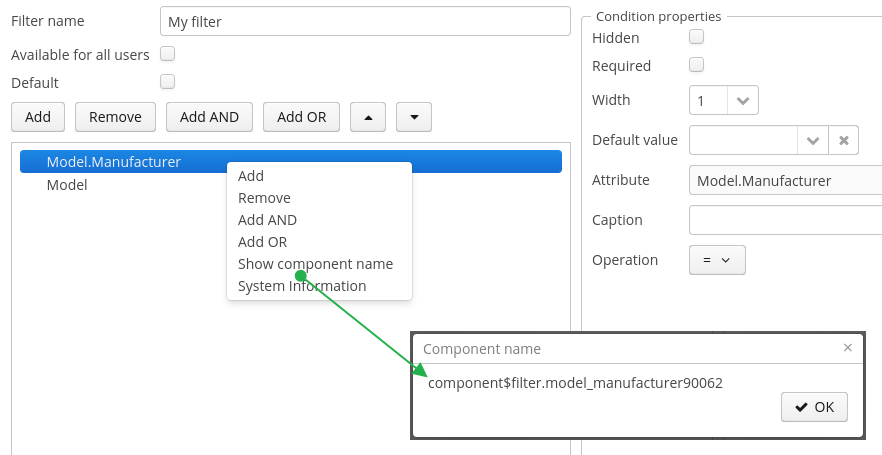
-
paramView− specifies a view, which will be used to load the list of condition parameter values if the parameter is a related entity. For example,_local. If view is not specified,_minimalview will be used.
-
-
custom– the element defining an arbitrary condition. The element content should be a JPQL expression (JPQL Macros can be used), which will be added to the data source query'swhereclause. The{E}placeholder should be used in the expression instead of the alias of the entity being selected. The condition can only have one parameter denoted by "?" if used.An example of a filter with arbitrary conditions is shown below:
<filter id="carsFilter" datasource="carsDs"> <properties include=".*"/> <custom name="vin" paramClass="java.lang.String" caption="msg://vin"> {E}.vin like ? </custom> <custom name="colour" paramClass="com.company.sample.entity.Colour" caption="msg://colour" inExpr="true"> ({E}.colour.id in (?)) </custom> <custom name="repair" paramClass="java.lang.String" caption="msg://repair" join="join {E}.repairs cr"> cr.description like ? </custom> <custom name="updateTs" caption="msg://updateTs"> @between({E}.updateTs, now-1, now+1, day) </custom> </filter>customconditions are displayed in the Custom conditions section of the dialog: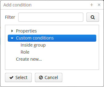
customattributes:-
caption− required attribute, localized condition name. Generally it is a string with themsg://prefix in accordance with MessageTools.loadString() rules. -
paramClass− Java class of the condition parameter. If the parameter is not specified, this attribute is optional. -
inExpr− should be set totrue, if the JPQL expression containsin (?)conditions. In this case user will be able to enter several condition parameter values. -
join− optional attribute. It specifies a string, which will be added to the data source queryfromsection. This can be required to create a complex condition based on an attribute of a related collection.joinorleft joinstatements should be included into the attribute value.For example, let us assume that the
Carentity has arepairsattribute, which is a related entityRepairinstances collection. Then the following condition can be created to filterCarbyRepairentity'sdescriptionattribute:<filter id="carsFilter" datasource="carsDs"> <custom name="repair" caption="msg://repair" paramClass="java.lang.String" join="join {E}.repairs cr"> cr.description like ? </custom> </filter>If the condition above is used, the original data source query
select c from sample$Car c order by c.createTs
will be transformed into the following one:
select c from sample$Car c join c.repairs cr
where (cr.description like ?)
order by c.createTs
-
paramWhere− specifies a JPQL expression used to select the list of condition parameter values if the parameter is a related entity. See the description of thepropertyelement's attribute of the same name. -
paramView− specifies a view, which will be used when a list of condition parameter values are loaded if the parameter is a related entity. For example,_local. If it is not specified,_minimalview will be used.
filter attributes:
-
editable– if the attribute value isfalse, the option is disabled. -
required– if the attribute value istrue, user should select one of available filters. If no default filter is set for the screen, the first created filter will be automatically selected in the filter list. -
manualApplyRequired− defines when the filter will be applied. If the attribute value isfalse, the filter will be applied when the screen is opened. If the value istrue, the filter will be applied only after the button is clicked. This attribute takes precedence over the cuba.gui.genericFilterManualApplyRequired application property. -
useMaxResults− limits the page size of entity instances loaded into the data source. It is set totrueby default.If the attribute value is
false, the filter will not show the Show rows field. The number of records in the data source (and displayed in the table accordingly) will be limited only by theMaxFetchUIparameter of theentity statistics, which is set to 10000 by default.If the attribute is not specified or is
true, the Show rows field will be displayed only if the user has specificcuba.gui.filter.maxResultspermission. If thecuba.gui.filter.maxResultspermission is not granted, the filter will force selecting only the first N rows without user to be able to disable it or specify another N. N is defined byFetchUI,DefaultFetchUIparameters. They are obtained from the entity statistics mechanism.A filter shown below has the following parameters:
useMaxResults="true", specific permission is denied, andcuba.gui.filter.maxResultsDefaultFetchUI = 2.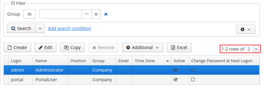
-
textMaxResults- enables using the text field instead of the drop-down list as the Show rows field.falseby default. -
folderActionsEnabled− if it is set tofalse, the following filter actions will be hidden: Save as Search Folder, Save as Application Folder. By default, the attribute value istrue, and Save as Search Folder, Save as Application Folder are available. -
applyTo− optional attribute, contains the identifier of a component associated with the filter. It is used when access to related component views is required. For example, when saving the filter as a search folder or as an application folder, the view that will be applied when browsing this folder can be specified.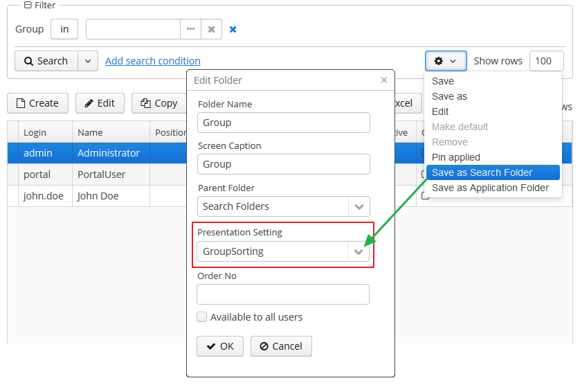
-
caption- allows setting a custom caption for the filter panel. -
columnsQty- defines the number of columns for conditions on the filter panel. Default value is 3.
All filter attributes:
| applyTo | datasource | folderActionsEnabled | margin |
| caption | editable | id | required |
| columnsQty | enable | manualApplyRequired | stylename |
| useMaxResults | visible |
filter elements:
properties attributes:
property attributes:
custom attributes:
-
o To create/change/delete global (available to all users) filters, user must have the cuba.gui.filter.global permission.
-
To create/change
customconditions user must have a cuba.gui.filter.customConditions permission. -
To change the maximum number of rows per table page using the Show rows field, user must have the cuba.gui.filter.maxResults permission. See also the useMaxResults filter attribute.
For specific permissions configuration information, see Chapter 7, Security Subsystem.
System-wide parameters
The following application properties affect filter behavior:
-
cuba.gui.genericFilterManualApplyRequired − disables automatic applying of the filter (i.e., data loading) when the screen is opened.
-
cuba.gui.genericFilterChecking − enables the check that at least one condition is filled before applying the filter.
-
cuba.gui.genericFilterControlsLayout − defines an internal layout of the filter controls.
-
cuba.allowQueryFromSelected enables sequential filters application mechanism.
-
cuba.gui.genericFilterColumnsQty - sets the default number of columns for placing conditions on the filter panel.
-
cuba.gui.genericFilterConditionsLocation - defines the location of the conditions panel.
-
cuba.gui.genericFilterPopupListSize - defines the maximum number of items displayed in the popup list of the button.
Screen invocation parameters
It is possible to specify the filter and parameters which should be applied when the screen is opened. For this purpose, the filter should be created in advance, stored in the database, and a corresponding entry in the SEC_FILTER table should have the CODE field set.
To specify a filter code, pass to the screen a parameter with the same name as filter component identifier in this screen . Parameter value should be the code of the filter, which should be set and applied.
To set filter parameter values, passed to the screen parameters with the names equal to parameter names and their values in string format.
An example of main menu item descriptor is shown below. It sets a filter with the FilterByVIN code to the carsFilter component of the sample$Car.browse screen which it opens. It also sets TMA value to the $carsFilter.vin79216 condition:
<item id="sample$Car.browse">
    <param name="carsFilter" value="FilterByVIN"/>
    <param name="component$carsFilter.vin79216" value="TMA"/>
</item>
It should be noted that that a filter with a defined CODE field has some specifics:
-
It cannot be edited by users.
-
This filter name can be displayed in several languages. To achieve this, specify a string with key equal to the filter code in the application main message pack.
Applying Filters Sequentially
If the cuba.allowQueryFromSelected application property is enabled, the last applied filter and the current filtered results can be pinned via the component's user interface. After that another filter or other parameters of the current filter can be selected and applied to the currently selected records.
This approach helps to achieve two aims:
-
Decompose complex filters, which may lead to better performance as well.
-
Apply filters to the records selected using application or search folders.
Take the following steps to use sequential filters. First, choose and apply one of the filters. Next click the filter settings button and select . The filter will be pinned at the top of the filter panel. Then another filter can be applied to the selected records and so on. Any number of filters can be applied sequentially. Filters can also be removed using  .
.
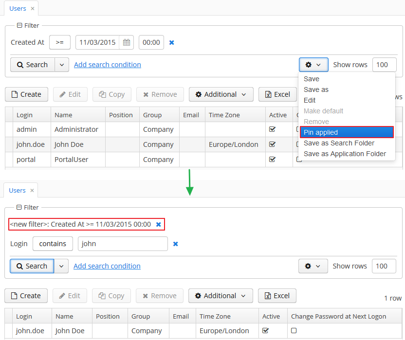
The sequential filters implementation is based on the ability of DataManager to run sequential queries.
GroupTable component is a table with an ability to group information dynamically by any field. In order to group a table by a column the required column should be dragged to the left and dropped on the  element of the table header. Grouped values can be expanded and collapsed using
  /
/ .
.
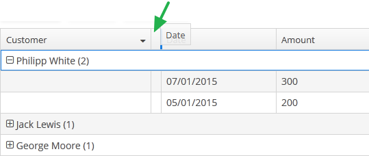
XML name of the component: groupTable.
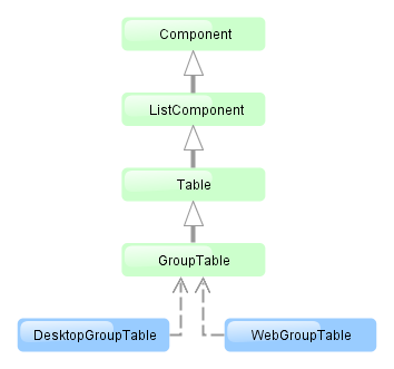
Component is implemented only for Web Client. In Desktop Client it behaves like a regular table.
groupDatasource must be specified for GroupTable in the datasource attribute of the rows element. Otherwise, grouping will not work. Example:
<dsContext>
    <groupDatasource id="ordersDs" class="com.sample.sales.entity.Order"
                     view="orderWithCustomer">
        <query>
            select o from sales$Order o order by o.date
        </query>
    </groupDatasource>
</dsContext>
<layout>
    <groupTable id="ordersTable" width="100%">
        <columns>
            <group>
                <column id="date"/>
            </group>
            <column id="customer.name"/>
            <column id="amount"/>
        </columns>
        <rows datasource="ordersDs"/>
    </groupTable>
group is an optional element that can be present in a single instance inside columns. It contains a set of column elements, by which grouping will be performed initially when opening a screen.
If aggregatable attribute is true, the table shows aggregation results for each group and results for all rows in an additional row on the top. If showTotalAggregation attribute is false, results for all rows are not shown.
The rest of the GroupTable functionality is similar to a simple Table.
groupTable attributes:
| allowPopupMenu | height | reorderingAllowed | width |
| columnControlVisible | id | sortable | |
| editable | multiselect | stylename | |
| enable | presentations | visible |
groupTable elements:
columns elements:
column attributes:
| caption | dateFormat | resolution | |
| captionProperty | editable | visible | |
| clickAction | id | width | |
| collapsed | optionsDatasource |
column elements:
rows attributes:
Label is a text component that displays static text or value of entity attribute.
XML name of the component: label
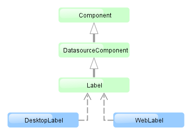
The Label component is implemented for Web Client and Desktop Client.
Below is an example of setting a label with text taken from the localized message pack:
<label value="msg://orders"/>
The value attribute sets text for a label.
In a web client, the text contained in value will be split into multiple lines if its length exceeds the width value. Therefore, to display a multiline label, it is sufficient to specify an absolute value of width. If the label text is too long and the value of width is not specified, the text will be truncated.
<label value="Label, which should be split into multiple lines"
       width="200px"/>
You can set label parameters in the screen controller. To do this, you should specify a component identifier to get a reference to it in the controller:
<label id="dynamicLabel"/>
@Inject
private Label dynamicLabel;

public void init(Map<String, Object> params) {
    dynamicLabel.setValue("Some value");
}
The Label component can display value of an entity attribute. For this purpose, datasource and property attributes are used. For example:
<dsContext>
    <datasource id="customerDs" class="com.sample.sales.entity.Customer" view="_local"/>
</dsContext>
<layout>
    <label datasource="customerDs" property="name"/>
In the example above, component displays the name attribute of the Customer entity located in the customerDs data source.
htmlEnabled attribute indicates the way the value attribute will be interpreted: if htmlEnabled="true", the attribute will be treated as HTML code, otherwise as string. Note that the desktop implementation of the screen will not support all html tags.
label attributes:
label elements:
Link is a hyperlink, which allows uniform opening of external web resources for the Web and Desktop client.
XML-name of the component: link
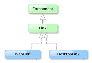
An example of XML-description for link:
<link caption="Link" url="https://www.cuba-platform.com" target="_blank"/>
link attributes:
-
url– the URL of the web resource. -
target– sets the web page opening mode for the Web Client, similar to thetargetattribute of the<a>HTML element.
Additional link attributes:
align |
caption |
description |
enable |
id |
icon |
stylename |
visible |
width
LinkButton is a button that looks like a hyperlink.
XML name of the component: linkButton
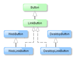
The link button component is implemented for Web Client and Desktop Client.
The link button can contain text or icon (or both). The figure below shows different types of buttons.
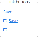
The link button differs from regular Button only in its appearance. All properties and behavior are identical to those described for Button.
Below is an example of XML description of a link button that invokes the someMethod() method of a controller with caption (the caption attribute), tooltip (the description attribute) and icon (the icon attribute):
<linkButton id="linkButton"
            caption="msg://linkButton"
            description="Press me"
            icon="icons/save.png"
            invoke="someMethod"/>
linkButton attributes:
This is a component to select a value from drop-down list. Drop-down list provides the filtering of values as the user inputs some text, and the pagination of available values.
XML name of the component: lookupField.
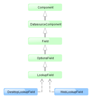
The LookupField component is implemented for Web Client and Desktop Client.
-
The simplest case of using
LookupFieldis to select an enumeration value for an entity attribute. For example, aRoleentity has atypeattribute of theRoleTypetype, which is an enumeration. Then you can useLookupFieldto edit this attribute as follows:<dsContext> <datasource id="roleDs" class="com.haulmont.cuba.security.entity.Role" view="_local"/> </dsContext> <layout> <lookupField datasource="roleDs" property="type"/>In the example above, the screen defines
roleDsdata source for theRoleentity. In thelookupFieldcomponent, you should specify a link to a data source in the datasource attribute, and a name of an entity attribute, which value should be displayed in the property attribute. In this case, the attribute is an enumeration and the drop-down list will display localized names of all enumeration values. -
Similarly,
LookupFieldcan be used to select an instance of a related entity. optionsDatasource attribute is used to create a list of options:<dsContext> <datasource id="carDs" class="com.company.sample.entity.Car" view="_local"/> <collectionDatasource id="coloursDs" class="com.company.sample.entity.Colour" view="_local"> <query>select c from sample$Colour c</query> </collectionDatasource> </dsContext> <layout> <lookupField datasource="carDs" property="colour" optionsDatasource="coloursDs"/>In this case, the component will display instance names of the
Colourentity located in thecolorsDsdata source, and the selected value will be put into thecolourattribute of theCarentity, which is located in thecarDsdata source.captionProperty attribute defines which entity attribute can be used instead of an instance name for string option names.
-
The list of component options can be specified arbitrarily using
setOptionsList()andsetOptionsMap(), or using an XMLoptionsDatasourceattribute.-
setOptionsList()allows you to programmatically specify a list of component options. To do this, declare a component in the XML descriptor:<lookupField id="numberOfSeatsField" datasource="modelDs" property="numberOfSeats"/>
Then inject the component into the controller and specify a list of options in the
init()method:@Inject protected LookupField numberOfSeatsField; @Override public void init(Map<String, Object> params) { List<Integer> list = new ArrayList<>(); list.add(2); list.add(4); list.add(5); list.add(7); numberOfSeatsField.setOptionsList(list); }In the dropdown list of the component values 2, 4, 5 and 7 will be displayed. Selected number will be put into the
numberOfSeatsattribute of an entity located in themodelDsdata source. -
setOptionsMap()allows you to specify string names and option values separately. For example, in thenumberOfSeatsFieldcomponent in the XML descriptor, specify an option map ininit():@Inject protected LookupField numberOfSeatsField; @Override public void init(Map<String, Object> params) { Map<String, Object> map = new LinkedHashMap<>(); map.put("two", 2); map.put("four", 4); map.put("five", 5); map.put("seven", 7); numberOfSeatsField.setOptionsMap(map); }In the drop down list of the component,
two,four,five,sevenstrings will be displayed. However, the value of the component will be a number that corresponds to the selected row. It will be put into thenumberOfSeatsattribute of an entity located in themodelDsdata source.
-
-
Using the
filterModeattribute, option filtering type can be defined for the user input:-
NO− no filtering. -
STARTS_WITH− by the beginning of a phrase. -
CONTAINS− by any occurrence (is used by default).
-
-
If the
LookupFieldcomponent has no required attribute to set up and if the related entity attribute is not declared as required, the list of component options has an empty row. If this row is selected, the component returnsnull. The nullName attribute allows you to specify a row to be displayed in this case instead of an empty one. Below is an example of use:<lookupField datasource="carDs" property="colour" optionsDatasource="coloursDs" nullName="(none)"/>
In this case, instead of an empty row,
(none)will be displayed. If this row is selected,nullwill be put into a related entity attribute.If you specify a list of options programmatically using
setOptionsList(), you can pass one of the options intosetNullOption()method. Then, if the user selects it, the component value will benull. -
The
LookupFieldcomponent is able to handle user input if there is no suitable option in the list. In this case,setNewOptionAllowed()andsetNewOptionHandler()are used. For example:@Inject protected LookupField colourField; @Inject protected CollectionDatasource<Colour, UUID> coloursDs; @Override public void init(Map<String, Object> params) { colourField.setNewOptionAllowed(true); colourField.setNewOptionHandler(new LookupField.NewOptionHandler() { @Override public void addNewOption(String caption) { Colour colour = new Colour(); colour.setName(caption); coloursDs.addItem(colour); colourField.setValue(colour); } }); }The
Instead of implementing theNewOptionHandlerhandler is invoked if the user enters a value that does not coincide with any option and presses Enter. In this case, a newColourentity instance is created in the handler, itsnameattribute is set to the value entered by the user, this instance is added to an option data source and selected in the component.LookupField.NewOptionHandlerinterface for processing user input, the controller method name can be specified in thenewOptionHandlerXML-attribute. This method should have two parameters, one ofLookupField, and the other ofStringtype. They will be set to the component instance and the value entered by the user, accordingly.
lookupField attributes:
align | caption | captionProperty | datasource | description | editable | enable | filterMode | height | id | inputPrompt | newOptionHandler | nullName | optionsDatasource | property | required | requiredMessage | stylename | visible | width
lookupField elements:
The LookupPickerField component enables to display an entity instance in a text field, select an instance in a drop-down list and perform actions by pressing buttons on the right.
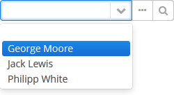
XML name of the component: lookupPickerField.
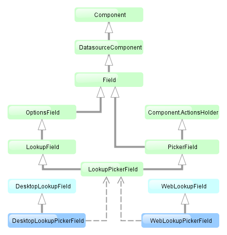
The component is implemented for Web Client and Desktop Client.
In fact LookupPickerField is a hybrid of LookupField and PickerField. Thus it has the same features except the default list of actions added when determining the component in XML: for LookupPickerField these are lookup  and
and open  actions.
Below is an example of using LookupPickerField to select a value of the colour reference attribute of the Car entity:
<dsContext>
    <datasource id="carDs" class="com.company.sample.entity.Car" view="_local"/>
    <collectionDatasource id="coloursDs" class="com.company.sample.entity.Colour" view="_local">
        <query>select c from sample$Colour c</query>
    </collectionDatasource>
</dsContext>
<layout>
    <lookupPickerField datasource="carDs" property="colour" optionsDatasource="coloursDs"/>
lookupPickerField attributes:
align | caption | captionProperty | datasource | description | editable | enable | filterMode | height | id | inputPrompt | metaClass | nullName | optionsDatasource | property | required | requiredMessage | stylename | visible | width
lookupPickerField elements:
This is a text field, in which data is entered in a predefined format. For example, it is convenient to use MaskedField to enter telephone numbers.
XML name of the component: maskedField.
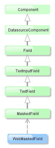
The MaskedField component is implemented for Web Client only.
Basically, MaskedField repeats the functionality of TextField, except that you cannot set datatype for it. So, MaskedField is intended for work only with text and string entity attributes. MaskedField has the following specific attributes:
-
mask– sets a mask for the field. To set a mask, use the following characters:-
#– number -
U– uppercase letter -
L– lowercase letter -
?– letter -
А– letter or number -
*– any character -
H– uppercase hex character -
H– lowercase hex character -
~– " +" or "-" character
-
-
valueMode– defines a format of a returned value (with a mask or not) and can take eithermaskedorclear.
Example of a text field with a mask for entering telephone numbers is provided below:
<maskedField id="phoneNumberField" mask="(###)###-##-##" valueMode="masked"/>
<button caption="msg://showPhoneNumberBtn" invoke="showPhoneNumber"/>
@Inject
private MaskedField phoneNumberField;

public void showPhoneNumber(){
    showNotification((String) phoneNumberField.getValue(), NotificationType.HUMANIZED);
}

maskedField attributes:
| align | editable | mask | requiredMessage | visible |
| caption | enable | maxLength | stylename | width |
| datasource | height | property | trim | |
| description | id | required | valueMode |
maskedField elements:
This is a component that allows you to choose from a list of options using radio buttons to choose a single value or a checkbox group to select several values.
XML name of the component: optionsGroup.
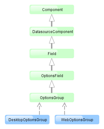
The OptionsGroup component is implemented for Web Client and Desktop Client.
-
The simplest case of using
OptionsGroupis to select an enumeration value for an entity attribute. For example, aRoleentity hastypeattribute of theRoleTypetype, which is an enumeration. Then you can useOptionsGroupto edit this attribute as follows:<dsContext> <datasource id="roleDs" class="com.haulmont.cuba.security.entity.Role" view="_local"/> </dsContext> <layout> <optionsGroup datasource="roleDs" property="type"/>In the example above
roleDsdata source is defined for theRoleentity. In theoptionsGroupcomponent, you should specify link to a data source in the datasource attribute and a name of an entity attribute, which value should be displayed, in the property attribute.As a result, the component will be as follows:
-
The list of component options can be specified arbitrarily using
setOptionsList()andsetOptionsMap(), or using anoptionsDatasourceattribute.-
setOptionsList()allows you to specify programmatically a list of component options. To do this, declare a component in the XML descriptor:<optionsGroup id="numberOfSeatsField"/>
Then inject the component into the controller and specify a list of options in the
init()method:@Inject protected OptionsGroup numberOfSeatsField; @Override public void init(Map<String, Object> params) { List<Integer> list = new ArrayList<>(); list.add(2); list.add(4); list.add(5); list.add(7); numberOfSeatsField.setOptionsList(list); }The component will be as follows:

Depending on the selected option, the
getValue()method of the component will returnIntegervalues: 2, 4, 5, 7. -
setOptionsMap()allows you to specify string names and option values separately. For example, we can set the following options map for thenumberOfSeatsFieldcomponent, described the XML descriptor, in theinit()method of the controller:@Inject protected OptionsGroup numberOfSeatsField; @Override public void init(Map<String, Object> params) { Map<String, Object> map = new LinkedHashMap<>(); map.put("two", 2); map.put("four", 4); map.put("five", 5); map.put("seven", 7); numberOfSeatsField.setOptionsMap(map); }The component will be as follows:

Depending on the selected option, the
getValue()method of the component will returnIntegervalues: 2, 4, 5, 7, and not the strings that are displayed on the screen. -
The component can take a list of options from a data source. For this purpose, the optionsDatasource attribute is used. For example:
<dsContext>
    <collectionDatasource id="coloursDs" class="com.company.sample.entity.Colour" view="_local">
        <query>select c from sample$Colour c</query>
    </collectionDatasource>
</dsContext>
<layout>
    <optionsGroup id="coloursField" optionsDatasource="coloursDs"/>
In this case, the
coloursFieldcomponent will display instance names of theColourentity, located in thecoloursDsdata source, and itsgetValue()method will return the selected entity instance.With the help of captionProperty attribute entity attribute to be used instead of an instance name for string option names can be defined.
-
-
multiselectattribute is used to switchOptionsGroupto a multiple choice mode. Ifmultiselectis turned on, the component is displayed as a group of independent checkboxes, and the component value is a list of selected options.For example, if we create the component in the XML screen descriptor:
<optionsGroup id="roleTypesField" multiselect="true"/>
and set a list of options for it –
RoleTypeenumeration values:@Inject protected OptionsGroup roleTypesField; @Override public void init(Map<String, Object> params) { roleTypesField.setOptionsList(Arrays.asList(RoleType.values())); }then the component will be as follows:

In this case the
getValue()method of the component will return ajava.util.List, containingRoleType.READONLYandRoleType.DENYINGvalues.The example above also illustrates an ability of the
OptionsGroupcomponent to display localized values of enumerations included in the data model. -
The
orientationattribute defines the orientation of group elements. By default, elements are arranged vertically. Thehorizontalvalue sets the horizontal orientation.
optionsGroup attributes:
| align | editable | optionsDatasource | stylename |
| caption | enable | orientation | visible |
| captionProperty | height | property | width |
| datasource | id | required | |
| description | multiselect | requiredMessage |
optionsGroup elements:
This is a text field that displays echo characters instead of those entered by a user.
XML name of the component: passwordField.
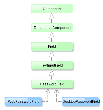
PasswordField is implemented for Web Client and Desktop Client.
Basically, PasswordField is similar to TextField apart from the ability to set datatype. PasswordField is intended to work with text and string entity attributes only.
Example:
<passwordField id="passwordField" caption="msg://name"/>
<button caption="msg://buttonsName" invoke="showPassword"/>
@Inject
private PasswordField passwordField;

public void showPassword(){
    showNotification((String) passwordField.getValue(), NotificationType.HUMANIZED);
}

passwordField attributes:
| align | editable | maxLength | stylename |
| caption | enable | property | visible |
| datasource | height | required | width |
| description | id | requiredMessage |
passwordField elements:
The input field with additional action buttons (PickerField) allows you to display an entity instance in a text field and perform actions by clicking buttons on the right.
XML name of the component: pickerField.
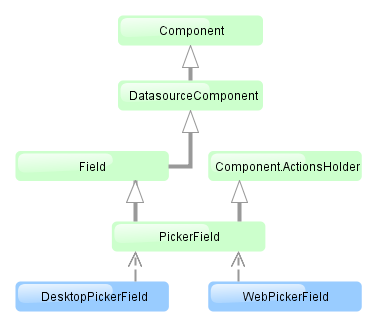
The PickerField component is implemented for Web Client and Desktop Client.
-
As a rule,
PickerFieldis used for reference entity attributes. It is sufficient to specify datasource and property attributes for the component:<dsContext> <datasource id="carDs" class="com.company.sample.entity.Car" view="_local"/> </dsContext> <layout> <pickerField datasource="carDs" property="colour"/>In the example above, the screen defines
carDsdata source for aCarentity having thecolourattribute. In thepickerFieldelement, you should specify a link to a data source in thedatasourceattribute, and a name of an entity attribute, the value of which should be displayed in the component – in thepropertyattribute. The entity attribute should refer to another entity, in the example above it isColour. -
For
PickerField, you can define an arbitrary number of actions, displayed as buttons on the right. It can be done either in the XML descriptor using theactionsnested element, or programmatically in the controller usingaddAction().-
There are standard actions, defined by the
PickerField.ActionType:lookup,clear,open. They perform the selection of a related entity, clearing the field and opening the edit screen of a selected related entity, respectively. For standard actions in XML, you do not have to define any attributes except the identifier. If no actions in theactionselement are defined when declaring the component, the XML loader will definelookupandclearactions for it. To add a default action, for example,open, you need to define theactionselement as follows:<pickerField datasource="carDs" property="colour"> <actions> <action id="lookup"/> <action id="open"/> <action id="clear"/> </actions> </pickerField>The
actionelement does not extend but overrides a set of standard actions. Identifiers of all required actions have to be defined in order to use them. The component looks like the following:
Use
addLookupAction(),addOpenAction()andaddClearAction()to set standard actions programmatically. If the component is defined in the XML descriptor withoutactionsnested element, it is sufficient to add missing actions:@Inject protected PickerField colourField; @Override public void init(Map<String, Object> params) { colourField.addOpenAction(); }If the component is created in the controller, it will get no default actions and you need to explicitly add all necessary actions:
@Inject
protected ComponentsFactory componentsFactory;

@Override
public void init(Map<String, Object> params) {
    PickerField colourField = componentsFactory.createComponent(PickerField.NAME);
    colourField.setDatasource(carDs, "colour");
    colourField.addLookupAction();
    colourField.addOpenAction();
    colourField.addClearAction();
}
You can parameterize standard actions. The XML descriptor has limited abilities to do this: there is only
openTypeattribute, in which you can specify the mode to open a selection screen (forLookupAction) or edit screen (forOpenAction).If you create actions programmatically, you can specify any properties of
PickerField.LookupAction,PickerField.OpenActionandPickerField.ClearActionobjects returned by methods of adding standard actions. For example, you can set a specific selection screen as follows:PickerField.LookupAction lookupAction = customerField.addLookupAction(); lookupAction.setLookupScreen("customerLookupScreen");For more information, see JavaDocs for standard actions classes.
-
Arbitrary actions in the XML descriptor are also defined in the
actionsnested element, for example:<pickerField datasource="carDs" property="colour"> <actions> <action id="lookup"/> <action id="show" icon="icons/show.png" invoke="showColour" caption=""/> </actions> </pickerField>You can programmatically set an arbitrary action as follows:
@Inject
protected PickerField colourField;

@Override
public void init(Map<String, Object> params) {
    colourField.addAction(new AbstractAction("show") {
        @Override
        public void actionPerform(Component component) {
            showColour(colourField.getValue());
        }

        @Override
        public String getCaption() {
            return "";
        }

        @Override
        public String getIcon() {
            return "icons/show.png";
        }
    });
}
The declarative and programmatic creation of actions is described in Section 4.5.4, “Actions. The Action Interface”.
-
-
PickerFieldcan be used without any direct reference to data, i.e., without datasource and property specification. In this casemetaClassattribute should be used to specify an entity type forPickerField. Entity name in metadata should be defined, for example:<pickerField id="colourField" metaClass="sample$Colour"/>
You can get an instance of a selected entity by injecting the component into a controller and invoking its
getValue()method.For proper operation of the
PickerFieldcomponent you need either set ametaClassattribute, or simultaneously set datasource and property attributes. -
You can use keyboard shortcuts in PickerField, see Section 4.5.11, “Keyboard Shortcuts” for details.
pickerField attributes:
| align | editable | property | width |
| caption | enable | required | |
| captionProperty | height | requiredMessage | |
| datasource | id | stylename | |
| description | metaClass | visible |
pickerField elements:
This is a button with a drop-down list of actions.
XML name of the component: popupButton.
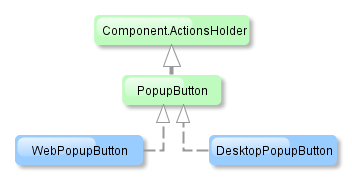
The component is implemented for Web Client and Desktop Client.
The PopupButton contain text or icon (or both). The figure below shows different types of buttons.
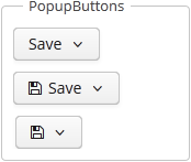
Below is an example of a button with a drop-down list containing two actions.
The button has a caption, which is specified using the caption attribute, and a tooltip defined in the description attribute. The drop-down actions list is specified in the actions element. PopupButton displays only the following action properties: caption, enable, visible. The description, icon, and shortcut properties are ignored.
popupButton attributes:
popupButton elements:
The ProgressBar component is used to display the progress of a long process.

XML name of the component: progressBar
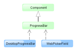
The component is implemented for Web Client and Desktop Client.
Below is an example of the component usage together with the mechanism of background tasks:
<progressBar id="progressBar" width="100%"/>
@Inject
protected ProgressBar progressBar;

@Inject
protected BackgroundWorker backgroundWorker;

private static final int ITERATIONS = 5;

@Override
public void init(Map<String, Object> params) {
    BackgroundTask<Integer, Void> task = new BackgroundTask<Integer, Void>(300, this) {
        @Override
        public Void run(TaskLifeCycle<Integer> taskLifeCycle) throws Exception {
            for (int i = 1; i <= ITERATIONS; i++) {
                TimeUnit.SECONDS.sleep(2); // time consuming task
                taskLifeCycle.publish(i);
            }
            return null;
        }

        @Override
        public void progress(List<Integer> changes) {
            float lastValue = changes.get(changes.size() - 1);
            progressBar.setValue(lastValue / ITERATIONS);
        }
    };

    BackgroundTaskHandler taskHandler = backgroundWorker.handle(task);
    taskHandler.execute();
}
Here in the BackgroundTask.progress() method, which is executed in UI thread, the ProgressBar component is set to the current value. The component value should be a float number from 0.0 to 1.0.
If a running process is unable to send information about the progress an indeterminate state of the indicator can be displayed using the indeterminate attribute. Indicator shows an indeterminate state if the attribute value is true. Default is false. For example:
<progressBar id="progressBar" width="100%" indeterminate="true"/>
progressBar attributes:
Related Entities component is a popup button with a list of classes related to the entity displayed in the table. Once the user selects the required entity class, a new lookup window is opened, containing the instances of this entity class, related to the entity instances selected in the initial table.
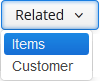
The XML-name of the component: relatedEntities
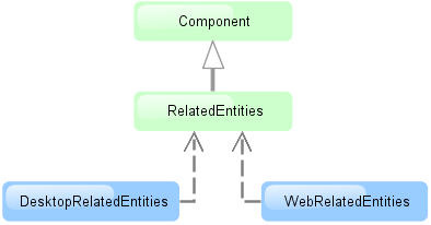
The component is implemented for Web Client andDesktop Client.
Related entities are selected according to the user permissions for entities , entity attributes and screens.
By default, the lookup window for the class selected in the dropdown is defined by convention (
.browse,.lookup). Optionally, you can define the screen explicitly in the component.
A filter selecting records related to the selected entities is dynamically created in the lookup window.
Example of using the component in screen XML-descriptor:
<table id="invoiceTable"
       multiselect="true"
       width="100%">
    <actions>
        <action id="create"/>
        <action id="edit"/>
        <action id="remove"/>
    </actions>

    <buttonsPanel id="buttonsPanel">
        <button id="createBtn"
                action="invoiceTable.create"/>
        <button id="editBtn"
                action="invoiceTable.edit"/>
        <button id="removeBtn"
                action="invoiceTable.remove"/>

        <relatedEntities for="invoiceTable"
                         openType="NEW_TAB">
            <property name="invoiceItems"
                      screen="sales$InvoiceItem.lookup"
                      filterCaption="msg://invoiceItems"/>
        </relatedEntities>
    </buttonsPanel>
The for attribute is required. It contains the table identifier.
The openType=”NEW_TAB” attribute sets the opening mode of the lookup windows to new tab. The entity browser is opened in the current tab by default.
The property element allows explicitly defining the related entity displayed in the dropdown.
property attributes:
The exclude attribute allows excluding some of the related entities from the dropdown list. The value of the property is a list of reference attributes of the current entity, separated by commas.
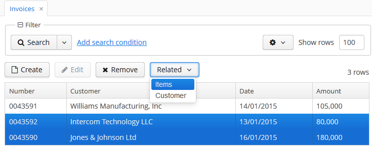
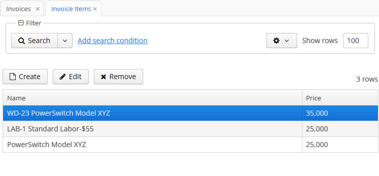
The relatedEntities attributes:
property attributes:
This is a text area to display and enter rich text.
XML name of the component: richTextArea
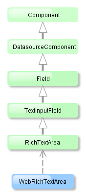
RichTextArea is implemented only for Web Client.
Basically, RichTextArea mirrors the functionality of TextField, except that you cannot set datatype for it. So, RichTextArea is intended for work only with text and string entity attributes.
You can apply formatting tools to the text entered in the RichTextArea component: change the font style, size and family – using controls located at the top of the component.
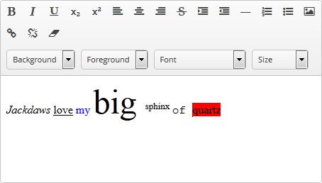
richTextArea attributes:
The SearchPickerField component is used to search for entity instances according to the entered string. User should enter a few characters and press Enter. If several matches have been found all of them will be displayed in a drop-down list. If only one instance matches the search query it immediately becomes a component value. SearchPickerField allows also to perform actions by clicking on buttons on the right.
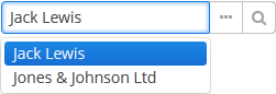
XML name of the component: searchPickerField.
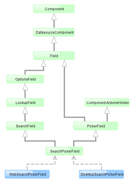
The component is implemented for Web Client and Desktop Client.
-
To use
SearchPickerFieldcomponent, you need to create collectionDatasource and specify a query, which contains corresponding search conditions. Condition must contain a parameter namedcustom$searchString. Component will pass a substring entered by the user after pressing Enter. A data source with a search condition should be defined in the optionsDatasource attribute of the component. For example:<dsContext> <datasource id="carDs" class="com.company.sample.entity.Car" view="_local"/> <collectionDatasource id="coloursDs" class="com.company.sample.entity.Colour" view="_local"> <query> select c from sample$Colour c where c.name like :(?i)custom$searchString </query> </collectionDatasource> </dsContext> <layout> <searchPickerField datasource="carDs" property="colour" optionsDatasource="coloursDs"/>In this case, the component will look for instances of
Colourentity according to the occurrence of the substring in itsnameattribute. The(?i)prefix is used for case-insensitive search (see Section 4.5.3.2.4, “Case-Insensitive Search for a Substring”). The selected value will be put into thecolourattribute of theCarentity located in thecarDsdatasource. -
Using the
minSearchStringLengthattribute the minimum number of characters, which the user should enter to search for values, can be defined. - In the screen controller two component methods can be implemented that will be invoked:
-
If the number of entered characters is less than the value of
minSearchStringLengthattribute. -
If the search of characters entered by the user has returned no results.
Below is an example of implementing methods to display on-screen messages:
@Inject private SearchPickerField colourField; @Override public void init(Map<String, Object> params) { colourField.setSearchNotifications(new SearchField.SearchNotifications() { @Override public void notFoundSuggestions(String filterString) { showNotification("No colours found for search string: " + filterString, NotificationType.TRAY); } @Override public void needMinSearchStringLength(String filterString, int minSearchStringLength) { showNotification("Minimum length of search string is " + minSearchStringLength, NotificationType.TRAY); } }); } -
-
SearchPickerFieldimplements LookupField and PickerField interfaces. Thus, it inherits the same functionality except the default list of actions added when defining the component in XML: forSearchPickerFieldthese arelookup and open actions.
searchPickerField attributes:
align | caption | captionProperty | datasource | description | editable | enable | filterMode | height | id | inputPrompt | metaClass | minSearchStringLength | nullName | optionsDatasource | property | required | requiredMessage | stylename | visible | width
searchPickerField elements:
The Table component presents information in a table view, sorts data, manages table columns and headers and invokes actions for selected rows.
XML-name of the component: table
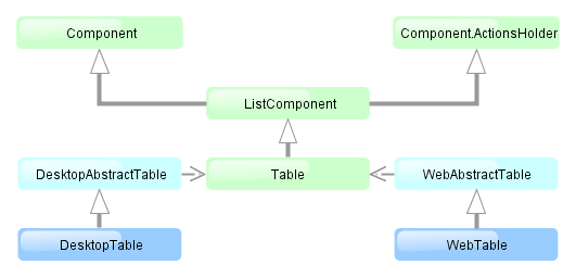
The component is implemented for both Web Client and Desktop Client.
An example of component definition in an XML-descriptor of a screen:
<dsContext>
    <collectionDatasource id="ordersDs"
                          class="com.sample.sales.entity.Order"
                          view="orderWithCustomer">
        <query>
            select o from sales$Order o order by o.date
        </query>
    </collectionDatasource>
</dsContext>
<layout>
    <table id="ordersTable" width="300px">
        <columns>
            <column id="date"/>
            <column id="customer.name"/>
            <column id="amount"/>
        </columns>
        <rows datasource="ordersDs"/>
    </table>
In the example the dsContext element defines collectionDatasource, which selects Order entities using JPQL query. For the table component rows element defines the data source that should be used, while columns element defines which entity attributes from the datasource should be used as table columns.
table elements:
-
rows– a mandatory element; itsdatasourceattribute defines the data source to be used by the table.Each row can have an icon in an additional column on the left. Create an implementation of the
Table.IconProviderinterface in the screen controller and set it for the table:@Inject protected Table customersTable; ... customersTable.setIconProvider(new Table.IconProvider() { @Nullable @Override public String getItemIcon(Entity entity) { CustomerGrade grade = ((Customer) entity).getGrade(); switch (grade) { case PREMIUM: return "icons/premium_grade.png"; case HIGH: return "icons/high_grade.png"; case MEDIUM: return "icons/medium_grade.png"; default: return null; } } }); -
columns– a mandatory element defining the set of columns for a table.Each column is described in a nested
columnelement with the following attributes:-
id− a mandatory attribute, contains the name of an entity attribute displayed in the column. Can be either an attribute of the entity from the data source or a linked entity – object graph traversal is indicated with a dot. For example:<columns> <column id="date"/> <column id="customer"/> <column id="customer.name"/> <column id="customer.address.country"/> </columns> -
caption− an optional attribute containing the column caption. If not specified, a localized attribute name will be displayed. -
collapsed− an optional attribute; hides the column by default when set totrue. Users can control column’s visibility using the menu accessible via a button in the top right part of the table when the table’s
 columnControlVisibleattribute is notfalse. By default,collapsedis set tofalse. -
width− an optional attribute controlling default column width. -
align− an optional attribute that sets text align for column cells. Possible values:LEFT,RIGHT,CENTER. Default isLEFT. -
editable− an optional attribute allowing / prohibiting editing of the corresponding column in the table. In order for a column to be editable, theeditableattribute of the entire table (see below) should be set totrueas well. -
maxTextLength– an optional attribute allowing to limit the number of characters in a cell. If the difference between the actual and the maximum allowed number of characters does not exceed the 10 character threshold, the "extra” characters remain unhidden. To see the entire record, users need to click on its visible part. An example of a column with a 5 character limitation: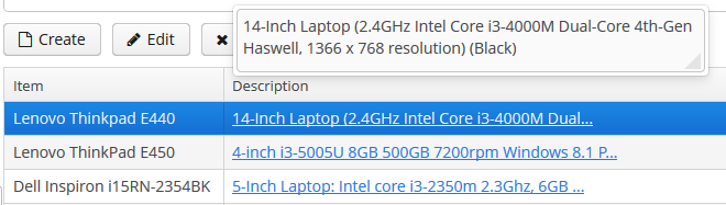
-
link- if set totrue, allows displaying a link to an entity editor in a table column (supported for Web Client only). Thelinkattribute may be set to true for primitive type columns, too; in this case, the main entity editor will be opened. This approach may be used to ease the navigation: the users will be able to open entity editors simply by clicking on some key attributes. -
linkScreen- contains the identifier of the screen that is opened by clicking the link enabled in thelinkattribute. -
linkScreenOpenType- sets the screen opening mode (THIS_TAB,NEW_TABorDIALOG). -
linkInvoke- invokes the controller method instead of opening the screen. -
columnelement may contain a nested formatter element that allows you to represent the attribute value in a format different from the standard for this Datatype:<column id="date"> <formatter class="com.haulmont.cuba.gui.components.formatters.DateFormatter" format="yyyy-MM-dd HH:mm:ss"/> </column>
-
-
rowsCount− an optional element adding theRowsCountcomponent for the table; this component allows loading the table data in pages. Page size can be defined by limiting the number of records in the data source usingCollectionDatasource.setMaxResults()method. Typically, this is performed by a Filter component linked to the table’s data source. However, if there is no generic filter, this method can be called directly from the screen controller.RowsCountcomponent can also show the total number of records returned by the current query from the datasource without extracting the records themselves. It invokesAbstractCollectionDatasource.getCount()when user clicks the ? icon, which results in performing a database query with the same conditions as the current query, but using aCOUNT(*)aggregate function instead. The number retrieved is displayed instead of the ? icon. -
actions− an optional element describing the actions, related to the table. In addition to custom arbitrary actions, the element supports the following standard actions, defined inListActionTypeenum:create,edit,remove,refresh,add,exclude,excel. -
buttonsPanel– an optional element, which adds a ButtonsPanel container to show action buttons above the table.
table attributes:
-
multiselectattribute allows setting multiple selection mode for table rows. Ifmultiselectistrue, users can select multiple rows in the table using keyboard or mouse holding Ctrl or Shift keys. By default, multiple selection mode is switched off. -
sortableattribute enables sorting data in the table. By default, it is set totrue. If sorting is allowed, clicking a column header will show a /
/ icon to the right of the column name.
Table sorting can be performed differently depending on whether all the records can be placed on one page or not. If they can, sorting is performed in memory without database queries. If there is more than one page, sorting is performed in the database by sending a new query with the corresponding
ORDER BYcondition.A table column may refer to a local attribute or a linked entity. For example:
<table id="ordersTable"> <columns> <column id="customer.name"/> <!-- the 'name' attribute of the 'Customer' entity --> <column id="contract"/> <!-- the 'Contract' entity --> </columns> <rows datasource="ordersDs"/> </table>In the latter case, the database sorting will be performed by attributes defined in the
@NamePatternannotation of the related entity. If the entity has no such annotation, the sorting will be performed in memory only within the current page.If the column refers to a non-persistent entity attribute, the database sorting will be performed by attributes defined in the
related()parameter of the@MetaPropertyannotation. If no related attributes are specified, the sorting will be performed in memory only within the current page. -
presentationsattribute controls the mechanism of presentations. By default, the value isfalse. If the attribute value istrue, a corresponding icon is added to the top right corner of the table . The mechanism of presentations is implemented for the Web Client only.
 -
Setting
columnControlVisibleattribute tofalseforbids the user to hide columns using the drop-down menu of the button in the right part of the table header. Currently displayed columns are marked with checkmarks in the menu.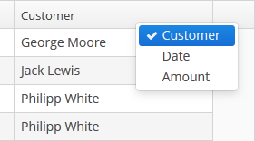
-
Setting
reorderingAllowedattribute tofalseforbids users to change columns order by dragging them with a mouse. -
contextMenuEnabledattribute enables the context menu. By default this attribute is set totrue. The context menu shows table actions (if any) and the System Information item containing information on the selected entity (if the user hascuba.gui.showInfopermission). -
Setting
multiLineCellstotrueenables multi-line display for cells containing several lines of text. In this mode, the web browser will load all the rows of the current table page at once, instead of lazy-loading the visible part of the table. It is required for proper scrolling in the Web Client. The default value isfalse. -
aggregatableattribute enables aggregation for table rows. The following operations are supported:-
SUM– calculate the sum -
AVG– find the average value -
COUNT– calculate the total number -
MIN– find the minimum value -
MAX– find the maximum value
The
aggregationelement should be set for aggregated table cells with thetypeattribute, which sets the aggregation function. The aggregated table values are shown in an additional row at the top of the table. An example of an aggregated table description:<table id="itemsTable" aggregatable="true"> <columns> <column id="product"/> <column id="quantity"/> <column id="amount"> <aggregation type="SUM"/> </column> </columns> <rows datasource="itemsDs"/> </table>A Formatter can be specified to display the aggregated value in the format other than the standard for this Datatype:
<column id="amount"> <aggregation type="SUM"> <formatter class="com.company.sample.MyFormatter"/> </aggregation> </column>In addition to the operations listed above, you can define a custom aggregation strategy by implementing the
AggregationStrategyinterface and passing it to thesetAggregation()method of theTable.Columnclass inside theAggregationInfoinstance. For example:public class TimeEntryAggregation implements AggregationStrategy<List<TimeEntry>, String> { @Override public String aggregate(Collection<List<TimeEntry>> propertyValues) { HoursAndMinutes total = new HoursAndMinutes(); for (List<TimeEntry> list : propertyValues) { for (TimeEntry timeEntry : list) { total.add(HoursAndMinutes.fromTimeEntry(timeEntry)); } } return StringFormatHelper.getTotalDayAggregationString(total); } @Override public Class<String> getResultClass() { return String.class; } }AggregationInfo info = new AggregationInfo(); info.setPropertyPath(metaPropertyPath); info.setStrategy(new TimeEntryAggregation()); Table.Column column = weeklyReportsTable.getColumn(columnId); column.setAggregation(info);
-
-
editableattribute allows switching the table to in-place editing mode for cells. In this mode, the columns witheditable = trueattribute show components to edit the attributes of the corresponding entity.The component type for each editable column is selected automatically based on the type of the corresponding entity attribute. For example, for string and numeric attributes, the application will use TextField, for
Date– DateField, for lists – LookupField, for links to other entities – PickerField.For a
Datetype editable column, you can additionally definedateFormatorresolutionattributes similar to the ones described for the DateField.optionsDatasource and captionProperty attributes can be additionally defined for an editable column showing a linked entity. If
optionsDatasourceis set, the application will use LookupField instead of PickerField.Custom configuration (including editing) of a cell can be performed using
Table.addGeneratedColumn()method – see below.
Methods of the Table interface:
-
getSelected(),getSingleSelected()return instances of the entities corresponding to the selected rows of the table. A collection can be obtained by invokinggetSelected(). If nothing is selected, the application returns an empty set. Ifmultiselectis disabled, it is more convenient to usegetSingleSelected()method returning one selected entity ornull, if nothing is selected. -
addGeneratedColumn()method allows you to define custom representation of data in a column. It takes two parameters: identifier of the column and an implementation of theTable.ColumnGeneratorinterface. Identifier can match one of the identifiers set for table columns in XML-descriptor – in this case the new column is inserted instead of the one defined in XML. If the identifier does not match any of the columns, a new column is added to the right.generateCell()method of theTable.ColumnGeneratorinterface is invoked for each row of the table. The method receives an instance of the entity displayed in the corresponding row.generateCell()method should return a visual component which will be displayed in the cell.Example of using the component:
@Inject protected Table carsTable; @Inject protected ComponentsFactory componentsFactory; @Override public void init(Map<String, Object> params) { carsTable.addGeneratedColumn("colour", new Table.ColumnGenerator() { @Override public Component generateCell(Entity entity) { LookupPickerField field = componentsFactory.createComponent(LookupPickerField.NAME); field.setDatasource(carsTable.getItemDatasource(entity), "colour"); field.setOptionsDatasource(coloursDs); field.addLookupAction(); field.addOpenAction(); return field; } }); }In the example above, all cells within the
colourcolumn in the table show the LookupPickerField component. The component should save its value into thecolourattribute of the entity which instance is displayed in the corresponding row. For this purposegetItemDatasource()method is used to get the datasource for the current entity instance from the table and pass it to theLookupPickerFieldcomponent.If you want to display just dynamic text, use special class
Table.PlainTextCellinstead of the Label component. It will simplify rendering and make the table faster.If
addGeneratedColumn()method receives the identifier of a column which is not declared in XML-descriptor, the header for the new column to be set as follows:carsTable.getColumn("colour").setCaption("Colour"); -
setClickListener()method can save you from adding generated columns with components when you need to draw something in cells and receive notifications when a user clicks inside these cells. TheCellClickListenerimplementation passed to this method receives the selected entity and the column identifier. The cells content will be wrapped in span element withcuba-table-clickable-cellstyle which can be used to specify the cell representation. -
setStyleProvider()method allows setting table cell display style. The method accepts an implementation ofTable.StyleProviderinterface as a parameter.getStyleName()method of this interface is invoked by the table for each row and each cell separately. If the method is invoked for a row, the first parameter contains the entity instance displayed by the row, the second parameter isnull. If the method is called for a cell, the second parameter contains the name of the attribute displayed by the cell.Example of setting a style:
@Inject protected Table customersTable; @Override public void init(Map<String, Object> params) { customersTable.setStyleProvider(new Table.StyleProvider() { @Nullable @Override public String getStyleName(Entity entity, @Nullable String property) { Customer customer = (Customer) entity; if (property == null) { // style for row if (hasComplaints(customer)) { return"unsatisfied-customer"; } } else if (property.equals("grade")) { // style for column "grade" switch (customer.getGrade()) { case PREMIUM: return "premium-grade"; case HIGH: return "high-grade"; case MEDIUM: return "medium-grade"; default: return null; } } return null; } }); }Then the cell and row styles set in the application theme should be defined. Detailed information on creating a theme is available in Section 4.5.7, “Creating Application Themes”. For web client, new styles are defined in the
styles.scssfile. Style names defined in the controller, together with prefixes identifying table row and column form CSS selectors. For example:.v-table-row-unsatisfied-customer { font-weight: bold; } .v-table-cell-content-premium-grade { background-color: red; } .v-table-cell-content-high-grade { background-color: green; } .v-table-cell-content-medium-grade { background-color: blue; } -
addPrintable()method allows setting a custom presentation of the data within a column when exporting to an XLS file via theexcelstandard action or directly using theExcelExporterclass. The method accepts the column identifier and an implementation of theTable.Printableinterface for the column. For example:ordersTable.addPrintable("customer", new Table.Printable<Customer, String>() { @Override public String getValue(Customer customer) { return "Name: " + customer.getName; } });getValue()method of theTable.Printableinterface should return data to be displayed in the table cell. This is not necessarily a string – the method may return values of other types, for example, numeric data or dates, which will be represented in the XLS file accordingly.If formatted output to XLS is required for a generated column, an implementation of the
Table.PrintableColumnGeneratorinterface passed to theaddGeneratedColumn()method should be used. The value for a cell in an XLS document is defined in thegetValue()method of this interface:ordersTable.addGeneratedColumn("product", new Table.PrintableColumnGenerator<Order, String>() { @Override public Component generateCell(Order entity) { Label label = componentsFactory.createComponent(Label.NAME); Product product = order.getProduct(); label.setValue(product.getName() + ", " + product.getCost()); return label; } @Override public String getValue(Order entity) { Product product = order.getProduct(); return product.getName() + ", " + product.getCost(); } });If
Printablepresentation is not defined for a generated column in one way or another, then the column will either show the value of corresponding entity attribute or nothing if there is no associated entity attribute. -
The
setItemClickAction()method allows you to define an action that will be performed when a table row is double-clicked. If such action is not defined, the table will attempt to find an appropriate one in the list of its actions in the following order:-
The action assigned to the Enter key by the
shortcutproperty -
The
editaction -
The
viewaction
If such action is found, and has
enabled = trueproperty, the action is executed. -
-
The
setEnterPressAction()allows you to define an action executed when Enter is pressed. If such action is not defined, the table will attempt to find an appropriate one in the list of its actions in the following order:-
The action defined by the
setItemClickAction()method -
The action assigned to the Enter key by the
shortcutproperty -
The
editaction -
The
viewaction
If such action is found, and has
enabled = trueproperty, the action is executed. -
table attributes:
| allowPopupMenu | enable | multiselect | stylename |
| columnControlVisible | height | presentations | visible |
| description | id | reorderingAllowed | width |
| editable | margin | sortable |
table elements:
column attributes:
| caption | dateFormat | linkInvoke | optionsDatasource |
| captionProperty | editable | linkScreen | resolution |
| clickAction | id | linkScreenOpenType | visible |
| collapsed | link | maxTextLength | width |
column elements:
rows attribute:
TextArea is a multi-line text editor field.
XML-name of the component: textArea

TextArea component is implemented for both Web Client and Desktop Client.
TextArea mostly replicates the functionality of the TextField component except that a datatype can not be assigned to it. I.e. TextArea is intended to be used for text and string attributes of entities only.
TextArea component has the following attributes:
-
colsandrowsset the number of columns and rows of text:<textArea id="textArea" cols="20" rows="5" caption="msg://name"/>
The values of
widthandheighthave priority over the values ofcolsandrows. -
resizable– if this attribute is set totrueand the number of rows is more than one, it becomes possible to change the size of the component:<textArea id="textArea" resizable="true" caption="msg://name" rows="5"/>
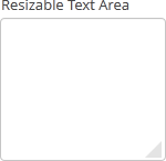
textArea attributes:
TextField is a component for text editing. It can be used both for working with entity attributes and entering/displaying arbitrary textual information.
XML-name of the component: textField
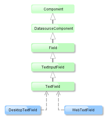
Text field component is implemented for both Web Client and Desktop Client.
-
An example of a text field with a caption retrieved from the localized messages pack:
<textField id="nameField" caption="msg://name"/>
The figure below shows an example of a simple text field. -
To create a text field connected to data, datasource and property attributes should be used.
<dsContext> <datasource id="customerDs" class="com.sample.sales.entity.Customer" view="_local"/> </dsContext> <layout> <textField datasource="customerDs" property="name" caption="msg://name"/>As you can see in the example, the screen describes the
customerDsdatasource forCustomerentity, which hasnameattribute. The text field component has a link to the data source specified in the datasource attribute; property attribute contains the name of the entity attribute that should be displayed in the text field.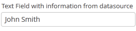
-
If the field is not connected to an entity attribute (i.e. the data source and attribute name are not set), you can set the data type using the
datatypeattribute. It is used to format field values. The attribute value accepts any data type registered in the application metadata – see Section 4.2.2.3, “Datatype”. Typically,TextFielduses the following data types:-
decimal -
double -
int -
long
As an example, let’s look at a text field with an
Integerdata type.<textField id="integerField" datatype="int" caption="msg://integerFieldName"/>
If a user enters a value that cannot be interpreted as an integer number, then when the field looses focus, the application will show an error message and revert field value to the previous one:
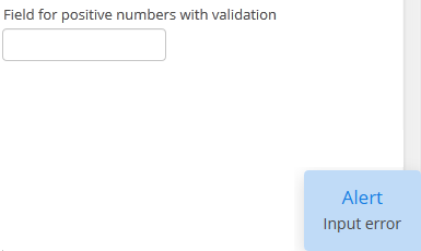
-
-
Text field can be assigned a validator – a class implementing
Field.Validatorinterface. The validator limits user input in addition to what is already done by thedatatype. For example, to create an input field for positive integer numbers, you need to create a validator class:public class PositiveIntegerValidator implements Field.Validator { @Override public void validate(Object value) throws ValidationException { Integer i = (Integer) value; if (i <= 0) throw new ValidationException("Value must be positive"); } }and assign it as a validator to the text field with
intdatatype:<textField id="integerField" datatype="int"> <validator class="com.sample.sales.gui.PositiveIntegerValidator"/> </textField>Unlike input check against the data type, validation is performed not when the field looses focus, but after invocation of the field’s
validate()method. It means that the field (and the linked entity attribute) may temporarily contain a value that does not satisfy validation conditions (a non-positive number in the example above). This should not be an issue, because validated fields are typically used in editor screens, which automatically invoke validation for all their fields before commit. If the field is located not in an editing screen, the field’svalidate()method should be invoked explicitly in the controller. -
If a text field is linked to an entity attribute (via
datasourceandproperty), and if the entity attribute has alengthparameter defined in the@ColumnJPA-annotation, then theTextFieldwill limit the maximum length of entered text accordingly.If a text field is not linked to an attribute, or if the attribute does not have
lengthvalue defined, or this value needs to be overridden, then the maximum length of the entered text can be limited usingmaxLengthattribute. The value of "-1" means there are no limitations. For example:<textField id="shortTextField" maxLength="10"/>
-
By default, text field trims spaces at the beginning and at the end of the entered string. I.e. if user enters "
aaa bbb", the value of the field returned by thegetValue()method and saved to the linked entity attribute will be "aaa bbb". You can disable trimming of spaces by setting thetrimattribute tofalse.It should be noted that trimming only works when users enter a new value. If the value of the linked attribute already has spaces in it, the spaces will be displayed until user edits the value.
-
Text field always returns
nullinstead of an entered empty string. Therefore, with thetrimattribute enabled, any string containing spaces only will be converted tonull. -
The
setCursorPosition()method can be used to focus the field and set the cursor position to the specified 0-based index.
textField attributes:
align | caption | datasource | datatype | description | editable | enable | height | id | inputPrompt | maxLength | property | required | requiredMessage | stylename | trim | visible | width
textField elements:
TimeField is a field to display and enter date and time values.
XML-name of the component: timeField.
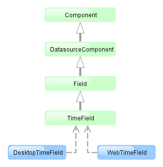
TimeField component is implemented for both Web Client and Desktop Client.
-
To create a date field associated with data, datasource and property attributes should be used:
<dsContext> <datasource id="orderDs" class="com.sample.sales.entity.Order" view="_local"/> </dsContext> <layout> <timeField datasource="orderDs" property="deliveryTime"/>As you can see in the example above, the screen defines the
orderDsdata source forOrderentity, which hasdeliveryTimeattribute. Thedatasourceattribute of the time input component contains a link to thedatasource, and thepropertyattribute – the name of the entity attribute displayed in the field.Related entity attribute should have
java.util.Dateorjava.sql.Timetype. -
The time format for representation is defined by the
timedatatype and is specified in the main localized messages pack in thetimeFormatkey. -
The time format can also be specified in the
timeFormatattribute. It can be either a format string, or a key in a message pack (with themsg://prefix). -
Regardless of the mentioned above format display of seconds can be controlled using
showSecondsattribute. By default, seconds are displayed if the format contains "ss".<timeField datasource="orderDs" property="createTs" showSeconds="true"/>
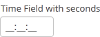
timeField attributes:
align |
caption |
editable |
enable |
datasource |
description |
height |
id |
property |
required |
requiredMessage |
showSeconds |
stylename |
timeFormat |
visible |
width
timeField elements:
validator
TokenList component offers a simplified way of working with lists: instance names are listed vertically or horizontally, adding is done using drop-down list, removal – using the buttons located near each instance.
XML-name of the component: tokenList
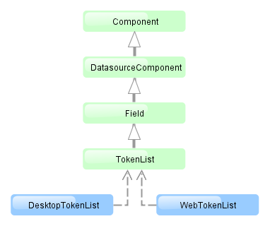
The component is implemented for both Web Client and Desktop Client.
Below is an example description of TokenList in an XML-descriptor of a screen:
<dsContext>
<datasource id="orderDs"
class="com.sample.sales.entity.Order"
view="order-edit">
<collectionDatasource id="productsDs" property="products"/>
</datasource>
<collectionDatasource id="allProductsDs"
class="com.sample.sales.entity.Product"
view="_minimal">
<query>select p from sales$Product p order by p.name</query>
</collectionDatasource>
</dsContext>
<layout>
<tokenList id="productsList" datasource="productsDs" inline="true" width="500px">
<lookup optionsDatasource="allProductsDs"/>
</tokenList>
In the example the nested productsDs datasource which includes a collection of products within an order is defined in dsContext, as well as allProductsDs datasource containing a collection of all products available in the database. The TokenList component with productsList identifier displays the content of the productsDs datasource and allows changing the collection by adding instances from allProductsDs.
tokenList attributes:
-
position– sets the position for the drop-down list. The attribute can take two values:TOP,BOTTOM. Default isTOP.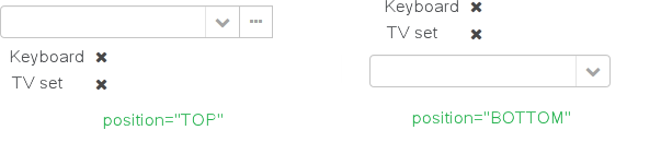
-
inlineattribute defines how the list with selected items will be displayed: vertically or horizontally.truecorresponds to horizontal alignment,false– to vertical. An example of a component with horizontal alignment:
-
simple– when set totrue, the items selection component will be hidden with only the button left. Clicking the button opens the screen with the list of entity instances which type is defined by the datasource. Selection screen identifier is selected according to the rules for thePickerField.LookupActionstandard action.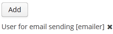
tokenList elements:
-
lookup− values selection component descriptor.Attributes of the
lookupattribute:-
lookupattribute makes it possible to select items using an entity lookup screen: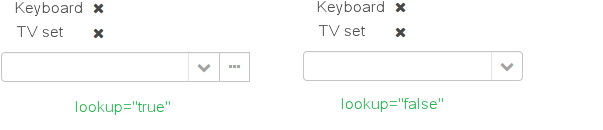
-
lookupScreenattribute sets the identifier of the screen used for items selection inlookup="true"mode. If this attribute is not set, screen identifier is selected according to the rules for thePickerField.LookupActionstandard action. -
openTypeattribute defines how the lookup screen will be opened, similar to what is described for thePickerField.LookupActionstandard action. Default value –THIS_TAB. -
If the value of the
multiselectattribute is set totrue, then a value oftruewill be passed to parameters map of the lookup screen for theMULTI_SELECTkey. This flag can be used to set the screen into multiple selection mode. This flag is defined in theWindowParamsenum so it is convenient to work with it in the following way:@Override public void init(Map<String, Object> params) { if (WindowParams.MULTI_SELECT.getBool(getContext())) { usersTable.setMultiSelect(true); } }
-
-
button– descriptor of the button for adding items. Can contain caption and icon attributes.
A full list of tokenList attributes:
| caption | editable | inline | visible |
| captionProperty | enable | position | width |
| datasource | height | simple | |
| description | id | stylename |
tokenList elements:
A full list of lookup attributes:
button attributes:
The Tree component is intended to display hierarchical structures represented by entities referencing themselves.
XML-name of the component: tree
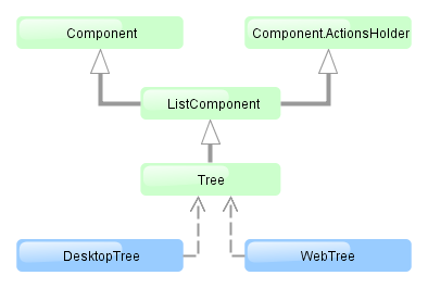
The component is implemented for both Web Client and Desktop Client.
For the Tree component, the datasource attribute of the treechildren element should contain a reference to a hierarchicalDatasource. Declaration of a hierarchicalDatasource should contain a hierarchyProperty attribute – the name of the entity attribute which is a reference to same entity.
Below is an example of the Tree component description in a screen XML-descriptor:
<dsContext>
<hierarchicalDatasource id="departmentsDs" class="com.sample.sales.entity.Department" view="browse"
hierarchyProperty="parentDept">
<query>
select d from sales$Department d order by d.createTs
</query>
</hierarchicalDatasource>
</dsContext>
<layout>
<tree id="departmentsTree" width="100%" height="100%">
<treechildren datasource="departmentsDs" captionProperty="name"/>
</tree>
The name of the entity attribute to be displayed in the tree can be set using the captionProperty attribute of the treechildren element. If this attribute is not defined, the screen will show the entity instance name.
The setItemClickAction() method may be used to define an action that will be performed when a tree node is double-clicked.
tree attributes:
tree elements:
treechildren attributes:
TreeTable component is a hierarchical table displaying a tree-like structure in the leftmost column. The component is used for entities that have references to themselves. For example, it can be a file system or a company organization chart.
XML-name of the component: treeTable
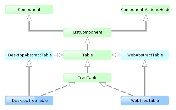
The component is implemented for both Web Client and Desktop Client.
For TreeTable, the hierarchicalDatasource should be set in the datasource attribute of the rows element. Declaration of a hierarchicalDatasource should contain hierarchyProperty attribute – the name of the entity attribute which references the same entity.
Below is an example of component description in a screen XML descriptor:
<dsContext>
<hierarchicalDatasource id="tasksDs" class="com.sample.sales.entity.Task" view="browse"
hierarchyProperty="parentTask">
<query>
select t from sales$Task t
</query>
</hierarchicalDatasource>
</dsContext>
<layout>
<treeTable id="tasksTable" width="100%">
<columns>
<column id="name"/>
<column id="dueDate"/>
<column id="assignee"/>
</columns>
<rows datasource="tasksDs"/>
</treeTable>
The functionality of TreeTable is similar to a simple Table.
treeTable attributes:
| allowPopupMenu | height | reorderingAllowed | width |
| columnControlVisible | id | sortable | |
| editable | multiselect | stylename | |
| enable | presentations | visible |
treeTable elements:
column attributes:
| caption | dateFormat | resolution |
| captionProperty | editable | visible |
| clickAction | id | width |
| collapsed | optionsDatasource |
column elements:
rows elements:
TwinColumn is a twin list component for multiple items selection. The left part of the list contains available unselected values, the right part – selected values. Users select the values by transferring them from the left to the right and backward using double click or dedicated buttons. A unique representation style and an icon can be defined for each value.
XML name of the component: twinColumn
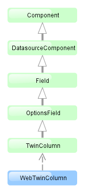
The component is implemented for Web Client only.
Below is an example of a twinColumn component usage to select entity instances:
<dsContext>
<datasource id="carDs" class="com.company.sample.entity.Car" view="_local"/>
<collectionDatasource id="coloursDs" class="com.company.sample.entity.Colour" view="_local">
<query>select c from sample$Colour c</query>
</collectionDatasource>
</dsContext>
<layout>
<twinColumn id="coloursField" optionsDatasource="coloursDs" addAllBtnEnabled="true"/>
In this example, the coloursField component will display Colour entity instances names located in the coloursDs data source and its getValue() method will return a collection of selected entity instances.
addAllBtnEnabled attribute shows the buttons moving all items between the lists.
columns attribute is used to set the number of characters in a row, and the rows attribute – to set the number of rows in each list.
The presentation of the items can be defined by implementing the TwinColumn.StyleProvider interface and returning a style name and icon path for each entity instance displayed in the component.
The list of component options can be specified arbitrarily using setOptionsList() and setOptionsMap() as described for the OptionsGroup component.
twinColumn attributes:
| caption | editable | optionsDatasource | stylename |
| captionProperty | enable | required | width |
| columns | height | requiredMessage | |
| datasource | id | rows | |
| description | property | visible |
twinColumn elements:
BoxLayout is a container with sequential placement of components.
There are three types of BoxLayout, identified by the XML-elements:
-
hbox− components are placed horizontally.
<hbox spacing="true" margin="true"> <dateField datasource="orderDs" property="date"/> <lookupField datasource="orderDs" property="customer" optionsDatasource="customersDs"/> <textField datasource="orderDs" property="amount"/> </hbox> -
vbox− components are placed vertically.vboxhas 100% width by default.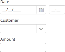
<vbox spacing="true" margin="true"> <dateField datasource="orderDs" property="date"/> <lookupField datasource="orderDs" property="customer" optionsDatasource="customersDs"/> <textField datasource="orderDs" property="amount"/> </vbox> -
flowBox− components are placed horizontally with line wrapping. If there is not enough space in a line, the components that do not fit will be displayed in the next line (the behavior is similar to SwingFlowLayout).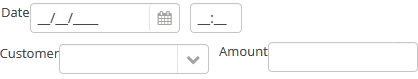
<flowBox spacing="true" margin="true"> <dateField datasource="orderDs" property="date"/> <lookupField datasource="orderDs" property="customer" optionsDatasource="customersDs"/> <textField datasource="orderDs" property="amount"/> </flowBox>
The following XML-attributes can be used in the hbox, vbox, flowBox elements:
ButtonsPanel is a container that streamlines the use and placement of the components (usually, buttons) for data management in a table.

XML-name of the component: buttonsPanel.
A sample description of a ButtonsPanel in screen XML-descriptor:
<table id="customersTable"
editable="false" width="100%">
<actions>
<action id="create"/>
<action id="edit"/>
<action id="remove"/>
<action id="excel"/>
</actions>
<buttonsPanel>
<button action="customersTable.create"/>
<button action="customersTable.edit"/>
<button action="customersTable.remove"/>
<button action="customersTable.excel"/>
</buttonsPanel>
<columns>
<column id="name"/>
<column id="email"/>
</columns>
<rows datasource="customersDs"/>
</table>
buttonsPanel element can be located either inside a table, or in any other place of a screen.
If the buttonsPanel is located in a table, it is combined with the table's rowsCount component thus using vertical space more effectively. Additionally, if a lookup screen is opened using IFrame.openLookup() (for example, from the PickerField component) the buttons panel becomes hidden.
alwaysVisible attribute disables panel hiding in a lookup screen when it is opened by IFrame.openLookup(). If the attribute value is true, the buttons panel is not hidden. By default, the attribute value is f false.
buttonsPanel attributes:
GridLayout is a container with grid placement of components.
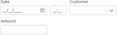
XML-name of the component: grid.
Example container usage:
<grid spacing="true">
<columns count="4"/>
<rows>
<row>
<label value="Date"/>
<dateField datasource="orderDs" property="date"/>
<label value="Customer"/>
<lookupField datasource="orderDs" property="customer"
optionsDatasource="customersDs"/>
</row>
<row>
<label value="Amount"/>
<textField datasource="orderDs" property="amount"/>
</row>
</rows>
</grid>
grid elements:
-
columns– a required element, describes grid columns. It should have either acountattribute, or a nestedcolumnelement for each column.In the simplest case, it is enough to set the number of columns in the
countattribute. Then, if the container width is explicitly defined in pixels or percents, free space will be divided between the columns equally.In order to divide screen space non-equally, a
columnelement with aflexattribute should be defined for each column.An example of a grid where the second and the fourth columns take all extra horizontal space and the fourth column takes three times more space:
<grid spacing="true" width="100%"> <columns> <column/> <column flex="1"/> <column/> <column flex="3"/> </columns> <rows> <row> <label value="Date"/> <dateField datasource="orderDs" property="date" width="100%"/> <label value="Customer"/> <lookupField datasource="orderDs" property="customer" optionsDatasource="customersDs" width="100%"/> </row> <row> <label value="Amount"/> <textField datasource="orderDs" property="amount" width="100%"/> </row> </rows> </grid>If
flexis not defined, or is set to 0, the width of the column will be set according to its contents given that at least one other column has a non-zeroflex. In the example above, the first and the third columns will get the width according to the maximum text length.In order for the free space to appear, the entire container width should be set in either pixels or percents. Otherwise, column width will be calculated according to content length, and
flexattribute will have no effect. -
rows− a required element, contains a set of rows. Each line is defined in its ownrowelement.rowelement can have aflexattribute similar to the one defined forcolumn, but affecting the distribution of free vertical space with a given total grid height.rowelement should contain elements of the components displayed in the grid's current row cells. The number of components in a row should not exceed the defined number of columns, but it can be less.
Any component located in a grid container can have colspan and rowspan attributes. These attributes set the number of columns and rows occupied by the corresponding component. For example, this is how Field3 field can be extended to cover three columns:
<grid spacing="true">
<columns count="4"/>
<rows>
<row>
<label value="Field1"/>
<textField/>
<label value="Field2"/>
<textField/>
</row>
<row>
<label value="Field3"/>
<textField colspan="3" width="100%"/>
</row>
</rows>
</grid>
As a result the components will be placed in the following way:
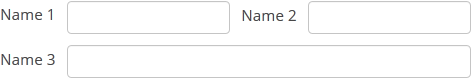
grid attributes:
grid elements:
columns attributes:
column attributes:
row attributes:
GroupBoxLayout is a container that allows framing the embedded components and setting a universal header for them. Additionally, it can collapse content.
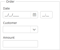
Component XML-name: groupBox.
An example container description in a screen XML-descriptor:
<groupBox caption="Order">
<dateField datasource="orderDs" property="date" caption="Date"/>
<lookupField datasource="orderDs" property="customer"
optionsDatasource="customersDs" caption="Customer"/>
<textField datasource="orderDs" property="amount" caption="Amount"/>
</groupBox>
groupBox attributes:
-
caption– group header. -
orientation– defines embedded components direction − horizontal or vertical. The default value isvertical. -
collapsable– if the value is set totruethe component’s content can be hidden using the icons/. -
collapsed– if set totrue, component’s content will be collapsed immediately after the screen gets opened. It is used withcollapsable="true".An example of a collapsed
GroupBox:
By default, the groupBox container is 100% wide, similar to vbox.
All groupBox attributes:
iframe element is intended for including frames into a screen.
Attributes:
-
screen– frame identifier in screens.xml (if the frame is registered).
One of these attributes should be defined. If both attributes are defined, frame will be loaded from the file explicitly set in src.
Other iframe attributes:
ScrollBoxLayout − a container that supports content scrolling.
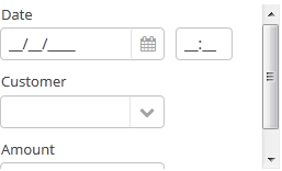
Component XML-name: scrollBox
An example container description in a screen XML-descriptor:
<groupBox caption="Order" width="300" height="170">
<scrollBox width="100%" height="100%" spacing="true" margin="true">
<dateField datasource="orderDs" property="date" caption="Date"/>
<lookupField datasource="orderDs" property="customer" optionsDatasource="customersDs" caption="Customer"/>
<textField datasource="orderDs" property="amount" caption="Amount"/>
</scrollBox>
</groupBox>
-
The components direction can be defined by
orientationattribute −horizontalorvertical. Default isvertical. -
scrollBarsattribute allows configuring scroll bars. It can behorizontal,vertical– for horizontal and vertical scrolling respectively,both– for scrolling in any direction. Setting the value tononeforbids scrolling in any direction.
The components embedded into the scrollBox should have fixed size or default size. It can not be set to height="100%" or width="100%".
At the same time, scrollBox cannot calculate its own size based on its content. Its absolute size should either be specified or the scrollBox should be stretched it in a parent container by setting height="100%" and width="100%".
scrollBox attributes:
SplitPanel − a container divided into two areas, its horizontal or vertical size can be adjusted by moving the separator.
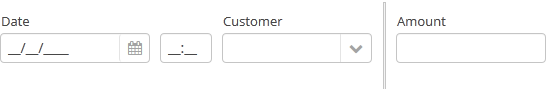
Component XML-name: split.
An example description of a split panel in a screen XML-descriptor:
<split orientation="horizontal" pos="30" width="100%" height="100%">
<vbox margin="true" spacing="true">
<dateField datasource="orderDs" property="date" caption="Date"/>
<lookupField datasource="orderDs" property="customer" optionsDatasource="customersDs" caption="Customer"/>
</vbox>
<vbox margin="true" spacing="true">
<textField datasource="orderDs" property="amount" caption="Amount"/>
</vbox>
</split>
split container must contain two nested containers or components. They will be displayed astride the separator.
split attributes:
-
orientation– defines component orientation.horizontal– nested components are aligned horizontally,vertical– they are aligned vertically. -
pos– an integer number defining percentage of the first component area compared to the second one. For example,pos="30"means that the areas ration is 30/70. By default the areas are divided 50/50.
All attributes of split:
TabSheet container is a tabbed panel. The panel shows content of one tab at a time.
XML-name of the component: tabSheet.
An example description of a tabbed panel in a screen XML-descriptor:
<tabSheet>
<tab id="mainTab" caption="Tab1" margin="true" spacing="true">
<dateField datasource="orderDs" property="date" caption="Date"/>
<lookupField datasource="orderDs" property="customer" optionsDatasource="customersDs" caption="Customer"/>
</tab>
<tab id="additionalTab" caption="Tab2" margin="true" spacing="true">
<textField datasource="orderDs" property="amount" caption="Amount"/>
</tab>
</tabSheet>
The tabSheet component should contain nested tab, elements describing tabs. Each tab is a container with a vertical components layout similar to vbox.
tab element attributes:
-
id– tab identifier. Please note that tabs are not components and their IDs are used only within aTabSheetin order to work with tabs from the controller. -
caption – tab caption.
-
lazy– sets lazy loading for tab content.Lazy-tabs do not load their content when a screen is opened, it reduces the number of components in memory. Components within a tab are loaded only when user selects the tab. Additionally, if a lazy-tab includes visual components linked to a data source, containing a JPQL query, this query is not invoked as well. As a result, screen opens quicker and data is loaded only when user requests it by selecting this tab.
Please note that the components located on a lazy-tab do not exist when the screen is opened. That is why they cannot be injected into a controller and cannot be obtained by invoking
getComponent()in the controller’sinit()method. Thelazy-tab components can be called only after user opens it. This moment may be caught usingTabSheet.TabChangeListener, for example:@Inject private TabSheet tabsheet; private boolean detailsInitialized, historyInitialized; @Override public void init(Map<String, Object> params) { tabsheet.addListener( new TabSheet.TabChangeListener() { @Override public void tabChanged(TabSheet.Tab newTab) { if ("detailsTab".equals(newTab.getName())){ initDetails(); } else if ("historyTab".equals(newTab.getName())){ initHistory(); } } } ); } private void initDetails() { if (detailsInitialized){ return; } // use getComponentNN("comp_id") here to get tab's components detailsInitialized = true; } private void initHistory() { if (historyInitialized){ return; } // use getComponentNN("comp_id") here to get tab's components historyInitialized = true; }By default, tabs are not
lazy, which means that all their content is loaded when a screen is opened. -
detachable– when it istrue, a tab can be detached to a separate window in a screen desktop implementation . It allows , for example, different parts of the application UI to be located on different displays. A detached tab has a dedicated button in its header:
tabSheet attributes:
All attributes of the tab element:
This section describes different elements of the universal user interface that are related to visual components.
Formatter should be used with read-only components, such as Label, Table column and similar. Editable components values, for example, TextField, can be formatted using the
Datatype
mechanism.
In an XML-descriptor of a screen, a component's formatter can be defined in a nested formatter element. The element has a single attribute:
-
class− the name of a class implementing acom.haulmont.cuba.gui.components.Formatter
If formatter's constructor class has a org.dom4j.Element, parameter, then it will receive an XML element, describing this formatter. This can be used to parameterize a formatter instance. For example, using a formatted string. Particularly, DateFormatter and NumberFormatter classes in the platform can take the format string from the format attribute. Example of using the component:
<column id="date">
    <formatter class="com.haulmont.cuba.gui.components.formatters.DateFormatter"
               format="yyyy-MM-dd HH:mm:ss"/>
</column>
Additionally, DateFormatter class also recognizes a type attribute, which can have a DATE or DATETIME value. In this case, formatting is done using the
Datatype
mechanism using a dateFormat or a dateTimeFormat string respectively. For example:
<column id="endDate">
<formatter class="com.haulmont.cuba.gui.components.formatters.DateFormatter" type="DATE"/>
</column>
If a formatter is implemented as an internal class, it should be declared with a static modifier and its name should be separated by "$" for loading, for example:
<formatter class="com.sample.sales.gui.OrderBrowse$CurrencyFormatter"/>
Formatter can be assigned to a component not only using a screen XML-descriptor , but also programmatically – by submitting an formatter instance into aд setFormatter() component.
An example of declaring a custom formatter and using it to format values in a table column:
public class CurrencyFormatter implements Formatter<BigDecimal> {
protected GeneralConfiguration generalConfiguration;
protected Currency currentCurrency;
public CurrencyFormatter(GeneralConfiguration generalConfiguration) {
this.generalConfiguration = generalConfiguration;
currentCurrency = generalConfiguration.getCurrency();
}
@Override
public String format(BigDecimal value) {
return currentCurrency.format(value);
}
}
protected void initTableColumns() {
Formatter<BigDecimal> currencyFormatter = new CurrencyFormatter(generalConfiguration);
table.getColumn("totalPrice").setFormatter(currencyFormatter);
}
The mechanism of presentations allows users to manage component display settings.
Capabilities:
-
Saving presentations using their unique names
-
Editing and removing presentations
-
Fast switching between presentations
-
Setting up a default presentation, which will be applied when a screen with a component opens
-
Auto saving for security controls in an active presentation
-
Global presentations, which can be accessed by any system user
Classes and Interfaces
In order to use presentations, a component class should implement a com.haulmont.cuba.gui.components.Component.HasPresentations interface. In the platform, these components are:
Presentation − POJO presentation object.
Presentations contains a list of component's presentations and a set of methods to work with them. Main methods:
-
getCurrent()− returns current presentation ornull, if presentation is not defined -
setCurrent(Presentation p)− sets an active presentation -
getSettings(Presentation p)− returns an XML-element with display settings for the current presentation -
setSettings(Presentation p, Element e)− modifies display settings for the specified presentation -
getPresentation(Object id)− returns a presentation based on its identifier -
getPresentations()− returns a list of presentations identifiers for the given component -
commit()− saves presentations to the database
PresentationsImpl − element implementation Presentations.
PresentationsChangeListener − a listener interface tracking presentation changes.
In order to create, change or remove global presentations, user should have rights to cuba.gui.presentations.global. More details are available in the CUBA Platform Manual. Security Subsystem.
Timer is a non-visual component allowing certain screen controller code to be run at specified time intervals. The timer works in a thread that handles user interface events, which allows screen to be refreshed without any limitations. Timer stops working when a screen it was created for gets closed.
The component is implemented for the Web Client and the Desktop Client. For the web client, timer implementation is based on interrogation server from web-browser, for the desktop client it based on javax.swing.Timer.
The main approach for creating the timers is by declaring them in a screen XML-descriptor – in the timers, element which is located between dsContext and layout elements.
Timers are described using the timer element.
-
delayis a required attribute; it defines timer interval in milliseconds. -
autostart– an optional attribute; when it is set totrue, timer starts immediately after a screen gets opened. By default the value isfalse, which means that timer should be started by invoking itsstart()method. -
repeating– an optional attribute, turns on repeating action for a timer. If the attribute is set totrue, timer runs in cycles at equal intervals defined in thedelayattribute. Otherwise, timer runs only once –delaymilliseconds after the timer start. -
onTimer– optional attribute containing a name of a method called when the timer fires. The handling method should be defined in a screen controller with apublicmodifier and have onecom.haulmont.cuba.gui.components.Timertype parameter.
An example of using a timer to refresh table content periodically:
<window ...
<dsContext>
<collectionDatasource id="bookInstanceDs" ...
</dsContext>
<timers>
<timer delay="3000" autostart="true" repeating="true" onTimer="refreshData"/>
</timers>
<layout ...
@Inject
private CollectionDatasource bookInstanceDs;
public void refreshData(Timer timer) {
bookInstanceDs.refresh();
}
Timer can be injected into a controller field, or acquired using the Window.getTimer() method. Timer activity can be controlled using the timer’s start() and stop() methods. For an already active timer, start() invocation will be ignored. After stopping the timer using stop() method, it can be started again with start().
An event handler can be set for a timer using the implementation of a Timer.TimerListener interface:
<timers>
<timer id="helloTimer" delay="5000"/>
</timers>
@Inject
private Timer helloTimer;
@Override
public void init(Map<String, Object> params) {
helloTimer.addTimerListener(new Timer.TimerListener() {
@Override
public void onTimer(Timer timer) {
showNotification("Hello", NotificationType.HUMANIZED);
}
@Override
public void onStopTimer(Timer timer) {
showNotification("Timer is stopped", NotificationType.HUMANIZED);
}
});
helloTimer.start();
}
Timer can be also created in the application controller code:
@Inject
private ComponentsFactory componentsFactory;
@Override
public void init(Map<String, Object> params) {
Timer helloTimer = componentsFactory.createTimer();
helloTimer.setDelay(5000);
helloTimer.setRepeating(true);
helloTimer.addTimerListener(new Timer.TimerListener() {
@Override
public void onTimer(Timer timer) {
showNotification("Hello", NotificationType.HUMANIZED);
}
@Override
public void onStopTimer(Timer timer) {
showNotification("Timer is stopped", NotificationType.HUMANIZED);
}
});
helloTimer.start();
addTimer(helloTimer);
}
Validator is intended to check values entered into visual components.
Validation and input type checking should be differentiated. If given component data type, for example
TextField
is set to anything different than string (this can happen when linking to an entity attribute or setting
datatype), then the component will not allow the user to enter a value that does not comply with this
data type – when the component loses focus or when the user presses Enter, the component will
show the previous value.
On the other hand, validation does not act immediately on data entry or on focus loss, but rather when the
component's validate()
method is invoked. It means that the component (and the entity attribute that it’s linked to) may temporarily
contain a value, which does not comply with the conditions of validation. This should not be a problem, because
the validated fields are typically found in edit screens, which automatically
invoke validation for all their fields before commit. If the component is located not in an editing screen, its
validate() method should be invoked explicitly in the controller.
In a screen XML-descriptor, a component validator can be defined in a nested validator elements.
The validator element can have the following attributes:
-
script− path to the Groovy script performing validation. -
class− name of the Java class implementing aField.Validatorinterface. -
Groovy validator and standard classes of Java validators, located in the
com.haulmont.cuba.gui.components.validatorspackage supportmessageattribute − a message displayed to a user when validation fails. The attribute value should contain either a message or a message key from the messages pack of the current screen. For example:<validator class="com.haulmont.cuba.gui.components.validators.PatternValidator" message="msg://validationError" pattern="\d{3}"/># messages.properties validationError = Input error
-
If the value of the
scriptattribute is not set and thevalidatorelement itself does not contain text with a Groovy expression, then the system will use a class defined in theclassattribute as a validator. -
If the
validatorelement contains text, it will be used as a Groovy expression and will be executed using Scripting. -
Otherwise, the system will use Scripting to run a Groovy script defined in the
scriptattribute.
value variable will be passed to a Groovy expression or script. It contains the value entered
into a visual component. An expression or a script should return a boolean value:
true − valid, false − not valid.
If a Java class is being used as a validator, it should have a default constructor without parameters or a constructor with the following set of parameters:
-
org.dom4j.Element,String– this constructor will receive the validator XML-element and a message pack name of the screen. -
org.dom4j.Element– this constructor will receive a validator XML-element.
If the validator is implemented as an internal class, it should be declared with a static
modifier and its name should be separated by "$", for example:
<validator class="com.sample.sales.gui.AddressEdit$ZipValidator"/>
The platform contains a set of implementations for the most frequently used validators
(see com.haulmont.cuba.gui.components.validators package), which can be used in your project:
-
DateValidator -
DoubleValidator -
EmailValidator -
IntegerValidator -
LongValidator -
PatternValidator -
ScriptValidator
A validator class can be assigned to a component not only using a screen XML-descriptor, but also
programmatically – by submitting a validator instance into the component's addValidator() method.
Example of creating a validator class for ZIP codes:
public class ZipValidator implements Field.Validator {
@Override
public void validate(Object value) throws ValidationException {
if (value != null && ((String) value).length() != 6)
throw new ValidationException("Zip must be of 6 characters length");
}
}
Example of using a zip code validator and a standard pattern validator for fields within a FieldGroup component:
<fieldGroup>
<field id="zip" required="true">
<validator class="com.company.sample.gui.ZipValidator"/>
</field>
<field id="imei">
<validator class="com.haulmont.cuba.gui.components.validators.PatternValidator"
pattern="\d{15}"
message="IMEI validation failed"/>
</field>
</fieldGroup>
Example of setting a validator programmatically in a screen controller:
if (Boolean.TRUE.equals(parameter.getRequired())) {
tokenList.addValidator(new Field.Validator() {
@Override
public void validate(Object value) throws ValidationException {
if (value instanceof Collection && CollectionUtils.isEmpty((Collection) value)) {
throw new ValidationException(getMessage("paramIsRequiredButEmpty"));
}
}
});
}
- align
- An attribute defining component position relative to the above container.
Possible values are:
-
TOP_RIGHT -
TOP_LEFT -
TOP_CENTER -
MIDDLE_RIGHT -
MIDDLE_LEFT -
MIDDLE_CENTER -
BOTTOM_RIGHT -
BOTTOM_LEFT -
BOTTOM_CENTER
-
- caption
-
An attribute setting a visual component's caption.
Attribute value can either be a message string or a key for the message pack. In case of a key, the value should begin with
There are two ways of setting a key:msg://prefix.-
A short key – in this case the message will be searched in a package set for the current screen:
caption="msg://infoFieldCaption"
- Full key including package name:
caption="msg://com.haulmont.refapp.gui.app/infoFieldCaption"
-
- captionProperty
- Defines the name of an entity attribute which is displayed by a component. The property can only be used for entities in a datasources (for example, defined by the optionsDatasource) property of the LookupFieldcomponent.
If
captionPropertyis not defined, names of instances contained in a list will be shown. - clickAction
-
The attribute contains a description of an action that will be executed when a user clicks in a cell or a field (for the FieldGroup component). Two types of actions are possible:
-
open− opens an editing screen with the specified name for an entity displayed in the cell, for example:clickAction="open:sec$User.edit". Entity name is displayed as a link:
-
invoke− invokes a method of a screen controller with a specified name, for example:clickAction="invoke:onClick". The method should have a singleObjecttype parameter, which will be used to send an instance of the displayed entity.
-
- colspan
-
Sets the number of extra grid columns that the component should occupy (default is 1).
This attribute can be defined for any component located immediately within a GridLayout container.
- datasource
-
Intended for setting a data source, described in a
dsContextsection of a screen XML-descriptor.When setting a
datasourceattribute for a component implementing aDatasourceComponentinterface, a property attribute should also be set. - description
-
An attribute defining hint text for a component.
- editable
-
An attribute indicating that the component’s content can be edited (do not mix with enable).
Possible values −
true,false. Default value istrue.Ability to edit content of a component linked to data (inheritor of
DatasourceComponentorListComponent) is also influenced by the security subsystem. If the security subsystem data indicates that a component should not be editable, the value of itseditableattribute will be ignored. - enable
-
An attribute defining component state:
If a component is disabled, it does not accept input focus. Disabling a container disables all of its components as well. Possible values are
true,false. By default all components are enabled. - expand
- An attribute of a container controlling its internal layout.
Defines a component within a container that should be expanded to cover all available space in the directions of component placement. For a container with components vertical placement, this attribute sets 100% height to a component; for the containers with horizontal placement - 100% width. Additionally, resizing a container will also resize this component.
- height
- An attribute setting component’s height.
Can be set in pixels or in percents of the parent container height. For example:
100px,100%,50. If it is specified without units, pixels are assumed.Setting a value in
%means that the component will occupy the corresponding height within an area provided by the parent container.When set to
AUTOor-1px, a default value will be used for the component height. For a container, height is defined by the content, according to a sum of heights of all nested components. - icon
- An attribute setting a visual component icon.
Attribute value should contain a path to an icon file relative to the themes folder. For example::
icon="icons/create.png"
If the icon should be changed depending on the user’s language, you can set a path to it in the messages package and specify a message key in an
iconattribute, for example:icon="msg://addIcon"
Font elements of Font Awesome can be used instead of files in web client with Halo theme (or derived from it). For this, specify the name of the required constant of the
com.vaadin.server.FontAwesomeclass in the icon property with thefont-icon:prefix, for example:icon="font-icon:BOOK"
- id
- Component identifier.
It’s recommended that values are generated using the rules for Java-identifiers and camelСase is used, for example,
userGrid,filterPanel. It can be specified for any component and should be unique within a screen. - inputPrompt
-
Defines a string which is displayed in the field when its value is
null.The attribute is used for TextField, LookupField, LookupPickerField, SearchPickerField components in web client only.
- margin
-
It can take 2 value types:marginattribute defines indentation between the outer borders and the container content.By default margins are disabled.-
margin="true"− enables margins for all sides -
margin="true,false,true,false"− enables only the top and the bottom margin (the value format is "top,right,bottom,left")
-
- nullName
-
Selection of this option is equal to setting the
nullvalue.Attribute is used for LookupField, LookupPickerField, and SearchPickerField components.
Example for a LookupField, component, setting an attribute value in an XML-descriptor:
<lookupField datasource="orderDs" property="customer" nullName="(none)" optionsDatasource="customersDs" width="200px"/>Example for a LookupField, component, setting an attribute value in a controller:
<lookupField id="customerLookupField" optionsDatasource="customersDs" width="200px" datasource="orderDs" property="customer"/>customerLookupField.setNullOption("<null>"); - optionsDatasource
-
Sets the name of a data source, used to generate a list of options.
captionProperty attribute can be used together with
optionsDatasource. - property
-
An attribute of a component implementing a
DatasourceComponentinterface.It is intended to set the name of an entity attribute which value will be displayed and edited using this visual component.
It is always used together with a datasource attribute.
- required
-
An attribute of a visual component implementing a
Fieldinterface. Identifies that this field requires a value.Possible values −
true,false. Default isfalse.requiredMessageattribute can be used together withrequired. - requiredMessage
-
An XML-attribute used together with a required attribute. It allows setting a message that will be displayed to a user when the required rule is not fulfilled..
An attribute should contain a key of a message from a package, for example:
requiredMessage="msg://infoTextField.requiredMessage" - rowspan
-
Sets the number of additional grid lines that the component should occupy (default is 1).
This attribute can be set for any component located immediately within a GridLayout container.
- spacing
-
spacingattribute sets spacing between components within a container.Possible values −
true,false.By default spacing is disabled.
- stylename
-
An attribute defining a style name for a component.
- visible
-
An attribute setting component visibility. Possible values −
true,false.If a container is invisible all its components are invisible. By default all components are visible.
- width
-
An attribute defining component width.
The value can be set in pixels or in percents of the width of the parent container. For example:
100px,100%,50. If specified without units, pixels are assumed. Setting a value in%means that the component will occupy the corresponding width within an area provided by the parent container.When set to
AUTOor-1px, a default value will be used for a component width. For a container, width is defined by the content, according to the sum of widths of all nested components.
Datasources provide work of data-aware components.
Visual components themselves do not access Middleware and get entity instances from related datasources. Furthermore, one data source can work with multiple visual components if they need the same instance or set of instances.
The link between a visual component and a data source consists of the following:-
When the user changes the value in the component, the new value is set for the entity attribute in the data source
-
When the entity attribute is modified in the code, the new value is set and displayed in the visual component
-
User input can be monitored both by the datasource listener and the value listener of the component – they are fired sequentially.
-
To read or write the value of an attribute in the application code, it is recommended to use the data source, rather than the component. Below is an example of reading the attribute:
@Inject private FieldGroup fieldGroup; @Inject private Datasource<Order> orderDs; public void init(Map<String, Object> params) { Customer customer; // Get customer from component customer = (Customer) fieldGroup.getFieldValue("customer"); // Get customer from datasource customer = orderDs.getItem().getCustomer(); }As can be seen, working entity attribute values through the component requires type casting and, in case of the FieldGroup, specifying the attribute name as a string. At the same time, if the instance is obtained from the datasource via the
getItem()method, the values of attributes can be read and modified directly.
Typically, the visual component is bound to the attribute that directly belongs to the entity in the data source. In the example above, the component is bound to the customer attribute of the Order entity.
A component can be associated with an attribute of a related entity, for example, customer.name. In this case, the component will display the value of the name attribute, however when the user changes the value, the datasource listeners will not be invoked and the changes will not be saved. Therefore, it makes sense to bind the component to second-order entity attributes only if they are intended for display. For example in a Label, a Table column, or in a TextField, where editable = false.
datasources also track changes in entities contained therein and can send modified instances back to Middleware for storing in a database.
The basic sources of interfaces are described below.
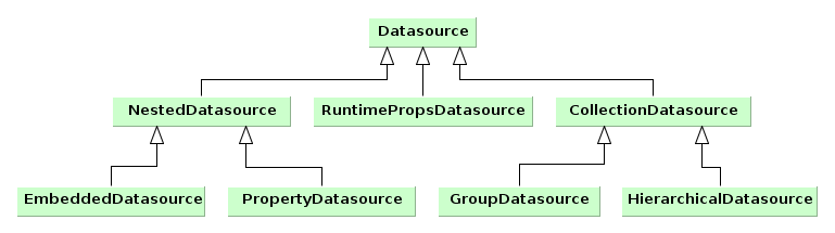
-
Datasourceis a simple data source designed to work with one entity instance. The instance is set by thesetItem()method and is accessed viagetItem().DatasourceImplclass is the standard implementation of such source, which is used, for instance, as a main data source on entity edit screens. -
CollectionDatasourceis a data source designed to work with a collection of entity instances. The collection is loaded with the invocation of therefresh()method, instance keys are accessible through thegetItemIds()method. ThesetItem()method sets the “current” instance of the collection andgetItem()returns it, i.e., for example, the one that corresponds to the currently selected table row.The way to load collections is determined by implementation. The most typical one is loading from Middleware via DataManager; in this case,
setQuery(),setQueryFilter()are used to form a JPQL query.CollectionDatasourceImplclass is the standard implementation of such sources, which is used on screens with entity lists.-
GroupDatasourceis a subtype ofCollectionDatasource, designed to work with the GroupTable component.Standard implementation is the
GroupDatasourceImplclass. -
HierarchicalDatasourceis a subtype ofCollectionDatasource, designed to work with the Tree and TreeTable components.Standard implementation is the
HierarchicalDatasourceImplclass.
-
-
NestedDatasourceis a data source designed to work with instances that are loaded in an attribute of another entity. In this case, a source that contains a parent entity is accessible viagetMaster(), and meta property that corresponds to the parent attribute containing instances of this source is accessible viagetProperty().For example an entity instance
Orderwhich contains a reference to theCustomerinstance is set in thedsOrdersource. Then, to link theCustomerinstance with visual components, it is enough to createNestedDatasourcewithdsOrder as parentand meta property to point to theOrder.customerattribute.-
PropertyDatasourceis a subtype ofNestedDatasource, designed to work with one instance or collection of related entities that are not embedded.Standard implementations: for working with one instance –
PropertyDatasourceImpl, with a collection –CollectionPropertyDatasourceImpl,GroupPropertyDatasourceImpl,HierarchicalPropertyDatasourceImpl. The latter also implement theCollectionDatasourceinterface, however some of its irrelevant methods associated with loading likesetQuery()throwUnsupportedOperationException. -
EmbeddedDatasourceis a subtype ofNestedDatasource, which contains an instance of an embedded entity.Standard implementation is the
EmbeddedDatasourceImpl class.
-
-
RuntimePropsDatasourceis a specific source, designed to work with dynamic attributes of entities.
Typically, datasources are declared in the dsContext section of a screen descriptor.
Data source objects can be created both declaratively, using an XML screen descriptor, and programmatically in a controller. Typically, standard implementation of sources is used, however, you can create your own class that is inherited from a standard one, if necessary.
Typically, datasources are declared in the dsContext element of a screen descriptor. Depending on the relative position of declaration elements, sources of two varieties are created:
-
if an element is located directly in
dsContext, a normalDatasourceorCollectionDatasource, which contains an independently loaded entity or collection, is created; -
if an element is located inside an element of another source,
NestedDatasourceis created and the external source becomes its parent.
Below is an example of declaring a data source:
<dsContext>
<datasource id="carDs" class="com.haulmont.sample.entity.Car" view="carEdit">
<collectionDatasource id="allocationsDs" property="driverAllocations"/>
<collectionDatasource id="repairsDs" property="repairs"/>
</datasource>
<collectionDatasource id="colorsDs" class="com.haulmont.sample.entity.Color" view="_local">
<query>
select c from sample$Color c order by c.name
</query>
</collectionDatasource>
</dsContext>
In the example above, carDs contains one entity instance, Car, and nested allocationsDs and repairsDs contain collections of related entities from the Car.driverAllocations and Car.repairs attributes, respectively. The Car instance together with related entities is set into the data source from the outside. If this screen is an edit screen, it happens automatically when opening the screen. The colorsDs data source contains a collection of instances of the Color entity, which is loaded by the source itself using the specified JPQL query with the _local view.
Below is the XML scheme.
dsContext – root element.
dsContext elements:
-
datasource– defines a data source that contains a single entity instance.Attributes:
-
id– source identifier, must be unique for thisDsContext. -
class– Java class of an entity that will be contained in this source. -
view– name of entity view. If the source itself loads instances, then this view will be used during loading. Otherwise, this view makes signals to external mechanisms on how to load an entity for this source. -
allowCommit– if set tofalse, theisModified()method of this source always returnsfalseand thecommit()method does nothing. Thus, changes in entities that are contained in the source are ignored. By default, it is set totrue, i.e., changes are traced and can be saved. -
datasourceClassis a custom class of data source implementation, if necessary.
-
-
collectionDatasource– defines a data source that contains a collection of instances.collectionDatasourceattributes:-
refreshMode– a source update mode, default isALWAYS. In theNEVERmode, whenrefresh()method is invoked, the source does not load data and only changes its state toDatasource.State.VALID, notifies listeners and sorts available instances. TheNEVERmode is useful if you need to programmatically fillCollectionDatasourcewith preloaded or created entities. For example:@Override public void init(Map<String, Object> params) { Set<Customer> entities = (Set<Customer>) params.get("customers"); for (Customer entity : entities) { customersDs.includeItem(entity); } customersDs.refresh(); } -
softDeletion– the false value disables the soft deletion mode when loading entities, i.e., deleted instances will also be loaded. Default value istrue.
collectionDatasourceelements:-
query– query to load entities
-
-
groupDatasource– completely similar tocollectionDatasource, but creates data source implementation that is suitable to use in conjunction with the GroupTable component. -
hierarchicalDatasource– similar tocollectionDatasource, and creates data source implementation that is suitable to use in conjunction with the Tree and TreeTable components.hierarchyPropertyis a specific attribute. It specifies an attribute name, upon which a hierarchy is built.
A source implementation class is selected implicitly based on the name of the XML element and, as mentioned above, the mutual arrangement of elements. However, if you need to apply a custom data source, you can explicitly specify its class in the datasourceClass attribute.
If you need to create a data source in the Java code, it is recommended to use a special class, DsBuilder.
The DsBuilder instance is parameterized by an invocation chain of its methods in the fluent interface style. If the master and property parameters are set, then NestedDatasource will be created, otherwise – Datasource or CollectionDatasource.
Example:
CollectionDatasource ds = new DsBuilder(getDsContext())
.setJavaClass(Order.class)
.setViewName(View.LOCAL)
.setId("ordersDs")
.buildCollectionDatasource();
Typically, custom implementation of a data source is required to change the loading process of a collection of entities. When creating a class of this source it should be inherited from CollectionDatasourceImpl, or from GroupDatasourceImpl, or HierarchicalDatasourceImpl, and the loadData() method should be overridden.
Example:
public class MyDatasource extends CollectionDatasourceImpl<SomeEntity, UUID> {
private SomeService someService = AppBeans.get(SomeService.NAME);
@Override
protected void loadData(Map<String, Object> params) {
detachListener(data.values());
data.clear();
for (SomeEntity entity : someService.getEntities()) {
data.put(entity.getId(), entity);
attachListener(entity);
}
}
}
In the example above, data is a base class field that stores a collection of loaded instances. The base class methods, detachListener() and attachListener(), control the assignment of a listener to loaded entities. The listener notifies the data source on changes in instance fields.
To create a custom data source declaratively, a class in the datasourceClass attribute of an XML element should be specified. In case of programmatic creation via DsBuilder, a source class is specified by invoking setDsClass().
The CollectionDatasourceImpl class and its inheritors, GroupDatasourceImpl, HierarchicalDatasourceImpl are standard implementation of datasources that work with collections of independent entity instances. These sources load data via DataManager by sending a JPQL query to Middleware. The format of these queries is described below.
A query should return entities of the type which is specified at the moment of creating a data source. In case of declarative creation, the entity type is specified in the class attribute of an XML element, if DsBuilder is used – in the setJavaClass() or setMetaClass() method.
Furthermore, the object type in the from query statement should match the source type. This is necessary for automatic query transformations if security limitations, etc. are applied.
For example, a query of the data source of the Customer type may look as follows:
select c from sales$Customer c
Below are examples of invalid queries for a source of the Customer type:
select c.id, c.name from sales$Customer c /* invalid – returns single fields, not the whole Customer object */ select o.customer from sales$Order o /* invalid – the 'from' type (Order) is different from the resulting type (Customer) */
A JPQL query in a data source may contain parameters of several types. A parameter type is determined by a prefix of a parameter name. A prefix is a part of the name before the $ character. The interpretation of the name after $ is described below.
If the value is not found by the rules given by the prefix for this parameter, the parameter value is set to null. For example, if the query has a parameter param$some_name, and the parameter map does not have the some_name key, then param$some_name is set to null.
-
The parameter value is data from another data source that is registered in the same
DsContext. For example:<collectionDatasource id="customersDs" class="com.sample.sales.entity.Customer" view="_local"> <query> select c from sales$Customer c </query> </collectionDatasource> <collectionDatasource id="ordersDs" class="com.sample.sales.entity.Order" view="_local"> <query> select o from sales$Order o where o.customer.id = :ds$customersDs </query> </collectionDatasource>In the example above, a query parameter of the
ordersDsdata source will be a current entity instance located in thecustomersDsdata source.If parameters with the
dsprefix are used, dependencies between datasources are created automatically. They lead to updating the source if its parameter are changed. In the example above, if the selected Customer is changed, the list of its Orders is changed automatically.Please note that in the example of the parameterized query, the left part of the comparison operator is the value of the
o.customer.ididentifier, and the right part – theCustomerinstance that is contained in thecustomersDssource. This comparison is valid since when running a query at Middleware, the implementation of the Query interface, by assigning values to query parameters, automatically adds entity ID instead of a passed entity instance.A path through the entity graph to an attribute (from which the value should be used) can be specified in the parameter name after the prefix and name of a source, for example:
<query> select o from sales$Order o where o.customer.id = :ds$customersDs.id </query>or
<query> select o from sales$Order o where o.tagName = :ds$customersDs.group.tagName </query> -
The
customprefix.A parameter value will be taken from the
Map<String, Object>object that is passed into therefresh()method of a data source. For example:<collectionDatasource id="ordersDs" class="com.sample.sales.entity.Order" view="_local"> <query> select o from sales$Order o where o.number = :custom$number </query> </collectionDatasource>Map<String, Object> params = new HashMap<>(); params.put("number", "1"); ordersDs.refresh(params);Bringing an instance to its identifier, if necessary, is performed similarly to parameters with the
dsprefix. The path through the entity graph in the parameter name is not supported in this case. -
The
paramprefix.A parameter value is taken from the
Map<String, Object>object that is passed into theinit()method of a controller.Bringing an instance to its identifier, if necessary, is performed similarly to parameters with the
dsprefix. The path through the entity graph in the parameter name is supported in this case. -
The
componentprefix.A parameter value will be a current value of a visual component, which path is specified in the parameter name. For example:
<query> select o from sales$Order o where o.number = :component$filter.orderNumberField </query>The path to a component should include all nested frames.
Bringing an instance to its identifier, if necessary, is similar to
dsparameters. The path through the entity graph in the parameter name is supported as the continuation of the path to a component in this case. -
The
sessionprefix.A parameter value will be a value of the user session attribute specified in the parameter name.
The value is extracted by the
UserSession.getAttribute()method, so predefined names of session attributes are also supported.-
userId– ID of the currently registered or substituted user; -
userLogin– login of the currently registered or substituted user in lowercase.
Example:
<query> select o from sales$Order o where o.createdBy = :session$userLogin </query>Bringing an instance to its identifier, if necessary, is similar to
dsparameters. In this case, the path through the entity graph in the parameter name is not supported. -
A data source query can be modified during the work of the application, depending on conditions entered by the user. This allows you to efficiently filter data at the level of selection from DB.
The easiest way to provide such ability is to connect a special visual component, Filter, to a data source.
If by any reason the use of a universal filter is unwanted, a special XML markup can be embedded into a query text. This will allow to create a resulting query based on values entered by the user into any visual components of the screen.
In this filter the following elements can be used:
-
filter– a root element of the filter. It can directly contain only one condition.-
and,or– logical conditions, may contain any number of other conditions and statements. -
c– JPQL statement, which is added into thewheresection. It contains only the text and an optionaljoinattribute, which value will be added into a corresponding place of the query.
-
Conditions and statements are added into the resulting query only if parameters inside contain values, i.e., they are not null.
Example:
<query>
select distinct d from app$GeneralDoc d
<filter>
<or>
<and>
<c join=", app$DocRole dr">dr.doc.id = d.id and d.processState = :custom$state</c>
<c>d.barCode like :component$barCodeFilterField</c>
</and>
<c join=", app$DocRole dr">dr.doc.id = d.id and dr.user.id = :custom$initiator</c>
</or>
</filter>
</query>
In this case, if state and initiator parameters are passed into the refresh() method of a data source, and a visual component, barCodeFilterField, has some value specified, then the resulting query will be as follows:
select distinct d from app$GeneralDoc d, app$DocRole dr where ( (dr.doc.id = d.id and d.processState = :custom$state) and (d.barCode like :component$barCodeFilterField) ) or (dr.doc.id = d.id and dr.user.id = :custom$initiator)
If, for example, the barCodeFilterField component is empty and only one parameter, initiator, was passed into the refresh() method, the query will be as follows:
select distinct d from app$GeneralDoc d, app$DocRole dr where (dr.doc.id = d.id and dr.user.id = :custom$initiator)
Do not use ds-parameters in query filters. They are intended for linking datasources and treated in a special way.
It is possible to use a special feature of JPQL queries execution in datasources, described for the Query interface of the Middleware level: for easy creation of case-insensitive search condition of any substring, (?i) prefix can be used. However, due to the fact that the query value is usually passed implicitly, the following differences take place:
-
The
(?i)prefix should be specified before a parameter name and not inside the value. -
The parameter value will be automatically converted to lowercase.
-
If the parameter value does not have
%characters, they will be added to the beginning and the end.
Below is an example of how to process the following query:
select c from sales$Customer c where c.name like :(?i)component$customerNameField
In this case, the parameter value taken from the customerNameField component will be converted to lowercase and will be framed with % characters, and then an SQL query with a lower(C.NAME) like ? condition will be executed in the database.
Please note that with this search, an index created in the DB by the NAME field, will not be used.
With datasource listeners it's possible to receive notifications about changes in data source states and entity instances located inside them.
To register listeners, the Datasource.addListener(), Datasource.removeListener() methods are used. Below is an example of registering a listener in a screen controller:
@Inject
private Datasource<Customer> customerDs;
...
public void init(Map<String, Object> params) {
...
customerDs.addListener(new DatasourceListener<Customer>() {
// listener methods implementation
});
}
There are two listener interfaces of datasources: DatasourceListener and CollectionDatasourceListener. The first can be used for registration in any of datasources, the second – only in those implementing CollectionDatasource. Typically, in practice, it's not necessary to receive all notifications from a listener. That's why it is convenient to use class-adapters, DsListenerAdapter and CollectionDsListenerAdapter, instead of implementation of listener interfaces, which contain empty implementations of all methods of corresponding interfaces.
DatasourceListener methods are provided below:
-
valueChanged()– declaration of this method is inherited from the base interface,ValueListener. This listener method is invoked if an attribute value of some entity that is currently located in the source has changed. The modified instance itself, the name of changed attribute, old and new values are passed into the method.valueChanged()notification can be used to respond to user changes in an entity from the UI, i.e., editing input fields. In the example below, a hypothetical method,updateSettings(), will be invoked when the value of theactiveattribute is changed, and a new attribute value will be passed into this method:@Inject private Datasource<Customer> customerDs; public void init(Map<String, Object> params) { ... customerDs.addListener(new DsListenerAdapter<Customer>() { @Override public void valueChanged(Customer source, String property, Object prevValue, Object value) { if ("active".equals(property)) { boolean active = BooleanUtils.isTrue((Boolean) value); // converting null to false updateSettings(active); } } }); } -
itemChanged()– is invoked when a selected instance returned by thegetItem()method is changed.For
Datasource, it happens when another instance (ornull) is set withsetItem()method.For
Below is an example of theCollectionDatasource, this notification is invoked when a selected element is changed in a linked visual component. For example, it may be a selected table row, tree element or item in a drop-down list.itemChanged()notification to control the state of an action of the table:@Inject protected CollectionDatasource<Customer, UUID> customersDs; @Named("customersTable.remove") protected RemoveAction removeAction; public void init(Map<String, Object> params) { ... customersDs.addListener(new DsListenerAdapter<Customer>() { @Override public void itemChanged(Datasource<Customer> ds, Customer prevItem, Customer item) { removeAction.setEnabled(canCustomerBeDeleted(item)); } }); } -
stateChanged()– is invoked when a state of the data source is changed. The data source can be in one of three states corresponding to theDatasource.Stateenumeration:-
NOT_INITIALIZED– source has just been created. -
INVALID– the whole DsContext, which this source is related to, is created. -
VALID– data source is in working state:Datasourcecontains an entity instance or null,CollectionDatasource– collection of instances or an empty collection.
Receiving a notification about changes in source state may be important for complex editors, which consist of several frames where it is difficult to trace the moment of putting an edited entity into the source. In this case,
stateChanged()notification for the delayed initialization of certain screen elements can be used:@Inject protected CollectionPropertyDatasourceImpl<CategoryAttribute, UUID> categoryAttrsDs; categoryAttrsDs.addListener(new DsListenerAdapter<CategoryAttribute>() { @Override public void stateChanged(Datasource ds, Datasource.State prevState, Datasource.State state) { if (state != Datasource.State.VALID) return; initDataTypeColumn(); initDefaultValueColumn(); } }); -
The CollectionDatasourceListener interface adds one more method:
-
collectionChanged()– is invoked when a entity collection, which is stored in the data source, is changed. One of the following type of changes is passed into the method:REFRESH,CLEAR,ADD,REMOVE,UPDATE.Below is an example of a listener that invokes the recalculation of a journey cost in case of the address of a stop (the
Stopentity) or the number of stops is changed:protected class StopDsListener extends CollectionDsListenerAdapter<Stop> { @Override public void valueChanged(Stop source, String property, Object prevValue, Object value) { // existing stop address changed if ("address".equals(property)) { fireRouteChanged(); } } @Override public void collectionChanged(CollectionDatasource ds, Operation operation) { // stop was added or removed fireRouteChanged(); } private void fireRouteChanged() { // journey route has changed, need to recalculate price, journey time, pickup time delay etc. } }
All datasources that are created declaratively are registered in the DsContext object of a screen. A reference to DsContext can be obtained using the getDsContext() method of a screen controller or with an injection into a class field.
DsContext solves the following tasks:
-
Organizes dependencies between datasources when with a navigation to one source (i.e. when changing a "current" instance with the
setItem()method) a related source is updated. Using these dependencies it's quite easy to organize master-detail connections among visual components on screens.Dependencies between sources are organized using query parameters with the
ds$prefix. -
Collects all changed entity instances and sends them to Middleware in a single invocation of
DataManager.commit(), i.e. to save them into a data base using a single transaction.As an example, let's assume that some screen allows a user to edit an instance of the
Orderentity and a collection ofOrderLineinstances belonging to it. TheOrderinstance is located inDatasource; theOrderLinecollection – in nestedCollectionDatasource, which is created using theOrder.linesattribute. If user changes some attribute ofOrderand creates a new instance,OrderLine. Then, when a screen is committed to DataManager, two instances – changedOrderand newOrderLine– will be sent simultaneously. After that, they will together get into one persistent context and will be saved into the DB with transaction commit. TheOrderLineinstance is also contained in theOrder.linescollection, but if it's not passed into persistent context independently, the cascade saving betweenOrderandOrderLinesat the ORM level should be set. Tight cascade relations at the ORM level sometimes cause unwanted consequences in unexpected places, so it will be better to avoid them, as described in theDsContextmechanism.As a result of committing transaction,
DsContextreceives a set of saved instances from Middleware (in case of optimistic blocking they at least have an increased value of theversionattribute), and sets these instances in datasources instead of outdated ones. This allows you to work with latest instances immediately after committing without an extra data source refresh that is related to queries to Middleware and the database. -
Declares a listener,
DsContext.CommitListener, which allows to receive notifications before and after committing modified instances. Before the commit it's possible to supplement a collection of instances sent to DataManager at Middleware which will lead to saving arbitrary entities in the same transaction. A collection of saved instances that are returned fromDataManagercan be obtained after commit.This mechanism is required if some entities, with which a screen works, are not under control of datasources, but are created and changed directly in the controller code. For example, a visual component,
FileUploadField, after uploading a file, creates a new entity instance,FileDescriptor, which can be saved together with other screen entities by adding toCommitContextin theDsContext.CommitListener.beforeCommit()method..DsContext.CommitListenerhas theDsContext.CommitListenerAdapteradapter, which is useful when it's needed to define only one method.In the following example, a new instance,
Customerwill be sent to Middleware and saved to the DB together with other modified screen entities when it is committed:protected Customer customer; protected void createNewCustomer() { customer = new Customer(); customer.setName("John Doe"); } public void init(Map<String, Object> params) { getDsContext().addListener(new DsContext.CommitListenerAdapter() { @Override public void beforeCommit(CommitContext context) { if (customer != null){ context.getCommitInstances().add(customer); } } }); }
DataSupplier – interface, through which the datasources refer to Middleware for loading and
saving entities. The standard implementation simply delegates to DataManager.
A screen can define its implementation of the DataSupplier in dataSupplier attribute
of the window element. Such own implementation may, for example, call an additional middleware
block for loading data for the screen from different database.
A reference to DataSupplier can be obtained either by injection into a screen controller or
through the DsContext or Datasource instances. In both cases, an own implementation
is returned if defined for the screen.
Action is an interface that abstracts an action (in other words, some function) from a visual
component. It is particularly useful when the same action can be invoked from different visual components ((for example, from
button and table context menu). In addition, this interface allows you to provide the action with additional
properties, such as name, flags of accessibility and visibility, etc.
Below are the Action interface methods:
-
actionPerform()is invoked by a visual component associated with this action. An instance of the caller is passed to the method. -
getId()returns an identifier of the action. The identifier is usually set by a constructor of a class that implementsActionand does not change throughout the lifecycle of the created action object. -
Methods for getting and setting
caption,description,shortcut,icon,enabled,visibleproperties. Typically, all these properties are used by related visual components to set their own corresponding properties. -
addPropertyChangeListener(),removePropertyChangeListener()methods used to add and remove listeners which handle changes to the abovementioned properties. A listener receives notification ofjava.beans.PropertyChangeEventtype, which contains the name of the changed property, its old and new values. -
refreshState()- a method that can be implemented in a particular action class to initialize the abovementioned properties in accordance to some external factors, such as user rights. It is usually invoked in constructors of implementing classes or from related visual components. -
addOwner(),removeOwner(),getOwner(),getOwners()– methods used to control relation between the action and visual components.
It is recommended to implement actions using the declarative creation or by inheriting from the BaseAction class. Furthermore, there is a set of standard actions applicable for tables and picker components. You can also derive action classes from standard actions to modify their behavior or to intercept events.
Visual components associated with an action can be of two types:
-
Visual component with a single action implements the
Component.ActionOwnerinterface. These are Button and LinkButton.Action is linked to the component by the invocation of the
ActionOwner.setAction()component method. At this point, the component replaces its properties with corresponding properties of the action (see components overview for details). -
Visual component containing several actions implements the
Component.ActionsHolderinterface. These areWindow,IFrame, Table and its inheritors, Tree, PopupButton, PickerField, LookupPickerField.The
ActionsHolder.addAction()method is used to add actions to the component. Implementation of this method in the component checks whether it already contains an action with the same identifier. If yes, then the existing action will be replaced with the new one. Therefore, it is possible, for example, to declare a standard action in a screen descriptor and then create a new one in the controller with overridden methods and add it to the component.
You can specify a set of actions in an XML screen descriptor for any component that implements the Component.ActionsHolder interface, including the entire screen or frame. This is done in the actions element, which contains nested action elements.
The action element can have the following attributes:
-
id− identifier, which should be unique within theActionsHoldercomponent. -
caption– action name. -
description– action description. -
enable– accessibility flag (true/false). -
icon– action icon. -
invoke- name of the controller method to be invoked. The method should bepublicvoid, and either not have arguments or have one argument of theComponenttype. If the method has aComponentargument, then an instance of the visual component that launches this action will be passed to it when invoked. -
shortcut- keyboard shortcut for invocation. Possible modifiers,ALT,CTRL,SHIFT, are separated by the "-" character. For example: ALT-CTRL-C. -
visible– visibility flag (true/false).
The examples of declaration are provided below.
-
Declaring actions at the screen level:
<window ...> <dsContext/> <actions> <action id="sayHelloAction" caption="msg://sayHello" shortcut="ALT-T" invoke="sayHello"/> </actions> <layout> <button action="sayHelloAction"/> </layout> </window>// controller public void sayHello(Component component) { showNotification("Hello!", NotificationType.TRAY); }In the example above, an action with
sayHelloActionidentifier and a name from message pack is declared. This action is bound with a button, which caption will be set to the action name. The action will invoke thesayHello()controller method when clicking on the button, or when pressing the ALT-T shortcut if at that moment the screen has input focus. -
Declaring actions for PopupButton:
<popupButton caption="Say something"> <actions> <action id="helloAction" caption="Say hello" invoke="sayHello"/> <action id="goodbyeAction" caption="Say goodbye" invoke="sayGoodbye"/> </actions> </popupButton> -
Declaring actions for Table:
<table id="usersTable" width="100%"> <actions> <action id="create"/> <action id="edit"/> <action id="copy" caption="msg://copy" icon="icons/copy.png" invoke="copy" trackSelection="true"/> <action id="changePassw" caption="msg://changePassw" icon="icons/change-pass.png" invoke="changePassword" trackSelection="true"/> </actions> <buttonsPanel> <button action="usersTable.create"/> <button action="usersTable.edit"/> <button action="usersTable.copy"/> <button action="usersTable.changePassw"/> </buttonsPanel> <rowsCount/> <columns> <column id="login"/> ... </columns> <rows datasource="usersDs"/> </table>In this example
copyandchangePasswactions are declared in addition tocreateandeditstandard actions of the table. These actions invoke corresponding methods of the controller. In addition, thetrackSelection="true"attribute is specified for them, which means that the action and corresponding button become disabled if no row is selected in the table. It is useful if the action is intended to be executed over a currently selected table row.An optional
openTypeattribute can be specified for create and edit actions to define edit screen opening mode, as described for thesetOpenType()method of the CreateAction class. -
Declaring PickerField actions:
<pickerField id="colourField" datasource="carDs" property="colour"> <actions> <action id="lookup"/> <action id="show" icon="icons/show.png" invoke="showColour" caption="" description="Show colour"/> </actions> </pickerField>In the example above, the standard
lookupaction and an additionalshowaction invoking theshowColour()method of the controller, are declared for thePickerFieldcomponent. SincePickerFieldbuttons that display actions use icons instead of captions, the caption attribute is explicitly set to an empty string, otherwise action name and button caption would be set to the action identifier. Thedescriptionattribute allows you to display a tooltip when hovering over the action button.
You can obtain references to any declared actions in the screen controller either directly by injection, or from components that implement the Component.ActionsHolder interface. This can be useful to set action properties programmatically. For example:
@Named("carsTable.create")
private CreateAction createAction;
@Named("carsTable.copy")
private Action copyAction;
@Inject
private PickerField colourField;
@Override
public void init(Map<String, Object> params) {
Map<String, Object> values = new HashMap<>();
values.put("type", CarType.PASSENGER);
createAction.setInitialValues(values);
copyAction.setEnabled(false);
Action showAction = colourField.getAction("show");
showAction.setEnabled(false);
}
Standard actions are classes that implement the Action interface and are intended to solve common tasks, such as invocation of an edit screen for an entity selected in a table. Standard actions have strictly defined identifiers; therefore, for the declaration of a standard action in XML, it is enough to specify its identifier.
There are two types of standard actions:
-
Actions over collections of entities that are displayed in tables or trees.
For inheritors of ListComponent (Table, GroupTable, TreeTable and Tree) the set of standard actions is defined in ListActionType enumeration; their implementation classes are located in com.haulmont.cuba.gui.components.actions package.
The example of using standard actions in a table:
<table id="usersTable" width="100%">
<actions>
<action id="create"/>
<action id="edit"/>
<action id="remove"/>
<action id="refresh"/>
</actions>
<buttonsPanel>
<button action="usersTable.create"/>
<button action="usersTable.edit"/>
<button action="usersTable.remove"/>
<button action="usersTable.refresh"/>
</buttonsPanel>
<rowsCount/>
<columns>
<column id="login"/>
...
</columns>
<rows datasource="usersDs"/>
</table>
These actions are described in details below.
CreateAction – action with create identifier. It is intended to create new entity instance and open its edit screen. If the edit screen successfully commits a new instance to the database, CreateAction adds this new instance to the table data source and makes it selected.
The following specific methods are defined in the CreateAction class:
-
setOpenType()allows you to specify new entity edit screen open mode.THIS_TABby default.Since it is quite often required to open edit screens in another mode (typically,
DIALOG), you can specify anopenTypeattribute with desired value in theactionelement when using declarative creation of thecreateaction. This eliminates the need to obtain action reference in the controller and set this property programmatically. For example:<table id="usersTable"> <actions> <action id="create" openType="DIALOG"/> -
setWindowId()allows you to specify the identifier of the entity edit screen. By default,{entity_name}.editis used, for examplesales$Customer.edit. -
setWindowParams()allows you to set edit screen parameters passed into itsinit()method. -
setInitialValues()allows you to set initial values of attributes of the entity being created. It takes aMapobject, where keys are attribute names, and values are attribute values. For example:Map<String, Object> values = new HashMap<>(); values.put("type", CarType.PASSENGER); carCreateAction.setInitialValues(values);An example of
setInitialValues()usage is also provided in the section of development recipes. -
afterCommit()is invoked by the action after the new entity has been successfully committed and the edit screen has been closed. This method does not have implementation and can be overridden in inheritors to handle this event. -
setAfterCommitHandler()allows you to provide a handler which will be called after the new entity has been successfully committed and the edit screen has been closed. This handler can be used instead of overridingafterCommit()to avoid creating the action subclass. For example:@Named("customersTable.create") private CreateAction customersTableCreate; @Override public void init(Map<String, Object> params) { customersTableCreate.setAfterCommitHandler(new CreateAction.AfterCommitHandler() { @Override public void handle(Entity entity) { showNotification("Committed", NotificationType.HUMANIZED); } }); } -
afterWindowClosed()is the last method invoked by the action after closing the edit screen regardless of whether the new entity has been committed or not. This method does not have implementation and can be overridden in inheritors to handle this event. -
setAfterWindowClosedHandler()allows you to provide a handler which will be called after closing the edit screen regardless of whether the new entity has been committed or not. This handler can be used instead of overridingafterWindowClosed()to avoid creating the action subclass.
EditAction is an action with edit identifier, intended to open an edit screen for a selected entity instance. If the edit screen successfully commits the instance to the database, then EditAction updates this instance in the table data source.
The following specific methods are defined in the EditAction class:
-
setOpenType()allows you to specify entity edit screen open mode.THIS_TABby default.Since it is quite often required to open edit screens in another mode (typically
DIALOG), you can specifyopenTypeattribute with desired value in theactionelement when creating the action declaratively. This eliminates the need to obtain action reference in the controller and set this property programmatically. For example:<table id="usersTable"> <actions> <action id="edit" openType="DIALOG"/> -
setWindowId()allows you to specify entity edit screen identifier.{entity_name}.editis used by default, for example,sales$Customer.edit. -
setWindowParams()allows you to set edit screen parameters, passed to itsinit()method. -
afterCommit()is invoked by the action after the entity has been successfully committed and the edit screen has been closed. This method does not have implementation and can be overridden in inheritors to handle this event. -
setAfterCommitHandler()allows you to provide a handler which will be called after the new entity has been successfully committed and the edit screen has been closed. This handler can be used instead of overridingafterCommit()to avoid creating the action subclass. For example:@Named("customersTable.edit") private EditAction customersTableEdit; @Override public void init(Map<String, Object> params) { customersTableEdit.setAfterCommitHandler(new EditAction.AfterCommitHandler() { @Override public void handle(Entity entity) { showNotification("Committed", NotificationType.HUMANIZED); } }); } -
afterWindowClosed()is the last method invoked by the action after closing the edit screen regardless of whether the edited entity has been committed or not. This method does not have implementation and can be overridden in inheritors to handle this event. -
setAfterWindowClosedHandler()allows you to provide a handler which will be called after closing the edit screen regardless of whether the new entity has been committed or not. This handler can be used instead of overridingafterWindowClosed()to avoid creating the action subclass.
RemoveAction - action with remove identifier, intended to remove a selected entity instance.
The following specific methods are defined in the RemoveAction class:
-
setAutocommit()allows you to control the moment of entity removal from the database. By defaultcommit()method is invoked after triggering the action and removing the entity from the data source. As result, the entity is removed from the database. You can setautocommitproperty into false usingsetAutocommit()method or corresponding parameter of the constructor. In this case you will need to explicitly invoke the data sourcecommit()method to confirm the removal after removing the entity from the data source.The value of
autocommitdoes not affect datasources in theDatasource.CommitMode.PARENTmode, i.e. the datasources that provide composite entities editing. -
setConfirmationMessage()allows you to set message text for the removal confirmation dialog. -
setConfirmationTitle()allows you to set removal confirmation dialog title. -
afterRemove()is invoked by the action after the entity has been successfully removed. This method does not have implementation and can be overridden. -
setAfterRemoveHandler()allows you to provide a handler which will be called after the new entity has been successfully removed. This handler can be used instead of overridingafterRemove()to avoid creating the action subclass. For example:@Named("customersTable.remove") private RemoveAction customersTableRemove; @Override public void init(Map<String, Object> params) { customersTableRemove.setAfterRemoveHandler(new RemoveAction.AfterRemoveHandler() { @Override public void handle(Set removedItems) { showNotification("Removed", NotificationType.HUMANIZED); } }); }
RefreshAction - an action with refresh identifier. It is intended to update (reload) entities collection. When triggered, it invokes refresh() method of a data source associated with the corresponding component.
The following specific methods are defined in the RefreshAction class:
-
setRefreshParams()allows you to set parameters passed into theCollectionDatasource.refresh()method to be used in the query. By default, no parameters are passed.
AddAction – action with add identifier, intended for selecting an existing entity instance and adding it to the collection. When triggered, opens entities lookup screen.
The following specific methods are defined in the AddAction class:
-
setOpenType()allows you to specify entity selection screen open mode.THIS_TABby default.Since it is often required to open the lookup screens in a different mode (usually
DIALOG), theopenTypeattribute can be specified in the action element, when creating theaddaction declaratively. This eliminates the need to get a reference to the action in the controller and set this property programmatically. For example:<table id="usersTable"> <actions> <action id="add" openType="DIALOG"/> -
setWindowId()allows you to specify entity selection screen identifier.{entity_name}.lookupby default, for example,sales$Customer.lookup. If such screen does not exist, attempts to open{entity_name}.browsescreen, for example,sales$Customer.browse. -
setWindowParams()allows you to set selection screen parameters, passed into itsinit()method. -
setHandler()allows you to set an object implementingWindow.Lookup.Handlerinterface which will be passed to the selection screen. By default,AddAction.DefaultHandlerobject is used.
ExcludeAction - an action with exclude identifier. It allows a user to exclude entity instances from a collection without removing them from the database. The class of this action is an inheritor of RemoveAction, however, when triggered it invokes excludeItem() of CollectionDatasource instead of removeItem(). In addition, for an entity in a nested datasource, the ExcludeAction disconnects the link with the parent entity. Therefore this action can be used for editing one-to-many associations.
The following specific methods are defined in the ExcludeAction class in addition to RemoveAction:
-
setConfirm()– flag to show the removal confirmation dialog. You can also set this property via the action constructor. By default it is set tofalse.
ExcelAction - an action with excel identifier, intended to export table data into XLS and download the resulting file. You can add this action only to Table, GroupTable and TreeTable components.
When creating the action programmatically, you can set the following constructor parameters:
-
display–ExportDisplayinterface implementation for file download. Standard implementation is used by default.. -
parameterized- if set to true, the action shows a special window withexcelExportidentifier, which allows user to choose table columns for export.
For PickerField,
LookupPickerField and
SearchPickerField
components, a set of standard actions is defined in the PickerField.ActionType
enumeration. Implementations are inner classes of the PickerField
interface, which are described in details below.
The example of standard actions usage in a picker component:
<searchPickerField optionsDatasource="coloursDs"
datasource="carDs" property="colour">
<actions>
<action id="clear"/>
<action id="lookup"/>
<action id="open"/>
</actions>
</searchPickerField>
LookupAction – action with lookup identifier, intended for selecting an entity instance and setting it as the component's value. When triggered, it opens an entities lookup screen.
The following specific methods are defined in the LookupAction class:
-
setLookupScreenOpenType()allows you to specify entity selection screen open mode.THIS_TABby default. -
setLookupScreenDialogParams()allows you to set the window properties for a lookup screen that is opened in theDIALOGmode (see previous method). Other modes are not affected. -
setLookupScreen()allows you to specify entity selection screen identifier.{entity_name}.lookupby default, for example,sales$Customer.lookup. If such screen does not exist, attempts to open{entity_name}.browsescreen, for example,sales$Customer.browse. -
setLookupScreenParams()allows you to set selection screen parameters, passed into itsinit()method. -
afterSelect()is invoked by the action after the selected instance is set as the component's value. This method does not have implementation and can be overridden. -
afterCloseLookup()is the last method invoked by the action after closing the lookup screen regardless of whether an instance has been selected or not. This method does not have implementation and can be overridden.
ClearAction - an action with clear
identifier, intended for clearing (i.e. for setting tonull) the value of the component.
OpenAction - action with open identifier, intended for opening an edit screen for the entity instance which is the current value of the component.
The following specific methods are defined in the OpenAction class:
-
setEditScreenOpenType()allows you to specify entity selection screen open mode.THIS_TABby default. -
setEditScreenDialogParams()allows you to set the window properties for an edit screen that is opened in theDIALOGmode (see previous method). Other modes are not affected. -
setEditScreen()allows you to specify entity edit screen identifier.{entity_name}.editscreen is used by default, for example,sales$Customer.edit. -
setEditScreenParams()allows you to set edit screen parameters, passed to itsinit()method. -
afterWindowClosed()is invoked by the action after closing the edit screen. This method does not have implementation and can be overridden in inheritors to handle this event.
BaseAction is a base class for actions implementation.
It is recommended to derive custom actions from it when declarative
actions creation functionality is insufficient.
When creating a custom action class, you should implement actionPerform() method and pass
action identifier to the BaseAction constructor. You can override any property
getters: getCaption(), getDescription(), getIcon(),
getShortcut(), isEnabled(), isVisible(). Standard implementations of
these methods return values set by setter methods, except the getCaption() method. If the action
name is not explicitly set by setCaption() method, it retrieves message using action identifier
as key from the the localized message pack corresponding to the action
class package. If there is no message with such key, then the key itself, i.e. the action identifier,
is returned.
BaseAction can change its enabled and visible properties depending on
user permissions and current context.
BaseAction is visible if the following conditions are met:
-
setVisible(false)method was not called; -
there is no
hideUI permission for this action.
The action is enabled if the following conditions are met:
-
setEnabled(false)method was not called; -
there are no
hideorread-onlyUI permissions for this action; -
isPermitted()method returns true; -
isApplicable()method returns true.
Usage examples:
-
Button action:
@Inject private Button helloBtn; @Override public void init(Map<String, Object>params) { helloBtn.setAction(new BaseAction("hello") { @Override public void actionPerform(Component component) { showNotification("Hello!", NotificationType.TRAY); } }); }In this example, the
helloBtnbutton caption will be set to the string located in the message pack with thehellokey. You can override thegetCaption()action method to initialize button name in a different way. -
Action of a programmatically created PickerField:
@Inject private ComponentsFactory componentsFactory; @Inject private BoxLayout box; @Override public void init(Map<String, Object>params) { PickerField pickerField = componentsFactory.createComponent(PickerField.NAME); pickerField.addAction(new BaseAction("hello") { @Override public String getCaption() { return null; } @Override public String getDescription() { return getMessage("helloDescription"); } @Override public String getIcon() { return"icons/hello.png"; } @Override public void actionPerform(Component component) { showNotification("Hello!", NotificationType.TRAY); } }); box.add(pickerField); }In this example an anonymous
BaseActionderived class is used to set the action of the picker field button. The button caption is not displayed, as an icon with a description, which pops up when hovering mouse cursor, is used instead. -
Table action:
@Inject private Table table; @Inject private Security security; @Override public void init(Map<String, Object> params) { table.addAction(new HelloAction()); } private class HelloAction extends BaseAction { public HelloAction() { super("hello"); } @Override public void actionPerform(Component component) { showNotification("Hello " + table.getSingleSelected(), NotificationType.TRAY); } @Override protected boolean isPermitted() { return security.isSpecificPermitted("myapp.allow-greeting"); } @Override public boolean isApplicable() { return target != null && target.getSelected().size() == 1; } }In this example, the
HelloActionclass is declared, and its instance is added to the table's actions list. The action is enabled for users who havemyapp.allow-greetingsecurity permission and only when a single table row is selected. The latter is possible because BaseAction'stargetproperty is automatically assigned to the action when it is added to aListComponentdescendant (TableorTree). -
If you need an action, which becomes enabled when one or more table rows are selected, use BaseAction's descendant -
ItemTrackingAction, which adds default implementation ofisApplicable()method:@Inject private Table table; @Override public void init(Map<String, Object> params) { table.addAction(new ItemTrackingAction("hello") { @Override public void actionPerform(Component component) { showNotification("Hello " + table.getSelected().iterator().next(), NotificationType.TRAY); } }); }
Dialogs and notifications can be used to display messages to users.
Dialogs have a title with a closing button and are always displayed in the center of the application main window. Notifications can be displayed both in the center and in the corner of the window, and can automatically disappear.
Dialogs are invoked by showMessageDialog() and showOptionDialog() methods of the IFrame interface. This interface is implemented by screen controller, so these methods can be invoked directly in the controller code.
-
showMessageDialog()is intended to display a message. The method has the following parameters:-
title– dialog title. -
message- message. For HTML type (see below), you can use HTML tags for formatting the message. When using HTML, make sure you escape data loaded from the database to avoid code injection in web client. You can use\ncharacters for line breaks in non-HTML messages. -
messageType– message type. Possible types:The difference in message types is reflected in desktop user interface only.-
CONFIRMATION,CONFIRMATION_HTML– confirmation dialog. -
WARNING,WARNING_HTML– warning dialog.
-
An example of showing a dialog:
showMessageDialog("Warning", "Something is wrong", MessageType.WARNING); -
-
showOptionDialog()is intended to display a message and buttons for user actions. In addition to parameters described forshowMessageDialog(), the method takes an array or a list of actions. A button is created for each dialog action. After a button is clicked, the dialog closes invokingactionPerform()method of the corresponding action.It is convenient to use anonymous classes derived from
DialogActionfor buttons with standard names and icons. Five types of actions defined by theDialogAction.Typeenum are supported:OK,CANCEL,YES,NO,CLOSE. Names of corresponding buttons are extracted from the main message pack.Below is an example of a dialog invocation with
YesandNobuttons and with a caption and messages taken from the message pack of the current screen:showOptionDialog( getMessage("confirmCopy.title"), getMessage("confirmCopy.msg"), MessageType.CONFIRMATION, new Action[] { new DialogAction(DialogAction.Type.YES) { public void actionPerform(Component component) { copySettings(); } }, new DialogAction(DialogAction.Type.NO) } );
Notifications can be invoked using showNotification() method of the IFrame interface. This interface is implemented by screen controlller, so this method can be invoked directly from the controller code.
showNotification() method takes the following parameters:
-
caption- notification text. In case of HTML-type (see below), you can format message text using HTML-tags. When using HTML, don’t forget to escape data to prevent code injection in the web-client. You can use\ncharacters for line breaks in non-HTML messages. -
description– an optional description displayed under the caption. You can also use\ncharacter or HTML-formatting. -
type– notification type. Possible values:-
TRAY,TRAY_HTML- a notification is displayed in the bottom right corner of the application and disappears automatically. -
HUMANIZED,HUMANIZED_HTML– a standard notification displayed in the center of the screen, disappears automatically. -
WARNING,WARNING_HTML– a warning. Disappears when clicked. -
ERROR,ERROR_HTML– a notification about an error. Disappears when clicked.
-
Examples of invoking a notification:
showNotification(getMessage("selectBook.text"), NotificationType.HUMANIZED);
showNotification("Validation error", "<b>Date</b> is incorrect", NotificationType.TRAY_HTML);
Background tasks can be used at the client tier to perform tasks asynchronously without locking the user interface.
-
A task is defined as an inheritor of an abstract class
BackgroundTask. A link to a screen controller which will be associated with the task and the task timeout should be passed to the task constructor.Closing the screen will interrupt the tasks associated with it. Additionally, the task will be interrupted automatically after the specified timeout.
Actual actions performed by the task are implemented in the
run()method. -
An object of "
BackgroundTaskHandler" class controlling the task is created by passing a task instance to thehandle()method of theBackgroundWorkerbean. A link to aBackgroundWorkercan be obtained by an injection in a screen controller, or a static method of theAppBeansclass.
@Inject
protected BackgroundWorker backgroundWorker;
@Override
public void init(Map<String, Object> params) {
// Create task with 10 sec timeout and this screen as owner
BackgroundTask<Integer, Void> task = new BackgroundTask<Integer, Void>(10, this) {
@Override
public Void run(TaskLifeCycle<Integer> taskLifeCycle) throws Exception {
// Do something in background thread
for (int i = 0; i < 5; i++) {
TimeUnit.SECONDS.sleep(1); // time consuming computations
taskLifeCycle.publish(i); // publish current progress to show it in progress() method
}
return null;
}
@Override
public void canceled() {
// Do something in UI thread if the task is canceled
}
@Override
public void done(Void result) {
// Do something in UI thread when the task is done
}
@Override
public void progress(List<Integer> changes) {
// Show current progress in UI thread
}
};
// Get task handler object and run the task
BackgroundTaskHandler taskHandler = backgroundWorker.handle(task);
taskHandler.execute();
}
Detailed information about methods is provided in JavaDocs for BackgroundTask, TaskLifeCycle, BackgroundTaskHandler classes.
Please note the following:
-
BackgroundTask<T, V>is a parameterized class:-
T− the type of objects displaying task progress. Objects of this type are passed to the task'sprogress()method during an invocation ofTaskLifeCycle.publish()in the working thread. -
V− task result type passed to thedone()method. It can also be obtained by invokingBackgroundTaskHandler.getResult()method, which will wait for a task to complete.
-
-
canceled()method is invoked only during a controlled cancelation of a task, i.e. whencancel()is invoked in theTaskHandler. -
If task timeout expires, or a window where it was running closes, the task is stopped without notifications. In the Web Client block, timeout-based interruption is performed with a delay specified in the cuba.backgroundWorker.maxClientLatencySeconds application property.
-
run()method of a task should support external interruptions. To ensure this, we recommend checking theTaskLifeCycle.isInterrupted()flag periodically during long processes and stopping execution when needed. Additionally, you should not silently discardInterruptedException(or any other exceptions) - instead you should either exit the method correctly or not handle the exception at all. -
BackgroundTaskobjects are stateless. If you did not create fields for temporary data when implementing task class, you can start several parallel processes using a single task instance. -
BackgroundHandlerobject (itsexecute()method) can only be started once. If you need to restart a task frequently, useBackgroundTaskWrapperclass. -
Use
BackgroundWorkWindoworBackgroundWorkProgressWindowclasses with a set of static methods to show a modal window with progress indicator and button. You can define progress indication type and allow or prohibit cancellation of the background task for the window. -
If you need to use certain values of visual components in the task thread, you should implement their acquisition in
getParams()method, which runs in the UI thread once, when a task starts. In therun()method, these parameters will be accessible via thegetParams()method of theTaskLifeCycleobject. -
If any exception occurs, the framework invokes
BackgroundTask.handleException()method in the UI thread, which can be used to display the error.
In order for background tasks to work correctly, the following configuration should be performed for the application project:
-
Timeout-based task interruption is implemented by the
WatchDogbean. To ensure that it is invoked periodically, you should add the following declaration to the spring.xml files of the Web Client and Desktop Client blocks:<bean id="backgroundWorkerScheduler" class="org.springframework.scheduling.concurrent.ThreadPoolTaskScheduler"> <property name="daemon" value="true"/> <property name="poolSize" value="1"/> </bean> <task:scheduled-tasks scheduler="backgroundWorkerScheduler"> <task:scheduled ref="cuba_BackgroundWorker_WatchDog" method="cleanupTasks" fixed-delay="2000"/> </task:scheduled-tasks> -
In the Web Client block task state polling is initiated by the client code running in web-browser. Polling interval is defined by the cuba.backgroundWorker.uiCheckInterval application property; the default value is 2 seconds.
Additionally, background tasks running in the Web Client block are affected by cuba.backgroundWorker.maxActiveTasksCount and cuba.backgroundWorker.maxClientLatencySeconds application properties.
Theme is used to manage visual presentation of an application.
A theme consists of SCSS files and other resources like images.
The platform includes two ready to use themes: Halo and Havana. By default, the application will use the one specified in the cuba.web.theme application property. The user may select the other theme in the standard > screen. If you want to disable the option to select new themes for users, register the settings screen in the web-screens.xml file of your project and set the changeThemeEnabled = false parameter for it:
<screen id="settings" template="/com/haulmont/cuba/web/app/ui/core/settings/settings-window.xml">
<param name="changeThemeEnabled" value="false"/>
</screen>
Some branding parameters can be configured for default themes, such as icons, login and main application window captions, and the website icon (favicon.ico). This can be done in the following way:
-
Create the following files structure in the
modules/webdirectory of the project:themes/ havana/ branding/ myapp-login.png myapp-menu.png favicon.icoHere,
havanais the directory of the theme,favicon.icois the website icon,myapp-login.png- login window logo image,myapp-menu.png- main window logo image. -
Open > in CUBA Studio and click at the bottom of the page. Set the paths to icon files for application and login window using and links. The path is specified relatively to the theme directory. Other links can be used to set window captions and the login window welcome text.
These parameters are saved in the main message pack of the gui module (i.e the
modules/gui/<root_package>/gui/messages.propertiesfile and its variants for different locales). Message packs allow you to use different image files for different user locales. A samplemessages.propertiesfile:application.caption = MyApp application.logoImage = branding/myapp-menu.png loginWindow.caption = MyApp Login loginWindow.welcomeLabel = Welcome to MyApp! loginWindow.logoImage = branding/myapp-login.png
You should not specify the path to
favicon.ico, since it must be located in the root directory of the theme.
Image files that will be used in the icon properties for actions and visual components, e.g. Button, can be also added to default themes.
For example, to add an icon to the Havana theme, you just have to add the image file to the modules/web/themes/havana directory described above (it is recommended to create a subfolder):
themes/
havana/
images/
address-book.png
After that, you can use the icon in the application by specifying the path relatively to the theme directory in the icon property:
<action id="adresses"
icon="images/address-book.png"/>
Font elements of Font Awesome can be used instead of icons. You should just specify the name of the required constant of the com.vaadin.server.FontAwesome in the icon property with a font-icon: prefix, for example:
<action id="adresses"
icon="font-icon:BOOK"/>
Images used for standard actions and screens of the platform can be replaced in the project. To replace a Havana theme icon, you should just copy the required image file to the modules/web/themes/havana/icons directory of the project. For example, create.png file should be created to replace the icon for the standard create action (the file name can be easily identified by URL of the corresponding img HTML-element in the running application):
themes/
havana/
icons/
create.png
In Halo theme, Font Awesome icons are used for standard actions and platform screens by default (if cuba.web.useFontIcons is enabled). In this case, you can replace a standard icon only by creating a custom theme based on Halo (see below) and setting the required correlation between the icon and the font element name in <your_theme>-theme.properties file:
cuba.web.icons.create.png = PLUS
If cuba.web.useFontIcons property is disabled, the icons for standard actions and screens are loaded similar to Havana theme - from image files in the icons subfolder. They can be replaced in the manner described for Havana.
Halo theme supports the cuba.web.useInverseHeader property, which controls the colour of the application header. By deafult, this property is set to true, which sets a dark (inverse) header.You can make a light header without any changes to the theme, simply by setting this property to false.
A platform theme can be modified in the project. Themes are described in SCSS files, that is why the simplest way to modify the theme is to modify the base SCSS variables that control application background colour, component size, or margins. Changing specific component parameters requires some expertise in CSS.
To adapt (extend) a theme in the project, you should create a specific file structure in the web module. A convenient way to do this is to use CUBA Studio: open the section and click . Select the theme you want to extend in the popup window. As a result, a directory structure, similar to the one described in the previous section, will be created. Apart from that, the build.gradle script will be complemented with the buildScssThemes task, which is executed automatically each time the web module is built.
Below is the example of a Halo theme extension, since it is based on Valo theme from Vaadin, and provides the widest range of options for customization.
The themes/halo/halo-ext-defaults.scss file is intended for theme variables. Most of the Halo variables correspond to those described in the Valo documentation. Below are the most common variables:
$v-background-color: #fafafa; /* component background colour */ $v-app-background-color: #e7ebf2; /* application background colour */ $v-panel-background-color: #fff; /* panel background colour */ $v-focus-color: #3b5998; /* focused element colour */ $v-error-indicator-color: #ed473b; /* empty required fields colour */ $v-line-height: 1.35; /* line height */ $v-font-size: 14px; /* font size */ $v-font-weight: 400; /* font weight */ $v-unit-size: 30px; /* base theme size, defines the height for buttons, fields and other elements */ $v-font-size--h1: 24px; /* h1-style Label size */ $v-font-size--h2: 20px; /* h2-style Label size */ $v-font-size--h3: 16px; /* h3-style Label size */ /* margins for containers */ $v-layout-margin-top: 10px; $v-layout-margin-left: 10px; $v-layout-margin-right: 10px; $v-layout-margin-bottom: 10px; /* spacing between components in a container (if enabled) */ $v-layout-spacing-vertical: 10px; $v-layout-spacing-horizontal: 10px; /* basic table dimensions */ $v-table-row-height: 30px; $v-table-header-font-size: 13px; $v-table-cell-padding-horizontal: 7px; /* input field focus style */ $v-focus-style: inset 0px 0px 5px 1px rgba($v-focus-color, 0.5); /* required fields focus style */ $v-error-focus-style: inset 0px 0px 5px 1px rgba($v-error-indicator-color, 0.5); /* animation for elements is enabled by default */ $v-animations-enabled: true; /* popup window animation is disabled by default */ $v-window-animations-enabled: false; /* inverse header is controlled by cuba.web.useInverseHeader property */ $v-support-inverse-menu: true; /* show "required" indicators for components */ $v-show-required-indicators: false !default;
A sample halo-ext-defaults.scss for a theme with a dark background and slightly minimized margins is provided below:
$v-background-color: #444D50; $v-font-size--h1: 22px; $v-font-size--h2: 18px; $v-font-size--h3: 16px; $v-layout-margin-top: 8px; $v-layout-margin-left: 8px; $v-layout-margin-right: 8px; $v-layout-margin-bottom: 8px; $v-layout-spacing-vertical: 8px; $v-layout-spacing-horizontal: 8px; $v-table-row-height: 25px; $v-table-header-font-size: 13px; $v-table-cell-padding-horizontal: 5px; $v-support-inverse-menu: false;
To modify parameters for specific components, you should add the corresponding CSS code to @mixin halo-ext {...} block of the halo-ext.scss file. For example, to display the application menu items in bold, the contents of the halo-ext.scss file should be as follows:
@import "../halo/halo";
@mixin halo-ext {
@include halo;
.v-menubar-menuitem-caption {
font-weight: bold;
}
}
You can create one or several application themes in the project and give the users an opportunity to select the most appropriate one. Creating new themes also allows you to override the variables in the *-theme.properties files, which set a few server-side parameters:
-
Default dialog window size.
-
Default input field width.
-
Dimensions of some components (Filter, FileMultiUploadField).
-
Correlation between icon names and constants of the
com.vaadin.server.FontAwesomeenumeration for using Font Awesome in standard actions and screens of the platform, if cuba.web.useFontIcons is enabled.
Below is the example of creating a Halo-based Facebook theme, which resembles the interface of a popular social network.
-
Open section in CUBA Studio and click . Select
haloand click . A Halo theme extension will be created in the project as described in the previous section. -
Rename the
themes/halodirectory in the web module tothemes/facebook, then rename thehalo-ext.scssfile inside it tofacebook.scss, andhalo-ext-defaults.scsstofacebook-defaults.scss. -
Edit the
styles.scssfile by changing thehalo-extimports and thehaloroot selector:@import "halo-defaults"; @import "facebook-defaults"; @import "facebook"; .facebook { @include facebook; } .v-theme-version { display: none; } -
Edit the
facebook.scssfile and replace@mixin halo-ext:@import "../halo/halo"; @mixin facebook { @include halo; } -
Copy the following variables to
facebook-defaults.scss:$v-background-color: #fafafa; $v-app-background-color: #e7ebf2; $v-panel-background-color: #fff; $v-focus-color: #3b5998; $v-border-radius: 0; $v-textfield-border-radius: 0; $v-font-family: Helvetica, Arial, 'lucida grande', tahoma, verdana, arial, sans-serif; $v-font-size: 14px; $v-font-color: #37404E; $v-font-weight: 400; $v-link-text-decoration: none; $v-shadow: 0 1px 0 (v-shade 0.2); $v-bevel: inset 0 1px 0 v-tint; $v-unit-size: 30px; $v-gradient: v-linear 12%; $v-overlay-shadow: 0 3px 8px v-shade, 0 0 0 1px (v-shade 0.7); $v-shadow-opacity: 20%; $v-selection-overlay-padding-horizontal: 0; $v-selection-overlay-padding-vertical: 6px; $v-selection-item-border-radius: 0; $v-line-height: 1.35; $v-font-size: 14px; $v-font-weight: 400; $v-unit-size: 25px; $v-font-size--h1: 22px; $v-font-size--h2: 18px; $v-font-size--h3: 16px; $v-layout-margin-top: 8px; $v-layout-margin-left: 8px; $v-layout-margin-right: 8px; $v-layout-margin-bottom: 8px; $v-layout-spacing-vertical: 8px; $v-layout-spacing-horizontal: 8px; $v-table-row-height: 25px; $v-table-header-font-size: 13px; $v-table-cell-padding-horizontal: 5px; $v-focus-style: inset 0px 0px 1px 1px rgba($v-focus-color, 0.5); $v-error-focus-style: inset 0px 0px 1px 1px rgba($v-error-indicator-color, 0.5);
-
Create a
facebook-theme.propertiesfile in thesrcdirectory of the web module:@include=halo-theme.properties
If necessary, you can use this file to override server-side theme variables from the
halo-theme.propertiesfile of the platform. -
Add the following properties to the
web-app.propertiesfile:cuba.web.theme = facebook cuba.themeConfig = havana-theme.properties halo-theme.properties facebook-theme.properties
-
Rebuild the application and start the server. Now the user will see the application in Facebook theme on first login, and will be able to choose between Facebook, Halo and Havana in the > menu.
The base theme for desktop applications is Nimbus.
To add any changes to the standard theme, you need to create a res.nimbus package in the com.sample.sales.desktop package of the desktop module. Theme files will be stored in the res.nimbus package.
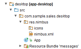
The icons folder contains icon files, the nimbus.xml file contains the description of the theme style.
The properties file of a desktop application should have cuba.desktop.resourceLocations property defined (defines a set of folders containing the style files):
cuba.desktop.resourceLocations = \ com/haulmont/cuba/desktop/res \ com/sample/sales/desktop/res
Examples
-
Adding an icon.
If you need to add a new icon to a desktop application, for example an icon for a button, you should create a
res.nimbus.iconspackage within thecom.sample.sales.desktoppackage of the desktop module and put the corresponding icon there.
Description of a button in the descriptor with a path to an icon set in the icon attribute:
<button id="button1" caption="Attention" icon="icons/attention.png"/>
Below you can see a button with the
attention.pngicon.
-
Redefining default values of theme properties.
For example, let us change text field background color for mandatory fields.
The
nimbus.xmlfile with the following content should be created in theres.nimbuspackage:<theme xmlns="http://schemas.haulmont.com/cuba/desktop-theme.xsd"> <ui-defaults> <color property="cubaRequiredBackground" value="#f78260"/> </ui-defaults> </theme>The
ui-defaultselement redefines the values of platform theme properties set by default.The
ui-defaultselement includes both the properties contained in a standardNimbus(http://docs.oracle.com/javase/tutorial/uiswing/lookandfeel/_nimbusDefaults.html) theme and the properties created in the CUBA platform.In this example, we redefined the value of the CUBA property –
cubaRequiredBackground, which stores the background color for required fields. This change will affect all required input fields. -
Creating a style for an element using standard tools.
Let’s consider an example of highlighting a text in bold.
To create a style like that you need to define
styleelement in the theme filenimbus.xmlin the following way:<theme xmlns="http://schemas.haulmont.com/cuba/desktop-theme.xsd"> <style name="boldlabel"> <font style="bold"/> </style> </theme>styleelement can also contain other elements which can define different properties:background,foreground,icon.You should add stylename attribute with the name of the created style into the description of the corresponding label in an xml-descriptor.
<label id="label1" value="msg://labelVal" stylename="boldlabel"/>
In such way the style will be applied only to the labels that have stylename attribute with the value of
boldlabel. -
Creating a custom style.
If standard style adjustment capabilities are insufficient, you can create a custom style.Let us create a custom style that will be applied to the Label component. With this style, the content of the Label will be displayed as underlined..
First, let us create a decorator class
UnderlinedLabelDecorator:public class UnderlinedLabelDecorator implements ComponentDecorator { @Override @SuppressWarnings("unchecked") public void decorate(Object component, Set<String> state) { DesktopLabel item = (DesktopLabel) component; JLabel jlabel = item.getComponent(); Font originalFont = jlabel.getFont(); Map attributes = originalFont.getAttributes(); attributes.put(TextAttribute.UNDERLINE, TextAttribute.UNDERLINE_ON); jlabel.setFont(originalFont.deriveFont(attributes)); } }Let us define a custom style in
nimbus.xml:<theme xmlns="http://schemas.haulmont.com/cuba/desktop-theme.xsd"> <style name="label-underlined" component="com.haulmont.cuba.desktop.gui.components.DesktopLabel"> <custom class="com.sample.sales.desktop.gui.decorators.UnderlinedLabelDecorator"/> </style> </theme>The
componentattribute of thestyleelement contains the name of the component that the style with the namelabel-underlinedcan be applied to.The
customelement should contain path to the decorator class defined above.When describing a label element that should be affected by the custom style, you should specify the style name in the
stylenameattribute:<label id="label1" stylename="label-underlined" value="Label"/


Implementation of the generic user interface of the Web Client block is based on the Vaadin framework. The main classes available in the web client infrastructure are described below.
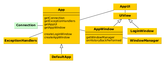
-
App- the central class of the application infrastructure. Contains links toConnection,AppWindowand other infrastructure objects. Only one instance ofAppexists for a given HTTP-session.Each application typically has its own
Appclass class inherited from theDefaultAppand thus from the basic abstractAppclass of the platform. It allows you to overridecreateAppWindow()andcreateLoginWindow()methods to create custom implementations of the main window and the login window.The
Appclass of an application should be registered in theapplicationparameter of theapp_servletin the web.xml file of the web module. -
Connectionis the interface providing functionality of connecting to middleware and storing user sessions.DefaultConnectionis a standard implementation of this interface. -
AppUIis a platform class inherited fromcom.vaadin.ui.UIclass. There is one instance of this class for each open tab of a web browser. Contains a link to theUIViewobject – either aLoginWindoworAppWindow.AppUIapplication class should be registered in theUIparameter of theapp_servletin theweb/WEB-INF/web.xmlfile of the web module. In most cases, standard platform class is used. -
LoginWindow– the window displayed before a user logs in. In your application you can create an inheritor ofLoginWindowand redefine thecreateLoginWindow()method of theAppclass to use it. -
AppWindow– main application window displayed after a user logs in. In your application, you can create an inheritor ofAppWindowand override thecreateAppWindow()method of theAppclass to use it.onHistoryBackPerformed()method allows you to handle browser button. This method is invoked instead of standard browser behavior if cuba.web.allowHandleBrowserHistoryBack application property is true.You can control certain main window parameters without creating
AppWindowinheritor, using the following application properties:-
cuba.web.useLightHeader - switches on compact window header - logo, menu bar, user name and log out button in one line. When switched off,
AppWindow.createTitleLayout()method creates additional area at the top. -
cuba.web.foldersPaneEnabled - allows creation of folders pane by
AppWindow.createFoldersPane()method. -
cuba.web.appWindowMode – sets default mode for the main window: tabbed or single screen (
TABBEDorSINGLE). Users can change the mode later using > screen. -
cuba.web.maxTabCount – when the main window is in the tabbed mode, this property sets the maximum number of tabs that a user can open. The default value is 7.
-
-
WindowManager- the central class implementing application screens management logic.openWindow(),openEditor(),showMessageDialog()and other methods of theIFrameinterface implemented by screen controllers delegate to the window manager.WindowManagerclass is located in the platform’s common gui module and is abstract. The web module has a dedicatedWebWindowManagerclass that implements web client specifics.Normally, the
WindowManageris not used in the application code directly. -
ExceptionHandlers- contains a collection of client-level exception handlers.
In order to work directly with Vaadin components implementing interfaces of the visual components library in the Web Client block you should use the WebComponentsHelper class. It has two static methods to retrieve links to Vaadin components:
-
unwrap– retrieves a Vaadin component for a given CUBA component. -
getComposition- retrieves a Vaadin component that is the outmost external container in the implementation of a given CUBA component. For simple components, such as Button this method returns the same object asunwrap()-com.vaadin.ui.Button. For complex components, such as Table,unwrap()will return the corresponding object -com.vaadin.ui.Table, whilegetComposition()will returncom.vaadin.ui.VerticalLayout, which contains the table together with ButtonsPanel andRowsCountdefined with it.
Please note that if a screen is located in the project’s gui module, you can only work with generalized interfaces of CUBA components. In order to use WebComponentsHelper.unwrap() you should either put the entire screen into the web module, or use the mechanism of controller companions.
The mechanism described below allows you to design the application main window layout with CUBA Generic UI technology by creating an XML-descriptor and Java controller, and using UI components and data sources.
The main window is defined by a specific screen with
mainWindow identifier. Its controller should be derived from the AbstractMainWindow
class.
The following special components may be used in the main window in addition to the standard UI components:
-
AppMenu- main application menu. -
FoldersPane- application and search folders panel. -
AppWorkArea- work area, the required component for opening screens in theTHIS_TAB,NEW_TABandNEW_WINDOWmodes. -
UserIndicator- the field which displays the name of the current user, as well as enables selecting substituted users, if any. -
NewWindowButton- the button which opens a new main window in a separate browser tab. -
LogoutButton- the application logout button. -
TimeZoneIndicator- the label displaying the current user's time zone. -
FtsField- the full text search field.
In order to define the special components, add the
xmlns:main namespace to the screen:
<window xmlns="http://schemas.haulmont.com/cuba/window.xsd"
xmlns:main="http://schemas.haulmont.com/cuba/mainwindow.xsd"
class="com.company.sample.gui.MainWindow">
<layout>
</layout>
</window>
The AppWorkArea component is designed to show application screens.
If the cuba.web.appWindowMode application property is
TABBED (default), the work area shows a TabSheet with open screens. Otherwise a single open screen is shown.
When no screens are opened, the work area shows components defined in the initialLayout internal
element:
<main:workArea id="workArea" width="100%" height="100%">
<main:initialLayout spacing="true" margin="true">
<!-- content shown when there are no open screens -->
</main:initialLayout>
</main:workArea>
The initial screen layout (initialLayout) is removed from
AppWorkArea when the first application screen is opened, and added back when all screens
are closed. You can add AppWorkArea.StateChangeListener to handle changing the work area between
the initial layout and application screens. Such listener can, for example, refresh the initial layout data.
The platform includes the standard main window implementation in
/com/haulmont/cuba/web/app/mainwindow/mainwindow.xml XML descriptor and corresponding
AppMainWindow controller class. The standard implementation can be extended in the project,
like any other application screen. Example of an extending screen:
<window xmlns="http://schemas.haulmont.com/cuba/window.xsd"
xmlns:ext="http://schemas.haulmont.com/cuba/window-ext.xsd"
extends="com/haulmont/cuba/web/app/mainwindow/mainwindow.xml"
class="com.haulmont.cuba.web.app.mainwindow.AppMainWindow">
<layout>
<vbox ext:index="0">
<label value="This is my main window!" stylename="h2"/>
</vbox>
</layout>
</window>
This screen should be registered in screens.xml with the
mainWindow identifier.
The standard main window implementation may be fully replaced with a custom one. For example:
<window xmlns="http://schemas.haulmont.com/cuba/window.xsd"
xmlns:main="http://schemas.haulmont.com/cuba/mainwindow.xsd"
class="com.company.sample.gui.MainWindow">
<layout expand="middlePanel">
<hbox margin="true"
stylename="gray"
width="100%">
<label align="MIDDLE_CENTER"
value="Header"/>
</hbox>
<main:menu width="100%"/>
<split id="middlePanel"
orientation="horizontal"
pos="80"
width="100%">
<main:workArea id="workArea"
height="100%"
width="100%">
<main:initialLayout stylename="red">
<label align="MIDDLE_CENTER"
value="Work Area (Initial Layout)"/>
</main:initialLayout>
</main:workArea>
<main:foldersPane height="100%"
stylename="blue"
width="100%"/>
</split>
<hbox margin="true"
stylename="gray"
width="100%">
<label align="MIDDLE_CENTER"
value="Footer"/>
</hbox>
</layout>
</window>
The resulting main window is shown below:
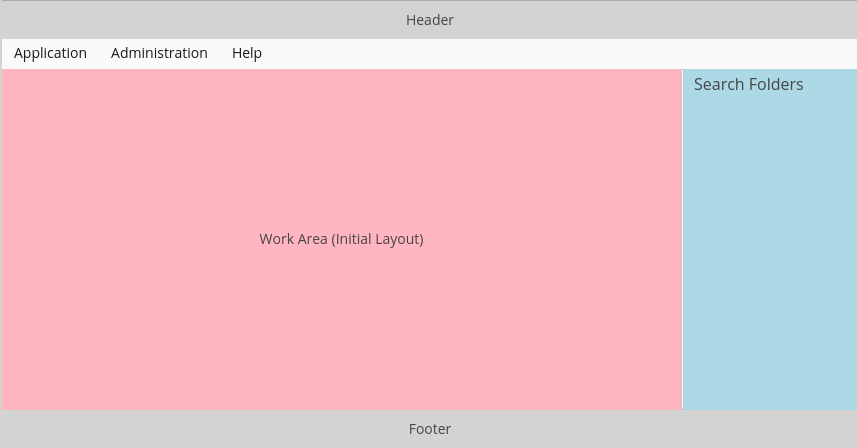
The same main window with an open screen:
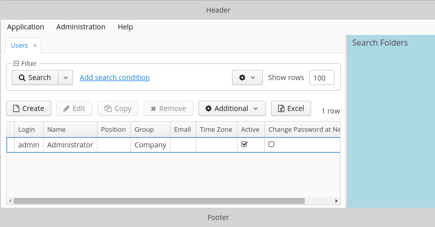
The cuba.web.showBreadCrumbs application property allows you to hide the navigation panel (breadcrumbs) above the opened screen.
Implementation of the generic user interface in the Desktop Client block is based on Java Swing. The main classes available in the desktop client infrastructure are described below.
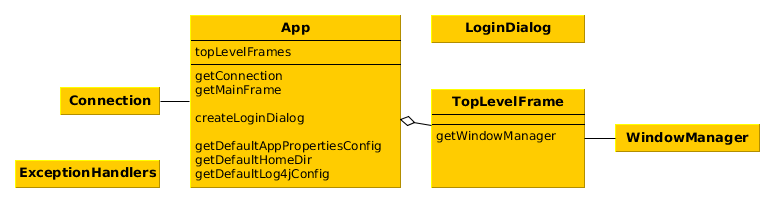
-
App– central class of the desktop application infrastructure. Contains links toConnectionand mainTopLevelFrame, as well as methods for initialization and retrieval of application settings.In your application, you should create a custom class – inheritor of
Appand override the following methods:-
getDefaultAppPropertiesConfig()- should return a string where all application properties files should be listed separated by spaces:@Override protected String getDefaultAppPropertiesConfig() { return "/cuba-desktop-app.properties /desktop-app.properties"; } -
getDefaultHomeDir()- should return path to the folder, where temporary and work files should be stored. For example:@Override protected String getDefaultHomeDir() { return System.getProperty("user.home") + "/.mycompany/sales"; } -
getDefaultLog4jConfig()- should return name of the Log4J file, if it is defined for the project. For example:@Override protected String getDefaultLog4jConfig() { return "sales-log4j.xml"; }
Additionally, for your custom class inheriting from the
Appyou should definemain()method in the following way:public static void main(final String[] args) { SwingUtilities.invokeLater(new Runnable() { public void run() { app = new App(); app.init(args); app.show(); app.showLoginDialog(); } }); } -
-
Connection- is a class that provides the functionality of connecting to middleware and storing a user session. -
LoginDialog– the dialog to enter credentials. In your application you can create an inheritor ofLoginDialogand redefine thecreateLoginDialog()method of theAppclass to use it. -
TopLevelFrame– inheritor ofJFrame, which is the top level window. The application has at least one instance of this class created when application is started and containing the main menu. This instance is returned by thegetMainFrame()method of theAppclass.When a user detaches tabs from the main window or a TabSheet (see
detachableattribute), additional instances ofTopLevelFramethat do not contain main menu are created. -
WindowManager- the central class implementing application screens management logic.openEditor(),showMessageDialog()and other methods of theIFrameinterface implemented by screen controllers delegate to the window manager.WindowManagerclass is located in the platform’s common gui module and is abstract. The desktop desktop module has a dedicatedDesktopWindowManagerclass that implements desktop client specifics.Typically,
WindowManageris not used in the application code directly. -
ExceptionHandlers- contains a collection of client-level exception handlers.
DesktopComponentsHelper class should be used to work directly with Swing components that implement interfaces of the visual components library in the Desktop Client block. It has two static methods to retrieve links to Swing components:
-
unwrap– retrieves a Swing component for a given CUBA component. -
getComposition- retrieves a Swing component that is the outmost external container in the implementation of a given CUBA component. For simple components, such as Button, this method returns the same object asunwrap()-javax.swing.JButton. For complex components, such as Table,unwrap()will return the correspondingorg.jdesktop.swingx.JXTableinstance, whilegetComposition()will return an instance ofjavax.swing.JPanel, which contains a table together with ButtonsPanel andRowsCountdefined with it.
Please note that if a screen is located in the project’s gui module, you can only work with generalized interfaces of CUBA-components. In order to use DesktopComponentsHelper.unwrap() you should either put the entire screen in the desktop module, or use the mechanism of companion controllers.
This section covers the process of creating and using custom visual components in the application. To begin with, we will take a third party component available as Vaadin add-on, include it in the project and use it directly in the screen. Then we will perform a tighter integration, by creating a new GUI interface and an XML loader for the component, which will allow us to use it in the same way as other platform components.
You can use third-party Vaadin components, distributed as add-ons, in the Web Client. Currently, the Vaadin library https://vaadin.com/directory has over 200 CUBA-compatible visual components. The main requirement for compatibility is the component’s support of Vaadin 7+.
The following should be done to integrate a third-party component into the project:
-
Add web-toolkit module to the project. This module integrates with the client (browser) part of Vaadin components. The easiest way to do this is to run the command on the Project properties panel of the CUBA Studio navigator.
-
Add the add-on dependency to the web module in the project’s build.gradle. For example:
configure(webModule) { ... dependencies { ... compile("org.vaadin.addons:some-addon:1.2.3") } -
Include the add-on widget set to the
AppWidgetSet.gwt.xmlfile, created in Step 1:<module> ... <inherits name="org.vaadin.someaddon.widgetset.SomeAddonWidgetset" /> -
In a web module screen (or in a corresponding companion), get a link to the Vaadin container using the WebComponentsHelper class, create a new component instance and add it to the container.
-
To change the component’s look, create a theme extension and make the required changes in the
<theme>-ext.scssfile. The easiest way to create a theme file is to run the command on the Project properties panel of the Studio navigator.
Section 5.8.6.1, “Example of Using a Third-party Vaadin Component ” covers the process of including and using the Stepper add-on, which allows stepping through the values.
Integration of a native component into the generic user interface allows using such component in a large number of screens with little effort, just like the basic platform components. Full integration requires the following steps:
-
Create the component interface. Interfaces are usually located in the GUI module, available to both client types – Web and Desktop. If the component should be implemented for one client type only, it can be placed in the Web or Desktop module directly. The example below implements the component for Web Client only.
The component interface should be derived from
com.haulmont.cuba.gui.components.Componentor any of its inheritors, for exampleDatasourceComponentorField:package com.company.myproject.gui.components; import com.haulmont.cuba.gui.components.Component; public interface MyComponent extends Component { String NAME = "myComponent"; int getSomeParameter(); void setSomeParameter(int value); }It is recommended to define the
NAMEconstant in the interface. The constant should define the name of the component as a string, used for obtaining the component through theComponentsFactory. This is also used as the name of the component’s XML element in the XML screen descriptors. -
Create the component implementation class in the web module.
It is recommended to derive the class from
com.haulmont.cuba.web.gui.components.WebAbstractComponentor one of its inheritors, for exampleWebAbstractField. A native component instance should be created in the class constructor, and the GUI interface calls should be delegated to it:package com.company.myproject.web.components; import com.company.myproject.gui.components.MyComponent; import com.haulmont.cuba.web.gui.components.WebAbstractComponent; public class WebMyComponent extends WebAbstractComponent<org.vaadin.someaddon.SomeComponent> implements MyComponent { public WebMyComponent() { component = new org.vaadin.someaddon.SomeComponent(); } @Override public int getSomeParameter() { return component.getSomeParameter(); } @Override public void setSomeParameter(boolean value) { component.setSomeParameter(value); } } -
Create a class implementing the
ComponentPaletteinterface and return a map of custom components and their implementation classes from thegetComponents()method:package com.company.myproject.web; import com.company.myproject.gui.components.MyComponent; import com.company.myproject.web.components.WebMyComponent; import com.haulmont.cuba.gui.ComponentPalette; import com.haulmont.cuba.gui.components.Component; import com.haulmont.cuba.gui.xml.layout.ComponentLoader; import java.util.HashMap; import java.util.Map; public class AppComponentPalette implements ComponentPalette { @Override public Map<String, Class<? extends Component>> getComponents() { Map<String, Class<? extends Component>> components = new HashMap<>(); components.put(MyComponent.NAME, WebMyComponent.class); return components; } @Override public Map<String, Class<? extends ComponentLoader>> getLoaders() { return Collections.emptyMap(); } }The instance of the component palette must be registered in the application. This can be done in the App class initialization block:
package com.company.myproject.web; import com.haulmont.cuba.web.DefaultApp; import com.haulmont.cuba.web.gui.WebUIPaletteManager; public class App extends DefaultApp { static { WebUIPaletteManager.registerPalettes(new AppComponentPalette()); } } -
At this point, the new GUI component can be retrieved via the
ComponentsFactory:@Inject private BoxLayout box; @Inject private ComponentsFactory componentsFactory; @Override public void init(Map<String, Object> params) { MyComponent myComponent = componentsFactory.createComponent(MyComponent.NAME); box.addComponent(myComponent); ... } -
In order to support component declaration in screen XML-descriptors, create a component loader class, implementing
com.haulmont.cuba.gui.xml.layout.ComponentLoader. It is recommended to derive the loader class fromcom.haulmont.cuba.gui.xml.layout.loaders.ComponentLoaderor any of its inheritors. The loader operates with the component GUI interface only, so it is common for all client types, and can be located in the gui module. The minimal implementation should call theloadComponent()method, which creates the component instance and sets its common properties, such as ID or size, taken from XML. Any custom component properties can be initialized afterwards:package com.company.myproject.gui.loaders; import com.company.myproject.gui.components.MyComponent; import com.haulmont.cuba.gui.components.Component; import com.haulmont.cuba.gui.xml.layout.*; import org.dom4j.Element; public class MyComponentLoader extends ComponentLoader { public MyComponentLoader(Context context, LayoutLoaderConfig config, ComponentsFactory factory) { super(context, config, factory); } @Override public Component loadComponent(ComponentsFactory factory, Element element, Component parent) { MyComponent component = (MyComponent) super.loadComponent(factory, element, parent); String someParameter = element.attributeValue("someParameter"); if (someParameter != null) { component.setSomeParameter(Integer.valueOf(someParameter)); } return component; } }The loader must be registered by the
getLoaders()method of the previously created component palette:public class AppComponentPalette implements ComponentPalette { ... @Override public Map<String, Class<? extends ComponentLoader>> getLoaders() { Map<String, Class<? extends ComponentLoader>> loaders = new HashMap<>(); loaders.put(MyComponent.NAME, MyComponentLoader.class); return loaders; } } -
Now the component can be used in XML-descriptors of your project:
<layout> <myComponent id="someId" width="100%" someParameter="10"/> </layout>In order to enable autocomplete for component name and attributes in IDE, define your own XSD and include it in the screens:
<window xmlns="http://schemas.haulmont.com/cuba/window.xsd" xmlns:app="http://schemas.company.com/app/0.1/app-components.xsd" ...> <layout> <app:myComponent id="someId" width="100%" someParameter="10"/> </layout>
Section 5.8.6.2, “Example of Integrating a Vaadin Component into the Generic UI” covers the process of integrating the IntStepper component, used for changing integer values incrementally.
This section provides a list of keyboard shortcuts used in the generic user interface of the application. All the application properties listed below belong to the ClientConfig interface and can be used in Web Client and Desktop Client application blocks.
-
Main application window.
-
CTRL-SHIFT-PAGE_DOWN – switch to the next tab. Defined by the
cuba.gui.nextTabShortcutproperty. -
CTRL-SHIFT-PAGE_UP – switch to the previous tab. Defined by the
cuba.gui.previousTabShortcutproperty.
-
-
Screens.
-
Standard actions for list components (Table, GroupTable, TreeTable, Tree). In addition to these application properties, a shortcut for a particular action can be set by calling it’s
setShortcut()method.-
CTRL-INSERT – call the CreateAction. Defined by the
cuba.gui.tableInsertShortcutproperty. -
CTRL-ALT-INSERT – call the AddAction. Defined by the
cuba.gui.tableAddShortcutproperty. -
ENTER – call the EditAction. Defined by the
cuba.gui.tableEditShortcutproperty. -
CTRL-DELETE – call the RemoveAction and ExcludeAction. Defined by the
cuba.gui.tableRemoveShortcutproperty.
-
-
Drop-down lists (LookupField, LookupPickerField).
-
SHIFT-DELETE – clear the value.
-
-
Standard actions for lookup fields (PickerField, LookupPickerField, SearchPickerField). In addition to these application properties, a shortcut for a particular action can be set by calling its
setShortcut()method.-
CTRL-ALT-L – call the LookupAction. Defined by the
cuba.gui.pickerShortcut.lookup. -
CTRL-ALT-O – call the OpenAction. Defined by the
cuba.gui.pickerShortcut.openproperty. -
CTRL-ALT-C – call the ClearAction. Defined by the
cuba.gui.pickerShortcut.clearproperty.
In addition to these shortcuts, lookup fields support action calls with CTRL-ALT-1, CTRL-ALT-2 and so on, depending on the number of actions. If you click CTRL-ALT-1 the first action in the list will be called; clicking CTRL-ALT-2 calls the second action, etc. The CTRL-ALT combination can be replaced with any other combination specified in
cuba.gui.pickerShortcut.modifiersproperty. -
-
Filter component.
-
SHIFT-BACKSPACE – open the filter selection popup. Defined by the
cuba.gui.filterSelectShortcutproperty. -
SHIFT-ENTER – apply the selected filter. Defined by the
cuba.gui.filterApplyShortcutproperty.
-
In this manual, a portal is a client block, which can solve the following problems:
-
provide an alternative web-interface, which is usually intended for users outside of the organization;
-
provide an interface for integration with mobile applications and third-party systems.
A specific application may contain several portal modules intended for different purposes; for example, in an application, which automates business tasks, it can be a public web site for customers, an integration module for a mobile application for ordering a taxi, an integration module for a mobile application for drivers, etc.
The cuba base project of the platform includes the portal module, which is a template to create portals in projects. First, it provides basic functionality of the client block to work with Middleware, and second, it includes the universal REST API to work with entities.
Below is an overview of the main components provided by the platform to build a portal.
-
PortalAppContextLoader– the AppContext loader; must be registered in thelistenerelement of theweb.xmlfile. -
PortalDispatcherServlet– the central servlet that distributes requests to Spring MVC controllers, for both the web interface and REST API. The set of files of the Spring context config is defined by the cuba.dispatcherSpringContextConfig application property. This servlet must be registered inweb.xmland displayed in the root URL of the web application. -
App– the object that contains information on the current HTTP request and the reference toConnectionobject. TheAppinstance can be obtained in the application code by calling theApp.getInstance()static method. -
Connection– allows a user to log in/out of the Middleware. -
PortalSession– the object of a user session that is specific for the portal. It is returned by the UserSessionSource infrastructure interface and by thePortalSessionProvider.getUserSession()static method.It has an additional
isAuthenticated()method, which returnstrueif this session belongs to a non-anonymous user, i.e. a user explicitly registered with the login and password.When a user first accesses the portal, the
SecurityContextHandlerInterceptorcreates an anonymous session for him (or ties to an already existing one) by registering at Middleware with a user name specified in the cuba.portal.anonymousUserLogin application property. The registration is made by loginTrusted() method, so it is necessary to set the cuba.trustedClientPassword property in the portal block as well. Thus, any anonymous user of the portal can work with Middleware withcuba.portal.anonymousUserLoginuser rights.If the portal contains user registration page with name and password
SecurityContextHandlerInterceptorassigns the session of the explicitly registered user to the execution thread afterConnection.login()is executed, and the work with Middleware is performed on this user's behalf. -
PortalLogoutHandler– handles the navigation to the logout page. It must be registered in theportal-security-spring.xmlproject file.
The universal REST API of the platform allows to load and save any entities defined in the application data model by sending simple HTTP requests. This provides easy way to integrate with a wide range of third-party applications – from the JavaScript code executed in the browser to arbitrary systems running on Java, .NET, PHP or any other platform.
Key API features:
-
Loading entity instances from the database by identifier or by JPQL query with parameters.
-
Saving new and modified instances, deleting instances.
-
Obtaining a description of the data model in HTML format.
-
Data representation in JSON and XML formats.
-
Middleware service calls.
-
User authentication.
REST API is implemented in the portal module of the cuba base project, therefore you need to create portal module in your application project. The easiest way to do this is to run the command on the Project properties panel of the CUBA Studio navigator.
Key configuration elements:
-
Add REST API controllers to Spring context defined by the portal-dispatcher-spring.xml file:
<context:component-scan base-package="com.haulmont.cuba.portal.restapi"/>
-
Set access mode in
portal-security-spring.xml:<intercept-url pattern="/api/**" access="IS_AUTHENTICATED_ANONYMOUSLY"/>
With standard settings of the portal module, all requests to REST API must have the URL starting with {host:port}/app-portal/api.
All functions require an authenticated user session, which means that you must perform the login first and then pass the resulting session identifier to subsequent requests.
Login can be performed by either GET or POST request.
- GET request
-
For GET request, create the URL
{host:port}/app-portal/api/loginwith the following parameters:-
u − user login
-
p − user password
-
l − user locale (optional)
For example:
http://localhost:8080/app-portal/api/login?u=admin&p=admin&l=ru
-
- POST request
-
To perform login using POST, execute request by
{host:port}/app-portal/api/loginaddress, passing JSON (Content-Typeheader has the valueapplication/json) or form (Content-Typeheader has the valueapplication/x-www-form-urlencoded) in request body.Example of the JSON format:
{ "username" : "admin", "password" : "admin", "locale" : "en" }Example of the form:
username: admin password: admin locale: en
The service will return userSessionId in response body and status 200 or status 401 if the authentication fails.
To login through REST API, the user must have cuba.restApi.enabled specific
permission. Notice that the user will have the permission if there are no
roles explicitly revoking it.
Logout can also be performed by either GET or POST request.
- GET request
-
To perform login using GET, construct the URL
{host:port}/app-portal/api/logoutwith the session parameter containing the current session ID obtained by callinglogin.For example:
http://localhost:8080/app-portal/api/logout?session=64f7d59d-2cf5-acfb-f4d3-f55b7882da72
- POST request
-
To perform login using POST, send request to
{host:port}/app-portal/api/logoutURL, passing JSON (Content-Typeheader has the valueapplication/json) or form (Content-Typeheader has the valueapplication/x-www-form-urlencoded) in request body.Example of the JSON format:
{ "session" : "64f7d59d-2cf5-acfb-f4d3-f55b7882da72" }Example of the form:
session: 64f7d59d-2cf5-acfb-f4d3-f55b7882da72
The service will return status 200.
To load an object, you should perform GET request {host:port}/app-portal/api/find.<format>?e=<entityRef>&s=<sessionId> with the following parameters:
-
e − the description of the required object in
<entity-id>or<entity-id-view>format (see EntityLoadInfo). For example,sales$Order-43c61345-d23c-48fe-ab26-567504072f05-_local. Thus, the format allows you to specify required view of the loaded object. -
s − current session identifier.
format element of the request specifies the result format. It takes two values: xml and json.
Example of a request, which returns the result in xml format:
http://localhost:8080/app-portal/api/find.xml?e=sales$Order-60885987-1b61-4247-94c7-dff348347f93-orderWithCustomer&s=c38f6bf4-fae7-4ee6-a412-9d93ff243f23
Example of request, which returns the result in json format:
http://localhost:8080/app-portal/api/find.json?e=sales$Order-60885987-1b61-4247-94c7-dff348347f93-orderWithCustomer&s=c38f6bf4-fae7-4ee6-a412-9d93ff243f23
To execute a query, the {host:port}/app-portal/api/query.<format>?e=<entity>&s=<sessionId>&q=<encoded query string>¶m1=<value 1>$param1_type=<type 1>¶mN=<value N>¶mN_type=<type N>&view=<viewName>&firstResult=<firstResult>&maxResults=<maxResults> GET request should be performed with the following parameters:
-
e − the name of the entity.
-
q − a JPQL data query. The request may contain parameters. Their values are provided as values of same-named parameters of HTTP query.
-
s − the identifier of the current session.
-
view (optional) − the view, which should be used to load data.
-
max (optional) − maximum number of rows in resulting dataset (similar to JPA
setMaxResults). -
first (optional) − number of the first row of resulting dataset (similar to JPA
setFirstResult).
format specifies the format of obtaining the result. It takes two values: xml or json.
Examples:
http://localhost:8080/app-portal/api/query.json?e=sales$Customer&q=select+c+from+sales$Customer+c&s=748e5d3f-1eaf-4b38-bf9d-8d838587367d&view=_local
http://localhost:8080/app-portal/api/query.json?e=sales$Customer&q=select+c+from+sales$Customer+c+where+c.name=:name&s=748e5d3f-1eaf-4b38-bf9d-8d838587367d&name=Smith
For each of the passed parameters, the type can be explicitly specified by adding the parameter of the same name and the _type suffix to the request. For example:
http://localhost:8080/app-portal/api/query.json?e=sales$Customer&q=select+c+from+sales$Customer+c+where+c.name=:name&s=748e5d3f-1eaf-4b38-bf9d-8d838587367d&name=Smith&name_type=string
Specifying parameter type is optional, however it allows to avoid parsing errors if the system cannot determine the type automatically.
Normally, the type should be specified only for string parameters, which for some reason have a more specific format types (dates, numbers, UUID), but must be interpreted as strings.
The list of available types can be found in meta-model description ( -> ) or by obtaining the HTML-description of the model.
The commit function allows performing operations on objects passed to it and returning their new state. The format of the result depends on format (JSON or XML) used for the request (the Content-Type header).
- JSON format
-
application/jsonshould be used as the value of theContent-Typeheader.Creating a
Customerentity with an automatically generated identifier:{ "commitInstances": [ { "id": "NEW-sales$Customer", "name": "Lawrence", "email": "lawrence@mail.com" } ] }Creating a
Customerentity with a specified identifier:{ "commitInstances": [ { "id": "NEW-sales$Customer-b32a6412-d4d9-11e2-a20b-87b22b1460c7", "name": "Bradley", "email": "bradley@mail.com" } ] }Creating the
Orderentity, specifying a link to a newCustomerentity and filling theCustomerentity with attributes:{ "commitInstances": [ { "id": "NEW-sales$Order", "amount": 15, "customer": { "id": "NEW-sales$Customer-b32e43e8-d4d9-11e2-8c8b-2b2939d67fff" } }, { "id": "sales$Customer-b32e43e8-d4d9-11e2-8c8b-2b2939d67fff", "name": "Fletcher", "email": "fletcher@mail.com" } ] }Changing two
Customerentities simultaneously:{ "commitInstances": [ { "id": "sales$Customer-b32e43e8-d4d9-11e2-8c8b-2b2939d67fff", "email": "fletcher@mail.com" }, { "id": "sales$Customer-32261b09-b7f7-4b8c-88cc-6dee6fa8e6ab", "email": "lawrence@mail.com" } ] }Removing the
Customerentity with soft deletion support:{ "removeInstances": [ { "id": "sales$Customer-b32e43e8-d4d9-11e2-8c8b-2b2939d67fff" } ], "softDeletion": "true" }-
The
commitInstancesarray contains created and modified entities.-
When creating an entity,
idorNEW-<entityName>should be specified as the value of theNEW-<entityName>-<uuid>field. -
When changing an entity,
<entityName>-<uuid>should be specified as the value of theidfield. -
Next, attribute names and values for created or modified entity should be provided in the list of elements, separated by commas.
If any attribute should be set to
nullwhile editing the entity, you must specify the view that includes this attribute, in the identifier. For example:{ "commitInstances": [ { "id": "sales$Customer-b32a6412-d4d9-11e2-a20b-87b22b1460c7-customer-edit", "name": "John Doe", "channel": null } ] }Here, the
customer-editview must contain thechannelattribute, otherwise the value will not change.
-
-
The
removeInstancesarray contains removed entities. When removing an entity, you must specify the value of theidfield. Before deletion,merge()will be executed for the provided object, which allows, for example, to check if the version of the removed object has changed. -
The
softDeletionfield controls soft deletion mode.
The function is called by a POST request to
{host:port}/app-portal/api/commit?s=<sessionId>. JSON is passed in the request body. The function returns a JSON objects array. For example, te following JSON objects array will be returned when theemailfield of theCustomerentity is changed:[ {"id":"sales$Customer-32261b09-b7f7-4b8c-88cc-6dee6fa8e6ab", "createTs":"2013-06-14T14:07:15.040", "createdBy":"admin", "deleteTs":null, "deletedBy":null, "email":"fletcher@mail.com", "name":"Fletcher", "updateTs":"2013-06-14T15:07:03.463", "updatedBy":"admin", "version":"3" } ] -
- XML format
-
text/xmlshould be used as the value ofContent-Typeheader.XML format example:
<CommitRequest> <commitInstances> <instance id="sales$Order-9873c8a8-d4e7-11e2-85c0-33423bc08c84"> <field name="date">2015-01-30</field> <field name="amount">3500.00</field> <reference name="customer" id="sales$Customer-32261b09-b7f7-4b8c-88cc-6dee6fa8e6ab"/> </instance> </commitInstances> <removeInstances> <instance id="sales$Customer-d67c10f0-4d28-4904-afca-4bc45654985d"/> </removeInstances> <softDeletion>true</softDeletion> </CommitRequest>XML document fields semantics is defined in http://schemas.haulmont.com/cuba/5.6/restapi-commit-v2.xsd scheme.
In case of an XML request, fields are set to null with the help of the
null="true"attribute. In addition to that, the identifier must contain the view, which contains the attribute. For example:<CommitRequest> <commitInstances> <instance id="Order-9873c8a8-d4e7-11e2-85c0-33423bc08c84"> <field name="amount" null="true"/> <reference name="customer" null="true"/> </instance> </commitInstances> </CommitRequest>The function is called with a POST request to
{host:port}/app-portal/api/commit?s=<sessionId>. XML is passed in the request body. The request returns array of XML objects similar to the one below:<instances> <instance ...> <instance ...> </instances>The schema containing the description of the function call result is located at http://schemas.haulmont.com/cuba/5.6/restapi-instance-v2.xsd">
Uploading files from FileStorage requires a {host:port}/app-portal/api/download?f=<fileDescriptorId>&s=<sessionId> GET request with the following parameters:
-
f − the ID of the corresponding
FileDescriptorinstance. -
s − current session ID.
The /printDomain?s=<sessionId> GET request allows developer to obtain data model description. The service returns a simple HTML, which contains basic data types list and description of all meta-model entities, their attributes and views defined for entities.
The /deployViews?s=<sessionId> POST request allows to load to middleware descriptions of view objects, required for the client. The view objects are sent as standard XML description of a view used in the platform. XML is placed in the request body. For more information about the format, see Section 4.2.3, “Views”.
Service methods available for API calls are listed in a configuration file. The name of the file is defined by the cuba.restServicesConfig property.
A sample REST API services configuration file:
<services xmlns="http://schemas.haulmont.com/cuba/restapi-service-v2.xsd">
<service name="refapp_PortalTestService">
<method name="findAllCars"/>
<method name="updateCarVin"/>
</service>
</services>
Service method call can be performed both by GET and POST requests. Additionally, POST requests allow passing entities or entity collections to the invoked method.
Request format:
{host:port}/app-portal/api/service.<format>?service=<serviceName>&method=<methodName>&view=<view>¶m0=<value 0>¶mN=<value N>¶m0_type=<type 0>¶mN_type=<type N>&s=<sessionId>
-
format- defines the output format. Two values are accepted:xmlorjson. -
service- the name of the service called. -
method- the name of the method invoked. -
param0 .. paramN- parameter values of the method. -
param0_type .. paramN_type- parameter types of the method. -
s- the current session identifier.
If a service has a single method with the specified name and number of parameters, explicit parameter type definition is not required. In other cases, parameter type must be specified.
Request format:
{host:port}/app-portal/api/service?s=<sessionId>
-
s- the current session identifier.
JSON or XML with the description of the method call is passed in the request body.
- JSON format
-
The
Content-Typeheader value isapplication/json.{ "service": "refapp_PortalTestService", "method": "updateCarVin", "view": "carEdit", "params": { "param0": { "id": "ref$Car-32261b09-b7f7-4b8c-88cc-6dee6fa8e6ab", "vin": "WV00001", "colour" : { "id": "ref$Colour-b32a6412-d4d9-11e2-a20b-87b22b1460c7", "name": "Red" }, "driverAllocations": [ { "id": "ref$DriverAllocation-b32e43e8-d4d9-11e2-8c8b-2b2939d67fff" }, { "id": "NEW-ref$DriverAllocation" } ] }, "param1": "WV00001", "param0_type": "com.haulmont.refapp.core.entity.Car", "param1_type": "java.lang.String" } }Properties of the passed object:
-
service- the name of the service called. -
method- the name of the method invoked. -
param0 .. paramN- method parameter values. -
param0_type .. paramN_type- method parameter types.
-
- XML format
-
The
Content-Typeheader value istext/xml.<ServiceRequest xmlns="http://schemas.haulmont.com/cuba/restapi-service-v2.xsd"> <service>refapp_PortalTestService</service> <method>updateCarVin</method> <view>carEdit</view> <params> <param name="param0"> <instance id="ref$Car-32261b09-b7f7-4b8c-88cc-6dee6fa8e6ab"> <field name="vin">WV00000</field> <reference name="colour"> <instance id="ref$Colour-b32a6412-d4d9-11e2-a20b-87b22b1460c7"> <field name="name">Red</field> </instance> </reference> <collection name="driverAllocations"> <instance id="ref$DriverAllocation-b32e43e8-d4d9-11e2-8c8b-2b2939d67fff"/> <instance id="NEW-ref$DriverAllocation"/> </collection> </instance> </param> <param name="param1">WV00001</param> <param name="param0_type">com.haulmont.refapp.core.entity.Car</param> <param name="param1_type">java.lang.String</param> </params> </ServiceRequest>The main elements of the passed document are:
-
service- the name of the service called. -
method- the name of the method invoked. -
param- the value of the parameter method or the parameter type. The name of the parameter (nameattribute) must have the formatparam0 .. paramNorparam0_type .. paramN_type.
If a service has a single method with the specified name and number of parameters, explicit parameter type definition is not required. In other cases, parameter types must be specified.
<param>element may contain both plain text (for setting primitive type values) and nested<instance>elements for entities or<instances>for entity collections.The XSD of the request is available at http://schemas.haulmont.com/cuba/5.6/restapi-service-v2.xsd.
-
- primitive Java types.
long,int,boolean, etc. should be specified as the type name. - primitive Java type wrappers. The full class name should be specified as the type name:
java.lang.Boolean,java.lang.Integer, etc. - string (
java.lang.String). - date (
java.util.Date). - UUID (
java.util.UUID). - BigDecimal (
java.math.BigDecimal) - entity (for POST requests only). The full class name should be specified as the type name,
e.g.
com.haulmont.cuba.security.entity.User. - entity collections (for POST requests only). The full class or collection interface name
should be specified as the type name, e.g.
java.util.List.
The result may be in JSON or XML, depending on the method call declaration. Currently, methods can return primitive data types, entities and entity collections.
- Example of a JSON result:
-
Primitive data type:
{ "result": "10" }Entity:
{ "result": { "id" : "ref$Colour-b32e43e8-d4d9-11e2-8c8b-2b2939d67fff", "name": "Red" } } - Example of XML result:
-
Primitive data type:
<result> 10 </result>Entity:
<result> <instance id="ref$Colour-b32a6412-d4d9-11e2-a20b-87b22b1460c7"> <field name="name">Red</field> </instance> </result>The XSD of the result is available at http://schemas.haulmont.com/cuba/5.6/restapi-service-v2.xsd.
This section provides overview on various optional features provided by the platform.
The platform offers two ways to run scheduled tasks:
-
By using the standard
TaskSchedulermechanism of the Spring framework. -
By using platform's own mechanism of scheduled tasks execution.
This mechanism is described in details in the Task Execution and Scheduling section of the Spring Framework manual.
TaskScheduler can be used to run methods of arbitrary Spring beans in any application block both at the middleware and client tiers.
Example of configuration in spring.xml:
<beans xmlns="http://www.springframework.org/schema/beans"
xmlns:xsi="http://www.w3.org/2001/XMLSchema-instance"
xmlns:context="http://www.springframework.org/schema/context"
xmlns:task="http://www.springframework.org/schema/task"
xsi:schemaLocation="http://www.springframework.org/schema/beans http://www.springframework.org/schema/beans/spring-beans-3.0.xsd
http://www.springframework.org/schema/context http://www.springframework.org/schema/context/spring-context-3.0.xsd
http://www.springframework.org/schema/task http://www.springframework.org/schema/task/spring-task-3.0.xsd">
...
<task:scheduled-tasks scheduler="scheduler">
<task:scheduled ref="sales_Processor" method="someMethod" fixed-rate="60000"/>
<task:scheduled ref="sales_Processor" method="someOtherMethod" cron="0 0 1 * * MON-FRI"/>
</task:scheduled-tasks>
</beans>
In the example above, two tasks are declared, which invoke someMethod() and someOtherMethod() of sales_Processor bean. someMethod() will be invoked at fixed time intervals (60 seconds) from the moment of application startup. someOtherMethod() is invoked according to the schedule specified by Cron expression (for the description of the format of such expressions, see http://quartz-scheduler.org/documentation/quartz-1.x/tutorials/crontrigger).
The actual launch of tasks is performed by TaskScheduler type bean, which is specified in the scheduler attribute of the scheduled-tasks element. In this example, CubaThreadPoolTaskScheduler bean with the scheduler name is used. It is configured in the core and web modules of the cuba base project (see cuba-spring.xml, cuba-web-spring.xml). This class contains specific implementation, which performs SecurityContext cleanup in the threads, which are being launched for execution.
CUBA scheduled tasks mechanism is intended to perform scheduled execution of arbitrary Spring beans methods in the Middleware block. The purposes of this mechanism and its distinction from the above mentioned standard Spring Framework mechanism are:
-
The ability to configure tasks while running an application without restarting the server.
-
The coordination of singleton tasks in the Middleware cluster, including:
-
Reliable protection from simultaneous execution.
-
Binding tasks to servers by priorities.
-
A singleton task is a task which must be performed only on one server at a certain moment of time. For example, reading from a queue and sending emails.
Tasks are registered in the SYS_SCHEDULED_TASK database table, which corresponds to the ScheduledTask entity. There are browser and editor screens for working with tasks, which are available through the -> menu.
Task attributes are described below:
-
Defined by – describes which software object implements the task. Possible values are:
-
Bean – the task is implemented by a method of a Spring bean. Additional attributes:
-
Bean name – the name of the bean. The bean is listed and available for selection only if it has an interface, which contains methods appropriate for invocation from the task. Beans without an interface are not supported.
-
Method name – the bean interface method that is executed. The method must either have no parameters, or all parameters must be of
Stringtype. -
Method parameters – the parameters of the chosen method. Only
Stringtype parameters are supported.
-
-
Class – the task is a class that implements the
java.util.concurrent.Callableinterface. The class must have a public constructor without parameters. Additional attributes:-
Class name – the name of the class.
-
-
Script – the task is a Groovy script. The script is executed by Scripting.runGroovyScript(). Additional attributes:
-
Script name – the name of the script.
-
-
-
User name – the name of a user on whose behalf the task will be executed. If not specified, the task will be executed on behalf of the user specified in the cuba.jmxUserLogin application property.
-
Singleton – indicates that the task is a singleton, i.e. should be run only on one application server.
-
Scheduling type – the means of task scheduling:
-
Cron – Cron expression is a sequence of six fields, separated by spaces: second, minute, hour, day, month, day of a week. The month and the day of a week can be represented by the first three letters of their English names. Examples:
-
0 0 * * * * – the beginning of every hour of every day
-
*/10 * * * * * – every 10 seconds
-
0 0 8-10 * * * – every day at 8, 9 and 10 o'clock
-
0 0/30 8-10 * * * – every day at 8:00, 8:30, 9:00, 9:30 and 10 o'clock
-
0 0 9-17 * * MON-FRI – every hour from 9 to 17 on working days
-
0 0 0 25 DEC ? – every Christmas at midnight.
-
-
Period – task execution interval in seconds.
-
-
Period – task execution interval in seconds for
Scheduling type = Period. -
Timeout – time in seconds, upon the expiration of which it is considered that the execution of the task is completed, regardless of whether there is information about task completion or not. If the timeout is not set explicitly, it is assumed to be 3 hours.
-
Start date – the date/time of the first launch. If not specified, the task is launched immediately on server startup. If specified, the task is launched at
startDate + period * N, where N is an integer.It is reasonable to specify
Start dateonly for "infrequent" tasks, i.e. running once an hour, once a day, etc. -
Time frame – if
Start dateis specified,Time framedefines the time window in seconds, during which the task will be launched afterstartDate + period * Ntime expires. IfTime frameis not specified explicitly, it is equal toperiod / 2.If
Start dateis not specified,Time frameis ignored, i.e. the task will be launched at any time afterPeriodsince the previous execution of the task expires. -
Permitted servers – the list of comma-separated identifiers of servers that have the permission to run this task. If the list is not specified, the task may be executed on any server.
For singleton tasks, the order of the servers in the list defines the execution priority: the first server has a higher priority than the last. The server with a higher priority will intercept the execution of the singleton as follows: if the server with a higher priority detects that the task has been previously executed by a server with lower priority, it launches the task regardless of whether the
Periodhas elapsed or not.Server priority works only if the
Start dateattribute is not specified. If Start date is specified, the start occurs at the same time and the interception is impossible. -
Log start – flags if the task launch should be registered in the
SYS_SCHEDULED_EXECUTIONtable, which corresponds to theScheduledExecutionentity.In the current implementation, if the task is a singleton, the launch is registered regardless of this flag.
-
Log finish – flags if the task completion should be registered in the
SYS_SCHEDULED_EXECUTIONtable, which corresponds to theScheduledExecutionentity.In the current implementation, if the task is a singleton, completion is registered regardless of this flag.
-
Description – an arbitrary text description of the task.
The task also has activity flag, which can be set in the tasks list screen. Inactive tasks are ignored.
-
cuba.schedulingActive application property should be set to
trueprior to server startup to enable tasks processing. -
For the ad hoc tasks processing management,
app-core.cuba:type=SchedulingJMX bean can be used. ItsActiveattribute enables tasks processing for the current session of the server. After restarting the server, the processing will be started only if the cuba.schedulingActive application property is set totrue. -
All changes to tasks made via system screens take effect immediately for all servers in the cluster.
The removeExecutionHistory() method of the app-core.cuba:type=Scheduling JMX bean can be used to remove old execution history. The method has two parameters:
-
age– the time (in hours) elapsed after the task execution. -
maxPeriod– the maximumPeriod(in hours) for tasks that should have their execution history removed. This allows removing the history for frequently run tasks only, while keeping the history for tasks executed once a day.
The method can be invoked automatically. Create a new task with the following parameters:
-
Bean name –
cuba_SchedulingMBean -
Method name –
removeExecutionHistory(String age, String maxPeriod) -
Method parameters – for example,
age = 72,maxPeriod = 12.
-
Tasks processing invocation (the
SchedulingAPI.processScheduledTasks()method) interval is specified incuba-spring.xmland is equal to 1 second by default. It sets the minimal interval between task launches, which should be twice higher, i.e. 2 seconds. Reducing these values is not recommended. -
The current implementation of the scheduler is based on the synchronization using row locks in the database table. This means that under significant load the database may not respond to the scheduler in time and it might be necessary to increase the launch interval (>1 second), thus the minimum period of launching tasks will be increased accordingly.
-
If the
Permitted serversattribute is not specified, singleton tasks are performed only on the master node of the cluster (in case other conditions are met). It should be kept in mind that a standalone server outside the cluster is also considered a master. -
The task will not be launched if its previous execution has not yet finished and the specified
Timeouthas not expired. For singleton tasks in the current implementation, this is achieved using the information in the database; for non-singletons, the execution status table is maintained in the server memory. -
The execution mechanism creates and caches user sessions in accordance with the user name specified for tasks or the cuba.jmxUserLogin application property. The session is available in the execution thread of a launched task using the standard UserSessionSource interface.
Precise time synchronization of Middleware servers is required for correct execution of singleton tasks!
The platform provides email sending facilities with the following features:
-
Synchronous or asynchronous sending. In case of synchronous sending, the calling code waits till the message is sent to the SMTP server. In case of asynchronous sending, the message is persisted to the database and the control is returned immediately to the calling code. The actual sending is done later by a scheduled task.
-
Reliable tracking of message sending timestamp or errors in the database for both synchronous and asynchronous modes.
-
User interface to search and view information about sent messages, including all message attributes and content, sending status and the number of attempts.
To send an email, the EmailerAPI bean should be used at the Middleware, and the EmailService service – at the client tier.
The basic methods of these components are described below:
-
sendEmail()– synchronous message sending. The calling code is blocked while sending the message to the SMTP server.The message can be transmitted in the form of a set of parameters (the comma-separated list of recipients, subject, content, array of attachments), and in the form of a special
EmailInfoobject, which encapsulates all this information and allows you to explicitly set the sender’s address and to form the message body using a FreeMarker template.EmailExceptionmay be thrown during synchronous sending, containing the information on the recipient addresses, where delivery has failed, and the corresponding error messages.During the execution of the
SendingMessagemethod, an entity instance is created in the database for each recipient with the initialSendingStatus.SENDINGstatus, andSendingStatus.SENTafter successful sending. In case of a message sending error, the message status changes toSendingStatus.NOTSENT. -
sendEmailAsync()– asynchronous message sending. This method returns the list (by number of recipients) ofSendingMessageinstances inSendingStatus.QUEUEstatus, which were created in the database. The actual sending is performed with the subsequent call of theEmailManagerAPI.queueEmailsToSend()method, which should be invoked from a scheduled task with desired frequency.
The EmailAttachment object is a wrapper that holds the attachment as a byte array (the data field), the file name (the name field), and, if necessary, the attachment identifier which is unique for this message (the optional but useful contentId field).
The attachment identifier may be used to insert images in the message body. For this, a unique contentId (for example, myPic) is specified when creating EmailAttachment. Expression like cid:myPic can be used as a path to insert the attachment in the message body. So, to insert an image you can specify the following HTML element:
<img src="cid:myPic"/>
Email sending parameters can be configured using the application properties listed below. All of them are runtime parameters and are stored in the database, but can be overridden for a specific Middleware block in its app.properties file.
All email sending parameters are available via the EmailerConfig configuration interface.
-
cuba.email.fromAddress – the default sender’s address. It is used if the
EmailInfo.fromattribute is not specified.Default value:
DoNotReply@localhost -
cuba.email.smtpHost – the address of the SMTP server.
Default value:
test.host -
cuba.email.smtpPort – the port of the SMTP server.
Default value:
25 -
cuba.email.smtpAuthRequired flags whether the SMTP server requires authentication. It corresponds to the
mail.smtp.authparameter, which is passed at the creation of thejavax.mail.Sessionobject.Default value:
false -
cuba.email.smtpStarttlsEnable – flags the use of the
STARTTLScommand when authenticating on the SMTP server. It corresponds to themail.smtp.starttls.enableparameter, which is passed at the creation of thejavax.mail.Sessionobject.Default value:
false -
cuba.email.smtpUser – the user name for SMTP server authentication.
-
cuba.email.smtpPassword – the user password for SMTP server authentication.
-
cuba.email.delayCallCount – is used in asynchronous sending of emails to skip first few calls of
EmailManager.queueEmailsToSend()after server startup to reduce the load during application initialization. Email sending will start with the next call.Default value:
2 -
cuba.email.messageQueueCapacity – for asynchronous sending, the maximum number of messages read from the queue and sent in one call of
EmailManager.queueEmailsToSend().Default value:
100 -
cuba.email.defaultSendingAttemptsCount for asynchronous sending, the default number of attempts to send an email. It is used if the
attemptsCountparameter is not specified when callingEmailer.sendEmailAsync().Default value:
10 -
cuba.email.maxSendingTimeSec– the maximum expected time in seconds, which is required to send an email to the SMTP server. It is used for asynchronous sending to optimize the selection ofSendingMessageobjects from the DB queue.Default value: 120
-
cuba.email.sendAllToAdmin – indicates that all messages should be sent to the cuba.email.adminAddress address, regardless of the specified recipient’s address. It is recommended to use this parameter during system development and debugging.
Default value:
false -
cuba.email.adminAddress – the address, to which all messages are sent if the cuba.email.sendAllToAdmin property is switched on.
Default value:
admin@localhost -
cuba.emailerUserLogin – the login of system user, used by asynchronous email sending code to be able to persist the information to the database. It is recommended to create a separate user (for example,
emailer) without a password, so that it will be impossible to log in under his name via user interface. This is also convenient to search for messages related to email sending in the server log.Default value:
admin
You can view the current parameter values and send a test message using the app-core.cuba:type=Emailer JMX bean.
Dynamic attributes are additional entity attributes, that can be added without changing the database schema and restarting the application. Dynamic attributes are usually used to define new entity properties at deployment or production stage.
CUBA dynamic attributes implement the Entity-Attribute-Value model.
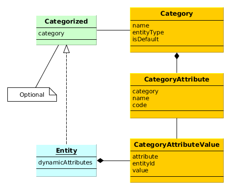
-
Category- defines a category of objects and the corresponding set of dynamic attributes. The category must be assigned to some entity type.For example, there is an entity of the Car type. We can define two categories for it: Truck and Passenger. The Truck category will contain Load Capacity and Body Type attributes, and the Passenger category – Number of Seats and Child Seat.
-
CategoryAttribute- defines a dynamic attribute related to some category. Each attribute describes a single field of a definite type. The requiredCodefield contains the system name of the attribute. TheNamefield contains the human-readable attribute name. -
CategoryAttributeValue- dynamic attribute value for a particular entity instance. Dynamic attribute values are physically stored in the dedicatedSYS_ATTR_VALUEtable. Each table record has a reference to some entity (ENTITY_IDcolumn).
An entity instance can have dynamic attributes of all categories related to the entity type. So if you create two categories of the Car entity mentioned above, you will be able to specify any dynamic attribute from both categories for a Car instance. If you want to be able to classify an entity instance as belonging to a single category (a car can be either truck or passenger), the entity must implement Categorized interface. In this case an entity instance will have the reference to a category, and dynamic attributes from this category only.
Loading and saving of dynamic attribute values is handled by DataManager.
The LoadContext.setLoadDynamicAttributes() method is used to indicate that dynamic attributes should
be loaded for entity instances. By default, dynamic attributes are not loaded. At the same time,
DataManager always saves dynamic attributes contained in entity instances passed to
commit().
Dynamic attribute values are available through getValue() / setValue() methods
for any persistent entity inherited from BaseGenericIdEntity. An attribute code with the
+ prefix should be passed to these methods, for example:
LoadContext lc = new LoadContext(Car.class).setId(id);
lc.setLoadDynamicAttributes(true);
Entity entity = dataManager.load(lc);
Double capacity = entity.getValue("+loadCapacity");
entity.setValue("+loadCapacity", capacity + 10);
dataManager.commit(entity);
In fact, the direct access to attribute values in the application code is rarely needed. Any dynamic attribute can be automatically displayed in any Table or FieldGroup component bound to a datasource containing the entity, for which the dynamic attribute was created. The attribute editor described below allows you to specify screens and components that should show the attribute.
User permissions to access dynamic attributes can be set in the
security role editor in the same way as for
regular attributes. Dynamic attributes are displayed with the + prefix.
Managing attributes categories and descriptions is done via special screens available in menu.
The category browser shows the list of all registered categories.
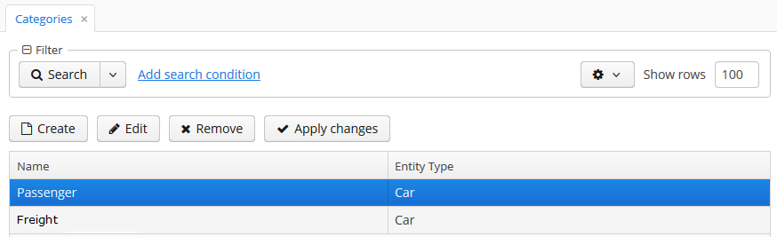
The category editor allows you to create a new category for an entity and define a set of dynamic
attributes. The category name and the related entity type fields are mandatory. The
Default checkbox indicates that this category will be automatically selected for a new
instance of an entity implementing Categorized interface.
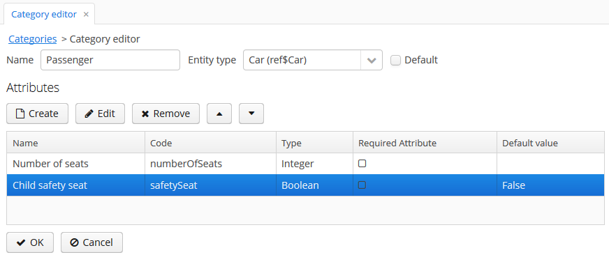
Dynamic attribute editor enables setting the name, system code, value type and the default value of the attribute.
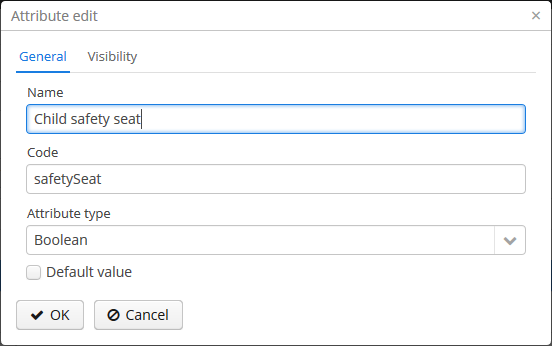
A dynamic attribute also has visibility settings, which define the screens where it should be displayed. By default, the attribute is invisible on any screen.
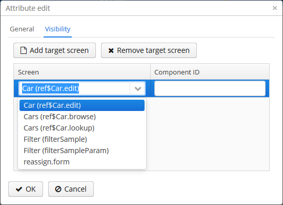
In addition to the screen, you can also specify a component in which the attribute is to appear (for example, for screens, where several FieldGroup components show the fields of the same entity).
If the attribute is marked as visible on a screen, it will automatically appear in all field groups and tables displaying entities of the corresponding type on the screen.
Access to dynamic attributes can also be restricted by user role settings. Security settings for dynamic attributes are similar to those for regular attributes.
In order for changes in attribute and visibility settings to take effect, click
in the categories browser. Changes can also be applied
via by calling the
clearDynamicAttributesCache() method of the app-core.cuba:type=CachingFacade JMX bean.
The dynamic attribute added to the screen automatically by specifying visibility settings is shown below:
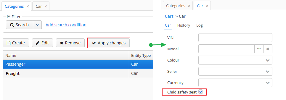
Dynamic attributes can be added to a screen manually. To do this, follow these steps:
-
In the
dsContextsection of the screen XML-descriptor, set theloadDynamicAttributesproperty totruefor a datasource that loads the entity (entities), for example:<dsContext> <datasource id="carDs" class="com.company.sample.entity.Car" view="_local" loadDynamicAttributes="true"/> </dsContext> -
Specify the dynamic attribute code with the
+prefix in thepropertyXML attribute of a component definition:<textField id="numberOfSeats" datasource="carDs" property="+numberOfSeats"/>
If an entity implements com.haulmont.cuba.core.entity.Categorized interface, you can use
com.haulmont.cuba.gui.components.RuntimePropertiesFrame component for displaying dynamic
attributes of this entity. This component allows a user to select a category for the particular entity
instance and specify values of dynamic attributes of this category.
In order to use the RuntimePropertiesFrame component in an edit screen, do the following:
-
Two datasources should be declared in the
dsContextsection:-
runtimePropsDatasource- a specific datasource to load theCategoryAttributeValueinstances. ThemainDsattribute must refer to the main datasource, which contains the edited entity. -
A regular
collectionDatasourceto load the list of categories of this entity type.
Example:
<dsContext> <datasource id="carDs" class="com.company.sample.entity.Car" view="carEdit"/> <runtimePropsDatasource id="runtimePropsDs" mainDs="carDs"/> <collectionDatasource id="categories" class="com.haulmont.cuba.core.entity.Category" view="_local"> <query> select c from sys$Category c where c.entityType='sample$Car' </query> </collectionDatasource> </dsContext> -
-
Now, the
runtimePropertiesvisual component may be included in the XML-descriptor of the screen:<runtimeProperties id="runtimePropsFrame" runtimeDs="runtimePropsDs" categoriesDs="categories"/>
REST API supports loading and saving dynamic attributes.
In order to load dynamic attributes of an entity instance, add the dynamicAttributes=true parameter
to the find or query request:
app-portal/api/find.xml?e=sample$Car-9f789ba9-ca15-4758-a8b8-77e434f1d438&s=9f789ba9-ca15-4758-a8b8-77e434f1d438&dynamicAttributes=true
Dynamic attributes are represented in JSON and XML documents in the same way as regular attributes, except
for the preceding + symbol.
REST API also saves dynamic attributes passed to commit.
This section describes the use of pessimistic locking in CUBA applications.
Pessimistic locking should be used when there is a high probability of simultaneous editing of a single entity instance. In such cases the standard optimistic locking, based on entity versioning, usually creates too many collisions.
Pessimistic locking explicitly locks an entity instance when it is opened in the editor. As a result, only one user can edit this particular entity instance in a given moment of time.
Pessimistic locking mode can be enabled for any entity class on application development or production stage using screen, or manually:
-
Insert a new record with the following field values into the SYS_LOCK_CONFIG table with the following field values:
-
ID – an arbitrary UUID-type identifier.
-
NAME – the name of the object to be locked. For an entity, it should be the name of its meta class.
-
TIMEOUT_SEC – lock expiration timeout in seconds..
Example:
insert into sys_lock_config (id, create_ts, name, timeout_sec) values (newid(), current_timestamp, 'sales$Order', 300)
-
-
Restart the server or call
reloadConfiguration()method of theapp-core.cuba:type=LockManagerJMX bean.
Pessimistic locking mechanism can also be used to manage simultaneous execution of arbitrary processes. The key benefit is that the locks are distributed, since they are replicated in the Middleware cluster.
More information is available in JavaDocs for the LockManagerAPI and LockService interfaces.
The entity statistics mechanism provides the information on the current number of entity instances in the database. This data is used to automatically select the best lookup strategy for linked entities and to limit the size of search results displayed in UI screens.
Statistics are stored in the SYS_ENTITY_STATISTICS table, corresponding to the EntityStatistics entity. Statistics can be updated manually by adding the the necessary records to the table, as well as automatically by using the refreshStatistics() method of the PersistenceManagerMBean JMX bean. When passing the entity name as a parameter, the statistics will be collected only for the corresponding entity; otherwise, the statistics will be collected for all entities. Collecting statistics may take a considerable amount of time and put excessive load on the database. Thus, it is better to do it manually or by using a scheduled task at an appropriate time.
Programmatic access to entity statistics is available via PersistenceManagerAPI interface on the middle tier and PersistenceManagerService on the the client tier. Statistics get cached into memory, and as a result, any direct changes to statistics in the database will only be applied after the server restart or after a calling to the PersistenceManagerMBean.flushStatisticsCache() method.
The description of the EntityStatistics attributes and their impact on the system behaviour is provided below:
-
name(NAME column) – the name of the entity meta-class, for example,sales$Customer. -
instanceCount(INSTANCE_COUNT column) – the approximate number of entity instances. -
fetchUI(FETCH_UI column) – the size of the data displayed on a page when extracting entity lists.For example, the Filter component uses this number in the Show N rows field.
-
maxFetchUI(MAX_FETCH_UI column) – the maximum number of entity instances that can be extracted and passed to the client tier.This limit is applied when showing entity lists in such components as LookupField or LookupPickerField, as well as tables without a filter, when no limitations are applied to the connected datasource via
CollectionDatasource.setMaxResults(). In this case the data source itself limits the number of extracted instances tomaxFetchUI. -
lookupScreenThreshold(LOOKUP_SCREEN_THRESHOLD column) – the threshold, measured in number of entities, which determines when lookup screens should be used instead of dropdowns for entity searches.The Filter component takes this parameter into account when choosing filter parameters. Until the threshold is reached, the system uses the LookupField component, and once the threshold is exceeded, the PickerField component is used. Hence, if lookup screens should be used for a specific entity in a filter parameter, it is possible to set the value of
lookupScreenThresholdto a value lower thaninstanceCount.
PersistenceManagerMBean JMX bean allows setting default values for all of the parameters mentioned above via DefaultFetchUI, DefaultMaxFetchUI, DefaultLookupScreenThreshold attributes. The system will use the corresponding default values when an entity has no statistics, which is a common case.
Besides, PersistenceManagerMBean.enterStatistics() method allows a user to enter statistics data for an entity. For example, the following parameters should be passed to the method to set a default page size to 1,000 and maximum number of loaded into LookupField instances to 30,000:
entityName: sales$Customer fetchUI: 1000 maxFetchUI: 30000
This mechanism tracks entity persistence at the entity listeners level, i.e. it is guaranteed to track all changes passing through persistent context of the EntityManager. Direct changes to entities in the database using SQL, including the ones performed using NativeQuery or QueryRunner, are not tracked.
Modified entity instances are passed to registerCreate(), registerModify() and registerDelete() methods of the EntityLogAPI bean before they are saved to the database. Each method has auto parameter, allowing separation of automatic logs added by entity listeners from manual logs added by calling these methods from the application code. When these methods are called from entity listeners the value of auto parameter is true.
The logs contain information about the time of modification, the user who has modified the entity, and the new values of the changed attributes. Log entries are stored in the SEC_ENTITY_LOG table corresponding to the EntityLogItem entity. Changed attribute values are stored in the CHANGES column and are converted to instances of EntityLogAttr entity when they are loaded by the Middleware.
The simplest way to set up the entity log is using the application screen. The process of manual set up is described below.
Logging is configured using the LoggedEntity and LoggedAttribute entities corresponding to SEC_LOGGED_ENTITY and SEC_LOGGED_ATTR tables.
LoggedEntity defines the types of entities that should be logged. LoggedEntity has the following attributes:
-
name(NAME column) – the name of the entity meta-class, for example,sales$Customer. -
auto(AUTO column) – defines if the system should log the changes when EntityLogAPI is called withauto = trueparameter (i.e. called by entity listeners). -
manual(MANUAL column) – defines if the system should log the changes whenEntityLogAPIis called withauto = falseparameter.
LoggedAttribute defines the entity attribute to be logged and contains a link to the LoggedEntity and the attribute name.
To set up logging for a certain entity, the corresponding entries should be added into the SEC_LOGGED_ENTITY and SEC_LOGGED_ATTR tables. For example, logging the changes to name and grade attributes of the Customer entity can be enabled using:
insert into SEC_LOGGED_ENTITY (ID, CREATE_TS, CREATED_BY, NAME, AUTO, MANUAL)
values ('25eeb644-e609-11e1-9ada-3860770d7eaf', now(), 'admin', 'sales$Customer', true, true);
insert into SEC_LOGGED_ATTR (ID, CREATE_TS, CREATED_BY, ENTITY_ID, NAME)
values (newid(), now(), 'admin', '25eeb644-e609-11e1-9ada-3860770d7eaf', 'name');
insert into SEC_LOGGED_ATTR (ID, CREATE_TS, CREATED_BY, ENTITY_ID, NAME)
values (newid(), now(), 'admin', '25eeb644-e609-11e1-9ada-3860770d7eaf', 'grade');
To activate the logging mechanism, the Enabled attribute of the app-core.cuba:type=EntityLog JMX bean should be set to true. The changes to logging settings made at runtime are applied after server restart or after calling invalidateCache() method of the same bean.
The entity log content can be viewed on a dedicated screen available at .
The change log for a certain entity can also be accessed from any application screen by loading a collection of EntityLogItem and the associated EntityLogAttr instances into the datasources and creating the visual components connected to these datasources. For example:
<dsContext>
<datasource id="customerDs"
class="com.sample.sales.entity.Customer"
view="customerEdit"/>
<collectionDatasource id="logDs"
class="com.haulmont.cuba.security.entity.EntityLogItem"
view="logView">
<query>
select i from sec$EntityLog i
where i.entityId = :ds$customerDs order by i.eventTs
</query>
<collectionDatasource id="logAttrDs"
property="attributes"/>
</collectionDatasource>
</dsContext>
<layout>
...
<split orientation="vertical" width="100%" height="100%">
<table id="logTable" width="100%" height="100%">
<columns>
<column id="eventTs"/>
<column id="user.login"/>
<column id="type"/>
</columns>
<rows datasource="logDs"/>
</table>
<table id="logAttrTable" width="100%" height="100%">
<columns>
<column id="name"/>
<column id="value"/>
</columns>
<rows datasource="logAttrDs"/>
</table>
</split>
...
</layout>
Logged attributes should contain the @LocalizedValue annotation in order to display localized values. When annotated, the logging mechanism populates the EntityLogAttr.messagesPack field, and the table in the example above is able to use locValue column instead of value:
<table id="logAttrTable" width="100%" height="100%">
<columns>
<column id="name"/>
<column id="locValue"/>
</columns>
<rows datasource="logAttrDs"/>
</table>
The entity saving mechanism, much like the entity log, is intended to track data changes at runtime. It has the following distinct features:
-
The whole state (or snapshot) of a graph of entities defined by a specified view is saved.
-
Snapshot saving mechanism is explicitly called from the application code.
-
The platform allows the snapshots to be viewed and compared.
In order to save a snapshot of a given graph of entities, you need to call the EntitySnapshotService.createSnapshot() method passing the entity which is an entry point to the graph and the view describing the graph. The snapshot will be created using the loaded entities without any calls to the database. As a result, the snapshot will not contain the fields that are not included in the view used to load the entity.
The graph of Java objects is converted into XML and saved in the SYS_ENTITY_SNAPSHOT table (corresponding to the EntitySnapshot enitity) together with the link to the primary entity.
Usually, snapshots need to be saved after editor screen commit. This may be achieved by overriding the postCommit() method of the screen controller, for example:
public class CustomerEditor extends AbstractEditor<Customer> {
@Inject
protected Datasource<Customer> customerDs;
@Inject
protected EntitySnapshotService entitySnapshotService;
...
@Override
protected boolean postCommit(boolean committed, boolean close) {
if (committed) {
entitySnapshotService.createSnapshot(customerDs.getItem(), customerDs.getView());
}
return super.postCommit(committed, close);
}
}
Viewing snapshots for arbitrary entities is possible using the com/haulmont/cuba/gui/app/core/entitydiff/diff-view.xml frame. For example:
<iframe id="diffFrame"
src="/com/haulmont/cuba/gui/app/core/entitydiff/diff-view.xml"
width="100%"
height="100%"/>
The snapshots should be loaded into the frame from the edit screen controller:
public class CustomerEditor extends AbstractEditor<Customer> {
@Inject
protected EntityDiffViewer diffFrame;
...
@Override
protected void postInit() {
if (!PersistenceHelper.isNew(getItem())) {
diffFrame.loadVersions(getItem());
}
}
}
The diff-view.xml frame shows the list of snapshots for the given entity, with an ability to compare them. The view for each snapshot includes the user, date and time. When a snapshot is selected from the list, the changes will be displayed compared to the previous snapshot. All attributes are marked as changed for the first snapshot. Selecting two snapshots shows the results of the comparison in a table.
The comparison table shows attribute names and their new values. When a row is selected, the detailed information on attribute changes across two snapshots is shown. Reference fields are displayed according to their instance name. When comparing collections, the new and removed elements are highlighted with green and red color respectively. Collection elements with changed attributes are displayed without highlighting. Changes to element positions are not recorded.
File storage allows uploading, storing and downloading arbitrary files associated with the entities. In the standard implementation, the files are stored outside of the main database using a specialized structure within the file system.
File storage mechanism includes the following parts:
-
FileDescriptorentity – the descriptor of the uploaded file (not to be confused withjava.io.FileDescriptor) allows referencing the file from the data model objects. -
FileStorageAPIinterface – provides access to the file storage at the Middleware tier. Its main methods are:-
saveStream()– saves the contents of the file passed as theInputStreamaccording to the specifiedFileDescriptor. -
openStream()– returns the contents of the file defined by theFileDescriptorin the form of an openedInputStream.
-
-
FileUploadControllerclass – a Spring MVC controller, which allows sending files from the Client to the Middleware with HTTP POST requests. -
FileDownloadControllerclass – Spring MVC controller which allows retrieving files from the Middleware to the Client with HTTP GET requests. -
FileUpload and FileMultiUpload visual components – enable uploading files from the user’s computer to the client tier of the application and then transferring them to the Middleware.
-
FileUploadingAPIinterface – temporary storage for files uploaded to the client tier. It is used for uploading the files to the client tier by the visual components mentioned above. The application code can useputFileIntoStorage()method for moving a file into the persistent storage of the Middleware. -
ExportDisplay– client tier interface allowing downloading various application resources to the user’s computer. Files can be retrieved from persistent storage using theshow()method, which requires aFileDescriptor. An instance ofExportDisplaymay be obtained either by calling theAppConfig.createExportDisplay()static method, or through injection into the controller class.
File transfer between the user’s computer and the storage in both directions is always performed by copying data between the input and output streams. Files are never fully loaded into memory at any application level, which allows transferring files of almost any size.
Files from the user's computer can be uploaded into the storage using the FileUpload and FileMultiUpload components. Usage examples are provided in this manual in the appropriate component descriptions, as well as in Section 5.8.5, “Loading and Displaying Images”.
The temporary client-level storage (FileUploadingAPI) stores temporary files in the folder defined by cuba.tempDir application property. Temporary files can remain in the folder in case of any failures. Periodical call of the clearTempDirectory() method of the cuba_FileUploading bean is recommended to remove such temporary files. This can be achieved with a scheduled task defined in the spring.xml file in the web (and/or desktop) module of the application. For example:
<task:scheduled-tasks scheduler="scheduler"> <task:scheduled ref="cuba_FileUploading" method="clearTempDirectory" cron="0 0 0 * * 2,4,6"/> </task:scheduled-tasks>
In the example above, the cleanup will be performed at 00:00:00 every Tuesday, Thursday and Saturday.
File download at the client tier can be performed via the ExportDisplay interface obtained by calling the AppConfig.createExportDisplay() static method or via injection in the controller class. For example:
AppConfig.createExportDisplay(this).show(fileDescriptor);
The show() method accepts an optional ExportFormat type parameter, which defines the type of the content and the file extension. If the format has not been provided, the extension is retrieved from the FileDescriptor, and the content type is set to application/octet-stream.
When the user is working through the web interface, the file extension defines whether the file is downloaded via the browser’s standard open/save dialog (Content-Disposition = attachment), or if the browser will attempt to show the file in the browser window (Content-Disposition = inline). The list of extensions for files that should be shown in the browser window is defined by the cuba.web.viewFileExtensions application property.
The standard implementation stores files in a dedicated folder structure within one or several file locations.
The roots of the structure can be defined in the cuba.fileStorageDir application property in the format of comma-separated paths list. For example:
cuba.fileStorageDir=/work/sales/filestorage,/mnt/backup/filestorage
If the property is not defined, the storage will be located in the filestorage sub-folder of the Middleware’s work directory. This folder is tomcat/work/app-core/filestorage in standard Tomcat deployment.
With several locations defined, the storage behaves as follows:
-
First folder in the list is considered as primary, others – as backup.
-
Stored files are first placed in the primary folder, and then copied to all of the backup directories.
The system checks that each folder is accessible before storing a file. If the primary directory is not accessible, the system throws an exception without storing the file. If any of the backup directories are not accessible, the file gets stored in available ones and the corresponding error is logged.
-
The files are read from the primary directory.
If the primary directory is not accessible, the system reads files from the first available backup directory containing the required files. A corresponding error is logged.
The storage folder structure is organized in the following way:
-
There are three levels of subdirectories representing the files upload date – year, month, and day.
-
The actual files are saved in the
daydirectory. The file names match the identifiers of the correspondingFileDescriptorobjects. The file extension matches that of the source file. -
The root folder of the structure contains a
storage.logfile with the information on each stored file, including the user and upload time. This log is not required for operation of the storage mechanism, but it could be useful for troubleshooting.
The app-core.cuba:type=FileStorage JMX bean displays the current set of storage roots and offers the following methods for troubleshooting:
-
findOrphanDescriptors()– finds all instances ofFileDescriptorin the database that do not have a matching file in the storage. -
findOrphanFiles()– finds all files in the storage that do not have a correspondingFileDescriptorinstance in the database.
This mechanism allows generating unique numerical sequences via a single API, independent of the DBMS type.
The main part of this mechanism is the UniqueNumbers bean with the UniqueNumbersAPI interface. The bean is available in the Middleware block. The interface methods are as follows:
-
getNextNumber()– get the next value in a sequence. The mechanism allows simultaneous management of several sequences, identified by arbitrary strings. The name of the sequence from which you want to retrieve the value is passed in thedomainparameter.Sequences do not require initialization. When
getNextNumber()is called for the first time, the corresponding sequence will be created and a value of 1 will be returned. -
getCurrentNumber()– obtain the current, i.e. the last generated value of the sequence. Thedomainparameter sets the sequence name. -
setCurrentNumber()– set the current value of the sequence. This value incremented by 1 will be returned by the next call togetNextNumber().
Below is an example of getting the next value in a sequence in a Middleware bean:
@Inject
private UniqueNumbersAPI uniqueNumbers;
private long getNextValue() {
return uniqueNumbers.getNextNumber("mySequence");
}
The getNextNumber() method of the UniqueNumbersService service is used to get sequence values in client blocks.
The app-core.cuba:type=UniqueNumbers JMX bean with methods duplicating the methods of the UniqueNumbersAPI is used for sequence management.
The sequence generation mechanism depends on the DBMS type. For HSQL, Microsoft SQL Server 2012+, PostgreSQL and Oracle each UniqueNumbersAPI sequence corresponds to sec_un_{domain} table in the database. For Microsoft SQL Server before 2012 each sequence corresponds to sec_un_{domain} database table with an auto increment field. In this regard, the sequence parameters can also be managed directly in the database.
QueryRunner is a class designed to run SQL. It should be used instead of JDBC in all cases where using plain SQL is necessary and working with the ORM tools of the same purpose is not desired.
The platform’s QueryRunner is a variant of Apache DbUtils QueryRunner with the added ability to use Java Generics.
Usage example:
QueryRunner runner = new QueryRunner(persistence.getDataSource());
try {
Set<String> scripts = runner.query("select SCRIPT_NAME from SYS_DB_CHANGELOG",
new ResultSetHandler<Set<String>>() {
public Set<String> handle(ResultSet rs) throws SQLException {
Set<String> rows = new HashSet<String>();
while (rs.next()) {
rows.add(rs.getString(1));
}
return rows;
}
});
return scripts;
} catch (SQLException e) {
throw new RuntimeException(e);
}
There are two ways of using QueryRunner: current transaction or separate transaction in autocommit mode.
-
To run a query in current transaction
QueryRunnermust be instantiated using a parameterless constructor. Then,query()orupdate()methods should be called with aConnectionparameter retrieved viaEntityManager.getConnection(). There is no need to close theConnectionafter the query, as it will be closed when the transaction is committed. -
To run a query in a separate transaction,
QueryRunnerinstance must be created using a constructor with theDataSourceparameter retrieved usingPersistence.getDataSource(). Then,query()orupdate()methods should be called without theConnectionparameter. Connection will be created from the specifiedDataSourceand immediately closed afterwards.
The platform includes MyBatis framework, which offers wider capabilities for running SQL and mapping query results to objects compared to ORM native query or QueryRunner.
The following beans must be added into spring.xml file of the core module to use MyBatis in the project:
<bean id="sqlSessionFactory" class="org.mybatis.spring.SqlSessionFactoryBean"> <property name="dataSource" ref="dataSource"/> <property name="configLocation" value="cuba-mybatis.xml"/> <property name="mapperLocations" value="classpath*:com/sample/sales/core/sqlmap/*.xml"/> </bean> <bean id="sqlSession" class="org.mybatis.spring.SqlSessionTemplate"> <constructor-arg index="0" ref="sqlSessionFactory" /> </bean>
The MapperLocations parameter defines a path to mapperLocations mapping files (according to the rules of ResourceLoader Spring interface).
Below is the an example of a mapping file for loading an instance of Order together with a related Customer and a collection of Order items:
<?xml version="1.0" encoding="UTF-8" ?>
<!DOCTYPE mapper
PUBLIC "-//mybatis.org//DTD Mapper 3.0//EN"
"http://mybatis.org/dtd/mybatis-3-mapper.dtd">
<mapper namespace="com.sample.sales">
<select id="selectOrder" resultMap="orderResultMap">
select
o.ID as order_id,
o.DATE as order_date,
o.AMOUNT as order_amount,
c.ID as customer_id,
c.NAME as customer_name,
c.EMAIL as customer_email,
i.ID as item_id,
i.QUANTITY as item_quantity,
p.ID as product_id,
p.NAME as product_name
from
SALES_ORDER o
left join SALES_CUSTOMER c on c.ID = o.CUSTOMER_ID
left join SALES_ITEM i on i.ORDER_ID = o.id and i.DELETE_TS is null
left join SALES_PRODUCT p on p.ID = i.PRODUCT_ID
where
c.id = #{id}
</select>
<resultMap id="orderResultMap" type="com.sample.sales.entity.Order">
<id property="id" column="order_id"/>
<result property="date" column="order_date"/>
<result property="amount" column="order_amount"/>
<association property="customer" column="customer_id" javaType="com.sample.sales.entity.Customer">
<id property="id" column="customer_id"/>
<result property="name" column="customer_name"/>
<result property="email" column="customer_email"/>
</association>
<collection property="items" ofType="com.sample.sales.entity.Item">
<id property="id" column="item_id"/>
<result property="quantity" column="item_quantity"/>
<association property="product" column="product_id" javaType="com.sample.sales.entity.Product">
<id property="id" column="product_id"/>
<result property="name" column="product_name"/>
</association>
</collection>
</resultMap>
</mapper>
The following code can be used to retrieve query results from the example above:
Transaction tx = persistence.createTransaction();
try {
SqlSession sqlSession = AppBeans.get("sqlSession");
Order order = (Order) sqlSession.selectOne("com.sample.sales.selectOrder", orderId);
tx.commit();
} finally {
tx.end();
}
The objects loaded using MyBatis can be changed and sent to EntityManager.merge() in order to be persisted to the database. However, only non-null attributes will be persisted, i.e. if an attribute was not loaded or was intentionally set to null, the corresponding database field will remain unchanged.
This behaviour is defined by the default openjpa.DetachState=loaded ORM parameter.
The folders panel provides quick access to frequently used information. It is a panel on the left side of the main application window containing a hierarchical structure of folders. Clicking on folders shows the corresponding system screens with certain parameters.
At the moment of this writing, the panel is available for the Web Client only.
The platform supports three types of folders: application folders, search folders and record sets. Application folders are displayed at the top of the panel as a separate folder tree. Search folders and record sets are displayed at the bottom of the panel in a combined tree.
-
-
Open screens with or without a filter.
-
The set of folders depend on the current user session. Folder visibility is defined by a Groovy script.
-
Application folders can be created and changed only by users with special permissions.
-
Folder headers may show the record count calculated by a Groovy script.
-
Folder headers are updated on timer events, which means that record count and display style for each folder can be updated.
-
-
Search folders:
-
Open screens with a filter.
-
Search folders can be local or global, accessible only by the user who created them or by all users, respectively.
-
Local folders can be created by any user, while global are created only by users with special permissions.
-
-
Record sets:
The following application properties can influence the functionality of the folder panel:
Creating application folders requires special permissions to create/edit application folders (cuba.gui.appFolder.global).
A simple application folder can be created via the folder panel context menu. Such folder will not be connected to the system screens and can be only used to group other folders within a folder tree.
A folder that opens a screen with a filter can be created as follows:
-
Open a screen and filter the records as necessary.
-
Select option in the button menu.
-
Fill in the folder attributes in the Add dialog:
-
Folder name.
-
Window title – a string to be added to the window title when opening it from the folder.
-
Parent folder – determines the location of the new folder in the folder tree.
-
Visibility script – a Groovy script defining folder visibility, executed at the start of user session.
The script should return a
Boolean. The folder is visible, if the script is not defined or returnstrueornull. Example of a Groovy script:userSession.currentOrSubstitutedUser.login == 'admin'
-
Count script – a Groovy script defining the record count and display style for a folder. Executed at the start of the user session and on timer.
The script should return a numeric value, the integer part of which will be used as the record count value. If the script is not defined or returns
null, the counter will not be displayed. In addition to the returned value, the script can also set thestylevariable, which will be used as folder display style. Example of a Groovy script:import com.haulmont.cuba.core.EntityManager import com.haulmont.cuba.core.Query EntityManager em = persistence.getEntityManager() Query q = em.createQuery('select count(o) from sales$Order o') Number count = q.getSingleResult() style = count > 0 ? 'emphasized' : null return countIn order for the style to be displayed, the application theme should contain this style for the
v-tree-nodeelement in thefolderspane, for example:.folderspane .v-tree-node.emphasized { font-weight: bold; }
-
Scripts can use the following variables defined in the groovy.lang.Binding context:
-
folder– an instance ofAppFolderentity for which the script is executed. -
userSession– instance of UserSession for current user session. -
persistence– implementation of the Persistence interface. -
metadata– implementation of the Metadata interface.
The platform uses the same instance of groovy.lang.Binding for all scripts when the folders are being updated. So it is possible to pass variables between them in order to eliminate duplicate requests and increase performance.
Script sources can be stored within the attributes of the AppFolder entity or in separate files. In the latter case, the attribute should include a file path with a mandatory ".groovy" extension, as required by the Resources interface. If an attribute contains a string ending with ".groovy", the script will be loaded from the corresponding file; otherwise, the attribute content itself will be used as a script.
Application folders are instances of the AppFolder entity and are stored in the related SYS_FOLDER and SYS_APP_FOLDER tables.
Search folders can be created by the users similar to application folders. Group folders are created directly via the context menu of the folder panel. The folders connected to screens are created from the button menu, using the option.
Creating global search folders, requires the user to have Create/edit global search folders permission (cuba.gui.searchFolder.global).
Search folder's filter can be edited once the folder is created by opening the folder and changing the Folder:{folder name} filter. Saving the filter will change the folder filter as well.
Search folders are instances of the SearchFolder entity stored in the related SYS_FOLDER and SEC_SEARCH_FOLDER tables.
Using records sets within a screen is possible, if the Filter has a corresponding Table component defined in the applyTo attribute. For example:
<layout>
<filter id="customerFilter"
datasource="customersDs"
applyTo="customersTable"/>
<groupTable id="customersTable"
width="100%">
<buttonsPanel>
<button action="customersTable.create"/>
...
</buttonsPanel>
...
or / buttons should now appear in table context menu. If a table includes a buttonsPanel (as in the example above), the corresponding table buttons will also be added.
Record sets are the instances of the SearchFolder entity stored in the related SYS_FOLDER and SEC_SEARCH_FOLDER tables.
The Web Client block allows opening application screens via commands embedded into a URL. If the browser does not have an active application session with the registered user, the application will show the login screen first, and then, after successful authentication, proceed to the main application window with the requested screen.
The list of supported commands is defined in the cuba.web.linkHandlerActions application property. By default, these are open and o. When the HTTP request is being processed, the last part of the URL is analyzed, and if a match with one of the commands is detected, control is handed over to the LinkHandler bean. The standard implementation of this bean accepts the following parameters:
-
screen– name of the screen defined in screens.xml, for example:http://localhost:8080/app/open?screen=sec$User.browse
-
item– an entity instance to be passed to the edit screen, encoded according to conventions of theEntityLoadInfoclass, i.e.entityName-instanceIdorentityName-instanceId-viewName. Examples:http://localhost:8080/app/open?screen=sec$User.edit&item=sec$User-60885987-1b61-4247-94c7-dff348347f93 http://localhost:8080/app/open?screen=sec$User.edit&item=sec$User-60885987-1b61-4247-94c7-dff348347f93-user.edit
-
params– parameters passed to the screen controller'sinit()method. Parameters are encoded asname1:value1,name2:value2. Parameter values may include entity instances encoded according to the conventions of theEntityLoadInfoclass. Examples:http://localhost:8080/app/open?screen=sales$Customer.lookup¶ms=p1:v1,p2:v2 http://localhost:8080/app/open?screen=sales$Customer.lookup¶ms=p1:sales$Customer-01e37691-1a9b-11de-b900-da881aea47a6
LinkHandler bean may be redefined in the application project
in order to provide specialized link handling. The LinkHandler bean is a prototype, so do not forget
to specify the scope when defining your bean in spring.xml, for example:
<!-- web-spring.xml --> <bean id="cuba_LinkHandler" class="com.company.sample.web.MyLinkHandler" scope="prototype"/>
The entity inspector allows working with any application objects without having to create dedicated screens. The inspector dynamically generates the screens to browse and edit the instances of the selected entity.
This gives the system administrator an opportunity to review and edit the data that is not accessible from standard screens due to their design, and to create the data model and main menu sections linked to the entity inspector only, at prototyping stage.
The entry point for the inspector is the com/haulmont/cuba/gui/app/core/entityinspector/entity-inspector-browse.xml screen.
If a String-type parameter named entity with an entity name has been passed to the screen, the inspector will show a list of entities with the abilities for filtering, selection and editing. The parameter can be specified when registering the screen in screens.xml, for example:
screens.xml
<screen id="sales$Product.lookup"
template="/com/haulmont/cuba/gui/app/core/entityinspector/entity-inspector-browse.xml">
<param name="entity"
value="sales$Product"/>
</screen>
menu.xml
<item id="sales$Product.lookup"/>
Screen identifier defined as {entity_name}.lookup allows PickerField and LookupPickerField components to use this screen within the PickerField.LookupAction standard action.
Generally, the screen may be called without any parameters. In this case, the top part will contain an entity selection field. In the cuba base project, the inspector screen is registered with the entityInspector.browse identifier, so it can be simply referenced in a menu item:
<item id="entityInspector.browse"/>
The platform provides an ability to register the information about third party software components used in the application (credits) and to display this information in the UI. The information includes a software component name, a website link and the license text.
Base projects of the platform contain their own files with descriptions, like cuba-credits.xml, reports-credits.xml. The cuba.creditsConfig application property can be used to define a list of application-specific description files depending on the base project used in the application.
The structure of the credits.xml file is as follows:
-
The
itemselement lists the used libraries with license texts included either as an embeddedlicenseelement, or as alicenseattribute with a link to the text in thelicensessection.It is possible to reference licenses declared in the current file as well as any other file declared in cuba.creditsConfig variable prior to the current one.
-
The
licenseselement lists the texts of general licenses used (e.g. LGPL).
The entire list of third-party software components can be displayed using the com/haulmont/cuba/gui/app/core/credits/credits-frame.xml frame, which loads the information from the files defined in the cuba.creditsConfig property. An example of a frame within a screen:
<layout expand="creditsBox">
<groupBox id="creditsBox"
caption="msg://credits"
width="100%">
<iframe id="credits"
src="/com/haulmont/cuba/gui/app/core/credits/credits-frame.xml"
width="100%"
height="100%"/>
</groupBox>
</layout>
If the modal mode (WindowManager.OpenType.DIALOG) is used to open the screen that contains the frame, the height must be specified; otherwise, the scrolling may not work correctly. The height can be set within the screen controller displaying the frame:
@Override
public void init(Map<String, Object> params) {
getDialogParams().setWidth(500).setHeight(400);
}
The platform enables extending and overriding the following aspects of its functionality in applications:
-
Extending entity attributes set.
-
Extending screens functionality.
-
Extending and overriding business logic contained in Spring beans.
Below is an example of the first two operations, illustrated by adding the "Address" field to the User entity of the platform security subsystem.
In the application project, derive an entity class from com.haulmont.cuba.security.entity.User and add the required attribute with the corresponding access methods:
@Entity(name = "sales$User")
@Extends(User.class)
public class ExtUser extends User {
@Column(name = "ADDRESS", length = 100)
private String address;
public String getAddress() {
return address;
}
public void setAddress(String address) {
this.address = address;
}
}
The new name of the entity should be specified in the @Entity annotation. Since the parent entity does not declare the inheritance strategy, it is assumed to be SINGLE_TABLE by default. It means that the child entity will be stored in the same table as the parent one, and the @Table annotation is not required. Other parent entity annotations ( @NamePattern, @Listeners, etc.) are automatically applied to the child entity, but can be overridden in its class.
An important element of the new entity class is the @Extends annotation, which takes the parent class as a parameter. It enables creating a registry of child entities and forces the platform mechanisms to use them everywhere instead of the parent ones. The registry is implemented by the ExtendedEntities class, which is a Spring bean named cuba_ExtendedEntities, and is also accessible via the Metadata interface.
Add a localized name of the new attribute to the com.sample.sales.entity package:
messages.properties
ExtUser.address=Address
messages_ru.properties
ExtUser.address=Адрес
Register the new entity in the persistence.xml file of the project:
<class>com.sample.sales.entity.ExtUser</class>
Add the update script for the corresponding table to the database create and update scripts:
alter table SEC_USER add ADDRESS varchar(100)
The platform supports creating new XML descriptors by inheriting them from the existing ones.
XML inheritance is implemented by specifying the parent descriptor path in the extends attribute of the root window element.
XML screen elements overriding rules:
-
If the extending descriptor has a certain element, the corresponding element will be searched for in the parent descriptor using the following algorithm:
-
If the overriding element is a
view, the corresponding element will be searched by thename,classandentityattributes. -
If the overriding element is a
property, the corresponding element will be searched by thenameattribute. -
In other cases, if the overrinding element has the
idattribute, the corresponding element with the sameidwill be searched for. -
If the search is successful, the found element is overridden.
-
Otherwise, the platform determines how many elements with the provided path and name are contained in the parent descriptor. If there is only one element, it is overridden.
-
If search yields no result and there is either zero or more than one element with the given path and name in the parent descriptor, a new element is added.
-
-
The text for the overridden or added element is copied from the extending element.
-
All attributes from the extending element are copied to the overridden or added element. If attribute names match, the value is taken from the extending element.
-
By default, the new element is added to the end of the list of adjacent elements. In order to add a new element to the beginning or with an arbitrary index, you can do the following:
-
Define an additional namespace in the extending descriptor:
xmlns:ext="http://schemas.haulmont.com/cuba/window-ext.xsd". -
Add the
ext:indexattribute with a desired index, for example:ext:index="0"to the extending element.
-
In order to debug the descriptor conversion, you can output the resulting XML to the server log by specifying the TRACE level for the com.haulmont.cuba.gui.xml.XmlInheritanceProcessor logger in the Log4j configuration file:
<appender name="FILE" ...
<param name="Threshold" value="TRACE"/>
...
<category name="com.haulmont.cuba.gui.xml.XmlInheritanceProcessor">
<priority value="TRACE"/>
</category>
Below is an example descriptor of the ExtUser entities browser screen:
<window xmlns="http://schemas.haulmont.com/cuba/window.xsd"
xmlns:ext="http://schemas.haulmont.com/cuba/window-ext.xsd"
extends="/com/haulmont/cuba/gui/app/security/user/browse/user-browse.xml">
<layout>
<groupTable id="usersTable">
<columns>
<column id="address" ext:index="2"/>
</columns>
</groupTable>
</layout>
</window>
In this example, the descriptor is inherited from the standard User entities browser of the platform. The address column is added to the table with index 2, so it is displayed after login and name.
If you register a new screen in screens.xml with the same identifiers that were used for the parent screen, the new screen will be invoked everywhere instead of the old one.
<screen id="sec$User.browse"
template="com/sample/sales/gui/extuser/extuser-browse.xml"/>
<screen id="sec$User.lookup"
template="com/sample/sales/gui/extuser/extuser-browse.xml"/>
Similarly, let us create an edit screen:
<window xmlns="http://schemas.haulmont.com/cuba/window.xsd"
xmlns:ext="http://schemas.haulmont.com/cuba/window-ext.xsd"
extends="/com/haulmont/cuba/gui/app/security/user/edit/user-edit.xml">
<layout>
<fieldGroup id="fieldGroup">
<column id="fieldGroupColumn2">
<field id="address" ext:index="4"/>
</column>
</fieldGroup>
</layout>
</window>
Register it in screens.xml with the identifier of the parent screen:
<screen id="sec$User.edit"
template="com/sample/sales/gui/extuser/extuser-edit.xml"/>
Once all the abovementioned actions are completed, the application will use ExtUser with the corresponding screens instead of the standard User entity of the platform.
Screen controller can be extended by creating a new class that is inherited from the base screen controller. Class name is specified in the class attribute of the root element of the extending XML descriptor; the usual rules of inheriting XML described above will apply.
The main part of platform business logic is contained in Spring beans. This enables to easily extend or override it in the application.
To substitute a bean implementation, you should create your own class that implements the interface or extends the base platform class and register it in spring.xml of the application. You cannot apply the @ManagedBean annotation to the extending class; overriding beans is possible only in the XML configuration.
Below is an example of adding a method to the PersistenceTools bean.
First, create a class with the necessary method:
public class ExtPersistenceTools extends PersistenceTools {
public Entity reloadInSeparateTransaction(final Entity entity, final String... viewNames) {
Entity result = persistence.createTransaction().execute(new Transaction.Callable<Entity>() {
@Override
public Entity call(EntityManager em) {
return em.reload(entity, viewNames);
}
});
return result;
}
}
Register the class in spring.xml of the project core module with the same identifier as the platform bean:
<bean id="cuba_PersistenceTools" class="com.sample.sales.core.ExtPersistenceTools"/>
After that, the Spring context will always return ExtPersistenceTools instead of the basePersistenceTools instance. A checking code example:
Persistence persistence; PersistenceTools tools; persistence = AppBeans.get(Persistence.class); tools = persistence.getTools(); assertTrue(tools instanceof ExtPersistenceTools); tools = AppBeans.get(PersistenceTools.class); assertTrue(tools instanceof ExtPersistenceTools); tools = AppBeans.get(PersistenceTools.NAME); assertTrue(tools instanceof ExtPersistenceTools);
This chapter contains practical information on how to create platform-based applications.
Code Formatting
-
For Java and Groovy code, it is recommended to follow the standard style described in Code Conventions for the Java Programming Language. When programming in IntelliJ IDEA, you can just use the default style and Ctrl-Alt-L shortcut for formatting.
The maximum line length is 120 characters. The indentation is 4 characters; using spaces instead of tabs is enabled.
-
XML code: indentation is 4 characters; using spaces instead of tabs is enabled.
Naming Conventions
| Identifier | Naming Rule | Example |
|---|---|---|
| Java and Groovy classes | ||
| Screen controller class |
UpperCamelCase Browse screen controller Edit screen controller |
|
| XML screen descriptors | ||
| Component identifier, parameter names in queries |
lowerCamelCase, only letters and numbers. |
|
| Datasource identifier |
lowerCamelCase, only letters and numbers ending with |
attributesDs
|
| SQL scripts | ||
| Reserved words | lowercase |
create table
|
| Tables | UPPER_CASE. The name is preceded by the project name to form a namespace. It is recommended to use singular form in table names. |
|
| Columns | UPPER_CASE |
|
| Foreign key columns | UPPER_CASE. Consists of the table referred by the column (without the project prefix) and the _ID suffix. |
CUSTOMER_ID
|
| Indexes | UPPER_CASE. Consists of the IDX_ prefix, name of the table that the index is created for (with the project prefix) and names of the fields included in the index. |
IDX_SALES_CUSTOMER_NAME
|
Below is the project file structure of a simple application, Sales, consisting of the Middleware, Web Client and Web Portal blocks.
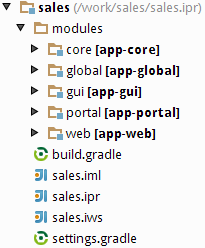
The project root contains build scripts (build.gradle, settings.gradle) and IntelliJ IDEA project files.
The modules directory includes the subdirectories of the project modules − global, core, gui, portal, web.
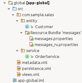
The global module contains the source code directory, src, with configuration files – metadata.xml, persistence.xml and views.xml. The com.sample.sales.core package contains interfaces of the Middleware services; the com.sample.sales.entity package contains entity classes and localization files for them.
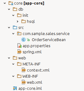
The core module contains the following directories:
-
db– directory with the database create and update scripts. -
src– source code directory; its root contains the application properties file of the Middleware block and the spring.xml configuration file. Thecom.samples.sales.corepackage contains the Middleware classes: implementations of services, managed beans and JMX beans. -
web– directory with the configuration files of the web application built from the Middleware block: context.xml and web.xml.
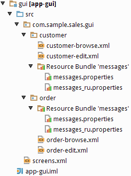
The gui module includes the source code directory, src, with the screens.xml configuration file. The com.sample.sales.gui package contains XML descriptors and screen controllers, and localization files for them.
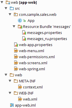
The web module contains the following directories:
-
src– source code directory with the application properties file of the Web Client block and configuration files – web-menu.xml, web-permissions.xml, web-screens.xml and web-spring.xml. Thecom.samples.sales.webpackage contains the main class of the Web Client block (inheritor ofDefaultApp) and the main localized messages pack. -
web– directory with configuration files of the web application built from the Web Client: context.xml and web.xml.
Platform based projects are built using Gradle build system. Build scripts are two files in the project root directory:
-
settings.gradle– defines the project name and the set of modules. -
build.gradle– defines the build configuration.
This section describes the structure of the scripts and the purpose and parameters of Gradle tasks.
The allprojects section defines the group and version of the project
artifacts being built. Artifact names are based on module names specified in
settings.gradle. If the ext.isSnapshot property is true,
artifact names will have the SNAPSHOT suffix. The ext.tomcatDir property sets the
location of the Tomcat installation directory. Furthermore,
the allprojects section may have the following optional properties:
-
ext.copyright– the copyright notice text that is inserted by IntelliJ IDEA into the source text files. -
ext.vcs– type of VCS used in the project. If this property is specified, IntelliJ IDEA’s generated project files will have a VCS integration parameter for this VCS. Possible values:svn,git. -
ext.uploadUrl– URL of the repository where assembled project artifacts will be uploaded to upon completion of theuploadArchivestask. Haulmont repository is used by default. -
ext.uploadUser– name of the repository user that will be used to upload assembled project artifacts.HAULMONT_REPOSITORY_USERenvironment variable value is used by default. -
ext.uploadPasswordrepository user password that will be used to upload assembled project artifacts.HAULMONT_REPOSITORY_PASSWORDenvironment variable value is used by default. -
ext.tomcatPort,ext.tomcatShutdownPortandext.tomcatDebugPortproperties affect thesetupTomcattask (see below) and can be used to install Tomcat with non-standard ports.
Instead of setting project properties in build.gradle itself, you can do it by passing a command-line argument with the -P prefix, for example:
gradlew uploadArchives -PuploadUser=myuser -PuploadPassword=mypassword
In the buildscript section, the following actions are executed:
-
The base projects version is specified.
-
The set of repositories for loading project dependencies is specified. Values of
repoUserandrepoPassproject properties or standard values explicitly set in the build script are used as credentials to access the repository. Similar to other project properties, you can passrepoUserandrepoPassin the command line arguments with-Pprefix. -
Dependency from the cuba-plugin is declared; the plugin contains the project's build specifics and is connected to the module build configuration using the following method:
apply(plugin: 'cuba')
Then, application modules building parameters are defined in the configure section.
Tasks are executable units in Gradle. They are defined both in the plugins and in the build script itself. Below are CUBA-specific tasks; their parameters can be configured in build.gradle.
-
enhance– theCubaEnhancing-type task that executes bytecode enhancement of persistent entity classes. It is declared in the global module. The path to the persistence.xml project file is specified in thepersistenceXmltask parameter.For example:
task enhance(type: CubaEnhancing) { persistenceXml = "${globalModule.projectDir}/src/persistence.xml" } -
enhanceTransient– theCubaEnhanceTransient-type task that executes bytecode enhancement of non-persistent entity classes. The path to the metadata.xml project file is specified in themetadataXmltask parameter.For example:
task enhanceTransient(type: CubaEnhanceTransient) { metadataXml = "${globalModule.projectDir}/src/metadata.xml" } -
setupTomcat– theCubaSetupTomcat-type task that performs installation and initialization of the local Tomcat server for subsequent fast deployment of the application. This task is automatically added to the project when you connect the cuba build plugin, so you don’t need to declare it inbuild.gradle. Tomcat installation directory is specified by theext.tomcatDirproperty in theallprojectssection. By default, it is the project’sbuild/tomcatsubfolder. -
deploy– theCubaDeployment-type task that performs fast deployment of a module to Tomcat. It is declared in the core, web and portal modules. Parameters:-
appName– name of the web application that will be created from the module. In fact, it is the name of a subdirectory insidetomcat/webapps. -
jarNames– the list of JAR file names (without versions) produced as a result of building a module and intended to be placed into theWEB-INF/libcatalog of the web application. All other module artifacts and dependencies will be copied totomcat/shared/lib.
For example:
task deploy(dependsOn: assemble, type: CubaDeployment) { appName = 'app-core' jarNames = ['cuba-global', 'cuba-core', 'app-global', 'app-core'] } -
-
buildWar– theCubaWarBuilding-type task that builds a module into a WAR file. It can be declared in the core, web and portal modules, if application deployment to WAR is required. The built WAR files are located in thebuild/distributionsmodule subdirectories.Task parameters:
-
appName– the name of the resulting WAR file. -
appHome– the path to the application home directory. The home directory contains the logging configuration file, the database scripts directory, and the configuration, temporary and work directories of the application.In the
appHomeparameter, you can specify either an absolute path to the home directory or a system variable, which should be set at server start. For example:appHome = '/work/sales_home'orappHome = '${app.home}'. -
appProperties– the map of the properties that will be written to theWEB-INF/local.app.propertiesfile in addition to those defined in the task itself. By default, thebuildWartask creates this file and defines propertiescuba.logDir,cuba.confDir,cuba.tempDir,cuba.dataDirin it, in order to work with the application home directory mentioned above. Additionally, the following parameter is set for the middleware:cuba.dataSourceJndiName = jdbc/CubaDS
and for the web client:
cuba.connectionUrl = http://localhost:8080/${appName}-core cuba.useLocalServiceInvocation = false
An example of a task in the web module:
task buildWar(dependsOn: assemble, type: CubaWarBuilding) { appName = 'app' appHome = '${app.home}' appProperties = ['cuba.connectionUrlList': 'http://server/app-core'] } -
-
createWarDistr– theCubaWarDistribution-type task that prepares the distribution that includes application WAR files and their home directory. The task must depend on the tasks of thebuildWarmodule and have the following parameters:-
appHome– the path to the home directory of the application (seebuildWartask description for details). -
distrDir– target folder for the distribution content. It is an optional parameter; by default, thebuild/warproject subdirectory is used.
Below is a sample task description:
task createWarDistr(dependsOn: [coreModule.buildWar, webModule.buildWar], type: CubaWarDistribution) { appHome = '${app.home}' } -
-
createDb– theCubaDbCreation-type task that creates application database by executing the corresponding scripts. It is declared in the core module. Parameters:-
dbms– the DBMS type; specified as string (hsql,postgres,mssql, ororacle). -
dbName– the database name. -
dbUser– the DBMS username. -
dbPassword– the DBMS user password. -
host– the DBMS host and port (optional) in thehost[:port]format. If not specified,localhostis used. -
masterUrl– the URL used to connect when creating the database. If not specified, the default value that depends on the DBMS type and thehostparameter is used. -
dropDbSql– the SQL command to delete the database. If not specified, the default value that depends on the DBMS type is used. -
createDbSql– the SQL command to create a database. If not specified, the default value that depends on the DBMS type is used. -
driverClasspath– the list of JAR files containing the JDBC driver. The items in the list are separated by ":" on Linux and by ";" on Windows. If not specified, the system uses the dependencies that are part of the current module’sjdbcconfiguration. Explicit definition ofdriverClasspathis necessary when using Oracle, because its JDBC driver is not available in the dependencies. -
oracleSystemPassword– the SYSTEM user password for Oracle.
Example for PostgreSQL:
task createDb(dependsOn: assemble, description: 'Creates local database', type: CubaDbCreation) { dbms = 'postgres' dbName = 'sales' dbUser = 'cuba' dbPassword = 'cuba' }Example for MS SQL Server:
task createDb(dependsOn: assemble, description: 'Creates local database', type: CubaDbCreation) { dbms = 'mssql' dbName = 'sales' dbUser = 'sa' dbPassword = 'saPass1' }Example for Oracle:
task createDb(dependsOn: assemble, description: 'Creates database', type: CubaDbCreation) { dbms = 'oracle' host = '192.168.1.10' dbName = 'orcl' dbUser = 'sales' dbPassword = 'sales' oracleSystemPassword = 'manager' driverClasspath = "$tomcatDir/lib/ojdbc6.jar" } -
-
updateDb– theCubaDbUpdate-type task that updates the database by executing the corresponding scripts. It is similar to thecreateDbtask, except that thedropDbSqlandcreateDbSqlparameters are omitted. -
startDb– theCubaHsqlStart-type task that starts the local HSQLDB server. Parameters:-
dbName– database name, default iscubadb. -
dbDataDir– database directory, default is thedatasubfolder of the project. -
dbPort– server port, default is 9001.
For example:
task startDb(type: CubaHsqlStart) { dbName = 'sales' } -
-
stopDb– theCubaHsqlStop-type task that stops the local HSQLDB server. The parameters are similar tostartDb. -
start– theCubaStartTomcat-type task that starts the local Tomcat server installed by the setupTomcat task. This task is automatically added to the project when you add the cuba plugin, so you don’t need to declare it inbuild.gradle. -
stop– theCubaStopTomcattype task that stops the local Tomcat server installed by the setupTomcat task. This task is automatically added to the project when you include the cuba plugin, so you don’t need to declare it inbuild.gradle. -
restart– the task that stops the local Tomcat server, runs fast deployment, and starts the server once again. -
debugWidgetSet- theCubaWidgetSetDebugtype task that launches GWT Code Server for debugging widgets in the browser.Example usage:
task debugWidgetSet(type: CubaWidgetSetDebug) { widgetSetClass = 'com.haulmont.cuba.web.toolkit.ui.WidgetSet' }Ensure that the
web-toolkitmodule has a dependency on Servlet API library in theruntimeconfiguration:configure(webToolkitModule) { dependencies { runtime(servletApi) } ...See Section 5.7.2, “Debugging Web Widgets” for information on how to debug code in the browser.
Gradle tasks described in build scripts can be launched in the following ways:
-
If you are working with the project in CUBA Studio, you can use the and menu items to connect to the Gradle daemon (launched at the start of Studio server), which will perform the corresponding tasks.
-
Alternatively, you can use the executable
gradlewscript (Gradle wrapper) included in the project. The script should be located in the project root directory and can be created in Studio using the > command. -
One more way is to use the manually installed Gradle version 1.12. In this case, the executable
gradlescript located in thebinsubdirectory of the installed Gradle, is used.
It is recommended to run the gradlew or gradle commands with the
--daemon key; in this case the Gradle daemon is retained in memory, which significantly
accelerates the subsequent execution.
To remove the daemon from memory, you can use the --stop key.
For example, in order to compile the Java files and build the JAR files for project artifacts, you need to run the following command:
gradlew --daemon assemble
Typical build tasks in their normal usage sequence are provided below.
-
idea– create IntelliJ IDEA project files. When this task is executed, dependencies with their source code are loaded from the artifact repository to the local Gradle cache. -
cleanIdea– remove IntelliJ IDEA project files. -
assemble– compile Java files and build JARs for project artifacts in thebuildsubdirectories of the modules. -
clean– removebuildsubdirectories of all project modules. -
setupTomcat – setup the Tomcat server to the path that is specified by the
ext.tomcatDirproperty of thebuild.gradlescript. -
deploy – deploy the application to the Tomcat server that has been pre-installed by the
setupTomcattask. -
createDb – create an application database and run the corresponding scripts.
-
updateDb – update the existing application database by running the corresponding scripts.
-
start – start the Tomcat server.
-
stop – stop the running Tomcat server.
-
restart – sequentially run the
stop,deploy,starttasks.
The CUBA Gradle plugin requires interactive accepting of the CUBA license agreement if this is the first build for the current user. This is impossible for an automatic build on a CI server. There are two ways to bypass this interactive step:
-
Create file
${user.home}/.haulmont/license.properties, where${user.home}is the home directory of the user that CI-server is running as, and add the following content:accepted=true
-
If creating the file in the user home is not desired, specify the following Gradle command line parameter:
-PlicenseAgreementAccepted=true
The recommended way to create a new project is to use CUBA Studio. An example can be found in the Quick Start chapter of this manual.
Once the project is created, you can keep developing it in the Studio, or create IntelliJ IDEA or Eclipse project files and open the project in the IDE.
This section provides practical advice on working with a database during application development.
Recommendations for working with a database in production are provided in Section 6.5, “Creating and Updating the Database in Production”.
In the process of application development you need to create and maintain the database schema that corresponds to the model entities. The platform offers an approach based on DB create and update scripts to solve this task. The practical steps to apply this approach are provided below.
The task to create and maintain the DB schema consists of two parts: creating the scripts and executing them.
Scripts can be created both manually and using Studio. The process of creating scripts in Studio is provided below. Run the command in the Entities section. In this case, Studio will connect to the database defined on the Project properties page and compare the available DB schema with the current data model.
If the database does not exist or does not have SYS_DB_CHANGELOG and SEC_USER tables, the system generates only DB initialization scripts. Otherwise, update scripts are created as well. Then, a page with the generated scripts is opened.
Update scripts are displayed on the Update scripts tab. Scripts with the new status reflect the difference between the current state of the data model and the DB schema. A separate script is created for each new or modified table. Some scripts also contain sets of referential integrity constraints. When the page is closed by clicking , the scripts are saved in the db/update/{db_type} directory of the core module.
Scripts that exist in the project and have been applied to the DB before are displayed with the applied status. They cannot be edited or removed.
The Update scripts tab can also display scripts with to be deleted status. These are the scripts available in the project, but not applied to the DB yet. These scripts are removed when you close the page by clicking OK. This is the standard behavior in case the scripts are created during previous scripts generation, but not applied by invoking . In this case, you don't need them any longer, because the current difference between the DB schema and the data model is reflected in newly generated scripts. However, if the scripts were authored by another developer and retrieved from a version control system, you should cancel the saving and apply the other party’s scripts to your DB first, and then generate new ones.
The Init tables, Init constraints and Init data tabs display DB create scripts that are located in the db/init/{db_type} directory of the core module.
The Init tables tab displays the 10.create-db.sql script that creates the tables. The code related to one and the same table is separated by begin {table_name} ... end {table_name} comments. When an entity in the model is changed, Studio will replace code only for the corresponding table between the comments, while leaving the rest of the code, where manual changes could have been made, untouched. Therefore, do not remove these comments when editing the code manually, otherwise Studio will not be able to properly apply the changes to the existing files.
The Init constraints tab displays the 20.create-db.sql script that creates integrity constraints. It also has table-separating comments that you should not remove.
The Init data tab displays the 30.create-db.sql script designed to provide additional information when initializing the DB. These may be, for example, functions, triggers or DML operators to fill the database with the necessary data. The contents of this script are created manually, if necessary.
At the initial stage of application development, when the data model is being actively changed, we recommend using only the DB creation scripts (located in the Init tables, Init constraints, Init data) tabs) and removing the update scripts in the Update scripts tab immediately after invoking the command. This is the most simple and reliable way to keep the DB up to date. Of course, it has a major drawback, since applying these scripts recreates the DB from scratch, and all data are lost. You can partially compensate this drawback at the development stage by adding commands to the Init data script that will create primary data upon initialization.
Update scripts become a convenient and necessary tool for developing and maintaining the DB at a later stage, when the data model is relatively stable, and the development and production databases have the data that cannot not be lost as a result of recreating the DB from scratch.
Use DB script execution by Gradle tasks to apply scripts: invoke > to recreate the database and > to apply the scripts. Please note that these items are available only if the application server is stopped. Of course, you can invoke the corresponding Gradle tasks (createDb and updateDb) at any time from the command line, but if the database or any of its objects are locked, script execution may fail.
HSQLDB, also called HyperSQL, is a convenient DBMS for application prototyping that does not require installation and is started automatically within CUBA Studio if the project has been configured to work with this DBMS. This section describes the ways of connecting to HSQLDB with external tools that allow working with DB schema and data directly via SQL.
SQuirreL SQL Client is an open-source Java application that allows working with databases via JDBC. You can download Squirrel SQL here: http://squirrel-sql.sourceforge.net.
Start Squirrel SQL and go to Drivers. Right-click HSQLDB Server in the drivers list, and choose Modify Driver.
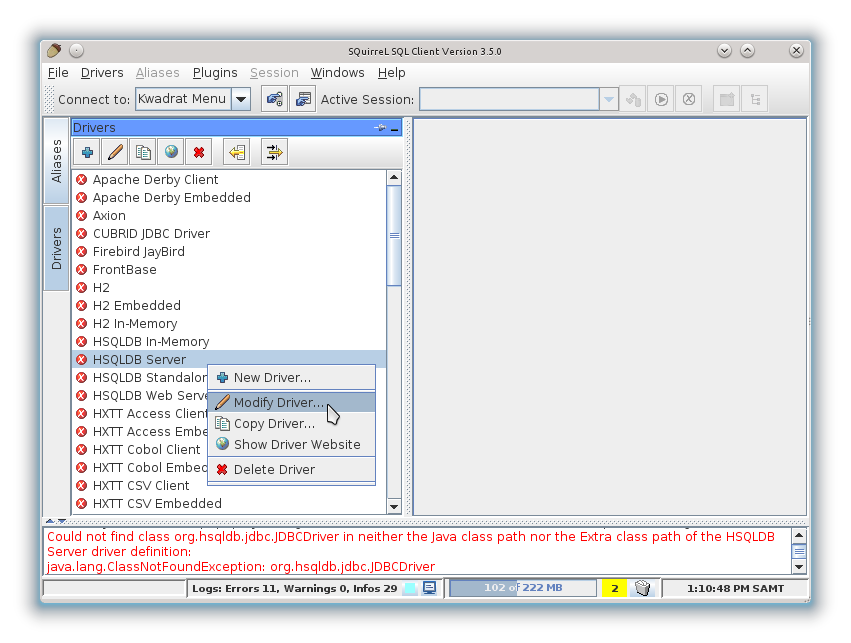
Go to the Extra Class Path tab in the window that appears, and click the button to add the .jar file with the driver.
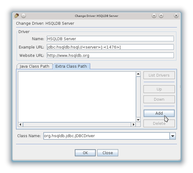
Then you need to select the hsqldb-x.x.x.jar, driver, which you should download from HSQLDB website in advance. If you are using HyperSQL only for CUBA development, then you can add the driver supplied as part of CUBA Studio (it is located in the lib subfolder).
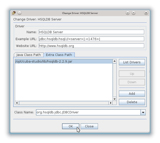
Next, create the alias for connection to the application database.
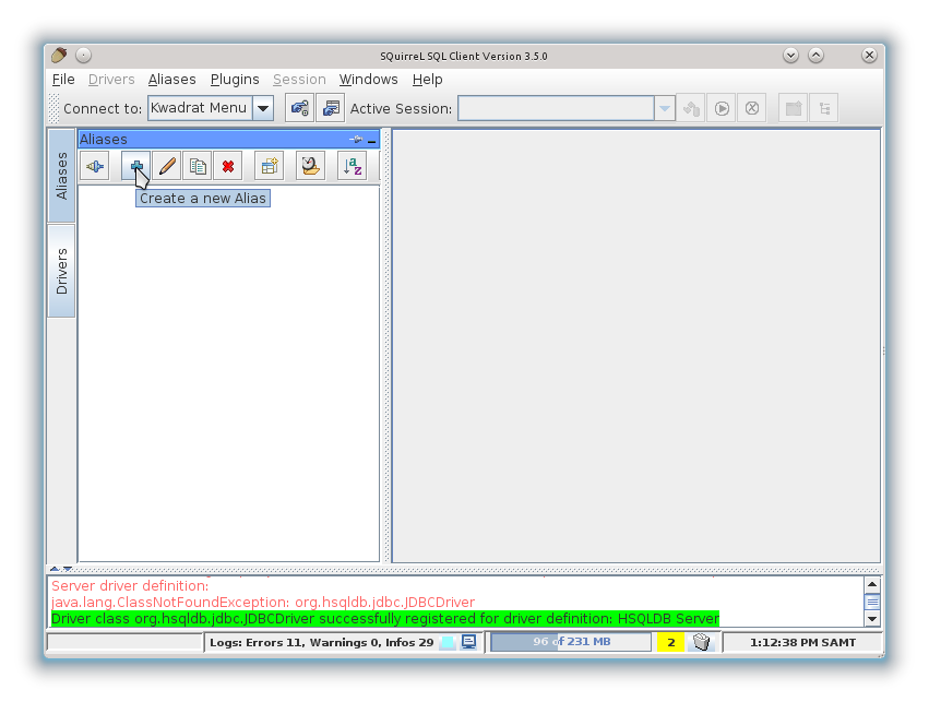
Fill in the connection properties in the window that appears: Database URL, username and password. The default user name is "sa", the password is empty. The database URL can be copied from the Project properties tab in CUBA Studio, or from the modules/core/web/META-INF/context.xml file of the project.
IntelliJ IDEA Ultimate Edition offers convenient tools for working with databases. To connect to HSQLDB, start IDEA and open the Database panel on the right.
If you cannot find the panel, open -> -> .
Create a new data source using the context menu.
In the appeared window select the hsqldb-x.x.x.jar driver that you downloaded from HSQLDB website in advance. If you are using Hyper SQL only for CUBA development, you can just add the driver supplied as part of CUBA Studio (it is located in the lib subfolder).
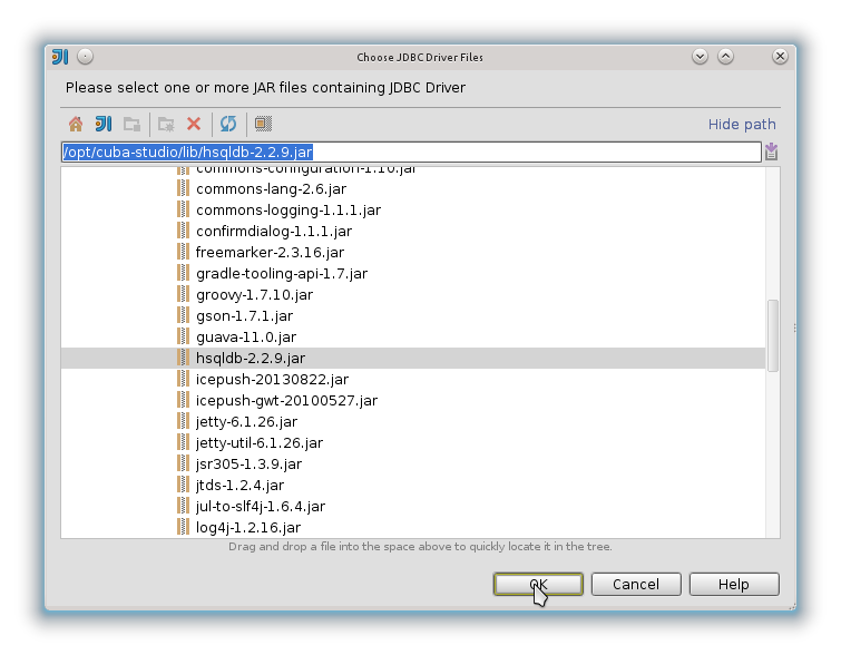
Then you should configure data source properties: database URL, username and password. Database URL can be copied from the Project properties properties tab in CUBA Studio or the modules/core/web/META-INF/context.xml project file. The default username is “sa”, the password is empty.
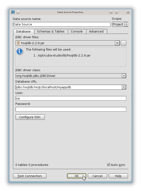
To create a PostgreSQL database on an Ubuntu-like system, you should install the postgresql-contrib package with the UUID generation function.
Microsoft SQL Server uses cluster indexes for tables.
By default, a cluster index is based on the table’s primary key, however UUID-type keys used by CUBA-applications are poorly suited for clustered index. That is why you should correctly select and create a clustered index for each table. The clustered index field should be relatively small and strictly ascending, following the general rules:
-
For most tables, you can use the CREATE_TS field. With this field, the records will be physically stored according to their creation order.
-
For composite entities, if reading prevails over writing, it makes sense to use an owner key. In this case, the records will be grouped by owner and their loading together with an owner will be faster.
-
For small (< 100 records) and rarely changing tables, the type of clustered index is not important and you can keep using ID.
-
For tables of the entities, inherited via
JOINEDstrategy, that do not have the CREATE_TS field, you can create it manually with thecurrent_timestampparameter.
Example:
create table SALES_CUSTOMER (
ID uniqueidentifier not null,
CREATE_TS datetime,
...
primary key nonclustered (ID)
)^
create clustered index IDX_SALES_CUSTOMER_CREATE_TS on SALES_CUSTOMER (CREATE_TS)^
Example of a composite entity:
create table SALES_ITEM (
ID uniqueidentifier not null,
CREATE_TS datetime,
...
ORDER_ID uniqueidentifier,
...
primary key nonclustered (ID),
constraint FK_SALES_ITEM_ORDER foreign key (ORDER_ID) references SALES_ORDER(ID)
)^
create clustered index IDX_SALES_ITEM_ORDER on SALES_ITEM (ORDER_ID)^
Example of an inherited entity:
create table SALES_DOC (
CARD_ID uniqueidentifier,
CREATE_TS datetime default current_timestamp,
NUMBER varchar(50),
primary key nonclustered (CARD_ID),
constraint FK_SALES_DOC_CARD foreign key (CARD_ID) references WF_CARD (ID)
)^
create clustered index IDX_SALES_DOC_CREATE_TS on SALES_DOC (CREATE_TS)^
create index IDX_SALES_DOC_CARD on SALES_DOC (CARD_ID)^
Due to the distribution policy of Oracle JDBC driver, it can only be downloaded manually from http://www.oracle.com/technetwork/database/features/jdbc/index-091264.html. After downloading, copy ojdbc6.jar file into the lib subfolder in Studio and the lib subfolder of the installed Tomcat server. Then you need to stop Studio, stop Gradle daemon by executing gradle --stop in the command line, then start Studio again.
The platform uses Apache Log4j version 1.2 for logging.
We recommend using logging via the Commons Logging API and getting a logger based on the current class name. Example of creating a logger and writing to it:
import org.apache.commons.logging.Log;
import org.apache.commons.logging.LogFactory;
public class ...
private Log log = LogFactory.getLog(getClass()); // create logger
private void someMethod() {
log.debug("someMethod invoked"); // output message with DEBUG level
}
Logs for the Middleware, Web Client and Web Portal blocks are configured at the application server level; in fast deployment mode the server is Tomcat. Logs for the Desktop Client block are configured separately.
Running Gradle setupTomcat task installs the Tomcat server into the project directory and performs its additional configuration. Particularly, setenv.bat and setenv.sh files are created in the tomcat/bin subfolder, and log4j.xml is created in the tomcat/conf subfolder.
Among other things, the setenv.* files define loading parameters for the log4j.xml configuration file using the CATALINA_OPTS variable.
log4j.xml defines logging configuration. The file has the following structure:
-
appenderelements define the "output device" for the log. The main appenders areFILEandCONSOLE. TheThresholdparameter of the appender defines the message threshold. By default, it isDEBUGfor a file andINFOfor console. It means thatERROR,WARN,INFOandDEBUGmessages are written to a file, whileERROR,WARNandINFOare written to console.The path to the log file for the file appender is defined in the
Fileparameter;Appendflag defines if the file should be flushed or appended to at server restart. The default settings aretomcat/logs/app.logand flush at restart. When an application is in production, we recommend settingAppendtotrue.By default, the file appender is implemented by the
org.apache.log4j.DailyRollingFileAppenderclass, which renames the log file to a previous date and starts a new file daily at 00:00:00. This helps avoiding excessively large log files. -
categoryelements define the logger parameters that are used to send messages from the program code. Category names are hierarchical, i.e. the settings of thecom.company.samplecategory have effect on thecom.company.sample.core.CustomerServiceBeanandcom.company.sample.web.CustomerBrowseloggers, if the loggers do not explicitly override the settings with their own.Minimum logging level is defined by the
priorityelement. For example, if the category isINFO, thenDEBUGandTRACEmessages will not be logged. It should be kept in mind that message logging is also affected by the level threshold set in the appender.
You can quickly change category levels and appender thresholds for a running server using the > screen available in the web client. Any changes to the logging settings are effective only during server runtime and are not saved to a file. The screen also allows viewing and loading log files from the server logs folder (tomcat/logs).
The platform automatically adds the following information to the messages written to a log:
-
[application]– the name of the Tomcat-deployed web application whose code has logged the message. This information allows identifying messages from different application blocks (Middleware, Web Client), since they are written into the same file. -
[user]– login name of the user who invoked the code logging the message. This helps to track activity of a certain user in the common log. If the code that logged a message was not invoked within a specific user session, the user information is not added.
For example, the following message has been written to the log by the code of the Middleware block (app-core), running under the admin user:
2013-12-19 18:48:17,282 DEBUG [com.haulmont.cuba.core.app.DataManagerBean] [app-core] [admin] loadList: metaClass=sec$User, view=com.haulmont.cuba.security.entity.User/user.browse, query=select u from sec$User u, max=100
For the desktop client, the log4j.xml file should be located in the source files directory of the project’s desktop module. When an application is built, it is packed into the corresponding JAR file and is accessible in CLASSPATH.
Make the following steps to set up logging for your project:
-
Create a new file, for example
sample-log4j.xml, in thesrcdirectory of the desktop module, and copy the contents ofcuba-log4j.xmlto this new file.cuba-log4j.xmlfile is located in one of the platform’s JAR files and can be easily found using search in the IDE, given that the base projects are configured properly. -
Define path to a log file in the
Fileparameter of theFILEappender. -
Add settings for category loggers in your project.
-
In the inheritor class of
com.haulmont.cuba.desktop.Appof your project, for exampleSampleApp, override thegetDefaultLog4jConfig()method and use it to return the path to your log file relative to the CLASSPATH root. For example:public class SampleApp extends App { ... @Override protected String getDefaultLog4jConfig() { return "sample-log4j.xml"; } -
If necessary, you can override the location of the configuration file at application start using log4j.configuration system property.
This section covers various aspects of testing and debugging CUBA applications.
You can start Tomcat server in debug mode by either running the Gradle task
gradlew start
or by running the bin/debug.* command file of the installed Tomcat.
After this, the server will accept debugger connections over port 8787. Port number can be changed in the bin/setenv.* file, in the JPDA_OPTS variable.
For debugging in Intellij IDEA you need to create a new Remote type Run/Debug Configuration element in the application project and set its Port property to 8787.
You can use GWT Super Dev Mode to debug web widgets on the browser side.
-
Setup the debugWidgetSet task in
build.gradle. -
Deploy the application and start Tomcat.
-
Run the
debugWidgetSettask:gradlew debugWidgetSetThe running GWT Code Server will recompile your widgetset on modification.
-
Open
http://localhost:8080/app?debug&superdevmodein Chrome web browser and wait for the widgetset is built for the first time. -
Open the debug console in Chrome:
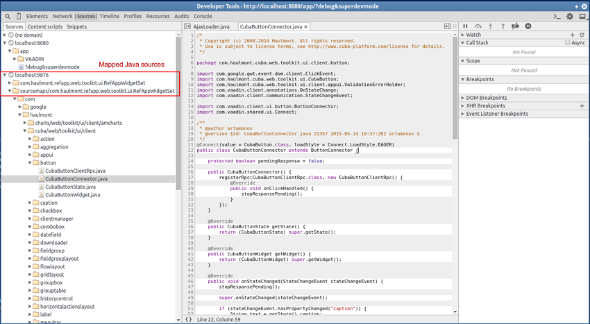
-
After changing the Java code in the
web-toolkitmodule, refresh the web page in the browser. The widgetset will be rebuilt incrementally in approximately 8-10 seconds.
This section covers various means of testing CUBA applications on different layers.
Unit tests can be created and run both at the Middleware and the Client tiers. The platform includes JUnit and JMockit frameworks for this purpose.
Let us assume you have the following screen controller:
public class OrderEditor extends AbstractEditor {
@Named("itemsTable.add")
protected AddAction addAction;
@Override
public void init(Map<String, Object> params) {
addAction.setWindowId("sales$Product.lookup");
addAction.setHandler(new Lookup.Handler() {
@Override
public void handleLookup(Collection items) {
// some code
}
});
}
}
You can write the following test checking the init() method:
public class OrderEditorTest {
OrderEditor editor;
@Mocked
Window.Editor frame;
@Mocked
AddAction addAction;
@Before
public void setUp() throws Exception {
editor = new OrderEditor();
editor.setWrappedFrame(frame);
editor.addAction = addAction;
}
@Test
public void testInit() {
editor.init(Collections.<String, Object>emptyMap());
editor.setItem(new Order());
new Verifications() {
{
addAction.setWindowId("sales$Product.lookup");
addAction.setHandler(withInstanceOf(Window.Lookup.Handler.class));
}
};
}
}
At the middle tier, you can create integration tests which are run in a fully functional Spring container connected to the database. In such tests you can run code from any layer of the Middleware, from services to ORM.
To create integration tests, the application’s core module should contain a base class derived from CubaTestCase. This class should override the methods for data access initialization and configuration files list retrieval. For example:
public class SalesTestCase extends CubaTestCase {
@Override
protected void initDataSources() throws Exception {
Class.forName("org.postgresql.Driver");
TestDataSource ds = new TestDataSource("jdbc:postgresql://localhost/sales_test", "cuba", "cuba");
TestContext.getInstance().bind("java:comp/env/jdbc/CubaDS", ds);
}
@Override
protected List<String> getTestAppProperties() {
String[] files = {
"cuba-app.properties",
"app.properties",
"test-app.properties",
};
return Arrays.asList(files);
}
}
We recommend using a separate test DB, which can be created, for example, with the help of the following task in build.gradle:
configure(coreModule) {
...
task createTestDb(dependsOn: assemble, description: 'Creates local Postgres database for tests', type: CubaDbCreation) {
dbms = 'postgres'
dbName = 'sales_test'
dbUser = 'cuba'
dbPassword = 'cuba'
}
CubaTestCase class contains the following fields and methods that can be used in the test code:
-
persistence– a reference to the Persistence interface. -
metadata– a reference to the Metadata interface. -
deleteRecord()– a method that can be conveniently used intearDown()to delete test objects from DB.
An example of a test that checks loading entities from the database:
public class CustomerLoadTest extends SalesTestCase {
private UUID customerId;
@Override
public void setUp() throws Exception {
super.setUp();
persistence.createTransaction().execute(new Transaction.Runnable() {
@Override
public void run(EntityManager em) {
Customer customer = new Customer();
customerId = customer.getId();
customer.setName("testCustomer");
em.persist(customer);
}
});
}
@Override
public void tearDown() throws Exception {
deleteRecord("SALES_CUSTOMER", customerId);
super.tearDown();
}
public void test() {
Transaction tx = persistence.createTransaction();
try {
EntityManager em = persistence.getEntityManager();
TypedQuery<Customer> query = em.createQuery(
"select c from sales$Customer c", Customer.class);
List<Customer> list = query.getResultList();
tx.commit();
assertTrue(list.size() > 0);
} finally {
tx.end();
}
}
}
Client tier integration tests can be implemented using JMockit framework. It helps isolating the tests from the Middleware and creating the required infrastructure objects.
Client integration test class should be inherited from CubaClientTestCase. In the @Before method, you should call the inherited methods addEntityPackage(), setViewConfig() and then setupInfrastructure() to create Metadata and Configuration objects and deploy metadata for selected entities. Then, in the @Before method, you can extend the infrastructure with required mock objects using Expectations or NonStrictExpectations.
An example of an initialized @Before method from one of the platform tests:
@Before
public void setUp() throws Exception {
addEntityPackage("com.haulmont.cuba.security.entity");
addEntityPackage("com.haulmont.cuba.core.entity");
addEntityPackage("com.haulmont.cuba.gui.data.impl.testmodel1");
setViewConfig("/com/haulmont/cuba/gui/data/impl/testmodel1/test-views.xml");
setupInfrastructure();
metadataSession = metadata.getSession();
dataSupplier = new TestDataSupplier();
dataSupplier.commitCount = 0;
new NonStrictExpectations() {
@Mocked ClientConfig clientConfig;
@Mocked PersistenceHelper persistenceHelper;
{
configuration.getConfig(ClientConfig.class); result = clientConfig;
clientConfig.getCollectionDatasourceDbSortEnabled(); result = true;
persistenceManager.getMaxFetchUI(anyString); result = 10000;
PersistenceHelper.isNew(any); result = false;
}
};
}
This section provides solutions for certain practical tasks.
This section covers ways of getting localized messages in different application components.
-
In screen XML-descriptors, component attributes for displaying static text (such as caption) can address localized messages using the rules of MessageTools.loadString() method. For example:
-
caption="msg://roleName"– gets a message defined by theroleNamekey in the message pack of the current screen. Screen message pack is defined by themessagesPackattribute of the rootwindowelement. -
caption="msg://com.company.sample.entity/Role.name"– gets a message defined by theRole.namekey in thecom.company.sample.entitymessage pack.
-
-
In screen controllers, localized strings can be retrieved in the following ways:
-
From the current screen message pack:
-
Using
getMessage()method inherited from the AbstractFrame base class. For example:String msg = getMessage("warningMessage"); -
Using
formatMessage()method inherited from theAbstractFramebase class. In this case, the extracted message is used to format submitted parameters according to the rules ofString.format()method. For example:messages.properties:
warningMessage = Invalid email address: '%s'
Java controller:
String msg = formatMessage("warningMessage", email);
-
-
From an arbitrary messages pack via an injection of Messages infrastructure interface. For example:
@Inject private Messages messages; @Override public void init(Map<String, Object> params) { String msg = messages.getMessage(getClass(), "warningMessage"); ... }
-
-
For components managed by a Spring container (managed beans, services, JMX-beans, Spring MVC controllers of the portal module), localized messages can be retrieved with the help of the Messages infrastructure interface injection:
@Inject protected Messages messages; ... String msg = messages.getMessage(getClass(), "warningMessage");
-
In application code where injection is not possible, the
Messagesinterface can be obtained using the staticget()method of theAppBeansclass:protected Messages messages = AppBeans.get(Messages.class); ... String msg = messages.getMessage(getClass(), "warningMessage");
There are different ways to assign initial values to the attributes of new entity instances.
Simple attributes (Boolean, Integer
etc.) can be initialized in the declaration of the corresponding field of an entity class, for example:
public class User extends StandardEntity {
...
@Column(name = "ACTIVE")
protected Boolean active = true;
...
}
Additionally, a specific initialization method with a
@PostConstruct annotation can be created in the entity
class. In this case, any global infrastructure interfaces and
beans can be invoked during initialization, for example:
public class MyEntity extends StandardEntity {
...
@ManyToOne(fetch = FetchType.LAZY)
@JoinColumn(name = "USER_ID")
protected User creator;
...
@PostConstruct
protected void init() {
setCreator(AppBeans.get(UserSessionSource.class).getUserSession().getUser());
}
}
If the initial value of an attribute depends on the data of the invoking screen, you can use setInitialValues() method of the CreateAction class.
Let us look at the example of two linked entities:

A fragment of a screen XML descriptor showing the lists of two entities simultaneously:
<dsContext>
<collectionDatasource id="typesDs"
class="com.haulmont.sample.entity.DeviceType"
view="_local">
<query>
select e from sample$DeviceType e
</query>
</collectionDatasource>
<collectionDatasource id="descriptionsDs"
class="com.haulmont.sample.entity.DeviceDescription"
view="_local">
<query>
select e from sample$DeviceDescription e where e.deviceType.id = :ds$typesDs
</query>
</collectionDatasource>
</dsContext>
<layout>
...
<table id="typeTable">
<actions>
<action id="create"/>
<action id="edit"/>
<action id="remove"/>
</actions>
<columns>
<column id="name"/>
</columns>
<rows datasource="typesDs"/>
</table>
...
<table id="descriptionTable">
<actions>
<action id="create"/>
<action id="edit"/>
<action id="remove"/>
</actions>
<columns>
<column id="description"/>
</columns>
<rows datasource="descriptionsDs"/>
</table>
</split>
</layout>
The screen controller:
public class DeviceTypeBrowse extends AbstractLookup {
@Inject
private CollectionDatasource<DeviceType, UUID> typesDs;
@Named("descriptionTable.create")
private CreateAction descrCreateAction;
@Override
public void init(Map<String, Object> params) {
typesDs.addListener(new CollectionDsListenerAdapter<DeviceType>() {
@Override
public void itemChanged(Datasource<DeviceType> ds, @Nullable DeviceType prevItem, @Nullable DeviceType item) {
descrCreateAction.setInitialValues(Collections.<String, Object>singletonMap("deviceType", item));
}
});
}
}
A listener is added in the controller for selected record change event in the typesDs datasource. When the selected record is changed, the system invokes the action’s setInitialValues() method and submits a map with one element whose key is the attribute name (deviceType) and value (the selected instance of DeviceType). Thus, during the execution of CreateAction, the deviceType attribute of the new DeviceDescription instance will contain the instance of the DeviceType that was selected in the table.
Initial values can also be defined in the initNewItem() method of the screen controller of the created entity.
Assume we have the following task: a project has an Employee entity that should be linked one-to-one to a platform entity (User). When a new employee instance is being created, a new user instance should be created as well.
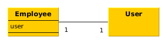
To achieve this, we declare the data source for the employee instance and the nested data source for the linked user in the employee edit screen XML descriptor:
<dsContext>
<datasource id="employeeDs"
class="com.haulmont.sample.entity.Employee"
view="employee-edit">
<datasource id="userDs"
property="user"/>
</datasource>
</dsContext>
In the employee edit screen controller, we declare:
@Inject
private Metadata metadata;
private Group defaultGroup;
private Role defaultRole;
@Override
protected void initNewItem(Employee item) {
User user = metadata.create(User.class);
user.setGroup(defaultGroup);
final UserRole userRole = metadata.create(UserRole.class);
userRole.setUser(user);
userRole.setRole(defaultRole);
getDsContext().addListener(new DsContext.CommitListenerAdapter() {
@Override
public void beforeCommit(CommitContext context) {
context.getCommitInstances().add(userRole);
}
});
item.setUser(user);
}
Here, in the initNewItem() method, the new User instance is created and assigned the defaultGroup. Association with the defaultRole is set up using the new instance of UserRole entity. To save this relationship to the DB during screen commit the UserRole instance is added to the saved entities collection in the beforeCommit() method of DsContext.CommitListener.
The new instance of User is assigned to the corresponding attribute of the edited Employee entity and is thus included in the nested data source userDs. This gives us an opportunity to edit necessary user attributes in the employee screen and also leads to automatic saving of the user instance in the same transaction with the other entities when the screen is committed.
CUBA platform supports two types of relationship between entities: association and composition. They are called ASSOCIATION and COMPOSITION respectively in the CUBA Studio interface. Association is a relationship between the objects that can exist separately from each other. Composition, on the other hand, is used for “master-detail” relations, when the detail instances can exist only as part of the master. A case of an airport and its terminals may be considered an example of composition: a terminal that does not belong to any airport does not make sense.
Typically, the entities belonging to a composition are edited together since it is more convenient. For example, a user opens the airport editing screen and sees the list of terminals, so he can create and edit them, but all changes both for the airport and the terminals are saved to the database together in one transaction, and only after the user confirms saving of the master entity (the airport).
Let us implement a composition using the Airport and the Terminal entities as an example:
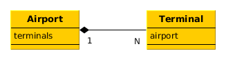
-
The
Terminalentity contains a mandatory link to theAirport:@Entity(name = "sample$Terminal") @Table(name = "SAMPLE_TERMINAL") public class Terminal extends StandardEntity { ... @ManyToOne(optional = false, fetch = FetchType.LAZY) @JoinColumn(name = "AIRPORT_ID") private Airport airport; public Airport getAirport() { return airport; } public void setAirport(Airport airport) { this.airport = airport; } } -
The
Airportentity contains one-to-many collection of terminals. The corresponding field is annotated with @Composition in order to implement composition, and @OnDelete for cascaded soft delete:@Entity(name = "sample$Airport") @Table(name = "SAMPLE_AIRPORT") public class Airport extends StandardEntity { ... @OneToMany(fetch = FetchType.LAZY, mappedBy = "airport") @OnDelete(DeletePolicy.CASCADE) @Composition protected List<Terminal> terminals; public List<Terminal> getTerminals() { return terminals; } public void setTerminals(List<Terminal> terminals) { this.terminals = terminals; } } -
The view of the airport editing screen should contain the
terminalsattributes collection:<view entity="sample$Airport" name="airport-edit" extends="_local"> <property name="terminals" view="_local"/> </view>For the
Terminalentity, we are using the_localview, although it contains theairportlink attribute (a link to an airport). Theairportattribute is set only at the creation of a newTerminalinstance and never changes after that, so we do not need to load it. -
Next, we define the datasources for the
Airportinstance and its terminals in the XML descriptor of the airport editor:<dsContext> <datasource id="airportDs" class="com.haulmont.sample.entity.Airport" view="airport-edit"> <collectionDatasource id="terminalsDs" property="terminals"/> </datasource> </dsContext> -
Define a table displaying terminals and standard actions for it in the XML descriptor of the airport editor:
<table id="terminalsTable"> <actions> <action id="create"/> <action id="edit"/> <action id="remove"/> </actions> <buttonsPanel> <button action="terminalsTable.create"/> <button action="terminalsTable.edit"/> <button action="terminalsTable.remove"/> </buttonsPanel> <columns> <column id="code"/> <column id="name"/> <column id="address"/> </columns> <rows datasource="terminalsDs"/> </table> -
It is sufficient to define the standard elements in the terminal editor:
datasourcefor theTerminalinstance and visual components related to thisdatasourcefor editing terminal attributes.
As a result, editing of an airport instance works as follows:
-
The airport edit screen shows a list of terminals.
-
A user can pick a terminal and open its editor. When is clicked in the terminal editor, the updated instance of the terminal is not saved to the database, but to the
terminalsDsdatasource of the airport editor. -
The user can create new terminals and delete existing ones. All changes will be saved to the
terminalsDsdatasource. -
When a user clicks OK in the airport edit screen, the updated
Airportinstance together with all the updatedTerminalinstances is submitted to the DataManager.commit() method on the Middleware and saved in the database within a single transaction.
Composition can be deeper, with several nested levels. Let’s extend the example above by adding a MeetingPoint entity describing a meeting point at an airport terminal:
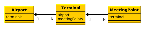
The Terminal entity contains the meetingPoints attribute – a collection of the MeetingPoint instances. In order for all three entities to become a single composition and be edited together, you should do the following in addition to the steps described above:
-
Mark the
meetingPointsattribute of theTerminalclass as@Compositionand@OnDeletesimilarly to theterminalsattribute of theAirportclass. -
Create a new view for the
Terminal:<view entity="sample$Terminal" name="terminal-edit" extends="_local"> <property name="meetingPoints" view="_local"/> </view>Use it in the
Airportview instead of_local:<view entity="sample$Airport" name="airport-edit" extends="_local"> <property name="terminals" view="terminal-edit"/> </view> -
Define datasources for an instance of the
Airportand nested entities for the entire composition depth in theAirportedit screen XML descriptor:<dsContext> <datasource id="airportDs" class="com.haulmont.sample.entity.Airport" view="airport-edit"> <collectionDatasource id="terminalsDs" property="terminals"> <collectionDatasource id="meetingPointsDs" property="meetingPoints"/> </collectionDatasource> </datasource> </dsContext>Here, the
meetingPointsDsdatasource is not associated with any visual components, however it is needed for correct operation of joint editing of the composition. -
Define the nested data source and a corresponding table for the
meetingPointscollection in the terminal edit screen XML descriptor.
As a result, the updated instances of the MeetingPoint, as well as the Terminal instances, will be saved to the database only with the Airport instance in the same transaction.
Sometimes you may need to run certain code immediately after the application start at the moment when all application functionality is already initialized and ready to work. For this, you can use the AppContext.Listener.
Assume we have the following task: a project has an Employee entity that should be linked one-to-one to a platform entity (User).
If the name attribute of the User entity is changed, for example, through a standard user management screen, the name attribute of the related Employee should change as well. This is a common task for "denormalized" data, which is typically solved using entity listeners. Our case is more complex, since we need to track changes of the platform’s User entity, and thus we cannot add an entity listener using @Listeners annotation. However, we can add a listener dynamically using the EntityListenerManager bean, and it is better to do this on application start.
Let us create the AppLifecycle bean implementing the AppContext.Listener interface in the application core module and register it by invoking AppContext.addListener() method in the object constructor:
@ManagedBean("sample_AppLifecycle")
public class AppLifecycle implements AppContext.Listener {
@Inject
private EntityListenerManager entityListenerManager;
public AppLifecycle() {
AppContext.addListener(this);
}
@Override
public void applicationStarted() {
entityListenerManager.addListener(User.class, UserEntityListener.class);
}
@Override
public void applicationStopped() {
}
public static class UserEntityListener implements BeforeUpdateEntityListener<User> {
@Override
public void onBeforeUpdate(User user) {
Persistence persistence = AppBeans.get(Persistence.class);
if (persistence.getTools().getDirtyFields(user).contains("name")) {
EntityManager em = persistence.getEntityManager();
TypedQuery<Employee> query = em.createQuery(
"select e from sample$Employee e where e.user.id = ?1", Employee.class);
query.setParameter(1, user.getId());
Employee employee = query.getFirstResult();
if (employee != null) {
employee.setName(user.getName());
}
}
}
}
}
As a result, the applicationStarted() method of this bean will be invoked immediately after the start of the Middleware block. In this method, the internal UserEntityListener class is registered as an entity listener for the User entity.
The onBeforeUpdate() method of the UserEntityListener class will be invoked every time before the changes in the User instances are saved to the database. The method checks if the name attribute exists among the updated attributes. If yes, a related Employee instance is loaded and its name is updated with the new value.
Let us consider a task of loading, storing and displaying employee photos:
-
An employee is represented by
Employeeentity. -
Image files are stored in the FileStorage. The
Employeeentity contains a link to the correspondingFileDescriptor. -
The
Employeeedit screen shows the picture and also supports uploading, downloading and clearing the picture.
Entity class with a link to the image file:
@Table(name = "SAMPLE_EMPLOYEE")
@Entity(name = "sample$Employee")
public class Employee extends StandardEntity {
...
@ManyToOne(fetch = FetchType.LAZY)
@JoinColumn(name = "IMAGE_FILE_ID")
protected FileDescriptor imageFile;
public void setImageFile(FileDescriptor imageFile) {
this.imageFile = imageFile;
}
public FileDescriptor getImageFile() {
return imageFile;
}
}
A fragment of the Employee edit screen XML descriptor:
<groupBox caption="Photo" spacing="true"
height="250px" width="250px" expand="embeddedImage">
<embedded id="embeddedImage" width="100%"
align="MIDDLE_CENTER"/>
<hbox align="BOTTOM_LEFT"
spacing="true">
<upload id="uploadField"/>
<button id="downloadImageBtn"
caption="Download"
invoke="onDownloadImageBtnClick"/>
<button id="clearImageBtn"
caption="Clear"
invoke="onClearImageBtnClick"/>
</hbox>
</groupBox>
Components used to display, upload and download images are contained within the groupBox container. Its top part shows a picture using the Embedded component, while its bottom part from left to right contains an upload component and a buttons to download and clear the image. As a result, this part of the screen should look like this:
Now, let us have a look at the edit screen controller.
public class EmployeeEdit extends AbstractEditor<Employee> {
private Log log = LogFactory.getLog(EmployeeEdit.class);
@Inject
private DataSupplier dataSupplier;
@Inject
private FileStorageService fileStorageService;
@Inject
private FileUploadingAPI fileUploading;
@Inject
private ExportDisplay exportDisplay;
@Inject
private Embedded embeddedImage;
@Inject
private FileUploadField uploadField;
@Inject
private Button downloadImageBtn;
@Inject
private Button clearImageBtn;
@Inject
private Datasource<Employee> employeeDs;
private static final int IMG_HEIGHT = 190;
private static final int IMG_WIDTH = 220;
@Override
public void init(Map<String, Object> params) {
uploadField.addListener(new FileUploadField.ListenerAdapter() {
@Override
public void uploadSucceeded(Event event) {
FileDescriptor fd = uploadField.getFileDescriptor();
try {
fileUploading.putFileIntoStorage(uploadField.getFileId(), fd);
} catch (FileStorageException e) {
throw new RuntimeException(e);
}
getItem().setImageFile(dataSupplier.commit(fd, null));
displayImage();
}
@Override
public void uploadFailed(Event event) {
showNotification("Upload failed", NotificationType.HUMANIZED);
}
});
employeeDs.addListener(new DsListenerAdapter<Employee>() {
@Override
public void valueChanged(Employee source, String property,
@Nullable Object prevValue, @Nullable Object value) {
if ("imageFile".equals(property)) {
updateImageButtons(value != null);
}
}
});
}
@Override
protected void postInit() {
displayImage();
updateImageButtons(getItem().getImageFile() != null);
}
public void onDownloadImageBtnClick(Component source) {
if (getItem().getImageFile() != null)
exportDisplay.show(getItem().getImageFile(), ExportFormat.OCTET_STREAM);
}
public void onClearImageBtnClick(Component source) {
getItem().setImageFile(null);
displayImage();
}
private void updateImageButtons(boolean enable) {
downloadImageBtn.setEnabled(enable);
clearImageBtn.setEnabled(enable);
}
private void displayImage() {
byte[] bytes = null;
if (getItem().getImageFile() != null) {
try {
bytes = fileStorageService.loadFile(getItem().getImageFile());
} catch (FileStorageException e) {
log.error("Unable to load image file", e);
showNotification("Unable to load image file", NotificationType.HUMANIZED);
}
}
if (bytes != null) {
embeddedImage.setSource(getItem().getImageFile().getName(), new ByteArrayInputStream(bytes));
embeddedImage.setType(Embedded.Type.IMAGE);
BufferedImage image;
try {
image = ImageIO.read(new ByteArrayInputStream(bytes));
int width = image.getWidth();
int height = image.getHeight();
if (((double) height / (double) width) > ((double) IMG_HEIGHT / (double) IMG_WIDTH)) {
embeddedImage.setHeight(String.valueOf(IMG_HEIGHT));
embeddedImage.setWidth(String.valueOf(width * IMG_HEIGHT / height));
} else {
embeddedImage.setWidth(String.valueOf(IMG_WIDTH));
embeddedImage.setHeight(String.valueOf(height * IMG_WIDTH / width));
}
} catch (IOException e) {
log.error("Unable to resize image", e);
}
// refresh image
embeddedImage.setVisible(false);
embeddedImage.setVisible(true);
} else {
embeddedImage.setVisible(false);
}
}
}
-
The
init()method first initializes theuploadFieldfield component intended for new images upload. In case of a successful upload, a newFileDescriptorinstance is retrieved from the component and the corresponding files are sent from the temporary storage to the persistent one by invokingFileUploadingAPI.putFileIntoStorage(). After that, theFileDescriptoris saved to the DB by invoking the DataSupplier.commit(), and the saved instance is set as the value of theimageFileattribute of the editedEmployeeentity. Then, the controller'sdisplayImage()method is invoked to display the uploaded image.After that a listener is added in the
init()method to the datasource containing anEmployeeinstance. The listener enables or locks download and clear buttons, depending on the fact whether the file has been loaded or not. -
postInit()method performs file display and refreshes the button states, depending on the existence of a loaded file. -
onDownloadImageBtnClick()is invoked when thedownloadImageBtnbutton is clicked; it downloads the file using the ExportDisplay interface. -
onClearImageBtnClick()is invoked when theclearImageBtnis clicked; it clears theimageFileattribute of theEmployeeentity. The file is not deleted from storage. -
displayImage()loads the file from storage into a byte array, sets the content of theembeddedImagecomponent and recalculates its size to preserve image height to width ratio.It should be noted that loading files into byte arrays is acceptable for small files only. If the file size is not predictable, you should download it using ExportDisplay, which sends the file through input and output streams and never keeps the entire file in memory.
This section covers the examples of creating and using custom visual components.
Integration of third-party Vaadin components is described in Section 4.5.10.1, “Using Third-Party Vaadin Components”.
Below is the example of using the Stepper component, available at http://vaadin.com/addon/stepper. This component allows changing text field value in steps using the keyboard, mouse scroll or built-in up/down buttons.
-
Assuming that the project has a
Customerentity with a String-typenameattribute. An editor screen (customer-edit.xml) was created in the web module with the following layout:<layout expand="windowActions" spacing="true"> <fieldGroup id="fieldGroup" datasource="customerDs"> <column width="250px"> <field id="name"/> </column> </fieldGroup> <iframe id="windowActions" screen="editWindowActions"/> </layout>Our task is to add an
Integer-typescoreattribute for step editing to the screen. -
Add the
scoreattribute to theCustomerentity in CUBA Studio:@Column(name = "SCORE") protected Integer score; public void setScore(Integer score) { this.score = score; } public Integer getScore() { return score; }Generate DB scripts and run the database update.
-
Run the command from the Project properties section of the Studio navigation panel.
-
Add a dependency on the component add-on to the web module in the project’s build.gradle:
configure(webModule) { ... dependencies { ... compile("org.vaadin.addons:stepper:2.1.2") } -
Re-create the IDE project files ( menu item).
-
Include the add-on widget set in the
AppWidgetSet.gwt.xmlof the project’s web-toolkit module after the platform widget set:<module> <inherits name="com.haulmont.cuba.web.toolkit.ui.WidgetSet" /> <inherits name="org.vaadin.risto.stepper.widgetset.StepperWidgetset" /> <set-property name="user.agent" value="safari" />Building of widgets can be accelerated by setting the
user.agentproperty. In this example, the widget set will be built only for WebKit-based browsers: Chrome, Safari, etc. -
Add a custom
scorefield to the fieldGroup component in thecustomer-edit.xmldescriptor:<fieldGroup id="fieldGroup" datasource="customerDs"> <column width="250px"> <field id="name"/> <field id="score" custom="true" caption="Score"/> </column> </fieldGroup> -
Add the following code to the
CustomerEditscreen controller:public class CustomerEdit extends AbstractEditor<Customer> { @Inject private ComponentsFactory componentsFactory; @Inject private FieldGroup fieldGroup; private IntStepper stepper = new IntStepper(); @Override public void init(Map<String, Object> params) { fieldGroup.addCustomField("score", new FieldGroup.CustomFieldGenerator() { @Override public Component generateField(final Datasource datasource, final String propertyId) { Component box = componentsFactory.createComponent(BoxLayout.VBOX); com.vaadin.ui.Layout layout = WebComponentsHelper.unwrap(box); layout.addComponent(stepper); stepper.setSizeFull(); stepper.addValueChangeListener(new Property.ValueChangeListener() { @Override public void valueChange(Property.ValueChangeEvent event) { datasource.getItem().setValue(propertyId, event.getProperty().getValue()); } }); return box; } }); } @Override protected void postInit() { stepper.setValue(getItem().getScore()); } }An instance of the component from the add-on is created in the
stepperfield. Theinit()method initializes the customscorefield. TheComponentsFactorycreates an instance of BoxLayout, retrieves a link to the Vaadin container via WebComponentsHelper, and adds the new component to it. TheBoxLayoutis then returned to be used in the custom field.Component data binding is implemented by setting its current value from the edited
Customerin thepostInit()method. Additionally, the corresponding entity attribute is updated through the implemented value change listener, when the user changes the value. -
The new component can be used in any part of the screen outside of the
FieldGroup. In order to do this, declare a container in the XML-descriptor:<hbox id="scoreBox" spacing="true"> <label value="Score"/> </hbox>Inject the container in the screen controller, retrieve a link to the Vaadin container and add the component to it:
public class CustomerEdit extends AbstractEditor<Customer> { @Inject private BoxLayout scoreBox; private IntStepper stepper = new IntStepper(); @Override public void init(Map<String, Object> params) { com.vaadin.ui.Layout box = WebComponentsHelper.unwrap(scoreBox); box.addComponent(stepper); stepper.addValueChangeListener(new Property.ValueChangeListener() { @Override public void valueChange(Property.ValueChangeEvent event) { getItem().setValue("score", event.getProperty().getValue()); } }); } @Override protected void postInit() { stepper.setValue(getItem().getScore()); } }Data binding is implemented in the same way as described above.
-
To adapt the component style, create a theme extension in the project. Run the command in the Project properties section of the Studio navigation panel. After that, open the
themes/havana/havana-ext.scssfile in the web module and add the following code:@import "../havana/havana"; @mixin havana-ext { @include havana; /* Basic styles for stepper */ .v-stepper { /* Use box-sizing: border-box; for all browsers */ @include box-defaults; height: 25px; border: 0; /* Use theme fonts */ font-family: $theme_fonts; } /* Basic styles for inner text box */ .v-stepper input[type="text"] { /* Use box-sizing: border-box; for all browsers */ @include box-defaults; height: 25px; padding: 1px; outline: 0; margin: 0; /* Use border color from theme */ border: 1px solid $theme_fieldBorderColor; } /* Focused styles */ .v-stepper.v-stepper input[type="text"]:focus { /* Use focused border color from theme */ border-color: $theme_fieldFocusedBorderColor; /* hide default focus outline */ outline: 0; } /* Readonly styles */ .v-readonly.v-stepper input[type="text"], .v-readonly.v-stepper input[type="text"]:focus { /* Use readonly border color from theme */ border-color: $theme_fieldReadonlyBorderColor; } }
Section 4.5.10.2, “Integration with Generic UI” covers the basics of native components integration into the Generic UI, which allows them to be declared in XML-descriptors and associated with data.
In the previous section, we have included the third-party Stepper component in the project. Integration of the IntStepper component, which implements incremental change of int numerical values, is described below.
-
Definition of component interface in the gui module:
package com.company.myproject.gui.components; import com.haulmont.cuba.gui.components.Field; public interface IntStepper extends Field { String NAME = "intStepper"; boolean isManualInputAllowed(); void setManualInputAllowed(boolean value); boolean isMouseWheelEnabled(); void setMouseWheelEnabled(boolean value); int getStepAmount(); void setStepAmount(int amount); int getMaxValue(); void setMaxValue(int maxValue); int getMinValue(); void setMinValue(int minValue); }The chosen base interface for the component is
Field, which allows data binding, i.e. the ability to view and edit an entity attribute. -
Component implementation in the web module:
package com.company.myproject.web.components; import com.company.myproject.gui.components.IntStepper; import com.haulmont.cuba.web.gui.components.WebAbstractField; public class WebIntStepper extends WebAbstractField<org.vaadin.risto.stepper.IntStepper> implements IntStepper { public WebIntStepper() { component = new org.vaadin.risto.stepper.IntStepper(); } @Override public boolean isManualInputAllowed() { return component.isManualInputAllowed(); } @Override public void setManualInputAllowed(boolean value) { component.setManualInputAllowed(value); } @Override public boolean isMouseWheelEnabled() { return component.isMouseWheelEnabled(); } @Override public void setMouseWheelEnabled(boolean value) { component.setMouseWheelEnabled(value); } @Override public int getStepAmount() { return component.getStepAmount(); } @Override public void setStepAmount(int amount) { component.setStepAmount(amount); } @Override public int getMaxValue() { return component.getMaxValue(); } @Override public void setMaxValue(int maxValue) { component.setMaxValue(maxValue); } @Override public int getMinValue() { return component.getMinValue(); } @Override public void setMinValue(int minValue) { component.setMinValue(minValue); } }The chosen base class is
WebAbstractField. The base class implements the datasource bindingFieldlogic and other methods of theFieldinterface. -
Implementation of XML loader in the gui module:
package com.company.myproject.gui.loaders; import com.company.myproject.gui.components.IntStepper; import com.haulmont.cuba.gui.components.Component; import com.haulmont.cuba.gui.xml.layout.*; import com.haulmont.cuba.gui.xml.layout.loaders.AbstractFieldLoader; import org.dom4j.Element; public class IntStepperLoader extends AbstractFieldLoader { public IntStepperLoader(Context context, LayoutLoaderConfig config, ComponentsFactory factory) { super(context, config, factory); } @Override public Component loadComponent(ComponentsFactory factory, Element element, Component parent) { IntStepper component = (IntStepper) super.loadComponent(factory, element, parent); String manualInput = element.attributeValue("manualInput"); if (manualInput != null) { component.setManualInputAllowed(Boolean.valueOf(manualInput)); } String mouseWheel = element.attributeValue("mouseWheel"); if (mouseWheel != null) { component.setMouseWheelEnabled(Boolean.valueOf(mouseWheel)); } String stepAmount = element.attributeValue("stepAmount"); if (stepAmount != null) { component.setStepAmount(Integer.valueOf(stepAmount)); } String maxValue = element.attributeValue("maxValue"); if (maxValue != null) { component.setMaxValue(Integer.valueOf(maxValue)); } String minValue = element.attributeValue("minValue"); if (minValue != null) { component.setMinValue(Integer.valueOf(minValue)); } return component; } }The
AbstractFieldLoaderclass contains the loading logic for the basic properties of theFieldcomponent. It is sufficient to load the specific properties of theIntSteppercomponent only. -
Implementation of component palette in the web module:
package com.company.myproject.web; import com.company.myproject.gui.components.IntStepper; import com.company.myproject.gui.loaders.IntStepperLoader; import com.company.myproject.web.components.WebIntStepper; import com.haulmont.cuba.gui.ComponentPalette; import com.haulmont.cuba.gui.components.Component; import com.haulmont.cuba.gui.xml.layout.ComponentLoader; import java.util.HashMap; import java.util.Map; public class AppComponentPalette implements ComponentPalette { @Override public Map<String, Class<? extends ComponentLoader>> getLoaders() { Map<String, Class<? extends ComponentLoader>> loaders = new HashMap<>(); loaders.put(IntStepper.NAME, IntStepperLoader.class); return loaders; } @Override public Map<String, Class<? extends Component>> getComponents() { Map<String, Class<? extends Component>> components = new HashMap<>(); components.put(IntStepper.NAME, WebIntStepper.class); return components; } } -
Registration of the component palette in the
Appclass of the web module:package com.company.myproject.web; import com.haulmont.cuba.web.DefaultApp; import com.haulmont.cuba.web.gui.WebUIPaletteManager; public class App extends DefaultApp { static { WebUIPaletteManager.registerPalettes(new AppComponentPalette()); } } -
Definition of the component XSD in the gui module:
<xs:schema targetNamespace="http://schemas.company.com/app/0.1/app-components.xsd" xmlns:xs="http://www.w3.org/2001/XMLSchema" xmlns="http://schemas.company.com/app/0.1/app-components.xsd" elementFormDefault="qualified" attributeFormDefault="unqualified"> <xs:element name="intStepper"> <xs:complexType> <xs:attribute name="id" type="xs:string"/> <xs:attribute name="caption" type="xs:string"/> <xs:attribute name="width" type="xs:string"/> <xs:attribute name="height" type="xs:string"/> <xs:attribute name="datasource" type="xs:string"/> <xs:attribute name="property" type="xs:string"/> <xs:attribute name="manualInput" type="xs:boolean"/> <xs:attribute name="mouseWheel" type="xs:boolean"/> <xs:attribute name="stepAmount" type="xs:int"/> <xs:attribute name="maxValue" type="xs:int"/> <xs:attribute name="minValue" type="xs:int"/> </xs:complexType> </xs:element> </xs:schema> -
Example of using the component inside a container:
<?xml version="1.0" encoding="UTF-8" standalone="no"?> <window xmlns="http://schemas.haulmont.com/cuba/window.xsd" xmlns:app="http://schemas.company.com/app/0.1/app-components.xsd" caption="msg://editCaption" class="com.company.myproject.web.customer.CustomerEdit" datasource="customerDs" focusComponent="fieldGroup" messagesPack="com.company.myproject.web.customer"> <dsContext> <datasource id="customerDs" class="com.company.myproject.entity.Customer" view="_local"/> </dsContext> <layout expand="windowActions" spacing="true"> <app:intStepper id="stepper" datasource="customerDs" property="score" caption="Score" minValue="1" maxValue="20"/> <iframe id="windowActions" screen="editWindowActions"/> </layout> </window>In the example above, the
intSteppercomponent is associated with thescoreattribute of theCustomerentity, an instance of which is contained within thecustomerDsdata source. -
Example of using the component in a FieldGroup:
<dsContext> <datasource id="customerDs" class="com.company.myproject.entity.Customer" view="_local"/> </dsContext> <layout expand="windowActions" spacing="true"> <fieldGroup id="fieldGroup" datasource="customerDs"> <column width="250px"> <field id="name"/> <field id="score" custom="true" caption="Score"/> </column> </fieldGroup> ...@Inject private ComponentsFactory componentsFactory; @Inject private FieldGroup fieldGroup; @Override public void init(Map<String, Object> params) { fieldGroup.addCustomField("score", new FieldGroup.CustomFieldGenerator() { @Override public Component generateField(final Datasource datasource, final String propertyId) { IntStepper stepper = componentsFactory.createComponent(IntStepper.NAME); stepper.setDatasource(datasource, propertyId); stepper.setWidth("100%"); return stepper; } }); }
This chapter describes different aspects of CUBA applications deployment and operation.
The diagram below shows possible structure of a deployed application.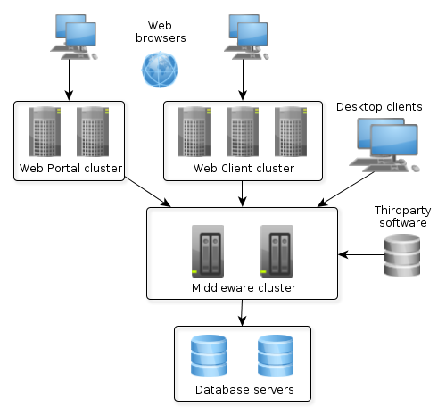
In the example above, the application prevents a single point of failure existence, provides load balancing and various client types connection. In the simplest case, however, the server part of an application can be installed on one computer that includes the database. Various deployment options depending on load and fault tolerance requirements are described in detail in Section 6.3, “Application Scaling”.
This section describes file system directories used by various application blocks at runtime.
The configuration directory is intended for resources that complement and override application properties, user interface and business logic after the application is deployed. Overriding is provided by the loading mechanism of the Resources infrastructure interface. Firstly it performs search in the configuration directory and then in CLASSPATH, so that resources from the configuration directory take precedence over identically named resources located in JAR files and class directories.
The configuration directory may contain the following resource types:
-
local.app.properties – a file that defines deployment parameters of the server-based application blocks.
-
metadata.xml, persistence.xml, views.xml, remoting-spring.xml configuration files.
-
XML-descriptors of UI screens.
-
Controllers of UI screens in the form of Java or Groovy source code.
-
Groovy scripts or classes, and Java source code that is used by the application via the Scripting interface.
The location of the configuration directory is determined by the cuba.confDir application property. For the Middleware, Web Client and Web Portal blocks in fast deployment configuration in Tomcat, it is a subdirectory with the web application name in the tomcat/conf directory, for example, tomcat/conf/app-core for the Middleware.
The application uses the work directory to store data and configuration files.
For example, the filestorage subdirectory of the work directory is used by the file storage. In addition, the Middleware block saves generated persistence.xml and orm.xml files in the work directory on start.
Work directory location is determined by the cuba.dataDir application property. For the Middleware, Web Client and Web Portal blocks in fast deployment configuration in Tomcat, it is a subdirectory with the name of the web application in the tomcat/work directory.
The content and settings of the log files are determined by the configuration of the Apache Log4j framework. The configuration file location is determined by log4j.configuration application property.
This directory can also be used to store arbitrary information about the running application. The log directory location is determined by cuba.logDir application property. For the Middleware, Web Client and Web Portal blocks in fast deployment configuration in Tomcat, it is the tomcat/logs directory.
See also Section 5.6, “Logging”.
This directory can be used for creating arbitrary temporary files at application run time. The path to the temporary directory is determined by the cuba.tempDir application property. For the Middleware, Web Client and Web Portal blocks in fast deployment configuration in Tomcat, it is a subdirectory with the web application name in the tomcat/temp directory.
This directory of the deployed Middleware block stores the set of SQL scripts to create and update the DB.
The script directory structure reproduces the one described in Section 4.3.2, “Scripts to Create and Update the Database”, but it also has an additional top level that separates base projects and the application scripts. The numbering of top level directories is performed by project build tasks.
The DB scripts directory location is determined by cuba.dbDir application property. For fast deployment configuration in Tomcat, it is the WEB-INF/db subdirectory of the middleware web application directory: tomcat/webapps/app-core/WEB-INF/db.
Fast deployment is performed using the deploy task that is declared for core and web modules in the build.gradle file. Before the first execution of deploy, a local Tomcat server should be set up and initialized using the setupTomcat task.
As result of fast deployment, the following structure is created in the directory that is specified by the ext.tomcatDir property of the build.gradle script (only important directories and files are listed below):
bin/
setenv.bat, setenv.sh
startup.bat, startup.sh
debug.bat, debug.sh
shutdown.bat, shutdown.sh
conf/
catalina.properties
server.xml
log4j.xml
logging.properties
Catalina/
localhost/
app/
app-core/
lib/
hsqldb-2.2.9.jar
logs/
app.log
shared/
lib/
temp/
app/
app-core/
webapps/
app/
app-core/
work/
app/
app-core/
-
bin– the directory that contains tools to start and stop the Tomcat server:-
setenv.bat,setenv.sh– the scripts that set environment variables. These scripts should be used for setting JVM memory parameters, specifying a configuration file for logging, configuring access to JMX, parameters to connect the debugger. -
startup.bat,startup.sh– the scripts that start Tomcat. The server starts in a separate console window in Windows and in background in *nix.To start the server in the current console window, use the following commands instead of
startup.*:> catalina.bat run$ ./catalina.sh run -
debug.bat,debug.sh– the scripts that are similar tostartup.*, but start Tomcat with an ability to connect the debugger. These scripts are launched when running the start task of the build script. -
shutdown.bat,shutdown.sh– the scripts that stop Tomcat.
-
-
conf– the directory that contains configuration files of Tomcat and its deployed applications.-
catalina.properties– the Tomcat properties. To load shared libraries from theshared/libdirectory (see below), this file should contain the following line:shared.loader=${catalina.home}/shared/lib/*.jar -
server.xml– Tomcat configuration descriptor. Server ports can be changed in this file. -
log4j.xml– application logging configuration descriptor. -
logging.properties– Tomcat server logging configuration descriptor. -
Catalina/localhost– in this directory, context.xml application deployment descriptors can be placed. Descriptors located in this directory take precedence over the descriptors in theMETA-INFapplication directories. This approach is often convenient for production environment. For example, with this descriptor, it is possible to specify the server-level database connection parameters that are different from those specified in the application itself.Server level deployment descriptor should have the application name and the
.xmlextension. So, to create this descriptor, for example, for theapp-coreapplication, the contents of thewebapps/app-core/META-INF/context.xmlfile should be copied toconf/Catalina/localhost/app-core.xmlfile. -
app– web client application configuration directory. -
app-core– middleware application configuration directory.
-
-
lib– directory of the libraries that are loaded by the server’s common classloader. These libraries are available for both the server and all web applications deployed in it. In particular, this directory should have JDBC drivers of the utilized databases (hsqldb-XYZ.jar,postgresql-XYZ.jar, etc.) -
logs– application and server logs directory. The main log file of the application isapp.log. -
shared/lib– directory of libraries that are available to all deployed applications. These libraries classes are loaded by the server’s special shared classloader. Its usage is configured in theconf/catalina.propertiesfile as described above.Deploy tasks of the build file use this directory to store all libraries not listed in the
jarNamesparameter, i.e. not specific for the given application. -
temp/app,temp/app-core– web client and the middleware applications temporary directories. -
webapps– web application directories. Each application is located in its own subdirectory in the exploded WAR format.Deploy tasks of the build file create application subdirectories with the names specified in the
appNameparameters and, among other things, copy the libraries mentioned in thejarNamesparameter to theWEB-INF/libsubdirectory for each application. -
work/app,work/app-core– web client and the middleware applications work directories.
The fast deployment procedure creates
app and app-core web applications running on port 8080 of a local Tomcat instance.
It means that the web client is available at http://localhost:8080/app. You can use this server
instance in production, but you need to change some application properties to conform to the production
environment.
First set up a server host name.
If you are not going to change the port (8080) or the web context name (app), set the following
properties in both tomcat/conf/app/local.app.properties and
tomcat/conf/app-core/local.app.properties files:
cuba.webHostName = myserver cuba.webAppUrl = http://myserver:8080/app
If the port differs from 8080, specify also the cuba.webPort property:
cuba.webPort = 7070 cuba.webHostName = myserver cuba.webAppUrl = http://myserver:7070/app
If you want to change the web context (e.g. to sales), do the following:
-
Rename the web applications and
confsubdirectories:tomcat/ conf/ sales/ local.app.properties sales-core/ local.app.properties webapps/ sales/ sales-core/ -
Open
tomcat/webapps/sales-core/WEB-INF/web.xmland change the last line in theappPropertiesConfigcontext parameter value to the following:file:${catalina.home}/conf/sales-core/local.app.properties -
Open
tomcat/webapps/sales/WEB-INF/web.xmland change the last line in theappPropertiesConfigcontext parameter value to the following:file:${catalina.home}/conf/sales/local.app.properties -
Add the following to
tomcat/conf/sales-core/local.app.properties:cuba.webContextName = sales-core cuba.webPort = 7070 cuba.webHostName = myserver cuba.webAppUrl = http://myserver:7070/sales
-
Add the following to
tomcat/conf/sales/local.app.properties:cuba.connectionUrlList = http://localhost:7070/sales-core cuba.webContextName = sales cuba.webPort = 7070 cuba.webHostName = myserver cuba.webAppUrl = http://myserver:7070/sales
The cuba.connectionUrlList property is used when transferring uploaded files between web client and middleware even in case of local service invocations, so it should always point to a real URL of the middleware application.
If you want to use the root context for the web client (http://myserver:8080), rename
sales directories to ROOT
tomcat/
conf/
ROOT/
local.app.properties
sales-core/
local.app.properties
webapps/
ROOT/
sales-core/
and use / as the web context name in tomcat/conf/ROOT/local.app.properties:
cuba.webContextName = /
JavaEE standard application deployment into WAR files is performed using the buildWar and createWarDistr build tasks. An example of building WAR files and their deployment on the Glassfish 4 server is provided below.
-
Add tasks to build WAR for the core and web modules to build.gradle:
configure(coreModule) { ... task buildWar(dependsOn: assemble, type: CubaWarBuilding) { appName = 'app-core' appHome = '${app.home}' } } configure(webModule) { ... task buildWar(dependsOn: assemble, type: CubaWarBuilding) { appName = 'app' appHome = '${app.home}' } } -
Add the task to build a distribution to
build.gradle:task createWarDistr(dependsOn: [coreModule.buildWar, webModule.buildWar], type: CubaWarDistribution) { appHome = '${app.home}' } - Start build process:
gradlew createWarDistrAs a result, the home directory named
${app.home}and theapp-core.warandapp.warfiles are created in thebuild/warproject subdirectory. Name of the home directory does not matter here, as the actual name will be set for the server using a Java system variable. -
Copy the content of
build/war/${app.home}to the server, for example, to the/home/user/app_homedirectory. -
Install the Glassfish 4 server, for example, into the
/home/user/glassfish4directory. -
Copy the JDBC driver of the database to the
/home/user/glassfish4/glassfish/domains/domain1/libdirectory. You can take the driver file from thelibdirectory in Studio, or from thebuild/tomcat/libproject directory (if fast deployment in Tomcat has been performed before). -
Start the server:
$ cd /home/user/glassfish4/bin$ ./asadmin start-domain -
Go to
http://localhost:4848and do the following steps in the server management console:-
Create a JDBC Connection Pool to connect to our database, for example:
-
Pool Name: AppDB
-
Resource Type: javax.sql.DataSource
-
Database Driver Vendor: Postgresql
-
Datasource Classname: org.postgresql.ds.PGSimpleDataSource
-
User: cuba
-
DatabaseName: app_db
-
Password: cuba
-
-
Create a JDBC Resource:
-
JNDI Name: jdbc/CubaDS
-
Pool Name: AppDB
-
-
In the server (Admin Server) -> Properties -> System Properties screen, set the following Java system variables:
-
app.home = /home/user/app_home– application home directory. -
log4j.configuration = file:///home/user/app_home/log4j.xml– application logging configuration file.
-
-
- Restart the server:
$ ./asadmin stop-domain$ ./asadmin start-domain -
Open the server console at
http://localhost:4848and, in the Applications screen, perform deployment of theapp-core.warandapp.warfiles located in the distribution folder created in Step 3. -
The application has now been started:
-
Web interface is available at
http://localhost:8080/app -
Log files are created in the
/home/user/app_home/logs
-
This section describes ways to scale a CUBA application that consists of the Middleware and the Web Client for increased load and stronger fault tolerance requirements.
|
Stage 1. Both blocks are deployed on the same application server. This is the simplest option implemented by the standard fast deployment procedure. In this case, maximum data transfer performance between the Web Client and the Middleware is provided, because when the cuba.useLocalServiceInvocation application property is enabled, the Middleware services are invoked bypassing the network stack. |
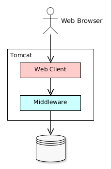 |
|
Stage 2. The Middleware and the Web Client blocks are deployed on separate application servers. This option allows you to distribute load between two application servers and use server resources better. Furthermore, in this case the load coming from web users has smaller effect on the other processes execution. Here, the other processes mean handling other client types (for example, Desktop), running scheduled tasks and, potentially, integration tasks which are performed by the middle layer. Requirements for server resources:
In this case and when more complex deployment options are used, the Web Client’s cuba.useLocalServiceInvocation application property should be set to |
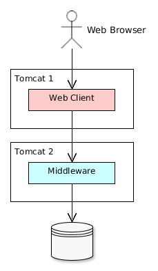 |
|
Stage 3. A cluster of Web Client servers works with one Middleware server. This option is used when memory requirements for the Web Client exceed the capabilities of a single JVM due to a large number of concurrent users. In this case, a cluster of Web Client servers (two or more) is started and user connection is performed through a Load Balancer. All Web Client servers work with one Middleware server. Duplication of Web Client servers automatically provides fault tolerance at this level. However, the replication of HTTP sessions is not supported, in case of unscheduled outage of one of the Web Client servers, all users connected to it will have to login into the application again. Configuration of this option is described in Section 6.3.1, “Setting up a Web Client Cluster”. |
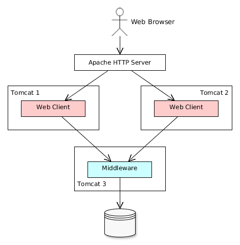 |
|
Stage 4. A cluster of Web Client servers working with a cluster of Middleware servers. This is the maximum deployment option, which provides fault tolerance and load balancing for the Middleware and the Web Client. Connection of users to the Web Client servers is performed through a load balancer. The Web Client servers work with a cluster of Middleware servers. They do not need an additional load balancer – it is sufficient to determine the list of URLs for the Middleware servers in the cuba.connectionUrlList application property. Middleware servers exchange the information about user sessions, locks, etc. In this case, full fault tolerance of the Middleware is provided – in case of an outage of one of the servers, execution of requests from client blocks will continue on an available server without affecting users. Configuration of this option is described in Section 6.3.2, “Setting up a Middleware Cluster”. |
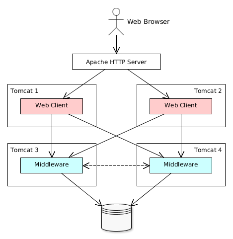 |
This section describes the following deployment configuration:
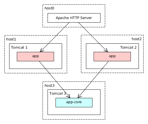
Servers host1 and host2 host Tomcat instances with the app web-app implementing the Web Client block. Users access the load balancer at http://host0/app, which redirects their requests to the servers. Server host3 hosts a Tomcat instance with the app-core web-app that implements the Middleware block.
Let us consider the installation of a load balancer based on Apache HTTP Server for Ubuntu 14.04.
-
Install Apache HTTP Server and its mod_jk module:
$ sudo apt-get install apache2 libapache2-mod-jk -
Replace the contents of the
/etc/libapache2-mod-jk/workers.propertiesfile with the following:workers.tomcat_home= workers.java_home= ps=/ worker.list=tomcat1,tomcat2,loadbalancer,jkstatus worker.tomcat1.port=8009 worker.tomcat1.host=host1 worker.tomcat1.type=ajp13 worker.tomcat1.connection_pool_timeout=600 worker.tomcat1.lbfactor=1 worker.tomcat2.port=8009 worker.tomcat2.host=host2 worker.tomcat2.type=ajp13 worker.tomcat2.connection_pool_timeout=600 worker.tomcat2.lbfactor=1 worker.loadbalancer.type=lb worker.loadbalancer.balance_workers=tomcat1,tomcat2 worker.jkstatus.type=status
-
Add the lines listed below to
/etc/apache2/sites-available/000-default.conf:<VirtualHost *:80> ... <Location /jkmanager> JkMount jkstatus Order deny,allow Allow from all </Location> JkMount /jkmanager/* jkstatus JkMount /app loadbalancer JkMount /app/* loadbalancer </VirtualHost> -
Restart the Apache HTTP service:
$ sudo service apache2 restart
On the Tomcat 1 and Tomcat 2 servers, the following settings should be applied:
-
In
tomcat/conf/server.xml, add thejvmRouteparameter equivalent to the name of the worker specified in the load balancer settings fortomcat1andtomcat2:<Server port="8005" shutdown="SHUTDOWN"> ... <Service name="Catalina"> ... <Engine name="Catalina" defaultHost="localhost" jvmRoute="tomcat1"> ... </Engine> </Service> </Server> -
Set the following application properties in
tomcat/conf/app/local.app.properties:cuba.useLocalServiceInvocation = false cuba.connectionUrlList = http://host3:8080/app-core cuba.webHostName = host1 cuba.webPort = 8080 cuba.webContextName = app
cuba.webHostName, cuba.webPort and cuba.webContextName parameters are not mandatory for WebClient cluster, but they allow easier identification of a server in other platform mechanisms, such as the JMX console. Additionally, Client Info attribute of the User Sessions screen shows an identifier of the Web Client that the current user is working with.
This section describes the following deployment configuration:
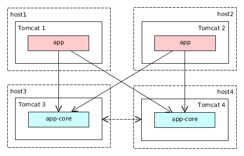
Servers host1 and host2 host Tomcat instances with the app web-app implementing the Web Client block. Cluster configuration for these servers is described in the previous section. Servers host3 and host4 host Tomcat instances with the app-core web-app implementing the Middleware block. They are configured to interact and share information about user sessions, locks, cash flushes, etc.
In order for the client blocks to be able to work with multiple Middleware servers, the list of URLs should be specified to these servers in the cuba.connectionUrl application property. For the Web Client, this can be done in tomcat/conf/app/local.app.properties:
cuba.useLocalServiceInvocation = false cuba.connectionUrlList = http://host3:8080/app-core,http://host4:8080/app-core cuba.webHostName = host1 cuba.webPort = 8080 cuba.webContextName = app
The order of servers in cuba.connectionUrl defines priority and order for the client to send the requests. In the example above, the client will first attempt to access host1, and then, if it is not available, host2. If a request to host2 completes successfully, the client will save host2 as the first server in the list and will continue working with this server. Restarting a client will reset the initial values. Uniform distribution of clients among all servers can be achieved using the cuba.randomServerPriority property.
Middleware servers can maintain shared lists of user sessions and other objects and coordinate invalidation of caches. cuba.cluster.enabled property should be enabled on each server to achieve this. Example of the tomcat/conf/app-core/local.app.properties file is shown below:
cuba.cluster.enabled = true cuba.webHostName = host3 cuba.webPort = 8080 cuba.webContextName = app-core
For the Middleware servers, correct values of the cuba.webHostName, cuba.webPort and cuba.webContextName properties should be specified to form a unique Server ID.
Interaction mechanism is based on JGroups. It is possible to fine-tune the interaction using the jgroups.xml file located in the root of cuba-core-<version>.jar. It can be copied to tomcat/conf/app-core and configured as needed.
ClusterManagerAPI bean provides the program interface for servers interaction in the Middleware cluster. It can be used in the application – see JavaDocs and examples in the platform code.
Server ID is used for reliable identification of servers in a Middleware cluster. The identifier is formatted as host:port/context:
tezis.haulmont.com:80/app-core
192.168.44.55:8080/app-core
The identifier is formed based on the configuration parameters cuba.webHostName, cuba.webPort, cuba.webContextName, therefore it is very important to specify these parameters for the Middleware blocks working within the cluster.
Server ID can be obtained using the ServerInfoAPI bean or via the ServerInfoMBean JMX interface.
This section describes various aspects of using Java Management Extensions in CUBA-based applications.
The Web Client module of the cuba base project contains JMX objects viewing and editing tool. The entry point for this tool is com/haulmont/cuba/web/app/ui/jmxcontrol/browse/display-mbeans.xml screen registered under the jmxConsole identifier and accessible via > in the standard application menu.
Without extra configuration, the console shows all JMX objects registered in the JVM where the Web Client block of the current user is running. Therefore, in the simplest case, when all application blocks are deployed to one web container instance, the console has access to the JMX beans of all tiers as well as the JMX objects of the JVM itself and the web container.
Names of the application beans have a prefix corresponding to the name of the web-app that contains them. For example, the app-core.cuba:type=CachingFacade bean has been loaded by the app-core web-app implementing the Middleware block, while the app.cuba:type=CachingFacade bean has been loaded by the app web-app implementing the Web Client block.
JMX console can also work with the JMX objects of a remote JVM. This is useful when application blocks are deployed over several instances of a web container, for example separate Web Client and Middleware.
To connect to a remote JVM, a previously created connection should be selected in the JMX Connection field of the console, or a new connection can be created:
To get a connection, JMX host, port, login and password should be specified. There is also the Host name field, which is populated automatically, if any CUBA-application block is detected at the specified address. In this case, the value of this field is defined as the combination of cuba.webHostName and cuba.webPort properties of this block, which allows identifying the server that contains it. If the connection is done to a 3rd party JMX interface, then the Host name field will have the "Unknown JMX interface" value. However it can be changed arbitrarily.
In order to allow a remote JVM connection, the JVM should be configured properly (see below).This section describes Tomcat startup configuration required for a remote connection of JMX tools.
-
Edit
bin/setenv.batin the following way:set CATALINA_OPTS=%CATALINA_OPTS% ^ -Dcom.sun.management.jmxremote ^ -Djava.rmi.server.hostname=192.168.10.10 ^ -Dcom.sun.management.jmxremote.ssl=false ^ -Dcom.sun.management.jmxremote.port=7777 ^ -Dcom.sun.management.jmxremote.authenticate=true ^ -Dcom.sun.management.jmxremote.password.file=../conf/jmxremote.password ^ -Dcom.sun.management.jmxremote.access.file=../conf/jmxremote.access
Here, the
java.rmi.server.hostnameparameter should contain the actual IP address or the DNS name of the computer where the server is running;com.sun.management.jmxremote.portsets the port for JMX tools connection. -
Edit the
conf/jmxremote.accessfile. It should contain user names that will be connecting to the JMX and their access level. For example:admin readwrite
-
Edit the
conf/jmxremote.passwordfile. It should contain passwords for the JMX users, for example:admin admin
-
The password file should have reading permissions only for the user running the Tomcat. server. You can configure permissions the following way:
-
Open the command line and go to the
conffolder - Run the command:
cacls jmxremote.password /P "domain_name\user_name":Rwhere
domain_name\user_nameis the user’s domain and name -
After this command is executed, the file will be displayed as locked (with a lock icon) in Explorer.
-
-
If Tomcat is installed as a Windows service, than the service should be started on behalf of the user who has access permissions for
jmxremote.password. It should be kept in mind that in this case thebin/setenv.batfile is ignored and the corresponding JVM startup properties should be specified in the application that configures the service.
-
Edit
bin/setenv.shthe following way:CATALINA_OPTS="$CATALINA_OPTS -Dcom.sun.management.jmxremote \ -Djava.rmi.server.hostname=192.168.10.10 \ -Dcom.sun.management.jmxremote.port=7777 \ -Dcom.sun.management.jmxremote.ssl=false \ -Dcom.sun.management.jmxremote.authenticate=true" CATALINA_OPTS="$CATALINA_OPTS -Dcom.sun.management.jmxremote.password.file=../conf/jmxremote.password -Dcom.sun.management.jmxremote.access.file=../conf/jmxremote.access"
Here, the
java.rmi.server.hostnameparameter should contain the real IP address or the DNS name of the computer where the server is running;com.sun.management.jmxremote.portsets the port for JMX tools connection -
Edit
conf/jmxremote.accessfile. It should contain user names that will be connecting to the JMX and their access level. For example:admin readwrite
-
Edit the
conf/jmxremote.passwordfile. It should contain passwords for the JMX users, for example:admin admin
-
The password file should have reading permissions only for the user running the Tomcat server. Permissions for the current user can be configured the following way:
-
Open the command line and go to the
conffolder. -
Run the command:
chmod go-rwx jmxremote.password
-
This section describes different ways of creating and updating a database during application deployment and operation. To learn more about the structure and the rules of database scripts, please see Section 4.3.2, “Scripts to Create and Update the Database” and Section 5.5.1, “Creating the DB Schema”.
The execution of DB scripts by server mechanism can be used for both database initialization and its further update during the application development and data schema modification.
The following actions should be completed to initialize a new database:
-
Enable the cuba.automaticDatabaseUpdate application property by adding the following line to the local.app.properties file:
cuba.automaticDatabaseUpdate = true
-
Create an empty database corresponding to the URL specified in the data source description in context.xml.
-
Start the application server containing the Middleware block. At application start, the database will be initialized and ready for work.
After that, each time when the application server starts, a scripts execution mechanism will compare the set of scripts located in the database scripts directory with the list of already executed scripts registered in the database. If new scripts are found, they will be executed and registered as well. Typically it is enough to include the update scripts in each new application version, and the database will be actualized each time when the application server is restarted.
When using the database scripts execution mechanism at server start, the following should be considered:
-
If any error occurs when running a script, the Middleware block stops initialization and becomes inoperable. The client blocks generate messages about inability to connect to the Middleware.
Check the
app.logfile located in the server’s log folder for a message about SQL execution from thecom.haulmont.cuba.core.sys.DbUpdaterEnginelogger and, possibly, further error messages to identify the error reasons. -
The update scripts, as well as the DDL and the SQL commands within the scripts separated with
"^", are executed in separate transactions. That is why when an update fails there is still a big chance that a part of the scripts or even individual commands of the last script will have been executed and committed to the database.With this in mind, creating a backup copy of the database immediately before starting the server is highly recommended. Then, when the error reason is fixed, the database can be restored and automatic process restarted.
If the backup is missing, you should identify which part of the script was executed and committed after the error is fixed. If the entire script failed to execute, the automatic process can be simply restarted. If some of the commands before the erroneous one were separated with the
"^"character, executed in a separate transaction and committed, then the remaining part of the commands should be run and this script should be registered in SYS_DB_CHANGELOG manually. After that, the server can be started and the automatic update mechanism will start processing the next unexecuted script.CUBA Studio generates update scripts with ";" delimiter for all database types except Oracle. If update script commands are separated by semicolons, the script is executed in one transaction and entirely rolled back in case of failure. This behavior ensures consistency between the database schema and the list of executed update scripts.
Database create and update scripts can be run from the command line using the com.haulmont.cuba.core.sys.utils.DbUpdaterUtil class included in the platform's Middleware block. At startup, the following arguments should be specified:
-
dialect– DBMS type, possible values: postgres, mssql, oracle. -
dbUser– database user name. -
dbPassword– database user password. -
dbUrl– database connection URL. For primary initialization, the specified database should be empty; the database is not cleared automatically in advance. -
scriptsDir– absolute path to the folder containing scripts in the standard structure. Typically, this is the database scripts directory supplied with the application. -
one of the possible commands:
-
create– initialize the database. -
check– show all unexecuted update scripts. -
update– update the database.
-
An example of a script for Linux running DbUpdaterUtil:
#!/bin/sh DB_URL="jdbc:postgresql://localhost/mydb" APP_CORE_DIR="./../webapps/app-core" WEBLIB="$APP_CORE_DIR/WEB-INF/lib" SCRIPTS="$APP_CORE_DIR/WEB-INF/db" TOMCAT="./../lib" SHARED="./../shared/lib" CLASSPATH="" for jar in `ls "$TOMCAT/"` do CLASSPATH="$TOMCAT/$jar:$CLASSPATH" done for jar in `ls "$WEBLIB/"` do CLASSPATH="$WEBLIB/$jar:$CLASSPATH" done for jar in `ls "$SHARED/"` do CLASSPATH="$SHARED/$jar:$CLASSPATH" done java -cp $CLASSPATH com.haulmont.cuba.core.sys.utils.DbUpdaterUtil \ -dialect postgres -dbUrl $DB_URL \ -dbUser $1 -dbPassword $2 \ -scriptsDir $SCRIPTS \ -$3
This script is designed to work with the database named mydb running on the local PostgreSQL server. The script should be located in the bin folder of the Tomcat server and should be started with {username}, {password} and {command}, for example:
./dbupdate.sh cuba cuba123 update
Script execution progress is displayed in the console. If any error occurs, same actions as described in the previous section for the automatic update mechanism should be performed.
When updating the database from the command line, the existing Groovy scripts are started, but only their main part gets executed. Due to the lack of the server context, the script’s PostUpdate part is ignored with the corresponding message written to the console.
The platform is shipped with the cuba.license free license file, available in the root of the
classpath. The cuba.licensePath application property points to it
by default.
If you have purchased a commercial license, you can use it in the application by one of the following ways.
-
If you are going to use the application within one organization, or you have an embedded license, include the license file into your application distribution. Add the license file into the core module source code folder. The file name or path should be different from
/cuba.license:modules/core/src/ myapp-cuba.license app.properties
Configure the
cuba.licensePathapplication property in theapp.propertiesfile of the core module:cuba.licensePath = /myapp-cuba.license
-
If you are going to use the application in different organizations, you have to obtain a separate file for each of them. In this case you can place the license files into configuration directories of the installed applications:
tomcat/conf/app-core/ myapp-cuba.license local.app.properties
Set the
cuba.licensePathapplication property in thelocal.app.propertiesfile:cuba.licensePath = /myapp-cuba.license
The CUBA platform uses the following methods to control access rights:
-
The role-based system for assigning user permissions. A set of roles and permissions can be configured by the system administrator during the system deployment or later in production.
-
A hierarchical structure of access groups with constraint inheritance.
- Access control at the following levels:
-
Operations on entities (read, create, update, delete): for example, user
Smithcan view documents, but cannot create, update or delete them. -
Entity attributes (modify, read, access denied): user
Smithcan view all document attributes except foramount. -
Access to particular entity instances (access control at the row level): user
Smithcan view the documents that have been created in their department only.
-
-
Integration with LDAP with an ability to implement SSO (Single Sign-On) for Windows users.
The main CUBA security subsystem components are shown in the diagram below.
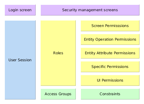
Below is an overview of these components.
Security management screens – screens available to system administrator for configuring user access rights.
Login screen − system login window. This window provides user authentication by username and password. The database stores password hashes for security.
The UserSession object is created upon login. This is the central security element associated with the currently authenticated user and containing information on data access rights.
The user login process is described in Section 4.2.10.2, “Login”.
Roles − user roles. A role is a system object, which, on the one hand, matches the permission set required to perform specific functions, and on the other hand, the subset of users who must have these permissions.
The permissions can have the following types:
-
Screen Permissions − an ability to open a screen.
-
Entity Operation Permissions − an ability to perform operations with an entity: read, create, update, delete.
-
Entity Attribute Permissions − access to an arbitrary entity attribute: modify, read only, access denied.
-
Specific Permissions − permissions for some named functionality.
-
UI Permissions − control access to screen elements.
Access Groups − user access groups. The groups have a hierarchical structure, with each element defining a set of constraints, allowing controlling access to individual entity instances (at table row level). For example, users can view the documents that have been created in their department only.
The login screen provides ability to register within the system with a username and password.
The login is case-insensitive.
The Web Client screen class is LoginWindow, the Desktop Client class is LoginDialog. These classes can be extended to provide additional functionality in the application. Override the following methods to register extended classes:
-
createLoginWindow()method of thecom.haulmont.cuba.web.Appclass for the Web Client. -
createLoginDialog()method of thecom.haulmont.cuba.desktop.Appclass for the Desktop Client.
The Web Client’s Remember Me checkbox can be configured by using the cuba.web.rememberMeEnabled application property.
The drop-down list of supported languages on the standard login screen can be configured with the cuba.localeSelectVisible and cuba.availableLocales application properties.
Each system user has a corresponding instance of sec$User entity, containing unique login, password hash, reference to access group and list of roles, and other attributes. User management is carried out using the > :
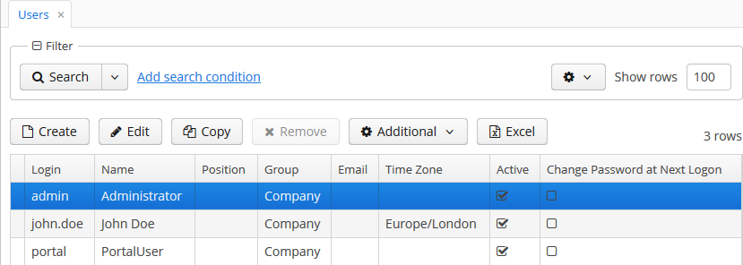
In addition to the standard actions to create, update and delete records, the following actions are available:
-
– quickly creates a new user based on the selected one. The new user will have the same access group and role set. Both can be changed in the new user edit screen.
-
– allows copying user interface settings from one user to several others. The settings include the table presentations, the SplitPanel separator position, filters and search folders.
-
– allowing changing password for a selected user.
-
– allows performing the following actions on selected users:
-
If Generate new passwords flag is not selected in the Reset passwords for selected users dialog, the Change password at next logon flag will be assigned to selected users. These users will be asked to change the password on the next successful login.
-
If Generate new passwords flag is selected, new random passwords will be generated for selected users and displayed to the system administrator. The list of passwords can be exported to XLS and sent to related users. Additionally, the Change password at next logon flag will be set for each user, ensuring that users change the password on next login.
-
If Send emails with generated passwords flag is selected in addition to Generate new passwords, the automatically generated one-time passwords will be sent to corresponding users directly, and not shown to system administrator.
-
The user edit screen is described below:
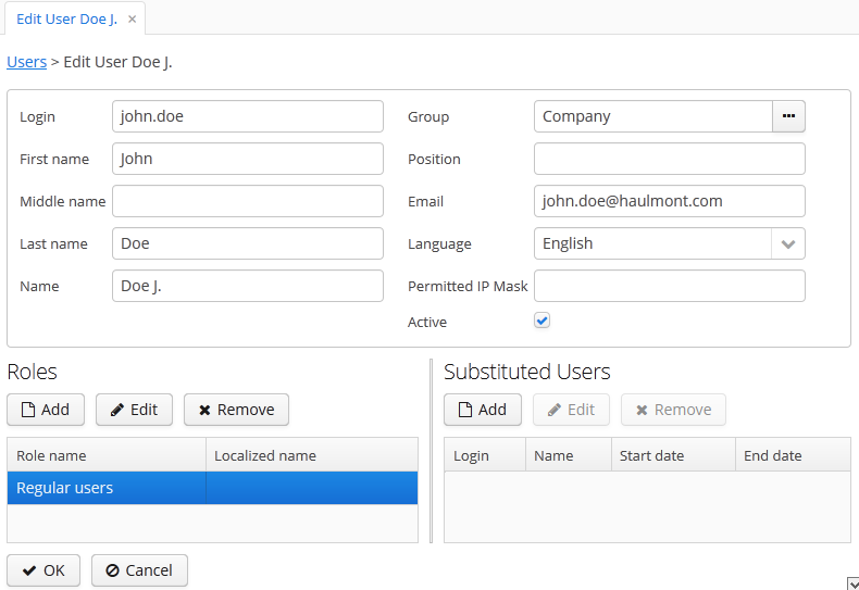
-
Login – unique login name (required).
-
Group – access group.
-
Last name, First name, Middle name – parts of user’s full name.
-
Name – automatically generated user’s full name. Based on full name parts above and a rule defined in the cuba.user.fullNamePattern application property. The name can also be changed manually.
-
Position – job position.
-
Language – the user interface language that will be set for the user, if the ability to choose a language on login is turned off using the cuba.localeSelectVisible application property.
-
Time Zone – the time zone that will be used for displaying and entering timestamp values.
-
Email – email address.
-
Active – if not set, the user is unable to login to the system.
-
Permitted IP Mask – IP address mask, defining addresses from which the user is allowed to login.
The mask is a list of IP addresses, separated with commas. Both the IPv4 and IPv6 address formats are supported. IPv4 address should consist of four numbers separated with periods. IPv6 address represents eight groups of four hexadecimal characters separated with colons. The "*” symbol can be used in place of an address part, to match any value. Only one type of address format (IPv4 or IPv6) can be used in the mask at the same time.
Example:
192.168.*.* -
Roles – user roles list.
-
Substituted Users – substituted users list.
The system administrator can give a user an ability to substitute another user. The substituting user will have the same session, but a different set of roles, constraints and attributes, assigned from the substituted user.
It is recommended to use the UserSession.getCurrentOrSubstitutedUser() method for retrieving the current user in the application code, which returns the substituted user, if there is an active substitution. The platform audit mechanisms (the createdBy and updatedBy attributes, change log and entity snapshots) always register the real logged-in user.
If the user has substituted users, a drop-down list will be shown in the application upper right corner instead of the plain text with the current user name:
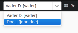
If another user is selected in this list, all opened screens will be closed and the substitution will be made active. The UserSession.getUser() method will still return the user that has logged in, however, the UserSession.getSubstitutedUser() method will return the substituted user. If there is no substitution, the UserSession.getSubstitutedUser() method will return null.
Substituted users can be managed through the Substituted Users table in the user edit screen. The user substitution screen is described below:
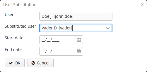
-
User – the edited user. This user will substitute another user.
-
Substituted user – the substituted user.
-
Start date, End date – optional substitution period. User substitution will be unavailable outside of this period. If no period is specified, substitution will be available until this table entry is removed.
By default, all temporal values are displayed in the server's time zone. The server's time zone is the
one returned by TimeZone.getDefault() method of an application block.
This default time zone is typically obtained from the operating system but can be set explicitly by
user.timezone Java system property. For example, to set the time zone to GMT for web client
and middleware running on Tomcat under Unix, add the following line to tomcat/bin/setenv.sh
file:
CATALINA_OPTS="$CATALINA_OPTS -Duser.timezone=GMT"
A user can view and edit timestamp values in a time zone different from server's time zone. There are two ways to manage user's time zone:
-
An administrator can do it in the User editor screen.
-
The user can change his time zone in the window.
In both cases, the time zone settings consist of two fields:
-
Time zone name dropdown allows a user to select the time zone explicitly.
-
Auto checkbox indicates that the time zone will be obtained from the current environment (web browser for the web client or OS for the desktop client).
If both fields are empty, no time zone conversions are performed for the user. Otherwise, the platform
saves time zone in the UserSession object when user logs in and uses
it for displaying and entering timestamp values. The application code can also use the value returned by
UserSession.getTimeZone() for custom functionality.
If a time zone is in use for the current session, its short name and offset from GMT are displayed in the application main window next to the current user's name.
Time zone conversions are performed only for DateTimeDatatype
entity attributes, i.e., timestamps. Attributes storing date (DateDatatype) and time
(TimeDatatype) separately are not affected. You can also deny conversions for a timestamp
attribute by annotating it with @IgnoreUserTimeZone.
The permission determines the user’s right to any system object or functionality, such as screen, entity operation, etc. The permission can either grant the user the right to the object, or revoke it (in essence, it is actually a prohibition).
By default, the user has the right to an object, unless explicitly denied by a permission.
The permissions are granted by the sec$Permission entity instances and contain the following attributes:
-
type– permission type: determines the object type the permission is imposed on. -
target– permission object: determines the specific object the permission is imposed on. The format of the attribute depends on the permission type. -
value– permission value. The value range depends on the permission type.
The permission types are described below:
-
PermissionType.SCREEN– screen permission.The screen identifier should be specified in the
targetattribute; thevalueattribute can be 0 or 1 (the screen is denied or allowed, respectively).The screen permissions are checked when building the system main menu and with each invocation of the
openWindow(),openEditor(),openLookup()methods of the IFrame interfaces.To check the screen permission in the application code, use the
isScreenPermitted()method of the Security interface. -
PermissionType.ENTITY_OP– entity operation permission.The entity name should be specified in the
targetattribute, followed by a colon, and then an operation type:create,read,update,delete. For example:library$Book:delete. Thevalueattribute can be 0 or 1 (the operation is denied or allowed, respectively).The entity operation permissions are checked when working with data through the DataManager, in data aware visual components, and in standard actions, which work with entity lists. As a result, the operation permissions affect the behavior of the client blocks and the REST API. The permissions are not checked when working with data on the Middleware directly via the EntityManager.
To check the entity operation permission in the application code, use the
isEntityOpPermitted()method of the Security interface. -
PermissionType.ENTITY_ATTR– entity attribute permission.The entity name should be specified in the
targetattribute, followed by a colon, and then an attribute name. For example:library$Book:name. Thevalueattribute can be 0, 1 or 2 (the attribute is hidden, read-only or read-write, respectively).The entity attribute permissions are only checked in the data aware visual components and the REST API.
To check the entity attribute permission in the application code, use the
isEntityAttrPermitted()method of the Security interface. -
PermissionType.SPECIFIC– permission on an arbitrary named functionality.The functionality identifier should be specified in the
targetattribute; thevalueattribute can be 0 or 1 (denied or allowed, respectively).Specific permissions for this project are set in the configuration file permissions.xml.
For example:
@Inject private Security security; private void calculateBalance() { if (!security.isSpecificPermitted("myapp.calculateBalance")) return; ... } -
PermissionType.UI– arbitrary screen component permission.The screen identifier should be specified in the
targetattribute, followed by a colon, and then a component path. The format of the component path is described in the next section.
The role combines a set of permissions that can be granted to the user.
The user may have several roles, in which case a logical sum (OR) is devised from all of the assigned roles. For example, if a user has roles A, B and C, role A denies X, role B allows X, role C does not set explicit permissions on X, then X will be allowed.
If no user roles explicitly define permission on the object, the user will have the permission for this object. Therefore, the users have rights to all the objects if they have no roles that explicitly define the permission, or have at least one role that grants the permission.
If a user has a single role without explicitly set permissions, or does not have any roles at all, he will have all rights to all objects.
The role list is displayed in the > . In addition to the standard actions to create, update, and delete records, the screen has the button, allowing assigning the selected role to multiple users.
The role edit screen is described below. The role attributes are displayed in the upper part:

-
Name – unique role name or id (required). The name cannot be changed after the role has been created.
-
Localized name – user-friendly role name.
-
Description – arbitrary role description.
-
Type – role type, can be:
-
Standard – the role of this type grants only explicitly set permissions.
-
Super – the role of this type automatically grants all permissions. It should be assigned to system administrators, since it removes all prohibitions set by other roles.
-
Read-only – the role of this type automatically denies the permissions for the following entity operations: CREATE, UPDATE, DELETE. Therefore, the user with this role can only read the data and is unable to update it (unless there are other user roles explicitly allowing these operations).
-
Denying – the role of this type automatically denies the permissions for all objects, except entity attributes. In order to view or update something in the system, the user should be assigned an additional role that explicitly gives the necessary rights.
Permissions can be explicitly set for all the role types; for example, you can add the permissions to modify entities for the Read-only role. However, it does not make sense to prohibit anything for the Super role, because this special role type removes all prohibitions.
A user with the Denying role cannot login to web or desktop client, because this type of role also revokes the
cuba.gui.loginToClientspecific permission (displayed as "Login to client" in the list of specific permissions). Therefore you have to grant this permission to users explicitly - either in another role, or right in the denying role. -
-
Default role – default role flag. All roles with this flag are automatically assigned to the newly created users.
The permission management tabs are described below.
-
The Screens tab configures screen permissions:
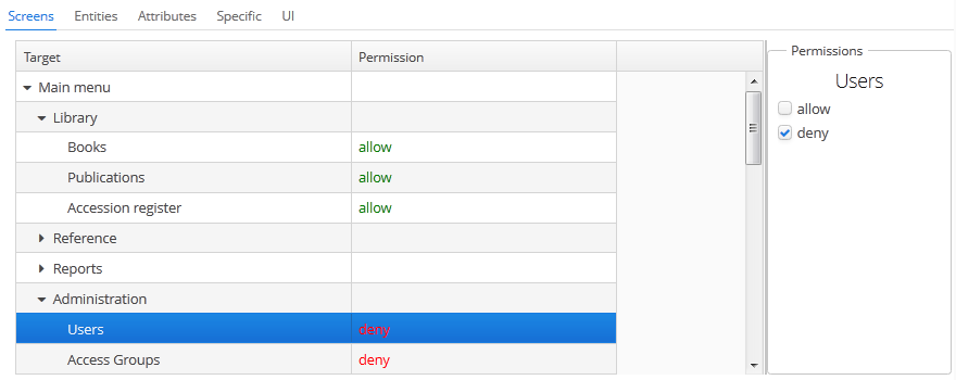
The tree in the left part of the tab reflects the structure of the application’s main menu. The last tree element is Other screens, which contains screens without a main menu item (for example, entity edit screens).
-
The Entities tab – configures entity operation permissions:
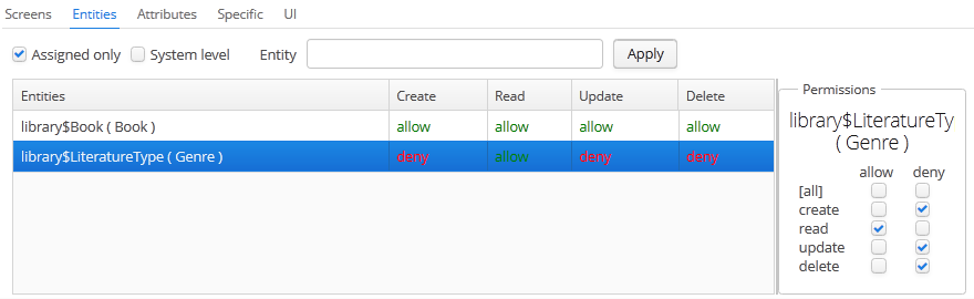
The Assigned only is selected by default, so that the table contains only the entities that have explicit permissions in this role. Therefore, the table for a new role will be empty. In order to add permissions, uncheck Assigned only and click . The entity list can be filtered by entering a part of an entity name in the Entity field and clicking .
System level checkbox allows viewing and selecting system entities marked with the
@SystemLevelannotation, which are not shown by default. -
The Attributes tab – configures entity attribute permissions:
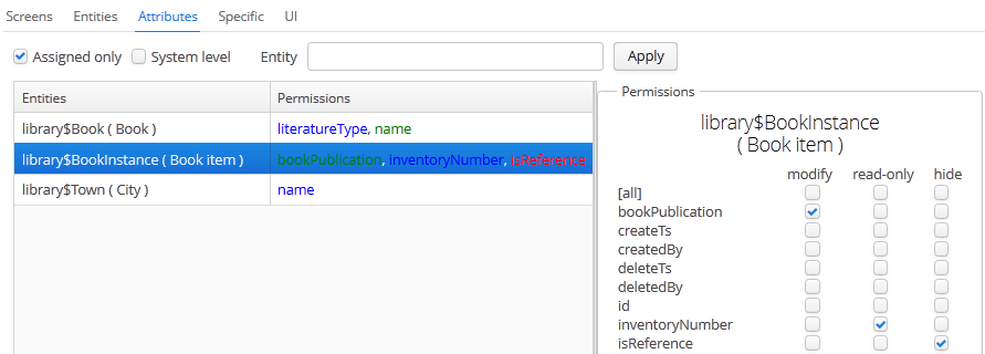
The Permissions column in the entity table shows the list of the attributes that have explicit permissions. The modify (full access) permissions are marked with green, read-only (read-only) – with blue, hide (the attribute is hidden) – with red.
Entity list can be managed similarly to the list in the Entities tab.
-
The Specific tab configures named functionality permissions:
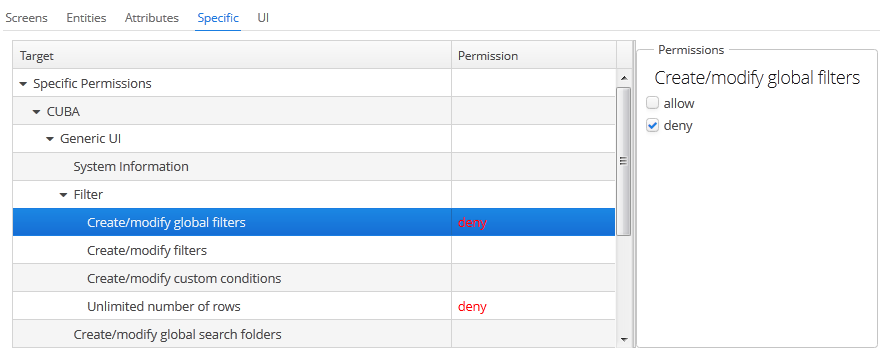
The permissions.xml project configuration file defines the object names to which specific permissions can be assigned.
-
The UI tab configures UI screen component permissions:
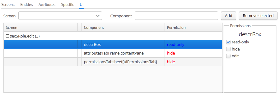
The permissions on this screen allow restricting access to any screen component, including the ones not associated with any data (for example, a container). The component identifiers must be known to create such permissions, therefore access to the screen source code is required.
In order to create a constraint, select the desired screen in the Screen drop-down list, specify the component path in the Component field, and click . Then set the access mode for the selected component in the Permissions panel.
The rules to forming the component path are listed below:
-
If the component belongs to the screen, simply specify the component identifier,
id. -
If the component belongs to the frame that is embedded within the screen, specify the frame identifier, and then the component identifier separated with period.
-
If configuring permission for the TabSheet tab or the FieldGroup field, specify the component identifier, and then the tab or field identifier in square brackets.
-
To configure permission for an action, specify the component, holding the action, and then the action identifier in angle brackets. For example:
customersTable<changeGrade>.
-
With access groups, users can be organized into a hierarchical structure and assigned constraints and arbitrary session attributes.
The user can be added to one group only, however the list of constraints and session attributes from all the groups up the hierarchy will be inherited.
User access groups can be managed from the > screen:
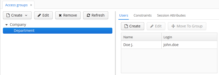
Constraints allow restricting access to particular entity instances (table records).
Constraints for an entity class are specified using JPQL expression fragments. These fragments are appended to all entity instance selection queries, thereby filtering them.
The user gets the constraint list from all the groups, starting with their own one, following up the hierarchy. Thus, the following principle is implemented: the lower the users are in the group hierarchy, the more constraints they have.
In order to create a constraint in the screen, select the group to create the constraint for, go to the Constraints tab and click :
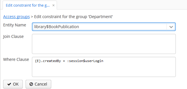
Then, select an entity from the Entity Name drop-down list and set the constraint in the Join Clause and Where Clause fields.
The JPQL editor in the Join Clause and Where Clause fields supports autocompletion for entity names and their attributes. In order to invoke autocompletion, press Ctrl+Space. If the invocation is made after the period symbol, an entity attributes list matching the context will be shown, otherwise – a list of all data model entities.
The following JPQL constraint rules apply:
-
The
{E}string should be used as an alias of the entity being extracted. On execution of the query, it will be replaced with a real alias, specified in the query. -
The following predefined constants can be used in JPQL parameters:
-
session$userLogin– login name of the current user (in case of substitution – the login name of the substituted user). -
session$userId– ID of the current user (in case of substitution – ID of the substituted user). -
session$userGroupId– group ID of the current user (in case of substitution − group ID of the substituted user). -
session$XYZ– arbitrary attribute of the current user session, where XYZ is the attribute name.
-
-
The Where Clause field content is added to the
wherequery clause usingandcondition. Addingwhereword is not needed, as it will be added automatically. -
The Join Clause field content is added to the
fromquery clause. It should begin with a comma,joinorleft join.
The simplest constraint example is shown in the figure above: the users with this constraint will see the library$BookPublication entity instances that they have created themselves only.
The access group can determine the session attribute list for the users in this group. These attributes can be used when setting the constraints. The availability of the session attributes can be checked in the application code at the development stage, so the final system behavior for particular user groups can be controlled at the operation stage.
When logging in, all the attributes set for the user group and for all the groups up the hierarchy will be placed into the user session. If an attribute is found in several levels of the hierarchy, the uppermost group value will be used. Hence, overriding the attribute values at the lower levels of the hierarchy is not possible. In case of the override attempt, the WARN level message will be written to the server log.
In order to create an attribute in the screen, select the group to create the attribute for, go to the Session Attributes tab, and click :
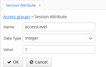
A unique attribute name, data type, and value must be specified.
A session attribute can be accessed in the application code in the following way:
@Inject
private UserSessionSource userSessionSource;
...
Integer accessLevel = userSessionSource.getUserSession().getAttribute("accessLevel");
A session attribute can be used in the constraints as a JPQL parameter by adding the session$ prefix:
{E}.accessLevel = :session$accessLevel
CUBA application can be integrated with LDAP to provide the following benefits:
-
Keep and manage user passwords centrally in the LDAP database.
-
For Windows domain users, allow logging in through Single Sign-On without having to specify the username and password.
To enable login, a user account with all the required properties and permissions must be created in the application. It is recommended to leave the password empty, so that the user could log in using the password from LDAP only. The first authentication attempt is made via LDAP, followed by the standard way of using the password hash from the database. As a result, a user can log in to the system with this password even if the user is not registered in LDAP or has a different LDAP password.
A CUBA-based application interacts with LDAP via the CubaAuthProvider interface. The platform includes a single implementation of this interface, LdapAuthProvider, which supports LDAP authentication without Single Sign-On. In order to enable advanced Active Directory integration and Single Sign-On, the Jespa library can be used with the corresponding CubaAuthProvider implementation, as described in Section 7.1.6.2, “Setting Up Authentication Using Jespa”. A custom CubaAuthProvider implementation class can also be used by setting the following application properties:
cuba.web.useActiveDirectory = true cuba.web.activeDirectoryAuthClass = com.company.sample.web.MyAuthProvider
If the cuba.web.useActiveDirectory property is enabled, the LdapAuthProvider class is used by default. In this case, Spring LDAP library is used for user authentication.
The following Web Client application properties are used to setup:
-
cuba.web.ldap.urls– Active Directory server URL. -
cuba.web.ldap.base– database for username search. -
cuba.web.ldap.user–sAMAccountNameattribute value of the user, which has the right to read the information from the Active Directory. -
cuba.web.ldap.password– the password for the LDAP user defined in thecuba.web.ldap.userproperty.
Example of local.app.properties file for the Web Client block:
cuba.web.useActiveDirectory = true cuba.web.ldap.urls = ldap://192.168.1.1:389 cuba.web.ldap.base = ou=Employees,dc=mycompany,dc=com cuba.web.ldap.user = myuser cuba.web.ldap.password = mypassword
Jespa is a Java library that enables integrating Active Directory service and Java applications using NTLMv2. For details, see http://www.ioplex.com.
Download the library at http://www.ioplex.com and place the JAR in a repository registered in your build.gradle script. This can be mavenLocal() or an in-house repository.
Add the following dependency to the web module configuration section in build.gradle:
configure(webModule) {
...
dependencies {
compile('com.company.thirdparty:jespa:1.1.17')
...
Create a CubaAuthProvider implementation class in the web module:
package com.company.sample.web;
import com.haulmont.cuba.core.global.AppBeans;
import com.haulmont.cuba.core.global.Configuration;
import com.haulmont.cuba.core.global.GlobalConfig;
import com.haulmont.cuba.core.global.Messages;
import com.haulmont.cuba.core.sys.AppContext;
import com.haulmont.cuba.security.global.LoginException;
import com.haulmont.cuba.web.auth.ActiveDirectoryHelper;
import com.haulmont.cuba.web.auth.CubaAuthProvider;
import com.haulmont.cuba.web.auth.DomainAliasesResolver;
import jespa.http.HttpSecurityService;
import jespa.ntlm.NtlmSecurityProvider;
import jespa.security.PasswordCredential;
import jespa.security.SecurityProviderException;
import org.apache.commons.lang.StringUtils;
import org.apache.commons.logging.Log;
import org.apache.commons.logging.LogFactory;
import javax.inject.Inject;
import javax.servlet.*;
import javax.servlet.http.HttpServletRequest;
import java.io.IOException;
import java.util.HashMap;
import java.util.Locale;
import java.util.Map;
public class JespaAuthProvider extends HttpSecurityService implements CubaAuthProvider {
private static class DomainInfo {
private String bindStr;
private String acctName;
private String acctPassword;
private DomainInfo(String bindStr, String acctName, String acctPassword) {
this.acctName = acctName;
this.acctPassword = acctPassword;
this.bindStr = bindStr;
}
}
private static Map<String, DomainInfo> domains = new HashMap<>();
private static String defaultDomain;
private Log log = LogFactory.getLog(getClass());
@Inject
private Configuration configuration;
@Inject
private Messages messages;
@SuppressWarnings("deprecation")
@Override
public void init(FilterConfig filterConfig) throws ServletException {
initDomains();
Map<String, String> properties = new HashMap<>();
properties.put("jespa.bindstr", getBindStr());
properties.put("jespa.service.acctname", getAcctName());
properties.put("jespa.service.password", getAcctPassword());
properties.put("jespa.account.canonicalForm", "3");
properties.put("jespa.log.path", configuration.getConfig(GlobalConfig.class).getLogDir() + "/jespa.log");
properties.put("http.parameter.anonymous.name", "anon");
fillFromSystemProperties(properties);
try {
super.init(properties);
} catch (SecurityProviderException e) {
throw new ServletException(e);
}
}
@Override
public void destroy() {
}
@Override
public void doFilter(ServletRequest request, ServletResponse response, FilterChain chain)
throws IOException, ServletException {
HttpServletRequest httpServletRequest = (HttpServletRequest) request;
if (httpServletRequest.getHeader("User-Agent") != null) {
String ua = httpServletRequest.getHeader("User-Agent").toLowerCase();
boolean windows = ua.contains("windows");
boolean gecko = ua.contains("gecko") && !ua.contains("webkit");
if (!windows && gecko) {
chain.doFilter(request, response);
return;
}
}
super.doFilter(request, response, chain);
}
@Override
public void authenticate(String login, String password, Locale loc) throws LoginException {
DomainAliasesResolver aliasesResolver = AppBeans.get(DomainAliasesResolver.NAME);
String domain;
String userName;
int atSignPos = login.indexOf("@");
if (atSignPos >= 0) {
String domainAlias = login.substring(atSignPos + 1);
domain = aliasesResolver.getDomainName(domainAlias).toUpperCase();
} else {
int slashPos = login.indexOf('\\');
if (slashPos <= 0) {
throw new LoginException(
messages.getMessage(ActiveDirectoryHelper.class, "activeDirectory.invalidName", loc),
login
);
}
String domainAlias = login.substring(0, slashPos);
domain = aliasesResolver.getDomainName(domainAlias).toUpperCase();
}
userName = login;
DomainInfo domainInfo = domains.get(domain);
if (domainInfo == null) {
throw new LoginException(
messages.getMessage(ActiveDirectoryHelper.class, "activeDirectory.unknownDomain", loc),
domain
);
}
Map<String, String> params = new HashMap<>();
params.put("bindstr", domainInfo.bindStr);
params.put("service.acctname", domainInfo.acctName);
params.put("service.password", domainInfo.acctPassword);
params.put("account.canonicalForm", "3");
fillFromSystemProperties(params);
NtlmSecurityProvider provider = new NtlmSecurityProvider(params);
try {
PasswordCredential credential = new PasswordCredential(userName, password.toCharArray());
provider.authenticate(credential);
} catch (SecurityProviderException e) {
throw new LoginException(
messages.getMessage(ActiveDirectoryHelper.class, "activeDirectory.authenticationError", loc),
e.getMessage()
);
}
}
private void initDomains() {
String domainsStr = AppContext.getProperty("cuba.web.activeDirectoryDomains");
if (!StringUtils.isBlank(domainsStr)) {
String[] strings = domainsStr.split(";");
for (int i = 0; i < strings.length; i++) {
String domain = strings[i];
domain = domain.trim();
if (!StringUtils.isBlank(domain)) {
String[] parts = domain.split("\\|");
if (parts.length != 4) {
log.error("Invalid ActiveDirectory domain definition: " + domain);
break;
} else {
domains.put(parts[0], new DomainInfo(parts[1], parts[2], parts[3]));
if (i == 0)
defaultDomain = parts[0];
}
}
}
}
}
public String getDefaultDomain() {
return defaultDomain != null ? defaultDomain : "";
}
public String getBindStr() {
return getBindStr(getDefaultDomain());
}
public String getBindStr(String domain) {
initDomains();
DomainInfo domainInfo = domains.get(domain);
return domainInfo != null ? domainInfo.bindStr : "";
}
public String getAcctName() {
return getAcctName(getDefaultDomain());
}
public String getAcctName(String domain) {
initDomains();
DomainInfo domainInfo = domains.get(domain);
return domainInfo != null ? domainInfo.acctName : "";
}
public String getAcctPassword() {
return getAcctPassword(getDefaultDomain());
}
public String getAcctPassword(String domain) {
initDomains();
DomainInfo domainInfo = domains.get(domain);
return domainInfo != null ? domainInfo.acctPassword : "";
}
public void fillFromSystemProperties(Map<String, String> params) {
for (String name : AppContext.getPropertyNames()) {
if (name.startsWith("jespa.")) {
params.put(name, AppContext.getProperty(name));
}
}
}
}
-
Follow the steps described in -> of the Jespa Operator's Manual, which is available at http://www.ioplex.com/support.html.
-
Set domain parameters in the
cuba.web.activeDirectoryDomainsproperty in the local.app.properties file. Each domain descriptor should have the following format:domain_name|full_domain_name|service_account_name|service_account_password. Domain descriptors are separated by semicolons.Example:
cuba.web.activeDirectoryDomains = MYCOMPANY|mycompany.com|JESPA$@MYCOMPANY.COM|password1;TEST|test.com|JESPA$@TEST.COM|password2
-
Enable the Active Directory integration by setting the
cuba.web.useActiveDirectoryproperty in thelocal.app.propertiesfile:cuba.web.useActiveDirectory = true
-
Configure additional Jespa properties in the
local.app.propertiesfile (see Jespa Operator's Manual). For example:jespa.log.level=3
-
Add the server address to the local intranet in the browser settings:
-
For Internet Explorer and Chrome: Settings -> Security -> Local intranet -> Sites -> Advanced
-
For Firefox: about:config -> network.automatic-ntlm-auth.trusted-uris=http://myapp.mycompany.com
-
This section provides some practical recommendations on how to configure data access for users.
The recommended way to configure roles and permissions is as follows:
-
Create a
Defaultrole, which denies all system rights. Create a role with Denying type and select the Default role checkbox to automatically assign this role to all new users. -
Create a set of roles for granting specific rights to different user categories. There are two strategies for creating such roles:
-
Coarse-grained roles – each role has a permission set for the full range of user responsibilities in the system. For example,
Sales Manager,Accountant. Only one role is assigned to each user when using this strategy, excluding theDefaultrole. -
Fine-grained roles – each role has a small permission set to execute specific functions within the system. For example,
Task Creator,References Editor. Each user will then be assigned numerous roles according to their range of responsibilities.
The strategies can also be combined.
-
-
It is possible to leave the system administrator without any assigned roles, in which case, they will have all the rights to all the system objects. Alternatively a Super type role, overriding any restriction imposed by other roles, can be assigned.
The hierarchical structure of access groups combined with the constraints inheritance allows creating local administrators, by delegating creation and configuration of users and their rights under organization departments.
The local administrators have access to the security subsystem screens; however they only see the users and groups in their access group and below. Local administrators can create subgroups and users and assign roles available in the system, however they will have at least the same constraints as the administrator who created them.
The global administrator in the root access group should create the roles that will be available to the local administrators for assigning to the users. The local administrators should not be able to create and update the roles.
An example access group structure is presented below:
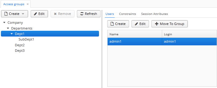
Problem:
-
The users under the
Departmentsgroup should only see the users of their own group and the groups below. -
Each subgroup –
Dept 1,Dept 2, etc. should have its own administrator, who can create users and assign them the available roles.
Solution:
-
Add the following constraints for the
Departmentsgroup: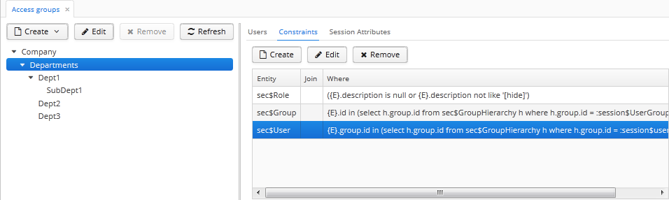
-
For the
sec$Groupentity:{E}.id in ( select h.group.id from sec$GroupHierarchy h where h.group.id = :session$userGroupId or h.parent.id = :session$userGroupId )With this constraint, the users will not be able to see the groups higher than their own.
-
For the
sec$Userentity:{E}.group.id in ( select h.group.id from sec$GroupHierarchy h where h.group.id = :session$userGroupId or h.parent.id = :session$userGroupId )With this constraint, the users will not be able to see the users in groups higher than their own.
-
For the
sec$Userentity:({E}.description is null or {E}.description not like '[hide]')With this constraint, the users will not be able to view the roles that have the
[hide]string in thedescriptionattribute.
-
-
Create a role that denies editing roles and permissions:
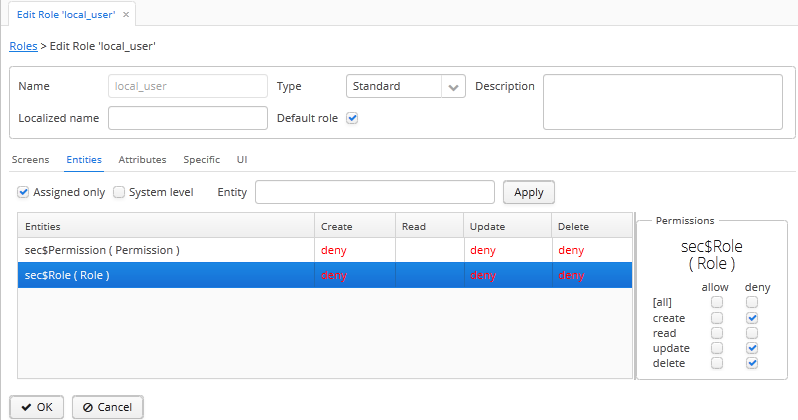
-
Select the Default role checkbox:
-
Add the
[hide]string to the Description field. -
In the Entities tab, deny create, update and delete operations for the
sec$Roleandsec$Permissionentities (to add permissions for thesec$Permissionobject, select the System level checkbox).
All created users, including the local administrators, will get the
local_userrole. This role is invisible to the users in theDepartmentsgroup, so even the local administrators are unable to unassign this role from themselves. Local administrators can only operate on the existing roles that have been created for them by the global administrator. Obviously, the roles available to department users should not remove restrictions imposed by thelocal_userrole. -
This appendix describes the main configuration files included in CUBA-applications.
context.xml file is the application deployment descriptor for the Apache Tomcat server. In a deployed application, this file is located in the META-INF subfolder of web application folder or the WAR file, for example, tomcat/webapps/app-core/META-INF/context.xml. In application project, the files of this type can be found in the /web/META-INF folders of the core, web and portal modules.
The main purpose of this file in the Middleware block is to define a datasource and assign a JNDI name, specified in the cuba.dataSourceJndiName application property.
An example of a data source declaration for PostgreSQL:
<Resource name="jdbc/CubaDS" type="javax.sql.DataSource" maxActive="100" maxIdle="2" maxWait="5000" driverClassName="org.postgresql.Driver" username="cuba" password="cuba" url="jdbc:postgresql://localhost/sales"/>
An example of a data source declaration for Microsoft SQL Server:
<Resource name="jdbc/CubaDS" type="javax.sql.DataSource" maxActive="100" maxIdle="2" maxWait="5000" driverClassName="net.sourceforge.jtds.jdbc.Driver" username="sa" password="saPass1" url="jdbc:jtds:sqlserver://localhost/sales"/>
An example of a data source declaration for Oracle:
<Resource name="jdbc/CubaDS" type="javax.sql.DataSource" maxActive="100" maxIdle="2" maxWait="5000" driverClassName="oracle.jdbc.OracleDriver" username="sales" password="sales" url="jdbc:oracle:thin:@//localhost:1521/orcl"/>
In all blocks implemented as web applications, this file may be used to disable serialization of HTTP-sessions:
<Manager className="org.apache.catalina.session.PersistentManager" debug="0" distributable="false"
saveOnRestart="false">
<Store className="org.apache.catalina.session.FileStore"/>
</Manager>
datatypes.xml defines the available data types for entity attributes. See Section 4.2.2.3, “Datatype”
The default file is located in the com.haulmont.chile.core.datatypes package of the cuba base project. If a similar file is created in the CLASSPATH root of the global module in an application project, the data types will be loaded from this file.
The loading mechanism does not support extension, i.e. all data types are loaded from a single file – either from the CLASSPATH root or from the com.haulmont.chile.core.datatypes package.
Available data types should be specified as datatype elements. The only mandatory attribute is class, which defines a data type class implementing the Datatype interface. The remaining attribute set depends on the class. The object created from the class, receives the corresponding XML element when created, and should parse the element itself.
Typical attributes:
-
format– format for conversion to string. -
groupingSeparator– number grouping separator character. -
decimalSeparator– decimal separator character.
Example:
<datatypes>
<datatype class="com.haulmont.chile.core.datatypes.impl.BooleanDatatype"/>
<datatype class="com.haulmont.chile.core.datatypes.impl.IntegerDatatype"
format="0" groupingSeparator=""/>
<datatype class="com.haulmont.chile.core.datatypes.impl.LongDatatype"
format="0" groupingSeparator=""/>
<datatype class="com.haulmont.chile.core.datatypes.impl.DoubleDatatype"
format="0.###" decimalSeparator="." groupingSeparator=""/>
<datatype class="com.haulmont.chile.core.datatypes.impl.BigDecimalDatatype"
format="0.####" decimalSeparator="." groupingSeparator=""/>
<datatype class="com.haulmont.chile.core.datatypes.impl.StringDatatype"/>
<datatype class="com.haulmont.chile.core.datatypes.impl.DateTimeDatatype"
format="yyyy-MM-dd'T'HH:mm:ss.SSS"/>
<datatype class="com.haulmont.chile.core.datatypes.impl.DateDatatype"
format="yyyy-MM-dd"/>
<datatype class="com.haulmont.chile.core.datatypes.impl.TimeDatatype"
format="HH:mm:ss"/>
<datatype class="com.haulmont.chile.core.datatypes.impl.UUIDDatatype"/>
<datatype class="com.haulmont.chile.core.datatypes.impl.ByteArrayDatatype"/>
</datatypes>
The files of this type define configuration of an additional Spring Framework container for client blocks containing Spring MVC controllers.
A set of dispatcher-spring.xml files, including the ones defined in base projects, is declared in the cuba.dispatcherSpringContextConfig application property. File order is important, because each subsequent file can override bean configurations defined by the previous files.
The Spring MVC controllers container is created with the main container (configured by spring.xml files) as its parent. Therefore, the beans of the controllers container can use the beans of the main container, while the beans of the main container cannot “see” the beans of the controllers container.
The files of this type are used in the application blocks implementing the generic user interface, such as the Web Client and the Desktop Client. These files define the main menu structure of the application.
XML schema is available at http://schemas.haulmont.com/cuba/5.6/menu.xsd
A set of menu.xml files, including the ones defined in base projects, is declared in the cuba.menuConfig application property. The file has the following structure:
menu-config – the root element.
Elements of menu-config form a tree structure:
-
menu– a folding menu containing menu items and other folding menus.menuattributes:-
id– identifier of an element, used for name localization (see below). -
insertBefore,insertAfter– determines whether the item should be inserted before or after a particular element or a menu item with specified identifier. This attribute is used to insert an element to an appropriate place in the menu defined in files of base projects. Before and after elements cannot be used at the same time.CUBA Studio supports
insertBeforeandinsertAfterattributes only for the top-level menu elements. Therefore the Studio menu designer should not be used if such attributes were defined manually, as Studio will delete them.
Menu elements:
-
menu -
item– menu item (see below). -
separator– separator.
-
-
item– menu item.itemattributes:-
id– identifier of an element, used for name localization (see below), and for linking to one of the UI screen elements registered in screens.xml file. When user clicks on a menu item, the corresponding screen will be opened in the main application window. -
shortcut– a keyboard shortcut for this menu item. Possible modifiers –ALT,CTRL,SHIFT– are separated with "-". For example:shortcut="ALT-C" shortcut="ALT-CTRL-C" shortcut="ALT-CTRL-SHIFT-C"
Shortcuts can also be configured in application properties and then used in
menu.xmlfile in the following way:shortcut="${sales.menu.customer}" -
openType– screen open mode. The following modes are available:WindowManager.OpenType:NEW_TAB,THIS_TAB,DIALOG,NEW_WINDOW.Default value –
NEW_TAB.NEW_WINDOWmode is only supported in the Desktop Client. For the Web Client it is equivalent toNEW_TABmode. -
insertBefore,insertAfter– determines whether the item should be inserted before or after a particular element or a menu item with specified identifier.Studio does not support
insertBefore,insertAfterattributes for theitemelement. Therefore the Studio menu designer should not be used if such attributes were defined manually, as Studio will delete them. -
resizable– only relevant toDIALOGscreen open mode. Controls window resizing ability. Possible values −true,false.By default, the main menu does not affect the ability to resize dialog windows.
itemelements:-
param– screen parameters passed to the controller’sinit()method. The properties configured inmenu.xmloverride the parameters set in screens.xml with the same name.paramattributes:-
name– parameter name. -
value– parameter value. String value, may be converted to an arbitrary object according to the following rules:-
If a string is an entity identifier, specified according to the rules of the
EntityLoadInfoclass, the system loads the specified entity instance. -
If a string has the format
${some_name}, the value of the parameter will be set to the some_name application property. -
Strings
trueandfalseare converted to the correspondingBooleanvalues. -
Otherwise, the string itself becomes the parameter value.
-
-
-
permissions– an element defining a set of permissions required to make the menu item available to the current user. This mechanism should only be used when item availability should be tied to a specific permission, or to more than one arbitrary permissions. In most cases, the standard capabilities of the security subsystem should be sufficient to manage the menu item availability based on screen identifiers.The element should contain nested
permissionelements, each describing a single required permission. The menu item will only be accessible if all permissions are granted.permissionattributes:-
type– permission type. The following types are available forPermissionType:SCREEN,ENTITY_OP,ENTITY_ATTR,SPECIFIC,UI. -
target– an object checked for permission. Depends on permission type:-
SCREEN– screen identifier, for examplesales$Customer.lookup. -
ENTITY_OP– a string formatted as{entity_name}:{op}, where{op}–read,create,update,delete. For example:sales$Customer:create. -
ENTITY_ATTR– a string formatted as{entity_name}:{attribute}, for examplesales$Customer:name. -
SPECIFIC– specific permission identifier, for examplesales.runInvoicing. -
UI– path to a visual component of a screen.
-
-
-
Example of a menu file:
<menu-config xmlns="http://schemas.haulmont.com/cuba/menu.xsd">
<menu id="sales" insertBefore="administration">
<item id="sales$Customer.lookup"/>
<separator/>
<item id="sales$Order.lookup"/>
</menu>
</menu-config>
A localized name of a menu element is defined the following way: the menu-config prefix with a dot at the end is added to the element identifier; the resulting string is used as a key for the main message pack. For example:
menu-config.sales=Sales menu-config.sales$Customer.lookup=Customers
Files of this type are used to register non-persistent entities and assign meta annotations, see Section 4.2.2, “Metadata Framework”.
XML schema is available at http://schemas.haulmont.com/cuba/5.6/metadata.xsd.
A set of metadata.xml files, including the ones defined in base projects, is declared in the cuba.metadataConfig application property.
The file has the following structure:
metadata – root element.
metadata elements:
-
metadata-model– the project's meta model descriptor.metadata-modelattribute:-
root-package– the project’s root package.
metadata-modelelements:-
class– a non-persistent entity class.
-
-
annotations– contains assignments of entity meta annotations.annotationselements:-
entity– entity to assign meta annotation to.entityattributes:-
class– entity class.
entityelements:-
annotation– meta annotation element.annotationattributes:-
name– meta annotation name. -
value– meta annotation value.
-
-
-
Example:
<metadata xmlns="http://schemas.haulmont.com/cuba/metadata.xsd">
<metadata-model root-package="com.sample.sales">
<class>com.sample.sales.entity.SomeTransientEntity</class>
<class>com.sample.sales.entity.OtherTransientEntity</class>
</metadata-model>
<annotations>
<entity class="com.haulmont.cuba.security.entity.User">
<annotation name="com.haulmont.cuba.core.entity.annotation.TrackEditScreenHistory"
value="true"/>
<annotation name="com.haulmont.cuba.core.entity.annotation.EnableRestore"
value="true"/>
</entity>
</annotations>
</metadata>
Files of this type are used in the Web Client and the Desktop Client blocks for registration of specific user permissions.
A set of permissions.xml files, including the ones defined in base projects, is declared in the cuba.permissionConfig application property.
XML schema is available at http://schemas.haulmont.com/cuba/5.6/permissions.xsd.
The file has the following structure:
permission-config - root element.
permission-config elements:
-
specific- specific permissions descriptor.specificelements:-
category- permissions category which is used for grouping permissions in the role edit screen.idattribute is used as a key for retrieving a localized category name from the main message pack. -
permission- named permission.idattribute is used to obtain the permission value by theSecurity.isSpecificPermitted()method, and as a key for retrieving a localized permission name form the main message pack to display the permission in the role edit screen.
-
For example:
<permission-config xmlns="http://schemas.haulmont.com/cuba/permissions.xsd">
<specific>
<category id="app">
<permission id="app.doSomething"/>
<permission id="app.doSomethingOther"/>
</category>
</specific>
</permission-config>
Files of this type are standard for JPA, and are used for registration of persistent entities and configuration of ORM framework parameters.
A set of persistence.xml files, including the ones defined in base projects, is declared in the cuba.persistenceConfig application property.
When the Middleware block starts, the specified files are combined into a single persistence.xml, stored in the application work folder. File order is important, because each subsequent file in the list can override previously defined ORM parameters. There are several DBMS specific (set in cuba.dbmsType) parameters that cannot be overridden in the persistence.xml. These parameters are:
-
openjpa.jdbc.DBDictionary -
openjpa.jdbc.MappingDefaults
Additionally, if the cuba.disableOrmXmlGeneration application property is set to false, and the project contains extended entities, the orm.xml file will be created in the application work folder on application start. The path to this file is written to the openjpa.MetaDataFactory parameter, which means that this parameter cannot be defined in the persistence.xml in advance.
Example of a file:
<persistence xmlns="http://java.sun.com/xml/ns/persistence" version="1.0">
<persistence-unit name="sales" transaction-type="RESOURCE_LOCAL">
<class>com.sample.sales.entity.Customer</class>
<class>com.sample.sales.entity.Order</class>
</persistence-unit>
</persistence>
Files of this type configure an additional Spring Framework container for the Middleware block, used for exporting services and other middleware components accessed by the client tier (hereafter remote access container).
A set of remoting-spring.xml files, including the ones defined in base projects, is declared in the cuba.remotingSpringContextConfig application property. File order is important because each subsequent file overrides already defined bean configurations.
Remote access container is created with the main container (configured by spring.xml files) as its parent. Therefore, the beans of the remote access container can use the beans of the main container, while the beans of the main container cannot “see” the beans of the remote access container.
The primary goal of remote access is to make Middleware services accessible to the client level using the Spring HttpInvoker mechanism. The cuba-remoting-spring.xml file in the cuba base project defines the servicesExporter bean of RemoteServicesBeanCreator type, which receives all service classes from the main container and exports them. In addition to regular annotated services, remote access container exports a number of specific beans, such as LoginService.
Furthermore, the cuba-remoting-spring.xml file defines a base package that serves as a starting point for lookup of annotated Spring MVC controller classes used for file uploading and downloading.
The remoting-spring.xml file in the application project should only be created when specific Spring MVC controllers are used. Application project services will be imported by the standard servicesExporter bean defined in the cuba base project.
Files of this type are used in the generic user interface of the Web Client and the Desktop Client for registration of screen XML-descriptors.
XML schema is available at http://schemas.haulmont.com/cuba/5.6/screens.xsd.
A set of screens.xml files, including the ones defined in base projects, is declared in the cuba.windowConfig application property.
The file has the following structure:
screen-config – the root element.
screen-config elements:
-
screen– screen descriptor.screenattributes:-
id– screen identifier used to reference this screen from the application code (e.g. in theIFrame.openWindow()and other methods) and in the menu.xml. -
template– path to screen’s XML-descriptor. Resources interface rules apply to loading the descriptor. -
class– if thetemplateattribute is not set, this attribute should contain the name of the class implementing eitherCallableorRunnable.In case of
Callable, thecall()method should return an instance ofWindow, which will be returned to the invoking code as the result of callingWindowManager.openWindow(). The class may contain a constructor with string parameters, defined by the nestedparamelement (see below). -
multipleOpen– optional attribute, allowing a screen to be opened multiple times. If set tofalseor not defined and the screen with this identifier has already been opened in the main window, the system will show the existing screen instead of opening a new one. If set totrue, any number of screen instances can be opened.
screenelements:-
param– defines a screen parameter submitted as a map to the controller’sinit()method. Parameters, passed to theopenWindow()methods by the invoking code, override the matching parameters set inscreens.xml.paramattributes:-
name– parameter name. -
value– parameter value. Stringstrueandfalseare converted into the correspondingBooleanvalues.
-
-
-
include– includes a different file, e.g.screens.xml.includeattributes:-
file– path to a file according to the rules of the Resources interface.
-
Example of a screens.xml file:
<screen-config xmlns="http://schemas.haulmont.com/cuba/screens.xsd"> <screen id="sales$Customer.lookup" template="/com/sample/sales/gui/customer/customer-browse.xml"/> <screen id="sales$Customer.edit" template="/com/sample/sales/gui/customer/customer-edit.xml"/> <screen id="sales$Order.lookup" template="/com/sample/sales/gui/order/order-browse.xml"/> <screen id="sales$Order.edit" template="/com/sample/sales/gui/order/order-edit.xml"/> </screen-config>
The files of this type configure the main Spring Framework container for each application block.
A set of spring.xml files, including the ones defined in base projects, is declared in the cuba.springContextConfig application property. File order is important because each subsequent file overrides already defined bean configurations.
Most of the configuration of the main container is performed using bean annotations (e.g. @ManagedBean, @Service, @Inject and others), therefore the only mandatory part of spring.xml in an application project is the context:component-scan element, which specifies the base Java package for lookup of annotated classes. For example:
<context:component-scan base-package="com.sample.sales"/>
The remaining configuration depends on the block that a container is being configured for, e.g. the registration of JMX-beans for the Middleware block, or services import for client blocks.
Files of this type are used to describe views, see Section 4.2.3, “Views”.
XML schema is available at http://schemas.haulmont.com/cuba/5.6/view.xsd.
views – root element.
views elements:
-
view–viewdescriptor.viewattributes:-
class– entity class. -
entity– the name of the entity, for examplesales$Order. This attribute can be used instead of theclassattribute. -
name– view name, unique within the entity. -
systemProperties– enables inclusion of system attributes defined in base interfaces for persistent entitiesBaseEntityandUpdatable. Optional attribute,falseby default. -
overwrite– enables overriding a view with the same class and name already deployed in the repository. Optional attribute,falseby default. -
extends– specifies an entity view, from which the attributes should be inherited. For example, declaringextends="_local", will add all local attributes of an entity to the current view. Optional attribute.
viewelements:-
property–ViewPropertydescriptor.propertyattributes:-
name– entity attribute name. -
view– for reference type attributes, specifies a view name the associated entity should be loaded with. -
lazy– for reference type attributes, enables excluding the attribute from the fetch plan and loading it via a separate SQL query initiated by a call to the attribute. Optional attribute,falseby default.Using
lazyis recommended, if the current view graph contains more than one collection attribute.lazy = "true"should be set for all collections, except one.
propertyelements:-
property– associated entity attribute descriptor. This allows defining an unnamed inline view for an associated entity in the current descriptor.
-
-
-
include– include anotherviews.xmlfile.includeattributes:-
file– file path according to the Resources interface rules.
-
Example:
<views xmlns="http://schemas.haulmont.com/cuba/view.xsd">
<view class="com.sample.sales.entity.Order"
name="orderWithCustomer"
extends="_local">
<property name="customer" view="_minimal"/>
</view>
<view class="com.sample.sales.entity.Item"
name="itemsInOrder">
<property name="quantity"/>
<property name="product" view="_minimal"/>
</view>
<view class="com.sample.sales.entity.Order"
name="orderWithCustomerDefinedInline"
extends="_local">
<property name="customer">
<property name="name"/>
<property name="email"/>
</property>
</view>
</views>
See also the cuba.viewsConfig application property.
The web.xml file is a standard descriptor of a Java EE web application and should be created for the Middleware, Web Client and Web Portal blocks.
In an application project, web.xml files are located in the web/WEB-INF folders of the corresponding modules.
web.xml for the Middleware block (core project module) has the following content:
<web-app xmlns="http://java.sun.com/xml/ns/javaee"
xmlns:xsi="http://www.w3.org/2001/XMLSchema-instance"
xsi:schemaLocation="http://java.sun.com/xml/ns/javaee
http://java.sun.com/xml/ns/javaee/web-app_2_5.xsd"
version="2.5">
<!-- Application properties config files -->
<context-param>
<param-name>appPropertiesConfig</param-name>
<param-value>
classpath:cuba-app.properties
classpath:app.properties
file:${catalina.home}/conf/app-core/local.app.properties
</param-value>
</context-param>
<listener>
<listener-class>com.haulmont.cuba.core.sys.AppContextLoader</listener-class>
</listener>
<servlet>
<servlet-name>remoting</servlet-name>
<servlet-class>com.haulmont.cuba.core.sys.remoting.RemotingServlet</servlet-class>
<load-on-startup>1</load-on-startup>
</servlet>
<servlet-mapping>
<servlet-name>remoting</servlet-name>
<url-pattern>/remoting/*</url-pattern>
</servlet-mapping>
<servlet>
<servlet-name>restapi</servlet-name>
<servlet-class>com.haulmont.cuba.core.sys.restapi.RestApiServlet</servlet-class>
<load-on-startup>1</load-on-startup>
</servlet>
<servlet-mapping>
<servlet-name>restapi</servlet-name>
<url-pattern>/api/*</url-pattern>
</servlet-mapping>
</web-app>
The context-param elements define initializing parameters for the ServletContext object of the current web application. The list of application property files is also defined in the appPropertiesConfig parameter.
The listener element defines a listener class implementing the ServletContextListener interface. The Middleware block uses the AppContextLoader class as a listener. This class initializes the AppContext.
Servlet descriptions follow, including the RemotingServlet class, mandatory for the Middleware block. This servlet is accessible via the /remoting/* URL, and is related to the remote access container (see Section A.8, “remoting-spring.xml”).
web.xml for the Web Client block (web project module) has the following content:
<web-app xmlns="http://java.sun.com/xml/ns/javaee"
xmlns:xsi="http://www.w3.org/2001/XMLSchema-instance"
xsi:schemaLocation="http://java.sun.com/xml/ns/javaee
http://java.sun.com/xml/ns/javaee/web-app_2_5.xsd"
version="2.5">
<context-param>
<description>Vaadin production mode</description>
<param-name>productionMode</param-name>
<param-value>false</param-value>
</context-param>
<context-param>
<param-name>appPropertiesConfig</param-name>
<param-value>
classpath:cuba-web-app.properties
classpath:web-app.properties
file:${catalina.home}/conf/app/local.app.properties
</param-value>
</context-param>
<listener>
<listener-class>com.haulmont.cuba.web.sys.WebAppContextLoader</listener-class>
</listener>
<servlet>
<servlet-name>app_servlet</servlet-name>
<servlet-class>com.haulmont.cuba.web.sys.CubaApplicationServlet</servlet-class>
<init-param>
<param-name>application</param-name>
<param-value>com.haulmont.sales.web.App</param-value>
</init-param>
<init-param>
<param-name>widgetset</param-name>
<param-value>com.haulmont.cuba.web.toolkit.ui.WidgetSet</param-value>
</init-param>
<init-param>
<param-name>UI</param-name>
<param-value>com.haulmont.cuba.web.AppUI</param-value>
</init-param>
<init-param>
<param-name>UIProvider</param-name>
<param-value>com.haulmont.cuba.web.sys.CubaUIProvider</param-value>
</init-param>
</servlet>
<servlet-mapping>
<servlet-name>app_servlet</servlet-name>
<url-pattern>/*</url-pattern>
</servlet-mapping>
<filter>
<filter-name>cuba_filter</filter-name>
<filter-class>com.haulmont.cuba.web.sys.CubaHttpFilter</filter-class>
</filter>
<filter-mapping>
<filter-name>cuba_filter</filter-name>
<url-pattern>/*</url-pattern>
</filter-mapping>
</web-app>
The list of application property files is defined in the appPropertiesConfig parameter. The productionMode property disables the Vaadin framework debugging mode.
The Web Client block uses the WebAppContextLoader class as a ServletContextListener.
Next, the CubaApplicationServlet is defined, providing the generic user interface implementation based on the Vaadin framework. The servlet has a number of parameters, including:
-
application– defines a project specific client application class, inherited fromcom.haulmont.cuba.web.App. -
widgetset– defines a set of GWT components used on the browser side.
Later, the CubaHttpFilter required for functioning of the Web Client block is defined.
This appendix describes all available application properties in alphabetical order.
- cuba.allowQueryFromSelected
-
Allows the generic filter to use sequential filtering mode. See also Section 4.2.6.10.2, “Sequential Queries”.
Default value:
trueInterface:
GlobalConfigUsed in the Web Client and the Middleware blocks.
- cuba.allowSetNotLoadedAttributes
-
Allows invoking setters for unloaded attributes of Detached entities. For more information, see Section 4.2.3, “Views”.
Default value:
falseUsed in all application blocks.
- cuba.automaticDatabaseUpdate
-
Determines whether server should run DB update scripts at application start.
Default value:
falseInterface:
ServerConfigUsed in the Middleware block.
- cuba.availableLocales
-
List of supported user interface languages.
Property format:
{language_name1}|{language_code_1};{language_name2}|{language_code_2};...Example:
cuba.availableLocales=French|fr;English|en
{language_name}– name displayed in the list of available languages. For example, such lists can be found on the login screen and on the user edit screen.{language_code}– corresponds to language code returned by theLocale.getLanguage()method. Used as a suffix for message pack file names. For example,messages_fr.properties.The first language listed in the cuba.availableLocales property, will be selected in the list of available languages by default, if the list does not contain the user’s operating system language. Otherwise, user’s operating system language will be selected by default.
Default value:
English|en;Russian|ru;French|frInterface:
GlobalConfigUsed in all standard blocks.
- cuba.backgroundWorker.maxActiveTasksCount
-
The maximum number of active background tasks.
Default value:
100Interface:
WebConfigUsed in the Web Client block.
- cuba.backgroundWorker.maxClientLatencySeconds
-
Delay in seconds added to the timeout of the background task, after which the task is interrupted by the
WatchDogmechanism. This delay compensates for the possible network latencies while polling task status.Default value:
60Interface:
WebConfigUsed in the Web Client block.
- cuba.backgroundWorker.uiCheckInterval
-
Background task status polling interval.
Default value:
2000Interface:
WebConfigUsed in the Web Client block.
- cuba.client.maxUploadSizeMb
-
Maximum file size (in megabytes) that can be uploaded using the FileUploadField and FileMiltiUploadField components.
Default value:
20Interface:
ClientConfigUsed in the Web Client and the Desktop Client blocks.
- cuba.confDir
-
Defines location of the configuration folder for an application block.
Default value for the Middleware, Web Client and Web Portal blocks:
${catalina.home}/conf/${cuba.webContextName}In case of a standard Tomcat deployment, this points to a sub-folder with the name of the current web app in the
tomcat/conffolder, for example,tomcat/conf/app-core.Default value for the Desktop Client block:
${cuba.desktop.home}/conf.Interface:
GlobalConfigUsed in all standard blocks.
- cuba.cluster.enabled
-
Enables interaction between Middleware servers in a cluster. See Section 6.3.2.2, “Configuring Interaction between Middleware Servers” for details.
Default value:
falseUsed in the Middleware block.
- cuba.connectionReadTimeout
-
Sets Middleware connection timeout for client blocks. Non-negative value is passed to the
setReadTimeout()method ofURLConnection.See also cuba.connectionTimeout.
Default value:
-1Used in the Web Client, Web Portal and Desktop Client blocks.
- cuba.connectionTimeout
-
Sets Middleware connection timeout for client blocks. Non-negative value is passed to the
setConnectTimeout()method ofURLConnection.See also cuba.connectionReadTimeout.
Default value:
-1Used in the Web Client, Web Portal and Desktop Client blocks.
- cuba.connectionUrlList
-
Sets Middleware server connection URL for client blocks.
Property value should contain one or more comma separated URLs
http[s]://host[:port]/app-core, wherehostis the server hostname,portis the server port, andapp-coreis the name of the the Middleware block web application. For example:cuba.connectionUrlList = http://localhost:8080/app-core
When using a cluster of Middleware servers, their addresses should be listed, separated with commas:
cuba.connectionUrlList = http://server1:8080/app-core,http://server2:8080/app-core
The order of servers in the list, determines the order in which the client will attempt to send requests. In the example above, the client will send request to
server1first, and if it is inaccessible, toserver2. If a request toserver2completes successfully, the client will useserver2as the primary server and will continue working with it. Restarting the client will reset the list to the initial value. Uniform distribution of clients across a cluster of servers can be achieved by using the cuba.randomServerPriority property.See also cuba.useLocalServiceInvocation.
Interface:
ClientConfigUsed in the Web Client, Web Portal and Desktop Client blocks.
- cuba.creditsConfig
-
Defines a set of
credits.xmlfiles containing information about the software components used by the application.Property value should contain a list of file names separated with spaces. Resources interface rules apply to loading files.
Used in the Web Client and the Desktop Client blocks.
Example:
cuba.creditsConfig = cuba-credits.xml reports-credits.xml credits.xml
- cuba.dataSourceJndiName
-
Defines JNDI name of the
javax.sql.DataSourceobject used for connection to the application database.Default value:
java:comp/env/jdbc/CubaDSUsed in the Middleware block.
- cuba.dataDir
-
Defines the location of the work folder for an application block.
Default value for the Middleware, Web Client and Web Portal blocks:
${catalina.home}/work/${cuba.webContextName}In case of a standard Tomcat deployment, this points to a sub-folder with the name of the current web-app inside the
tomcat/workfolder, for example,tomcat/work/app-core.Default value for the Desktop Client block:
${cuba.desktop.home}/work.Interface:
GlobalConfigUsed in all standard blocks.
- cuba.dbDir
-
Defines the location of the database scripts folder.
Default value:
${catalina.home}/webapps/${cuba.webContextName}/WEB-INF/db, which points to theWEB-INF/dbsub-folder of the current web-app folder in Tomcat.Interface:
ServerConfigUsed in the Middleware block.
- cuba.dbmsType
-
Defines the DBMS type. Affects the choice of DBMS integration interface implementations and the search for database init and update scripts together with cuba.dbmsVersion.
See Section 4.3.1, “DBMS Types” for details.
Default value:
hsqlUsed in the Middleware block.
- cuba.dbmsVersion
-
An optional property that sets the database version. Affects the choice of DBMS integration interface implementations and the search for database init and update scripts together with cuba.dbmsType.
See Section 4.3.1, “DBMS Types” for details.
Default value:
noneUsed in the Middleware block.
- cuba.defaultQueryTimeoutSec
-
Defines default transaction timeout.
Default value:
0(no timeout).Interface:
ServerConfigUsed in the Middleware block.
- cuba.desktop.useServerTime
-
Enables adjustment of the time provided by the TimeSource interface of the Desktop Client block.The time will approximately equal to the time of the Middleware the client is connected to.
Default value:
trueInterface:
DesktopConfigUsed in the Desktop Client block.
- cuba.desktop.useServerTimeZone
-
Enables adjustment of the Desktop Client block’s JVM timezone to the timezone of the Middleware the client is connected to.
Default value:
trueInterface:
DesktopConfigUsed in the Desktop Client block.
- cuba.disableOrmXmlGeneration
-
Prohibits automatic generation of the
orm.xmlfile for extended entities. Allows creating and registering this file manually in theopenjpa.MetaDataFactoryparameter of the persistence.xml file.Default value:
false(orm.xmlwill be created automatically if any extended entity exist).Used in the Middleware block.
- cuba.dispatcherSpringContextConfig
-
Defines a set of dispatcher-spring.xml files in the client blocks.
The value of the property should contain a list of file names separated with spaces. Resources interface rules apply to loading files.
Used in the Web Client and Web Portal blocks.
Example:
cuba.dispatcherSpringContextConfig = cuba-portal-dispatcher-spring.xml portal-dispatcher-spring.xml
- cuba.download.directories
-
Defines a list of folders from which the Middleware files can be downloaded from via
com.haulmont.cuba.core.controllers.FileDownloadController. For example, file downloading is utilized by the server log display mechanism found in the > web client screen.The folder list should be separated with semicolon.
Default value:
${cuba.tempDir};${cuba.logDir}(files can be downloaded from the temporary folder and the logs folder).Used in the Middleware block.
- cuba.email.*
-
Email sending parameters described in Section 4.7.2.3, “Configuring Email Sending Parameters”.
- cuba.fileStorageDir
-
Defines file storage folder structure roots. For more information, see Section 4.7.8.3, “Standard File Storage Implementation”.
Default value:
nullUsed in the Middleware block.
- cuba.gui.genericFilterChecking
-
Influences the behavior of the Filter component.
When set to
true, does not allow to apply a filter without specifying parameters.Default value:
falseInterface:
ClientConfigUsed in the Web Client and Desktop Client blocks.
- cuba.gui.genericFilterControlsLayout
-
Sets a template for Filter controls layout. Each control has the following format:
[component_name | options-comma-separated], e.g.[pin | no-caption, no-icon].Available controls:
-
filters_popup- popup button for selecting a filter, combined with the button. -
filters_lookup- lookup field for selecting a filter. The button should be added as a separate control. -
search- button. Do not add if usefilters_popup. -
add_condition- link button for adding new conditions. -
spacer- an empty space between controls. -
settings- button. Specify action names that should be displayed in Settings popup as options (see below). -
max_results- group of controls for setting maximum number of records to be selected. -
fts_switch- checkbox for switching to the Full-Text Seacrh mode.
The following actions can be used as options of the
settingscontrol:save,save_as,edit,remove,pin,make_default,save_search_folder,save_app_folder.The actions can also be used as independent controls outside of the Settings popup. In this case, they can have the following options:
-
no-icon- if an action button should be dispalyed without an icon. For example:[save | no-icon]. -
no-caption- if an action button should be dispalyed without a caption. For example:[pin | no-caption].
Default value:
[filters_popup] [add_condition] [spacer] \ [settings | save, save_as, edit, remove, make_default, pin, save_search_folder, save_app_folder] \ [max_results] [fts_switch]
Interface:
ClientConfigUsed in the Web Client and Desktop Client blocks.
-
- cuba.gui.genericFilterManualApplyRequired
-
Influences the behavior of the Filter component.
When set to
true, the screens containing filters will not load the corresponding datasources automatically, until user clicks the filter button.The value of cuba.gui.genericFilterManualApplyRequired is ignored, when opening browser screens using an application or search folders, i.e. the filter is applied. The filter will not be applied, if the
applyDefaultvalue for a folder is explicitly set tofalse.Default value:
falseInterface:
ClientConfigUsed in the Web Client and Desktop Client blocks.
- cuba.gui.genericFilterColumnsQty
-
Defines the number of columns with conditions for the Filter component.
Default value:
3Interface:
ClientConfigUsed in the Web Client and Desktop Client blocks.
- cuba.gui.genericFilterConditionsLocation
-
Defines the location of the conditions panel in the Filter component. Two locations are available:
top(above the filter control elements) andbottom(below the filter control elements).Default value:
topInterface:
ClientConfigUsed in the Web Client and Desktop Client blocks.
- cuba.gui.genericFilterPopupListSize
-
Defines the number of items displayed in the popup list of the button. If the number of filters exceeds this value, action is added to the popup list. The action opens a new dialog window with a list of all possible filters.
Default value:
10Interface:
ClientConfigUsed in the Web Client and Desktop Client blocks.
- cuba.groovyEvaluationPoolMaxIdle
-
Sets the maximum number of unused compiled Groovy expressions in the pool during
Scripting.evaluateGroovy()method execution. It is recommended to increment this parameter when intensive execution of Groovy expressions is required, for example, for a large number of application folders.Default value: 8
Used in all standard blocks.
- cuba.groovyEvaluatorImport
-
Defines a list of classes imported by all Groovy expressions executed through Scripting.
Class names in the list should be separated with commas or semicolons.
Default value:
com.haulmont.cuba.core.global.PersistenceHelperUsed in all standard blocks.
Example:
cuba.groovyEvaluatorImport = com.haulmont.cuba.core.global.PersistenceHelper,com.abc.sales.CommonUtils
- cuba.gui.useSaveConfirmation
-
Defines the layout of the dialog displayed when a user attempts closing a screen with unsaved changes in datasources.
Value of
truecorresponds to a layout with three possible actions: Save changes, Don’t Save, Don’t close the screen.The value of
falsecorresponds to a form with two options: Close the screen without saving changes, Don’t close the screen.Default value:
trueInterface:
ClientConfigUsed in the Web Client and Desktop Client blocks.
- cuba.httpSessionExpirationTimeoutSec
-
Defines HTTP-session inactivity timeout in seconds.
Default value:
1800Interface:
WebConfigUsed in the Web Client block.
It is recommended to use the same values for cuba.userSessionExpirationTimeoutSec and
cuba.httpSessionExpirationTimeoutSecproperties. - cuba.inMemoryDistinct
-
Enables in-memory filtering of duplicate records instead of using
select distinctat the database level. Used by the DataManager.Default value:
falseInterface:
ServerConfigUsed in the Middleware block.
- cuba.jmxUserLogin
-
Defines a user login that should be used for system authentication.
Default value:
adminUsed in the Middleware block.
- cuba.licensePath
-
Path to the CUBA platform license file. Resources interface rules apply to loading files. See also Section 6.6, “License File Usage”.
Default value:
/cuba.licenseInterface:
ServerConfigUsed in the Middleware block.
- cuba.localeSelectVisible
-
Disables the user interface language selection when logging in.
If
cuba.localeSelectVisibleis set to false, the locale for a user session is selected in the following way:-
If the
Userentity instance has alanguageattribute defined, the system will use this language. -
If the user’s operating system language is included in the list of available locales (set by the cuba.availableLocales property), the system will use this language.
-
Otherwise, the system will use the first language defined in the cuba.availableLocales property.
Default value:
trueInterface:
GlobalConfigUsed in all standard blocks.
-
- cuba.logDir
-
Defines the location of the log folder for an application block.
Default value for the Middleware, Web Client and Web Portal blocks:
${catalina.home}/logsIn case of a standard Tomcat deployment, this property points to the
tomcat/logsfolder.Default value for the Desktop Client block:
${cuba.desktop.home}/logs.Interface:
GlobalConfigUsed in all standard blocks.
- cuba.mainMessagePack
-
Defines the main message pack for an application block.
The value may include a single pack or a list of packs separated with spaces.
Used in all standard blocks.
Example:
cuba.mainMessagePack = com.haulmont.cuba.web com.sample.sales.web
- cuba.manualScreenSettingsSaving
-
If the property is set to
true, screens will not save their settings automatically on close. In this mode, a user can save or reset settings using the context menu which appears on clicking a screen tab or a dialog window caption.Default value:
falseInterface:
ClientConfigUsed in the Web Client and Desktop Client blocks.
- cuba.menuConfig
-
Defines a set of menu.xml files.
The property value should be a list of files separated with spaces. Resources interface rules apply to loading files.
Used in the Web Client and Desktop Client blocks.
Example:
cuba.menuConfig = cuba-web-menu.xml web-menu.xml
- cuba.metadataConfig
-
Defines a set of metadata.xml files.
The property value should be a list of files separated with spaces. Resources interface rules apply to loading files.
Used in the Middleware, Web Client and Desktop Client.
Example:
cuba.metadataConfig = cuba-metadata.xml metadata.xml
- cuba.passwordEncryptionModule
-
Defines the name of the bean used for user password hashing.
Default value:
cuba_Sha1EncryptionModuleUsed in all standard blocks.
- cuba.passwordPolicyEnabled
-
Enables password policy enforcement. If the property is set to
true, all new user passwords will be checked according to the cuba.passwordPolicyRegExp property.Default value:
falseInterface:
ClientConfigUsed in the client blocks: Web Client, Web Portal, Desktop Client.
- cuba.passwordPolicyRegExp
-
Defines a regular expression used by the password checking policy.
Default value:
((?=.*\\d)(?=.*\\p{javaLowerCase}) (?=.*\\p{javaUpperCase}).{6,20})The expression above ensures that password contains from 6 to 20 characters, uses numbers and Latin letters, contains at least one number, one lower case and one upper case letter. More information on regular expression syntax is available at https://en.wikipedia.org/wiki/Regular_expression and http://docs.oracle.com/javase/6/docs/api/java/util/regex/Pattern.html.
Interface:
ClientConfigUsed in the client level blocks: Web Client, Web Portal, Desktop Client.
- cuba.permissionConfig
-
Defines a set of permissions.xml files.
Used in the Web Client and Desktop Client blocks.
Example:
cuba.permissionConfig = cuba-web-permissions.xml web-permissions.xml
- cuba.persistenceConfig
-
Defines a set of persistence.xml files.
The property value should be a list of files separated with spaces. Resources interface rules apply to loading files.
Used in the Middleware, Web Client and Desktop Client.
Example:
cuba.persistenceConfig = cuba-persistence.xml persistence.xml
- cuba.portal.anonymousUserLogin
-
Defines a user login that should be used for anonymous session in the Web Portal block.
The user with the specified login should exist in the security subsystem and should have the required permissions. User password is not required, because anonymous portal sessions are created via the loginTrusted() method with the password defined in the cuba.trustedClientPassword property.
Interface:
PortalConfigUsed in the Web Portal block.
- cuba.randomServerPriority
-
Enables random selection of a Middleware server to connect to in a cluster, to ensure uniform distribution of clients between servers.
See also the cuba.connectionUrlList property.
Default value:
falseUsed in the Web Client, Web Portal, Desktop Client blocks.
- cuba.remotingSpringContextConfig
-
Defines a set of remoting-spring.xml files in the Middleware block.
The property value should be a list of files separated with spaces. Resources interface rules apply to loading files.
Used in the Middleware block.
Example:
cuba.remotingSpringContextConfig = cuba-remoting-spring.xml remoting-spring.xml
- cuba.rest.productionMode
-
Activates the REST API production mode that does not return exception text to client.
Interface:
RestConfigUsed in the Web Portal block.
Default value:
false - cuba.rest.apiVersion
-
Defines the REST API version. If the value is set to
1, the REST API of the platform versions before 5.4 is used. Setting the value to2enables the new REST API version with support for service calls.Interface:
RestConfigUsed in the Web Portal block.
Default value:
2 - cuba.restApiUrl
-
URL to the application’s REST API.
Interface:
GlobalConfigCan be used in all standard blocks.
Default value:
http://localhost:8080/app-portal/api - cuba.restServicesConfig
-
This configuration parameter defines a set of files that contains a list of services available for application REST API calls.
The value is a list of file names, separated by spaces. The files are loaded according to the Resources interface rules.
The XSD of the file is available at
http://schemas.haulmont.com/cuba/5.6/restapi-service-v2.xsd.Used in the Web Portal block.
Default value:
cuba-rest-services.xmlExample:
cuba.restServicesConfig = cuba-rest-services.xml app-rest-services.xml
- cuba.schedulingActive
-
Enables the CUBA scheduled tasks mechanism.
Default value:
falseInterface:
ServerConfigUsed in the Middleware block.
- cuba.springContextConfig
-
Defines a set of spring.xml files in an application block.
The property value should be a list of file names separated with spaces. Resources interface rules apply to loading files.
Used in all standard blocks.
Example:
cuba.springContextConfig = cuba-spring.xml spring.xml
- cuba.supportEmail
-
Specifies an email address to which exception reports from the default exception handler screen, as well as user messages from the > screen will be sent.
button in the exception handler screen will be hidden, if this property is set to an empty string.
In order to successfully send emails, the parameters described in Section 4.7.2.3, “Configuring Email Sending Parameters” must also be configured.
Interface:
WebConfigUsed in the Web Client block.
- cuba.systemInfoScriptsEnabled
-
Enables the display of SQL-scripts for creating / updating / retrieving an entity instance in the System Information window.
Such scripts actually show the contents of the database rows that store the selected entity instance, regardless of security settings that may deny viewing of some attributes. That is why it is reasonable to revoke the
CUBA / Generic UI / System Informationspecific permission for all user roles except the administrators, or set thecuba.systemInfoScriptsEnabledtofalsefor the whole application.Default value:
trueInterface:
ClientConfigUsed in the Web Client and the Desktop Client blocks.
- cuba.tempDir
-
Defines the location of the temporary directory for an application block.
The default value for the Middleware, Web Client, Web Portal blocks:
${catalina.home}/temp/${cuba.webContextName}In case of a standard Tomcat deployment, this points to a sub-folder with the name of the current web-app in the
tomcat/tempfolder, for example,tomcat/temp/app-core.The default value for the Desktop Client block:
${cuba.desktop.home}/temp.Interface:
GlobalConfigUsed in all standard blocks.
- cuba.triggerFilesCheck
-
Enables the processing of bean invocation trigger files.
The trigger file is a file that is placed in the
triggerssubdirectory of the application block’s temporary directory. The trigger file name consists of two parts separated with a period. The first part is the bean name, the second part is the method name of the bean to invoke. For example:cuba_Messages.clearCache. The trigger files handler monitors the folder for new trigger files, invokes the appropriate methods and then removes the files.By default, the trigger files processing is configured in the
cuba-web-spring.xmlfile and performed for the Web Client block only. At the project level, the processing for other modules can be performed by periodically invoking theprocess()method of thecuba_TriggerFilesProcessorbean.Default value:
trueUsed in blocks with the configured processing, default is Web Client.
- cuba.themeConfig
-
Defines a set of
*-theme.propertiesfiles that store theme variables, such as default popup window dimensions and input field width.The property takes a list of files separated by spaces. The files are loaded as defined by the Resources interface.
Default value for Web Client:
havana-theme.properties halo-theme.propertiesDefault value for Desktop Client:
nimbus-theme.propertiesUsed in the Web Client and Desktop Client block.
- cuba.trustedClientPassword
-
Defines password used by the
LoginService.loginTrusted()method. The Middleware layer can authenticate users who connect via the trusted client block without checking the user password.This property is used when user passwords are not stored in the database, while the client block performs the actual authentication itself. For example, by integrating with Active Directory.
Interfaces:
ServerConfig,WebConfigUsed in blocks: Middleware, Web Client, Web Portal.
- cuba.trustedClientPermittedIpMask
-
Defines IP address mask in form of regular expression, to which the invocation of the
LoginService.loginTrusted()method is allowed.Default value:
127\.0\.0\.1Interfaces:
ServerConfig,WebConfigUsed in blocks: Middleware, Web Client, Web Portal.
- cuba.uniqueConstraintViolationPattern
-
A regular expression which is used to find out that the exception is caused by a database unique constraint violation. The first or second group of the expression must return the constraint name. For example:
ERROR: duplicate key value violates unique constraint "(.+)"
The constraint name can be used to display a localized message that indicates what entity is concerned. For this the main message pack should contain keys equal to constraint names. For example:
IDX_SEC_USER_UNIQ_LOGIN = A user with the same login already exists
This property allows you to define a reaction to unique constraint violations depending on DBMS locale and version.
Default value is returned by the
PersistenceManagerService.getUniqueConstraintViolationPattern()method for the current DBMS.Used in all client blocks.
- cuba.useCurrentTxForConfigEntityLoad
-
Enables using current transaction, if there is one at the moment, for loading entity instances via the configuration interfaces. This could have a positive impact on performance. Otherwise, a new transaction is always created and committed, and the detached instances are returned.
Default value:
falseUsed in the Middleware block.
- cuba.useLocalServiceInvocation
-
When set to
true, and Tomcat fast deployment is used, the Web Client and Web Portal blocks invoke the Middleware services locally, bypassing the network stack, which has a positive impact on system performance. This property should be set to false for all other deployment options.Default value:
falseUsed in the Web Client and Web Portal blocks.
- cuba.user.fullNamePattern
-
Defines the full name pattern for user.
Default value:
{FF| }{LL}The full name pattern can be formed from the user’s first, last and middle names. The following rules apply to the pattern:
-
The pattern parts are separated by
{} -
The pattern inside
{}must contain one of the following characters followed by the|character without any spaces:LL– long form of user’s last name (Smith)L– short form of user’s last name (S)FF– long form of user’s first name (John)F– short form of user’s first name (J)MM– long form of user’s middle name (Paul)M– short form of user’s middle name (P) -
The
|character can be followed by any symbols including spaces.
Used in the Web Client and Desktop Client blocks.
-
- cuba.user.namePattern
-
Defines the display name pattern for the
Userentity. The display name is used in different places, including the upper right corner of the system’s main window.Default value:
{1} [{0}]{0}is substituted with theloginattribute,{1}– with thenameattribute.Used in the Middleware, Web Client and Desktop Client blocks.
- cuba.userSessionExpirationTimeoutSec
-
Defines the user session expiration timeout in seconds.
Default value:
1800Interface:
ServerConfigUsed in the Middleware block.
It is recommended to use the same values for cuba.userSessionExpirationTimeoutSec and cuba.httpSessionExpirationTimeoutSec.
- cuba.userSessionProviderUrl
-
Defines the Middleware block URL used for logging users in.
This parameter should be set in additional middleware blocks that execute client requests, but do not share the user session cache. If there is no required session in the local cache at the start of the request, this block invokes the
LoginService.getSession()method at the specified URL, and caches the retrieved session.Interface:
ServerConfigUsed in the Middleware block.
- cuba.viewsConfig
-
Defines a list of the views.xml files, automatically deployed during startup of the application. See Section 4.2.3, “Views”.
Used in all standard blocks.
Example:
cuba.viewsConfig = cuba-views.xml reports-views.xml views.xml
- cuba.webAppUrl
-
Defines URL of the Web Client application.
In particular, used to generate external application screen links, as well as by the
ScreenHistorySupportclass.Interface:
GlobalConfigCan be used in all standard blocks.
Default value:
http://localhost:8080/app - cuba.windowConfig
-
Defines a list of the screens.xml files.
The property value should contain a list of file names separated with spaces. Resources interface rules apply to loading files.
Used in the Web Client and Desktop Client blocks.
Example:
cuba.windowConfig = cuba-web-screens.xml web-screens.xml
- cuba.web.allowHandleBrowserHistoryBack
-
Enables handling of browser button in the application by overriding
AppWindow.onHistoryBackPerformed(). If the property is true, the standard browser behavior is replaced with this method invocation.See Section 4.5.8, “Web Client Specifics”.
Default value:
trueInterface:
WebConfigUsed in the Web Client block.
- cuba.web.appFoldersRefreshPeriodSec
-
Defines application folders refresh period in seconds.
Default value:
180Interface:
WebConfigUsed in the Web Client block.
- cuba.web.appWindowMode
-
Determines the initial mode for the main application window – tabbed or single screen (
TABBEDorSINGLErespectively). In single screen mode, screens opened in theNEW_TABmode will replace the current screen, instead of opening a new tab. This can be useful for simple applications and inexperienced users.The user is able to change the mode later, using the > screen.
Default value:
TABBEDInterface:
WebConfigUsed in the Web Client block.
- cuba.web.foldersPaneDefaultWidth
-
Defines default width (in pixels) for the folders panel.
Default value:
200Interface:
WebConfigUsed in the Web Client block.
- cuba.web.foldersPaneEnabled
-
Enables the folders panel functionality.
Default value:
trueInterface:
WebConfigUsed in the Web Client block.
- cuba.web.foldersPaneVisibleByDefault
-
Determines whether the folders panel should be expanded by default.
Default value:
falseInterface:
WebConfigUsed in the Web Client block.
- cuba.web.linkHandlerActions
-
Defines a list of URL commands handled by the
LinkHandlerbean. See Section 4.7.13, “Screen Links” for more information.The elements should be separated with the
|character.Default value:
open|oInterface:
WebConfigUsed in the Web Client block.
- cuba.web.loginDialogDefaultUser
-
Defines default user name, which will be automatically populated in the login screen. This is very convenient during development. This property should be set to
<disabled>value in production environment.Default value:
adminInterface:
WebConfigUsed in the Web Client block.
- cuba.web.loginDialogDefaultPassword
-
Defines default user password, which will be automatically populated in the login screen. This is very convenient during development. This property should be set to
<disabled>value in production environment.Default value:
adminInterface:
WebConfigUsed in the Web Client block.
- cuba.web.maxTabCount
-
Defines the maximum number of tabs that can be opened in the main application window. The value of
0disables this limitation.Default value:
7Interface:
WebConfigUsed in the Web Client block.
- cuba.web.rememberMeEnabled
-
Enables displaying Remember Me checkbox in the standard login screen of the web client.
Default value:
trueInterface:
WebConfigUsed in Web Client.
- cuba.web.resourcesRoot
-
Sets a directory for loading files to display by Embedded component. For example:
cuba.web.resourcesRoot = ${cuba.confDir}/resourcesDefault value:
nullInterface:
WebConfigUsed in Web Client.
- cuba.web.showBreadCrumbs
-
Enables hiding of the breadcrumbs panel which normally appears on top of the main window working area.
Default value:
trueInterface:
WebConfigUsed in the Web Client block.
- cuba.web.showFolderIcons
-
Enables the folders panel icons. When enabled, the following application theme files are used:
-
icons/app-folder-small.png– for application folders. -
icons/search-folder-small.png– for search folders. -
icons/set-small.png– for record sets.
Default value:
falseInterface:
WebConfigUsed in the Web Client block.
-
- cuba.web.table.cacheRate
-
Adjusts Table caching in the web browser. The amount of cached rows will be
cacheRatemultiplied with pageLength both below and above visible area.Default value:
2Interface:
WebConfigUsed in the Web Client block.
- cuba.web.table.pageLength
-
Sets the number of rows to be fetched from the server into the web browser when Table is rendered first time on refresh. See also cuba.web.table.cacheRate.
Default value:
15Interface:
WebConfigUsed in the Web Client block.
- cuba.web.theme
-
Defines the name of the theme used as default for the web client. See also cuba.themeConfig.
Default value:
havanaInterface:
WebConfigUsed in the Web Client block.
- cuba.web.useFontIcons
-
If this property is enabled for Halo theme, Font Awesome glyphs will be used for standard actions and platform screens instead of images.
The correspondence between the name in the icon attribute of a visual component or action and font element is defined in the
halo-theme.propertiesfile of the platform. Keys withcuba.web.iconsprefixes correspond to icon names, and their values - tocom.vaadin.server.FontAwesomeenumeration constants. For example, a font element for the standardcreateaction is defined as follows:cuba.web.icons.create.png = FILE_O
Default value:
trueInterface:
WebConfigUsed in the Web Client block.
- cuba.web.useInverseHeader
-
Controls the web client application header for Halo theme and its inheritors. If
true, the header will be dark (inverse), iffalse- the header takes the colour of the main application background.This property is ignored in case
$v-support-inverse-menu: false;
property is set in the application theme. This makes sense for a dark theme, if the user has the option to choose between a light and a dark theme. In this case, the header will be inverse for the light theme, and the same as the main background in the dark theme.
Default value:
trueInterface:
WebConfigUsed in the Web Client block.
- cuba.web.useLightHeader
-
Enables the compact version of the upper part of the main application window – logo, menu bar, user name and logout button will be placed in single line. When disabled,
AppWindow.createTitleLayout()creates additional area at the top.Default value:
trueInterface:
WebConfigUsed in the Web Client block.
- cuba.web.viewFileExtensions
-
Defines a list of file extensions displayed in the browser when downloading the file using
ExportDisplay.show(). The|character should be used to separate the list items.Default value:
htm|html|jpg|png|jpeg|pdfInterface:
WebConfigUsed in the Web Client block.
- cuba.web.showBreadCrumbs
-
Hides breadcrumbs (screens navigation) panel.
Default value:
trueInterface:
WebConfigUsed in the Web Client block.
- cuba.webContextName
-
Defines the web application context name. It is usually equivalent to the name of the directory or WAR-file containing this application block.
Interface:
GlobalConfigUsed in blocks: Middleware, Web Client, Web Portal.
For example, for the Middleware block, located in
tomcat/webapps/app-coreand available athttp://somehost:8080/app-core, the property should be set to the following value:cuba.webContextName = app-core
- cuba.webHostName
-
Defines the host name of the machine, on which this application block is running.
Default value:
localhostInterface:
GlobalConfigUsed in blocks: Middleware, Web Client, Web Portal.
For example, for the Middleware block, available at
http://somehost:8080/app-core, the property should be set to the following value:cuba.webHostName = somehost
- cuba.webPort
-
Defines the port, on which this application block is running.
Default value:
8080Interface:
GlobalConfigUsed in blocks: Middleware, Web Client, Web Portal.
For example, for the Middleware block, available at
http://somehost:8080/app-core, this property should be set to the following value:cuba.webPort = 8080
System properties can be specified at JVM startup, using the command line argument -D. Additionally, system properties can be read or set using the getProperty() and setProperty() methods of the System class.
- log4j.configuration
-
Defines the location of the Apache Log4j framework configuration file.
For application blocks running on the Tomcat web server, this system property is configured in the
tomcat/bin/setenv.batandtomcat/bin/setenv.shfiles. By default, it points to thetomcat/conf/log4j.xmlconfiguration file.For the Desktop Client block, the application code configures this property, if it is not defined at JVM startup. By default it points to the
cuba-log4j.xmlfile located in the CLASSPATH root. A different configuration file can be specified by overriding thegetDefaultLog4jConfig()method of thecom.haulmont.cuba.desktop.Appclass. - cuba.desktop.home
-
For the Desktop Client block, this property defines the root for the folders defined in the cuba.confDir, cuba.logDir, cuba.tempDir, and cuba.dataDir application properties.
If this property is not defined at JVM startup, the default value of
${user.home}/.haulmont/cubawill be used. A different location can be specified by overriding thegetDefaultHomeDir()method of thecom.haulmont.cuba.desktop.Appclass. - cuba.unitTestMode
-
This system property is set to
truewhen theCubaTestCasebase class is running integration tests.Example:
if (!Boolean.valueOf(System.getProperty("cuba.unitTestMode"))) return "Not in test mode";
A
- Application Tiers
- Application Properties
-
Application properties are named data values of various types that define different aspects of application configuration or functions. See Section 4.2.8, “Application Properties ”.
- Application Blocks
- Artifact
-
In the context of this manual, an artifact is a file (usually a JAR or ZIP file) that contains executable code or other code obtained as a result of building a project. An artifact has a name and a version number defined according to specific rules and can be stored in the artifact repository.
- Artifact Repository
-
A server that stores artifacts in a specific structure. The artifacts that the project depends on are loaded from the repository when that project is built.
C
- Container
-
Containers control lifecycle and configuration of application objects. This is a base component of the dependency injection mechanism also known as Inversion of Control.
CUBA platform uses the Spring Framework container. For extra information, please refer to the section called “Further Reading”.
D
- DB
-
A relational database.
- Datasource
- Dependency Injection
-
Also known as Inversion of Control (IoC) principle. A mechanism for retrieving links to the objects being used, which assumes that an object should only declare which objects it depends on, while the container creates all the necessary objects and injects them in the dependent object.
E
- Eager Fetching
-
Loading data from subclasses and related objects together with the requested entity.
- Entity
-
Main element of the data model, see Section 4.2.1, “Data Model”.
- Entity Browser
-
A screen containing a table with a list of entities and buttons to create, edit and delete entities.
- EntityManager
-
A middle tier component for working with persistent entities.
I
J
- Java EE Web Profile
-
Simplified Java Enterprise Edition profile created for web applications that do not use technologies like EJB, JTA and others.
- JMX
-
Java Management Extensions − a technology that provides tools to manage applications, system objects and devices. Defines the standard for JMX-components.
Additional details are available at: http://www.oracle.com/technetwork/java/javase/tech/javamanagement-140525.html.
See also Section 6.4, “Using JMX Tools”.
- JPA
-
Java Persistence API – a standard specification of the object-relational mapping technology (ORM). CUBA platform uses Apache OpenJPA framework that implements this specification.
- JPQL
-
Platform independent object-oriented query language, defined as a part of the JPA specification.
Additional details are available at: http://openjpa.apache.org/builds/2.2.0/apache-openjpa/docs/jpa_langref.html.
L
M
- Managed Beans
-
Components that contain application business logic.
- Main Message Pack
- MBeans
-
Managed Beans that have a JMX-interface. Typically, such beans have an internal state (e.g. cache, configuration data or statistics) that needs to be accessible through JMX.
- Middleware
-
Middle tier – the application tier that contains the business logic, works with the database and provides a common interface for higher client tier of an application.
O
- Optimistic locking
-
Optimistic locking – an approach to managing access to shared data by different users that assumes a very low probability of simultaneous access to the same entity instance. With this approach, locking itself is not applied, instead the system checks if a newer version of the data is available in the database at the moment when the changes are being saved. If so, an exception is thrown and the user must reload the entity instance.
See also http://en.wikipedia.org/wiki/Optimistic_concurrency_control.
- ORM
-
Object-Relational Mapping – a technology that links tables in a relational database to objects of a programming language.
P
- Persistent context
-
A set of entity instances loaded from the database or just created. Persistent context serves as data cache within the current transaction. When transaction is committed, all persistent context entity changes are saved to a database.
- POJO
-
Plain Old Java Object – a Java-object that has not been inherited from any specific class and that does not implement any service interfaces except the ones required for business logic.
S
- Screen Controller
-
A Java class containing screen initialization and event handling logic. Works in conjunction with screen’s XML-descriptor.
- Services
-
Middleware services provide the business interface for client calls and form the Middleware boundary. Services can encapsulate the business logic or delegate the execution to Managed Beans.
- Soft deletion
U
- UI
-
User Interface.
V
- View
W
- Work directory
-
A local file system directory containing the application project. Contains source code,
build.gradle,settings.gradlebuild scripts and IDE project files.
X
- XML-descriptor
-
An XML file containing layout of visual components and datasources for a screen.