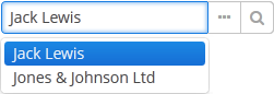
The SearchPickerField component is used to search for entity instances according to the entered string. User should enter a few characters and
press Enter. If several matches have been found all of them will be displayed in a drop-down list. If only one instance matches the search
query it immediately becomes a component value. SearchPickerField allows also to perform actions by clicking on buttons on the right.
XML name of the component: searchPickerField.
The component is implemented for Web Client and Desktop Client.
-
To use
SearchPickerFieldcomponent, you need to create collectionDatasource and specify a query, which contains corresponding search conditions. Condition must contain a parameter namedcustom$searchString. Component will pass a substring entered by the user after pressing Enter. A data source with a search condition should be defined in the optionsDatasource attribute of the component. For example:<dsContext> <datasource id="carDs" class="com.company.sample.entity.Car" view="_local"/> <collectionDatasource id="coloursDs" class="com.company.sample.entity.Colour" view="_local"> <query> select c from sample$Colour c where c.name like :(?i)custom$searchString </query> </collectionDatasource> </dsContext> <layout> <searchPickerField datasource="carDs" property="colour" optionsDatasource="coloursDs"/>In this case, the component will look for instances of
Colourentity according to the occurrence of the substring in itsnameattribute. The(?i)prefix is used for case-insensitive search (see Section 4.5.3.2.4, “Case-Insensitive Search for a Substring”). The selected value will be put into thecolourattribute of theCarentity located in thecarDsdatasource. -
Using the
minSearchStringLengthattribute the minimum number of characters, which the user should enter to search for values, can be defined. - In the screen controller two component methods can be implemented that will be invoked:
-
If the number of entered characters is less than the value of
minSearchStringLengthattribute. -
If the search of characters entered by the user has returned no results.
Below is an example of implementing methods to display on-screen messages:
@Inject private SearchPickerField colourField; @Override public void init(Map<String, Object> params) { colourField.setSearchNotifications(new SearchField.SearchNotifications() { @Override public void notFoundSuggestions(String filterString) { showNotification("No colours found for search string: " + filterString, NotificationType.TRAY); } @Override public void needMinSearchStringLength(String filterString, int minSearchStringLength) { showNotification("Minimum length of search string is " + minSearchStringLength, NotificationType.TRAY); } }); } -
-
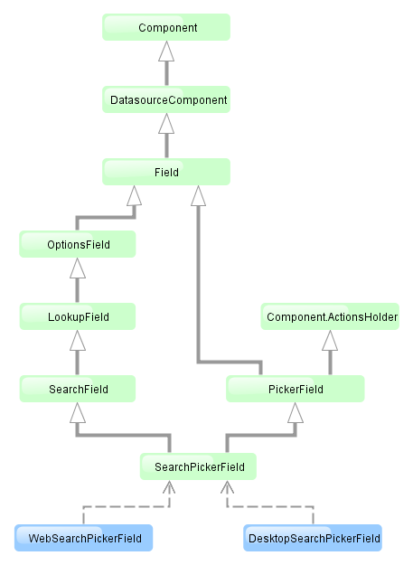
SearchPickerFieldimplements LookupField and PickerField interfaces. Thus, it inherits the same functionality except the default list of actions added when defining the component in XML: forSearchPickerFieldthese arelookup and
and open actions.
searchPickerField attributes:
align | caption | captionProperty | datasource | description | editable | enable | filterMode | height | id | inputPrompt | metaClass | minSearchStringLength | nullName | optionsDatasource | property | required | requiredMessage | stylename | visible | width
searchPickerField elements:
