FieldGroup is intended for the joint display and editing of multiple entity attributes.
XML-name of the component: fieldGroup
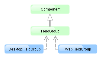
The component is implemented for Web Client and Desktop Client.
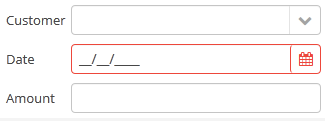
Below is an example of describing a group of fields in an XML screen descriptor:
<dsContext>
    <datasource id="orderDs"
                class="com.sample.sales.entity.Order"
                view="orderWithCustomer">
    </datasource>
</dsContext>
<layout>
    <fieldGroup id="orderFieldGroup" datasource="orderDs" width="250px">
        <field id="date"/>
        <field id="customer"/>
        <field id="amount"/>
    </fieldGroup>
In the example above, dsContext defines an orderDs data source, which contains a single instance of the Order entity. For the fieldGroup component, you should specify a data source in datasource attribute. Entity attributes containing in the data source, which you need to display, should be specified in field elements.
fieldGroup elements:
-
column– optional element that allows you to position fields in multiple columns. For this purpose,fieldelements should be placed not immediately withinfieldGroup, but within itscolumn. For example:<fieldGroup id="orderFieldGroup" datasource="orderDs" width="100%"> <column width="250px"> <field id="num"/> <field id="date"/> <field id="amount"/> </column> <column width="400px"> <field id="customer"/> <field id="info"/> </column> </fieldGroup>In this case, fields will be arranged in two columns; the first column will contain all fields with the width of
250px, the second one with the width of400px.columnmay have the following attributes:-
width– specifies the field width of a column. By default, fields have the width of200px. In this attribute, the width can be specified both in pixels and in percentage of the total horizontal width of the column. -
flex– a number, which indicates the degree of horizontal change in the overall size of the column relative to other columns as a result of changing the entire width offieldGroup. For example, you can specifyflex=1for a column, andflex=3for another one. -
id– an optional column identifier, which allows you to refer to it in case of screen extension.
-
-
field– main component element. It describes one component field.Attributes of
field:-
id– required attribute; it should contain either an entity attribute name, which is displayed in the field, or an arbitrary unique identifier of a programmatically defined field. In the latter case,fieldshould havecustom="true"as well (see below). -
caption− allows you to specify a field caption. If not specified, an entity attribute localized name will be displayed. -
visible− allows you to hide the field together with the caption. -
datasource− allows you to specify a data source for the field, other than specified for the entirefieldGroupcomponent. Thus, attributes of different entities can be displayed in a field group. -
optionsDatasourcespecifies a name of a data source, used to create a list of options. You can specify this attribute for a field related to a reference entity attribute. By default, the selection of a related entity is made through a selection screen. IfoptionsDatasourceis specified, you can select the related entity from a drop-down list of options. Actually, specifyingoptionsDatasourcewill lead to the fact that LookupPickerField will be used in the field instead of PickerField. -
width− allows you to specify the field width excluding caption. By default, the field width will be200px. The width can be specified both in pixels and in percentage of the total horizontal width of the column. To specify the width of all fields simultaneously, you can use thewidthattribute ofcolumn, described above. -
custom– if set totrue, it means that a field identifier does not refer to an entity attribute, and a component, which is in the field, will be set programmatically usingaddCustomField()method ofFieldGroup(see below). -
link- if set totrue, allows displaying a link to an entity editor instead of an entity picker field (supported for Web Client only). Such behaviour may be required when the user should be able to view the related entity, but should not change the relationship. -
linkScreen- contains the identifier of the screen that is opened by clicking the link, enabled in thelinkattribute. -
linkScreenOpenType- sets the screen opening mode (THIS_TAB,NEW_TABorDIALOG). -
linkInvoke- contains the controller method to be invoked instead of opening the screen.
The following attributes of
fieldcan be applied depending on an entity attribute type, which is displayed in the field:-
If you specify a value of the
maskattribute for a text entity attribute, MaskedField with an appropriate mask will be used instead of TextField. In this case, you can also specify thevalueModeattribute. -
If you specify a value of the
rowsattribute for a text entity attribute, TextArea with an appropriate number of rows will be used instead of TextField. In this case, you can also specify thecolsattribute. -
For a text entity attribute, you can specify the
maxLengthattribute similarly to one described for TextField. -
For an entity attribute of the
dateordateTimetype, you can specify thedateFormatandresolutionfor the parameterization of the DateField component located in the field. -
For an entity attribute of the
timetype, you can specify theshowSecondsattribute for the parameterization of the TimeField component located in the field.
-
fieldGroup attributes:
Methods of the FieldGroup interface:
-
addCustomField()is used together with thecustom="true"attribute offieldand it allows you to set your own field view. It takes two parameters: field identifier specified in theidattribute offieldand the implementation of theFieldGroup.CustomFieldGeneratorinterface.generateField()of theCustomFieldGeneratorinterface is invoked byFieldGroup. A data source and field identifier, for which this generator is registered, are passed into the method. The method should return a visual component (or container), which will be displayed in the field.Example:
@Inject protected FieldGroup fieldGroup; @Inject protected ComponentsFactory componentsFactory; @Override public void init(Map<String, Object> params) { fieldGroup.addCustomField("password", new FieldGroup.CustomFieldGenerator() { @Override public Component generateField(Datasource datasource, String propertyId) { PasswordField passwordField = componentsFactory.createComponent(PasswordField.NAME); passwordField.setDatasource(datasource, propertyId); return passwordField; } }); } -
getFieldComponent()returns a visual component, which is located in a field with the specified identifier. This may be required for additional component parameterization, which is not available through XML attributes offielddescribed above.To obtain a reference to a field component in a screen controller, you can use injection instead of the explicit invocation of
getFieldComponent(). To do this, use the@Namedannotation with the indication of an identifier offieldGroupand a field identifier after a dot.For example, in the field to select a related entity, you can add an action to open an instance and remove the field cleaning action as follows:
<fieldGroup id="orderFieldGroup" datasource="orderDs">
    <field id="date"/>
    <field id="customer"/>
    <field id="amount"/>
</fieldGroup>
@Named("orderFieldGroup.customer") protected PickerField customerField; @Override public void init(Map<String, Object> params) { customerField.addOpenAction(); customerField.removeAction(customerField.getAction(PickerField.ClearAction.NAME)); }To use
getFieldComponent()or to inject field components, you need to know which component type is located in the field. The table below shows the matching of entity attribute types and components created for them:Entity attribute type Additional conditions Field component type Related Entity optionsDatasourceis specifiedLookupPickerField PickerField Enumeration ( enum)LookupField stringmaskis specifiedMaskedField rowsis specifiedTextArea TextField booleanCheckBox date,dateTimeDateField timeTimeField int,long,double,decimalTextField
All fieldGroup attributes:
All field attributes:
field elements:
column attributes:
