- align
- An attribute defining component position relative to the above container.
Possible values are:
-
TOP_RIGHT -
TOP_LEFT -
TOP_CENTER -
MIDDLE_RIGHT -
MIDDLE_LEFT -
MIDDLE_CENTER -
BOTTOM_RIGHT -
BOTTOM_LEFT -
BOTTOM_CENTER
-
- caption
-
An attribute setting a visual component's caption.
Attribute value can either be a message string or a key for the message pack. In case of a key, the value should begin with
There are two ways of setting a key:msg://prefix.-
A short key – in this case the message will be searched in a package set for the current screen:
caption="msg://infoFieldCaption"
- Full key including package name:
caption="msg://com.haulmont.refapp.gui.app/infoFieldCaption"
-
- captionProperty
- Defines the name of an entity attribute which is displayed by a component. The property can only be used for entities in a
datasources (for example, defined by the optionsDatasource) property of the LookupFieldcomponent.
If
captionPropertyis not defined, names of instances contained in a list will be shown. - clickAction
-
The attribute contains a description of an action that will be executed when a user clicks in a cell or a field (for the FieldGroup component). Two types of actions are possible:
-
open− opens an editing screen with the specified name for an entity displayed in the cell, for example:clickAction="open:sec$User.edit". Entity name is displayed as a link: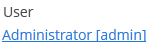
-
invoke− invokes a method of a screen controller with a specified name, for example:clickAction="invoke:onClick". The method should have a singleObjecttype parameter, which will be used to send an instance of the displayed entity.
-
- colspan
-
Sets the number of extra grid columns that the component should occupy (default is 1).
This attribute can be defined for any component located immediately within a GridLayout container.
- datasource
-
Intended for setting a data source, described in a
dsContextsection of a screen XML-descriptor.When setting a
datasourceattribute for a component implementing aDatasourceComponentinterface, a property attribute should also be set. - description
-
An attribute defining hint text for a component.
- editable
-
An attribute indicating that the component’s content can be edited (do not mix with enable).
Possible values −
true,false. Default value istrue.Ability to edit content of a component linked to data (inheritor of
DatasourceComponentorListComponent) is also influenced by the security subsystem. If the security subsystem data indicates that a component should not be editable, the value of itseditableattribute will be ignored. - enable
-
An attribute defining component state:
If a component is disabled, it does not accept input focus. Disabling a container disables all of its components as well. Possible values are
true,false. By default all components are enabled. - expand
- An attribute of a container controlling its internal layout.
Defines a component within a container that should be expanded to cover all available space in the directions of component placement. For a container with components vertical placement, this attribute sets 100% height to a component; for the containers with horizontal placement - 100% width. Additionally, resizing a container will also resize this component.
- height
- An attribute setting component’s height.
Can be set in pixels or in percents of the parent container height. For example:
100px,100%,50. If it is specified without units, pixels are assumed.Setting a value in
%means that the component will occupy the corresponding height within an area provided by the parent container.When set to
AUTOor-1px, a default value will be used for the component height. For a container, height is defined by the content, according to a sum of heights of all nested components. - icon
- An attribute setting a visual component icon.
Attribute value should contain a path to an icon file relative to the themes folder. For example::
icon="icons/create.png"
If the icon should be changed depending on the user’s language, you can set a path to it in the messages package and specify a message key in an
iconattribute, for example:icon="msg://addIcon"
Font elements of Font Awesome can be used instead of files in web client with Halo theme (or derived from it). For this, specify the name of the required constant of the
com.vaadin.server.FontAwesomeclass in the icon property with thefont-icon:prefix, for example:icon="font-icon:BOOK"
- id
- Component identifier.
It’s recommended that values are generated using the rules for Java-identifiers and camelСase is used, for example,
userGrid,filterPanel. It can be specified for any component and should be unique within a screen. - inputPrompt
-
Defines a string which is displayed in the field when its value is
null.The attribute is used for TextField, LookupField, LookupPickerField, SearchPickerField components in web client only.
- margin
-
It can take 2 value types:marginattribute defines indentation between the outer borders and the container content.By default margins are disabled.-
margin="true"− enables margins for all sides -
margin="true,false,true,false"− enables only the top and the bottom margin (the value format is "top,right,bottom,left")
-
- nullName
-
Selection of this option is equal to setting the
nullvalue.Attribute is used for LookupField, LookupPickerField, and SearchPickerField components.
Example for a LookupField, component, setting an attribute value in an XML-descriptor:
<lookupField datasource="orderDs"
             property="customer"
             nullName="(none)"
             optionsDatasource="customersDs" width="200px"/>
Example for a LookupField, component, setting an attribute value in a controller:
<lookupField id="customerLookupField" optionsDatasource="customersDs"
             width="200px" datasource="orderDs" property="customer"/>
customerLookupField.setNullOption("<null>"); - optionsDatasource
-
Sets the name of a data source, used to generate a list of options.
captionProperty attribute can be used together with
optionsDatasource. - property
-
An attribute of a component implementing a
DatasourceComponentinterface.It is intended to set the name of an entity attribute which value will be displayed and edited using this visual component.
It is always used together with a datasource attribute.
- required
-
An attribute of a visual component implementing a
Fieldinterface. Identifies that this field requires a value.Possible values −
true,false. Default isfalse.requiredMessageattribute can be used together withrequired. - requiredMessage
-
An XML-attribute used together with a required attribute. It allows setting a message that will be displayed to a user when the required rule is not fulfilled..
An attribute should contain a key of a message from a package, for example:
requiredMessage="msg://infoTextField.requiredMessage" - rowspan
-
Sets the number of additional grid lines that the component should occupy (default is 1).
This attribute can be set for any component located immediately within a GridLayout container.
- spacing
-
spacingattribute sets spacing between components within a container.Possible values −
true,false.By default spacing is disabled.
- stylename
-
An attribute defining a style name for a component.
- visible
-
An attribute setting component visibility. Possible values −
true,false.If a container is invisible all its components are invisible. By default all components are visible.
- width
-
An attribute defining component width.
The value can be set in pixels or in percents of the width of the parent container. For example:
100px,100%,50. If specified without units, pixels are assumed. Setting a value in%means that the component will occupy the corresponding width within an area provided by the parent container.When set to
AUTOor-1px, a default value will be used for a component width. For a container, width is defined by the content, according to the sum of widths of all nested components.
