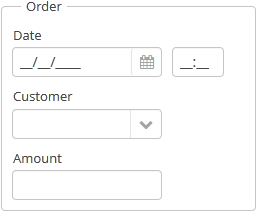
GroupBoxLayout is a container that allows framing the embedded components and setting a universal header for them. Additionally, it can
collapse content.

Component XML-name: groupBox.
An example container description in a screen XML-descriptor:
<groupBox caption="Order">
    <dateField datasource="orderDs" property="date" caption="Date"/>
    <lookupField datasource="orderDs" property="customer"
                 optionsDatasource="customersDs" caption="Customer"/>
    <textField datasource="orderDs" property="amount" caption="Amount"/>
</groupBox>
groupBox attributes:
-
caption– group header. -
orientation– defines embedded components direction − horizontal or vertical. The default value isvertical. -
collapsable– if the value is set totruethe component’s content can be hidden using the icons /
/ .
.
-
collapsed– if set totrue, component’s content will be collapsed immediately after the screen gets opened. It is used withcollapsable="true".An example of a collapsed
GroupBox:
By default, the groupBox container is 100% wide, similar to vbox.
All groupBox attributes:

