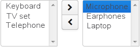
TwinColumn is a twin list component for multiple items selection. The left part of the list contains available unselected values, the
right part – selected values. Users select the values by transferring them from the left to the right and backward using double
click or dedicated buttons. A unique representation style and an icon can be defined for each value.
XML name of the component: twinColumn
The component is implemented for Web Client only.
Below is an example of a twinColumn component usage to select entity instances:
<dsContext>
    <datasource id="carDs" class="com.company.sample.entity.Car" view="_local"/>
    <collectionDatasource id="coloursDs" class="com.company.sample.entity.Colour" view="_local">
        <query>select c from sample$Colour c</query>
    </collectionDatasource>
</dsContext>
<layout>
    <twinColumn id="coloursField" optionsDatasource="coloursDs" addAllBtnEnabled="true"/>
In this example, the coloursField component will display Colour entity instances names located in the coloursDs data source and its getValue() method will return a collection of selected entity instances.
addAllBtnEnabled attribute shows the buttons moving all items between the lists.
columns attribute is used to set the number of characters in a row, and the rows attribute – to set the number of rows in each list.
The presentation of the items can be defined by implementing the TwinColumn.StyleProvider interface and returning a style name and icon path for each entity instance displayed in the component.
The list of component options can be specified arbitrarily using setOptionsList() and setOptionsMap() as described for the OptionsGroup component.
twinColumn attributes:
| caption | editable | optionsDatasource | stylename |
| captionProperty | enable | required | width |
| columns | height | requiredMessage | |
| datasource | id | rows | |
| description | property | visible |
twinColumn elements:
